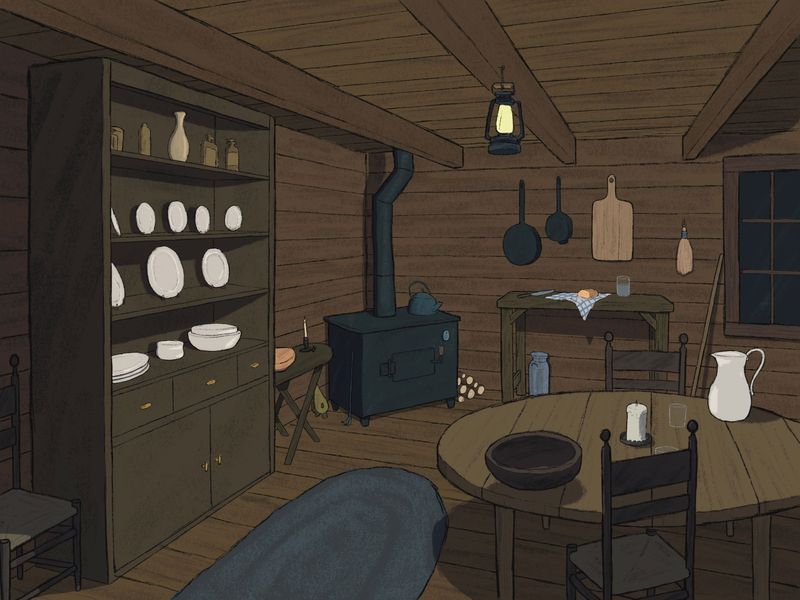
Critique on interior
-
Hey folks!
So this is my design for Hansel and Gretel’s cabin for the children’s book pro class. I’ve spent a ton of time on this, never done an interior before so there was lots of learning here. It’s basically done BUT I am not satisfied with it at all.
Normally I like to ask for feedback on something specific but I just can’t figure out why this piece feels lack luster to me, is it the lighting, the colors, the line work? I sure don’t know but if you’d like to take a stab at it I’d love to hear some feedback!
-
I think that the piece is technically sound but the problem is that nothing seems to be going on. It is just a good view of a regular cabin. What if, for example, the oven was running full blast, with fire and smoke scaping through the cracks, and some scratch marks in the floor around it. I think that you should play with some elements to get the observer curious about the scene.
-
@Griffin technically, it looks great! What it feels like it's missing for me is some personality. Who lives there? What vibe does the house have? What makes it unique? A home?
Even though it's a log cabin, therefore might be plainer in terms of design and furnishings, and more monochromatic -- could you play around with color, value, and lighting? The hanging lantern could cast a cozy glow or bring warmer tones into the room. Could the line work be not as perfect or not as straight, giving a handmade look to the beams, logs, and furniture? Is there wear and tear on this person's belongings?
From the window, it seems like this is a nighttime scene, so I'd expect to see more lighting, a lit candle, and the lightest value would be the lantern (the main source of light). It would also change the shadows and color temperature in the room, if the lantern was the main source of light. What season is this? If it's winter, could snow or ice be built up on the window? When is this set? Modern day? Historical? (If historical, you may want to double check your furnishings and replace the anachronistic glasses with mugs.)
What's the story of the house? Is it newly built? Has it been here a long time? Has the occupant just moved in or did they build it with their own hands? Are they poor, just scraping by? Or do they love their life and are thriving? Is the person utilitarian or do they like some creature comforts or some homey touches like pictures, tablecloth, etc.? It looks like the action hinted at in the scene is happening in the background, the bread being unwrapped and sliced next to a half-drunk cup of water. Could that be moved up into the foreground to heighten the sense that this house is lived in and the occupant is coming right back? Or is the cabin abandoned, and those things have been standing there for weeks/months? If so, they should look dry, old, weathered ... throw in some cobwebs for good measure...
Not sure if this helps at all. I definitely see potential but I do agree that the piece right now is a little lackluster -- hopefully these questions can help you zero in on a time, place, and personality for this room. Please share your progress. We'd love to see how it turns out!
illustrator - author - smiley person
mbaileyart.com
instagram.com/mbaileyart/ -
@Melissa-Bailey-0 all great feedback! Helps so much to get other’s perspectives, thanks so much!
-
@Griffin For me the floor/ceiling are so similar to the walls that it almost feels like they are one continual thing. Could you darken the line work between the floor and wall and also the ceiling and wall? Or maybe change the color or brightness of the floor and ceiling to be different from the wall? Maybe more of an almond color or add just a hint of red? This is fun to see. Good job, even if you're not quite happy with it yet.
-
@Griffin you're so welcome! Looking forward to seeing what you do with this piece!
-
The perspective on the left side - the shelves and dishes especially, is a tad off. The third beam on the left side needs to be removed. It's clumsy, arguing with the top of the shelves. It's also structurally unsound as that beam would likely be in the top of the wall - also too close to the chimney pipe. Most chimney pipes bend to go through a wall not a ceiling. Embed it in the top of the wall if you want to keep it. Then give the chimney pipe a clean line through the ceiling. It will look better.
Move the canter beam a tad to the left. This will give the lantern a better vertical line to the floor too.
Lose the table between the shelves and stove. It's bridging he space between the two. You could put something smaller there.
Put more detail in the rug as it in in the foreground - looks too flat.
Distinguish the value or color between the walls and ceiling. You can use the light and shadows cast by the lantern to do this.
The glasses on the table look unfinished. Glass will bend light and change the look of things seen through it. A tiny detail that can make a big difference. Ceramic or tin cups might be more appropriate for the story.
Log ends are too bright - ad wood grain and tone them down so they stay in the background whee they belong.
Hope this helps.
-
Chimney pipe could be bent up like they needed to use whatever pipe they could find instead of looking new,
-
Clarify - embed the beam in the top of the wall
-
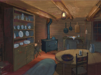
@Griffin Looks Great! My first thought for feedback is maybe to look at Albert Hurter or the Brothers Hildebrant for warm and inviting interior fairytale spaces. I thinking making warm and cool areas might really liven up the room. You can fake the light sources for effect...maybe the stove is leaking light? Maybe the lamp is throwing an impossible amount of warm light (which seems to be a pretty standard trick) Maybe textured brush and a more varied plank width on the floor walls and ceiling? On can imaging the timbers were hewn by hand so maybe some of them would be massive or have a bit of a live edge here and there? I hope you will forgive the super quick paint over ...was thinking i would splash some warms and cools about to maybe show what i was thinking.
-
@Griffin I'd say a focal point that tells a story. Whether it's the kettle boiling -someone's got to get to it before...or put something delicious in that bowl (with a pop of colour to say look here first). It's very homey which is inviting but needs a little more go here first and then look here.
Hope that helps,
-
@Griffin HI! Great work as usual!
 However, in terms of narrative, I think this house looks too pristine. I think we should keep in mind that Hansel and Gretel's family is so destitute that the parents are willing to leave their kids in the woods to die. However, this family still has china? I'd imagine that's the first to go when times get tough. I personally think you can still add more character to this house. Make it more dilapidated and wrecked. Maybe also add a cool hue to the room in order to have a cold and unwelcoming feeling. I hope this was helpful.
 -
The main thing that sticks out to me is similar to what Kevin said. Warm and cool areas, lit and less lit areas, lively and stagnant areas or something along those lines would help to create more contrast in the room which I think would add a lot more depth and space. This is the biggest thing that popped out to me. Since most of the piece is brownish I have a hard time feeling the depth even though your perspective looks quite good.