Society of Visual Storytelling

    SVSLearn Forums

    • Register
    • Login
    • Search
    • Recent
    • Tags
    • Popular
    • Users
    • Groups
    • Search

    Crit for Poppy fields?

    General Discussion
    8
    10
    152
    Loading More Posts
    • Oldest to Newest
    • Newest to Oldest
    • Most Votes
    Reply
    • Reply as topic
    Log in to reply
    This topic has been deleted. Only users with topic management privileges can see it.
    • Laurasketches
      Laurasketches last edited by

      ![alt text](image url)Poppyfields (1).jpg
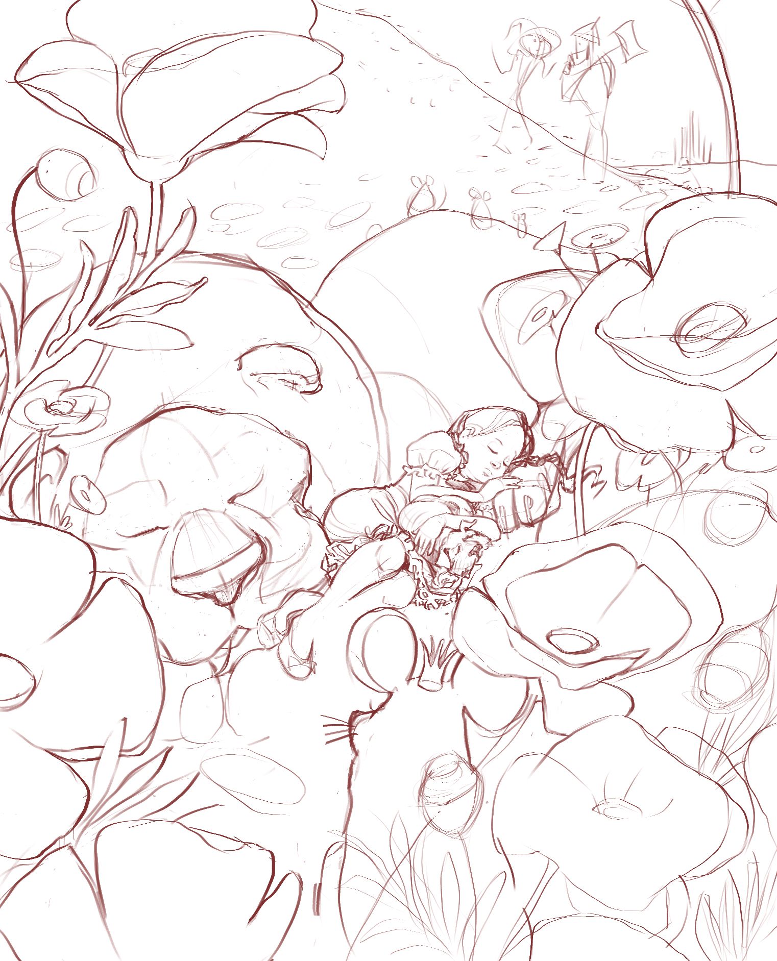
      Alright, Illustrators...
      I'm looking to flush out my portfolio in the next few months by adding some pieces to accompany my Wizard of Oz book cover...
      I'm looking for a crit on this rough sketch. Particularly, how to solve the depth of field from Queen mouse's perspective looking towards the main characters... how to effectively show the distance... or do I need to?
      Any advise on what portfolio pieces were most helpful for you in finding work is also appreciated...
      Cheers,
      Laura

      Matthew Oberdier Pamela Fraley Miriam ajillustrates Nyrryl  Cadiz 5 Replies Last reply Reply Quote 7
      • Matthew Oberdier
        Matthew Oberdier @Laurasketches last edited by

        @Laurasketches I think the distance is effectively conveyed just by size relationships and overlap. You could put something else small near the mouse, like a ladybug or something to reinforce the scale.

        Instagram.com/mattoberdier

        Laurasketches 1 Reply Last reply Reply Quote 4
        • Janette
          Janette last edited by

          looks beautiful! Cant wait to see the final image

          Art is hard.
          https://www.instagram.com/janettehillart/

          1 Reply Last reply Reply Quote 1
          • Laurasketches
            Laurasketches @Matthew Oberdier last edited by

            @Matthew-Oberdier Thank you! a lady bug is a simple and great solution!

            1 Reply Last reply Reply Quote 0
            • Pamela Fraley
              Pamela Fraley SVS OG @Laurasketches last edited by

              @Laurasketches I love this!! It’s very beautiful. And, I think it’s reading well. The other mice up on top of the lion help with the perspective. Also lighting can do a lot to communicate depth. Maybe a color study or two would help you know whether you need to change anything or not?

              instagram.com/fraleycreates

              Laurasketches 1 Reply Last reply Reply Quote 2
              • Laurasketches
                Laurasketches @Pamela Fraley last edited by

                @Pamela-Fraley Thank you for this feedback. I'm batching my sketches, before moving onto color studies, but I will keep your advice in mind, as I go along in process

                1 Reply Last reply Reply Quote 0
                • Miriam
                  Miriam @Laurasketches last edited by

                  @Laurasketches, I agree with @Pamela-Fraley about lighting / color. I remember Will Terry teaching about making the foreground darker, and the background lighter than the mid-ground to create depth of field.
                  I like your composition & the big poppy flowers.

                  1 Reply Last reply Reply Quote 0
                  • ajillustrates
                    ajillustrates @Laurasketches last edited by

                    @Laurasketches This is awesome! Your Dorothy and Toto are killer. The easises way to get the depth across is to make sure that the Queen Mouse's ear overlaps Dorothy's legs. Right now it's reading like more of a tangent. You could also try flipping the queen, so that her ear and crown are overlapping the lion, so that she's looking directly at Dorothy. Then you could fill the space she left with a handful of smaller mice approaching our sleeping heroes.

                    https://ajillustrates.com
                    https://www.instagram.com/aj.illustrates/

                    1 Reply Last reply Reply Quote 0
                    • Griffin McPherson
                      Griffin McPherson last edited by

                      I don’t really see the depth of field as an issue, I think it’s working well so far. Sometimes it can change once lighting is placed. If it feels out of balance later on I would recommend just having the mouse a tiny bit more in focus than the background elements.

                      1 Reply Last reply Reply Quote 0
                      • Nyrryl  Cadiz
                        Nyrryl Cadiz SVS OG @Laurasketches last edited by

                        @Laurasketches add some smaller poppies around dorothy and the lion

                        Portfolio: nyrrylcadiz.com
                        Instagram: https://www.instagram.com/nyrryl_cadiz/

                        1 Reply Last reply Reply Quote 0
                        • First post
                          Last post