Landscape Illustrations
-
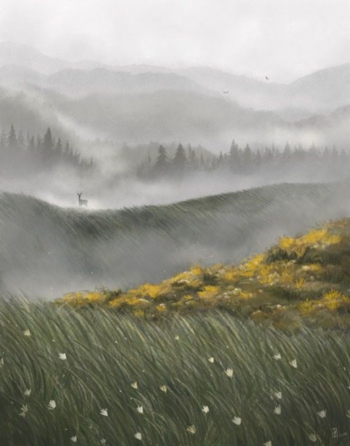
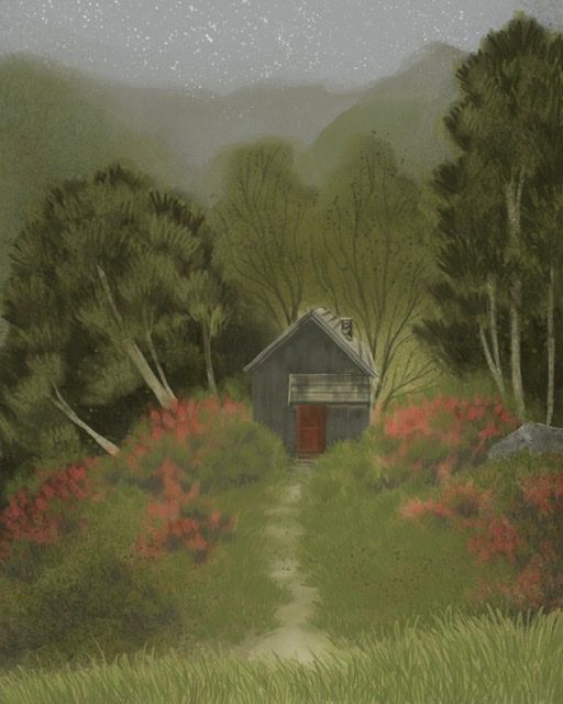
Working on some landscape illustrations and wanted to share. The one with the cabin is a work in progress. Probably trying to learn too many things at once, but I did these on my iPad as a way of learning how to use Procreate (also attempting to wrap my brain around lighting and color. ) I’m hoping to do a few more of these and then start integrating some characters once I get comfortable using layers and stuff. I think one of the biggest things I struggle with is making characters match environments stylistically. Any feedback is appreciated. I am very new to digital art. -
Very nice @Pamela-Fraley! The atmospheric perspective in your top piece is excellent!
Regarding the bottom piece, I noticed it’s snowing at the top, but no where else. Is that intentional for just starting to snow? The snow stands out to me more than anything, perhaps due to the gray and white contrast. The piece feels gloomy because there’s no light source.
I think the foreground grass would look better if it were darker since the scene is dark.
Also, have you thought about adding sunlight to the piece? You can hit the cabin with light and make some great cast shadows.
Here’s an example of Thomas Cole’s Home in the Woods.
https://commons.m.wikimedia.org/wiki/File:Cole_Thomas_Home_in_the_Woods_1847.jpg
-
@Jeremy-Ross Thank you for the feedback! That piece you linked is so beautiful. The lighting is magical. I saved it as a reference photo.
I actually didn’t even think about the fact that the cabin piece would look like it was snowing. it’s not supposed to be snow. I just put a little spatter texture on the background before I started painting it and hadn’t done anything else with that bit. It will be fixed. Especially now! Ha! I definitely think it needs more light too. Im trying to figure out how I want that to go. I should probably know those things before I start. For some reason I struggle to understand light until I have everything blocked in really well, though. I will definitely post another pic when it’s closer to done.
 -
I love your illlustrations and style, the atmosphere is so calming to look at
") I'm inspired to try out digital painting now.
I'm inspired to try out digital painting now.For improvements, I think that your painting on the right could use a little bit more contrast in some places. Not much, just some imo. The dark behind the lightness of the tree bark is really nice. I feel like the house could use some shadow or lightness, and you could either make it go lighter or darker compared to the surrounding plants. If I squint my eyes, the grey is around the same shade as the bushes. Temporarily adjusting the picture all black and white could help see which spots could use tweaking
-
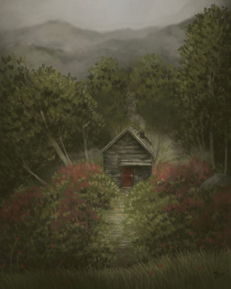
I think I am calling it on this one unless anyone sees something horribly wrong. Why does the last 10% always take so long? It’s also the hardest for me because, I cant ever get to a spot where I feel like thinks are “done.” Anyone else? I took your advice @Elisabeth-Rae and looked at it as a black and white image. That helps so much. Especially with a piece like this where things are a little dark and misty. @Jeremy-Ross I got rid of the accidental snow. haha! Thank you for your help!
-
Beautiful @Pamela-Fraley!