Feedback on Character Design
-
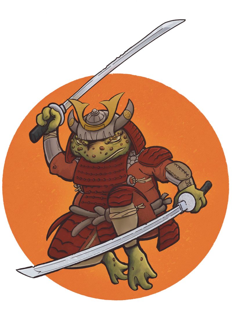
Hello friends! For the past several months I've been working through the Foundations courses and wanted to submit the following image to glean your feedback.
Backstory: My 8 year old son has been obsessed with catching woodshed toads this summer. I caught him yesterday chasing down a golf cart full of teenage girls with one BIG DADDY toad. He was smiling ear-to-ear as they sped away squealing.
For giggles I merged a Samurai warrior with a toad (to both make a fun drawing for my son but also to submit something I could tie to my training here with the knowledgeable SVS staff).

-
Really cool design! Bet your 8 year old loves it! The thing that first came to mind is to add some lighter highlights on the areas that you want to come forward, maybe the eyes and the sword. Just want to say I really like your line work.
-
@Judy-Elizabeth-Wilson Thank you and good advise on bumping up the highlights.
-
This is really cool! and I love the story behind it.
My suggestion would be to consider more saturated colours, especially in the toad skin, if it's intended for children. It seems a bit odd to me that the most saturated colours appear to be in the background circle. -
@CukiArtist Thank you and dually noted!
-
This is really cool! The only thing I think I could add to the comments already given is that the left eye doesn't quite feel wide/big enough or maybe open enough compared to the right eye. Does that make sense? Good work, this is a neat character!
-
@CukiArtist said in Feedback on Character Design:
e background circle.
This is really cool!! It did make me think that, it IS hard to critique a chaacter design, without knowing what that design is intended for.
A kids show? A grity comic book? A main character? A side character?
All of those change the perception of it wildly. -
@Frost-Drive Good point! I was totally feeling a Teenage Mutant Ninja Turtle vibe when I was sketching it out.
-
@Frogpunzel Oh I never realized that until you pointed it out. I could explain that he's squinting but I do need make the left eye larger.
-
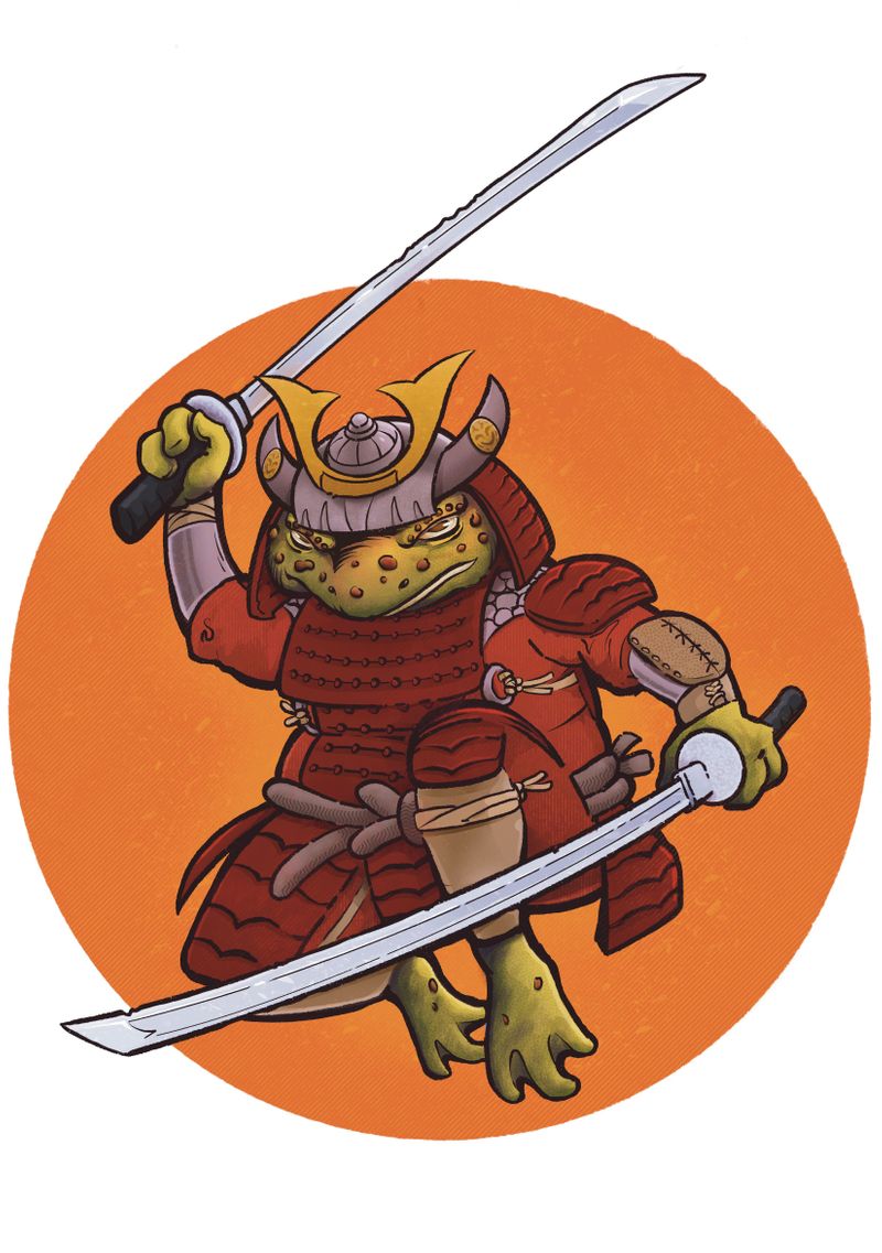
Here is an updated image with added highlights and more saturated colors.

-
@Guy-McAlister Now just put 'em on a shirt and sell it to me. Looks nice Guy.
-
@frownhub seriously
-
This looking really nice.. I'm going to suggest (as others did) adding some cool tones... especially where you want to pull focus... consider rim light?
Nice work! -
This post is deleted! -
@frownhub Thank you! I did have 50 printed on an Indigo press at 11X17. If you would like a print send me a DM on Facebook with your address and I'll mail one to you. Cost is $15... my wife has a venmo account at Destini-McAlister to collect payment.
-
I think this is an excellent design. If anything had to be changed I would just say that the values could be slightly more contrasting, particularly with the armor and the clothing beneath it.
-
@R-Fey-Realme Thank you!
-
@Laurasketches Thank you! I appreciate your insight.
-
@Griffin Thank you Griffin! I appreciate your comments.