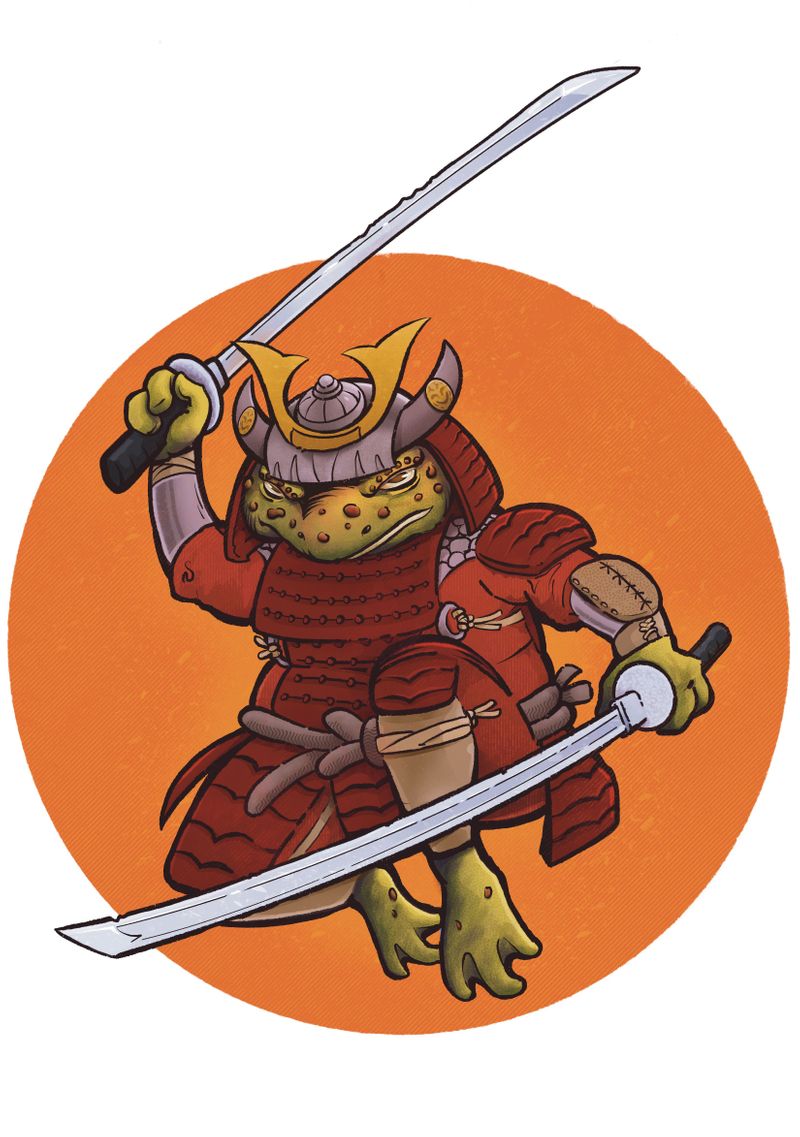
Feedback on Character Design
-
@CukiArtist Thank you and dually noted!
-
This is really cool! The only thing I think I could add to the comments already given is that the left eye doesn't quite feel wide/big enough or maybe open enough compared to the right eye. Does that make sense? Good work, this is a neat character!
-
@CukiArtist said in Feedback on Character Design:
e background circle.
This is really cool!! It did make me think that, it IS hard to critique a chaacter design, without knowing what that design is intended for.
A kids show? A grity comic book? A main character? A side character?
All of those change the perception of it wildly. -
@Frost-Drive Good point! I was totally feeling a Teenage Mutant Ninja Turtle vibe when I was sketching it out.
-
@Frogpunzel Oh I never realized that until you pointed it out. I could explain that he's squinting but I do need make the left eye larger.
-
Here is an updated image with added highlights and more saturated colors.

-
@Guy-McAlister Now just put 'em on a shirt and sell it to me. Looks nice Guy.
-
@frownhub seriously
-
This looking really nice.. I'm going to suggest (as others did) adding some cool tones... especially where you want to pull focus... consider rim light?
Nice work! -
This post is deleted! -
@frownhub Thank you! I did have 50 printed on an Indigo press at 11X17. If you would like a print send me a DM on Facebook with your address and I'll mail one to you. Cost is $15... my wife has a venmo account at Destini-McAlister to collect payment.
-
I think this is an excellent design. If anything had to be changed I would just say that the values could be slightly more contrasting, particularly with the armor and the clothing beneath it.
-
@R-Fey-Realme Thank you!
-
@Laurasketches Thank you! I appreciate your insight.
-
@Griffin Thank you Griffin! I appreciate your comments.