Character Pose Sheet — Serious Critique Requested
-
Hi folks!
How's everyone's pandemic going? I'm writing to you from our 6th lockdown here in Melbourne. I realise this is a bit off topic but sometimes it feels weird not to mention it!
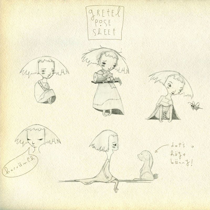
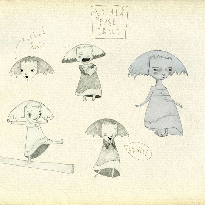
I've been working on character designs for Hansel and Gretel for my portfolio and would love some feedback on my Gretel pose sheet! Obviously I'm looking for character consistency and appeal and successfully conveying emotions

My keywords for Gretel are shy, wild, and kind. Thank you for any and all feedback you take the time to provide!


-
@Katherine Hi Katherine, thanks for posting these. I think they're really good. I particularly like her unkempt hairstyle! You can do a lot with that in your storytelling.
For consistency, I would definitely include a chin when in profile view (I'm looking at the picture where Gretel is with the rabbit), as you've clearly included it in your other drawings. It would bring more appeal too. Only needs to be a little child's chin.
Also, perhaps allow her spine to be more flexible to enhance her range of gesture.
What do you think? -
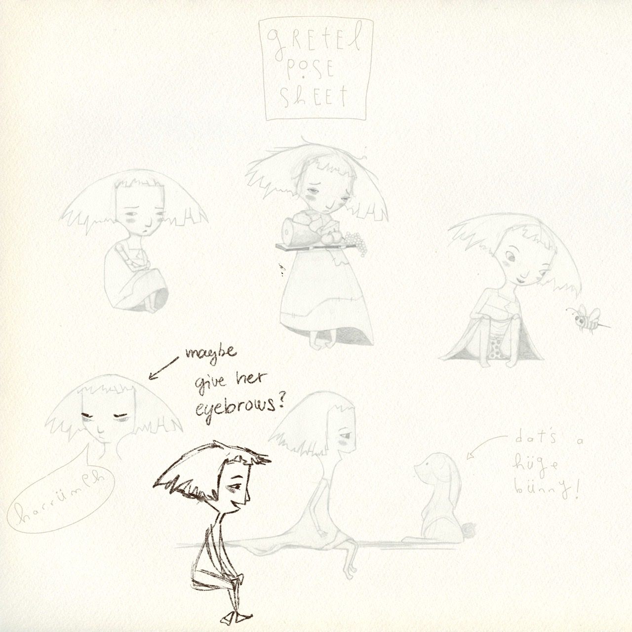
She’s super cute! I love how she’s not the “typical” cute child character, but has her own spirit!
Maybe I would work a bit on understanding the understructure of her - how her body and face is built. If it’s ok I did a little draw over of her sitting pose. But I might miss-understood how she’s built, so take this with a grain of salt.

-
Hey, @Katherine... I don't have much to add to Adam and Mag's comments, other than the fact that I really like your Gretel. She's fantastically cute, and has a rather unique design. Adam already mentioned her hair! The facial expressions and body language are easy to read. I really like it.
-T
-
@Adam-Thornton-0 Thank you Adam — I will definitely re-draw the profile pose with a chin!
-
@Casual-T Thank you so much for saying she has a rather unique design — I drew a lot of Gretels to get to this one!

-
@mag I am so honoured you did a draw-over on my illustration Mag — I'm always so in awe of your Critique Arena submissions! I've definitely had a bit of trouble visualising the structure, as you say, and may need to go take a sculpture short course
