Wizard of Oz
-
Hi All,
For those of you who have been following me on here for a while, you know that I work on these images of real children (many who have health and physical challenges). The idea of this ongoing project is to make it look like the kids have found themselves in the land of a fairy tale. I have shared some others in the past including Cinderella and Rapunzel.
One of the most recent pieces I was asked to work on features a young girl (12yo) who fell ill around Thanksgiving only to discover she has a rare and aggressive form of cancer. She has already started undergoing various procedures and treatments but was feeling up to a photoshoot about a week ago. She requested to be Dorothy so they got her the costume and her Mom and Dad stood in as two of the characters we would make hear appear to be arm in arm with (Also she needs there support as the treatments leave her week and she mostly travels via wheelchair right now so she does not fall. Cancer sucks!)
Anyway I wanted to share this project with you as I always see flaws and areas I know I can get better in, but on this one I also see so many improvements over past pieces, all based on tips/tricks I have picked up in the SVS classes, crtiques and forums!
So to start out with here is an example of the type of photo I am provided to work from:
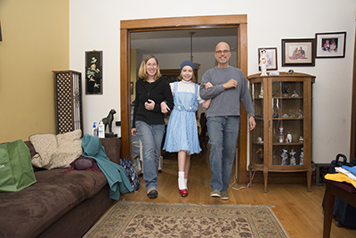
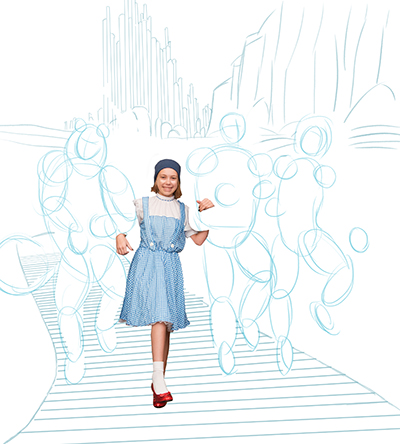
I begin by masking away everything but the young girl and starting to just do the basic sketch elements of where backgrounds and characters may go.
You will see here I was using my shapes to form out the bodies of the other characters - this was part of what had prompted me to realize I should really work on gesture drawings. And while much of that gesture work took place after I had done the sketch for this piece (as I needed to turn this around rather quickly as they wanted to get her copies before her next round of treatments to give out to the medical staff with her autograph on them). But I know for future pieces all of the gesture work I am doing behind the scenes will definitely help me at this stage in the process.
While trying to explore the setting - the client asked me to try the traditional look of all four characters arm in arm skipping along the yellow brick road as shown in version A. They also asked me to have the wizard in the background as if he is waving them good bye and sending them home. A bit of a positive thought that this young girl goes home healthy soon as well.
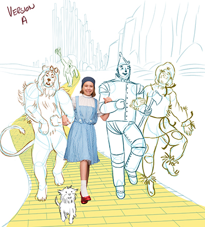
I had really liked the Scarecrow in this version - he felt light and happy which I enjoyed.
But I also sketched another varation with him off to the side and slightly ahead of the group. Originally he was just waving them on as shown here in version B.
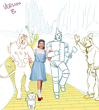
But then when I thought about it more - if they had already been to see the wizard they would have earned their awards from him and that allowed me to change up a few more things as shown in version D.
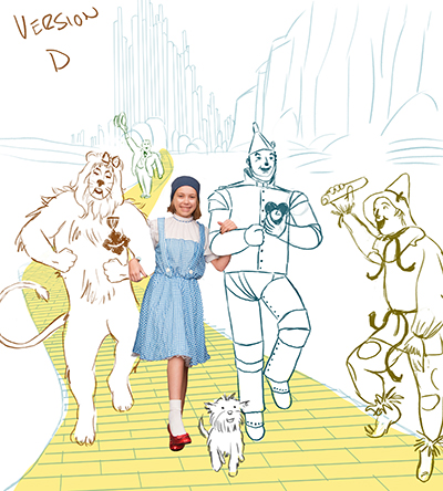
I changed up the arms on Lion to give him a bit more pep in his step. I removed the Tin Man's axe and had him holding up his new heart. And I put the diploma in the hand of the Scarecrow and also worked in the more animated foot positioning which I liked much better.
The client approved the sketch and I started in on coloring the background first and then worked my way through each of the characters.
You will noticed that I also added the braided hair onto Dorothy (that was a request of the young lady herself - as she had on a hairpiece/cap in the photo but really wanted the full Dorothy look).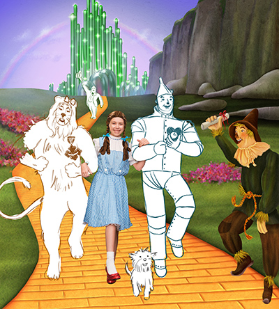
It took a while to create the Emerald City, all those spires and individually placed sparkles. I always feel like rocks/mountains/cliffs should be so easy - but I can not tell you how long I spent working on them. I still see samples of others work online that I like more, but I do see significant improvement in these over some I have done in the past. Plus I have completed stopped using black/white for highlights and shadows on anything - I color pick I change the colors/hues and really play around with what will have the most impact. I also like to adjust the layer type to dodge, multiply, overlay and see what sort of impact those may have.
I took my time drawing in the highlights and shadows for each yellow brick, I pulled in color to add shadow towards the edges for a bit of a pop on the road overall.
I really had fun working in soft/subtle clouds into the sky and creating that faint rainbow. I also used some atmosphere in the fields/cliffs in the background to make them lighter and appear further away - something I had not been doing before.
The filed itself has had drawn as well as texture layers applied to give the idea of grass without being literal so it was not overly distracting. Same for the patches of pink/red poppies. I just wanted to suggest they are there not make them a focal point.
I did my best to avoid any/all line work that was not necessary on the characters so they did not look like the traditional 2D animation style I used to use, and that was pointed out as an area I need to work on resolving on here by Lee and at a portfolio review critique at an SCBWI event. And then with the main characters I really tried to make them look different in terms of textures as well. The tin man has hints of rust but still has that smooth metal like surface. The lion is furry etc.
I made some minor changes from the sketch (the Wizard is smaller so as to appear more in scale with the road and distance from the characters.
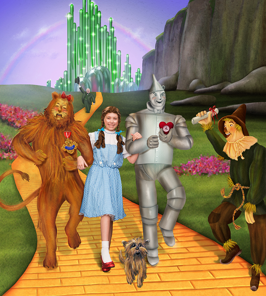
Oh one other thing I did - I put some blue into their shadows to make it a bit cooler. Before I know I would have done those in some shade of black or gray - so after watching the Marco Bucci videos and him talking about cooler colors for shadows - that is what I am trying to do from now on.
All in all I think this is probably some of my best work to date. Not saying that I still don't wish I was even better than I am now - but I can see I am improving all the time, trying to absorb all the info I can and get better with each new piece I work on.
Areas I am still having a hard time with on each piece I work on:
-
all of the little details - small face on the wizard where the brush can never get small enough - or I am just zooming in and worrying about it too much. But I also know that these will be turned into 40" prints for display at some point and at that size the WIzard's face will have more impact.
-
trying not to make everything look soft/airbrushed
-
worried I may rely on textures too much
-
worried that while I can recreate scenes/characters that exist already - that I really struggle on coming up with my own designs. Relying on photo references too much in all the work I do.
-
wondering how you learn to make better paintings - especially on the environment items like mountains, or fields or patches of flowers as I had to do in this piece. I look at samples of work I like but can not yet deconstruct them in my mind to figure out how they reached their end point.
-
-
I had no idea you did this kind of stuff Rich... incredible and very inspiring! You've inspired me to do something like that. Art can heal and inspire so many things. Drop me an email and let me know how you got into this kind of thing. You're an amazing person, Rich.
Ace
-
Such a wonderful idea and project - this is truly heartwarming! I'm sure it will give the girl and her family something positive in these trying times ♡
-
Silly question Rich, but what size are you working at? What DPI? I always work at about 300, but for printing something 40 inches, I would probably go as high as 600 dpi. Just to play it safe, your file size will be a beast, but if you're computer can handle it, you should be okay to add more detail, no matter how much you zoom. I think I've sold posters at 24x30 at 300 dpi, that is had clients print that high up from files I've done.
I wish you all the luck in the world with this, being a cancer patient, I know what she's going through, and I hope you can bring her even a small moment to forget. You're a prince among men Rich...
-
@Bobby-Aquitania - originally when all of these illustrations began they were intended (and still are) to be part of a book that will include a mix of photos of all of these wonderful kids composited over places/landmarks in Chicago that make them look whimsical or fantastical in some way. The photographer uses an instructor of mine from a class I took at School of the Art Institute Chicago to do that compositing and photowork. When he was looking for someone who could illustrate these fairy tale scenes to add another take on all of this into the book, my instructor knew of my children's book work and recommended me. And that is who I became fortunate enough to become involved in this project.
This book (which will be his second project like this - the first featured all wild animals in settings around Chicago) is created with the sole purpose of being a fundraiser for groups such as Chicago Lighthouse for the Blind and Visually impaired. 100% of the proceeds are donated to them. The kids from the lighhouse group are the subject of many of the illustrations. But as word of this project has started to spread among other child health advocacy type groups around Chicago - this hobbyist/philanthropist photographer has been getting photos with all of these different amazing kids. And in doing so one of the children's hospitals is talking about turning these into a permanent exhibit - where they would require large prints between 30-40 inches I am told. Working with his printing company they have been able to create some 30 inch prints a few months back for an event and I heard they turned out amazing - I have not seen them in person yet.
I did not adjust my dpi beyond the print 300dpi I had been doing. File size as you mention can be challenging but also brushes and textures and everything else I use right now become even more of a challenge at larger than 300dpi. So trying to make sure the work is improving but also consistent for the entirety of this project I have no changed the dpi or some other details. The size of the images are also odd compared to a standard book but this is really going into a more photo/coffee table style book so it does not face the same industry standards as the traditional children's book might I suppose.
The photographer is really the most wonderful man - his generousity and compassion for these kids, the families, the charities is unlike any other I have seen. I sometimes tear up a little when I am done with a piece as I know I gave it my very best and I want nothing more than to make the kids feel really special. Sometimes I get emails forwarded onto me with the replies from the families. Hearing that I made Cinderella's mother cry tears of joy that someone cared enough to make her girl feel like a princess is one of those moments I will never forget.
I was told on this piece that Ally (Dorothy) who had been sleeping as the recent treatments are really wearing her out - woke up and was just beaming when they showed this too her. The photographer had 50 copies made up for her to autograph and hand out as I mentioned. To show a kindness to those helping her on her journey and also to just make her feel special over and over again when she shares the image with them and it turns the conversation into how wonderful she looks as Dorothy etc. Seriously - good stuff.
Thank you to @Camomilla and @Ace-Connell for the kinds words as well. I love that this project is having such a great impact well beyond those featured in the images!
-
This is just wonderful! I love the expressions and movement in your characters. Great job with your shadows. I always struggle with placing realistic shadows behind figures. I can tell you put your heart in this!
-
this put a smile on my face
-
Reading about this and seeing you artwork has made my day! It must be an amazing feeling for you knowing that your artwork can bring so much joy! I struggle with all of the same things you mentioned. I worry that I am so dependent on reference that I have dulled the part of my brain that creates.
-
@Rich-Green Seriously awesome.
-
What an awesome project. As far as background environment items, it is something I am working on as well. I don't have enough reference in my mental filing cabinet, so one of the things I am doing is Googling landscape photos, copying them into Photoshop, lowering the opacity and tracing over them, then playing with the value. It helps me deconstruct the environment. Hope that helps.
-
@Carrie - thank you so much for picking up on the expressions and the movement in the characters, I really appreciate you noticing them!
@Naroth-Kean - and your comment put a smile on my face. Thank you my friend!
@stacilyn - comments like the one you left have made my day, so thank you for that! And yes I feel like if I can look at something in person or via photo I can usually draw its likeness fairly well. But when it is from my pure imagination I freeze up for some reason. So in projects outside of this one where I have to create recognizable references to pop culture characters, I am really trying to push myself to be influences by references without taking them literally. I am definitely a work in progress on that one!
@shinjifujioka - that is very high praise coming from someone whose work I admire so much - thank you!
@Rebecca-Hirsch Thank you! And yes I go between real photo references and then other illustrators/digital painters work to see how they intemperate similar landscapes and what it is about their variations that appeal to me. Then I try and figure out how to recreate that but it has been slow going in some areas that's for sure!

Seriously everyone, thank you all so much for all the kind words/comments/upvotes on this one - really feels good!
-
Great work and a great cause!
Hey guys, just a fyi on resolution. There is no benefit to going any higher than 300 ppi, even when working at large scale (provided your file is built at 100% of the printed size). The reason for this is that all images print through a line screen when printing on paper. That line screen will limit resolution on the printing end of things. The line screen is typically 300 dots per inch. Anything over 300 pixels per inch in your file will not show up once it goes through the line screen. Occasionally a coffee table photo book might go up to 450 lines per inch where you would need the higher resolution file, but it's not common. So don't make your files bigger than necessary by going with big resolution sizes.
Hope that makes sense. : )
-
Wow Rich, these just keep getting better and better!! The characters have so much life, but none take away from Dorothy! she has such a beautiful smile! I like how you added all of their awards hehe. The only things i noticed is the wizard gets a bit lost. his suit is clost to the same color as the grass, and Toto needs a bit of shadow under him. Oddly he looks like he was "photoshopped" into the picture.
Keep up the amazing work, and all of the good you do!! You rock!!
-
@Lee-White Thank you Lee, for the kind words. Also thanks for the recommendations on resolution as well.
-
@Lynn-Larson - You know it was tricky because the wizard is green, the field is green, the emerald city is green - not ideal. I had him a bit bolder but then he jumped to far forward in the scene. So I put some of the hazy blue from the sky in him to tone him down a bit and pull your focus back to the foreground. Its one of those things where I should have designed something behind him to contrast him I suppose. Hmmm
-
@Rich-Green I know you don't want him to stand out, he's not the main focus. It is just my opinion
