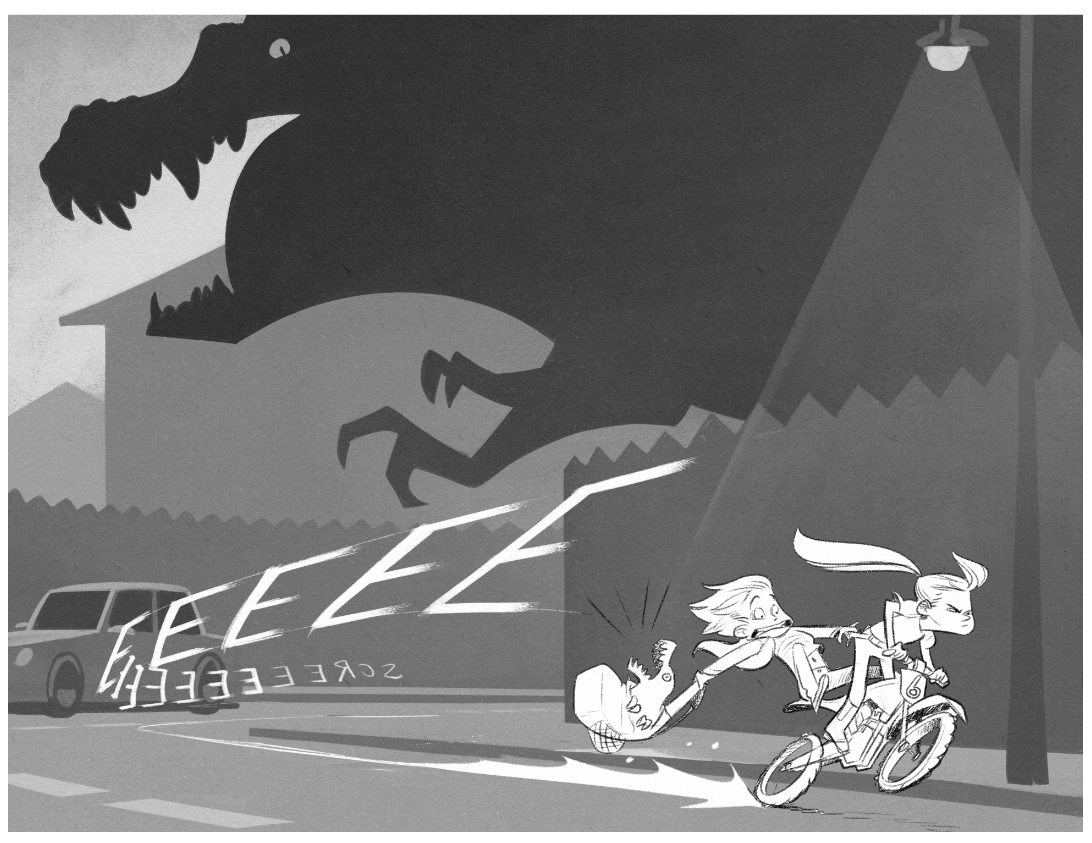
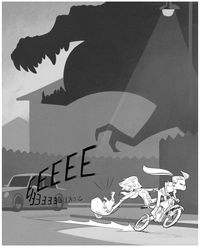
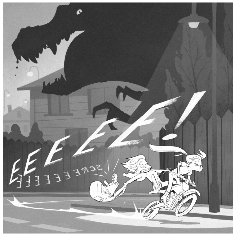
Dino chase! Landscape or portrait?
-
Which one do you like better? The landscape or the portrait? Thanks guys
 I've had some say one and some say the other!
landscape

portrait

-
@Braden-Hallett I like the portrait one better. It uses less real estate to depict the same information. And the beam of light kind of guides your eyes downward over the image from the dino to the car to the kids... :-]
-
I think the landscape version makes everything too crowded feeling. I voted portrait
 ️
️ -
@Braden-Hallett both are great! The portrait, though, raises the stakes. The dinosaur is closer to catching the kids so it ups the danger level.
Also, in landscape orientation, all that dark space of the dinosaur's body could lead the eye into a dead space instead of keeping it focused on the action.
That's how I see it, anyway. Awesome piece and storytelling!
-
Amazing! I love it!
-
I like the portrait and I would be interested to see what it looks like with white lettering, like the landscape one has.
-
As usual, great work! My vote is for portrait as well--it makes the action feel more immediate... and, because of the verticality of the format makes the T-rex seem bigger...
-
I vote portrait as well! Awesome design

-
overwhelmingly for the portrait! Cool! I think there's more of a sense of speed in the landscape orientation, but portrait is good too! Maybe I'll go halfway and try a square instead. Square is always fun

Thanks everyone!
-
Tried square. Liked square. Went with square


-
@Braden-Hallett The square looks good, but now that initial question feels like it was a trick question…
-
@Kevin-Treaccar said in Dino chase! Landscape or portrait?:
but now that initial question feels like it was a trick question…
It was my clever plan all along

-
@Braden-Hallett evil illustrator strikes again…