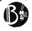
What's this logo look like?
-
I'm thinkin' of redoing my logo (maybe just tweaking it slightly) and I'd love for it to be legible at a distance.
So my question is!
What's the thing next to the "B" look like?

Thanks in advance! I know what it looks like to me, but what's important is what it looks like to others

-
@Braden-Hallett Looks like a bee to me

-
@Braden-Hallett I see a bee

-
@Braden-Hallett A bee? The shape looks like it could perhaps be a fly (with the big eyes) but the stripes on the body makes it definitely read as a bee. This is really cute! I love a good round logo
 You could have a little custom rubber stamp made for this on Etsy.
 -
@Braden-Hallett yes, a bee is what first comes in mind.I would consider making the bee "break"the circle in some way, if that it something that appeals to you.

-
I see a bee.
-
Hi @Braden-Hallett, I see a Big B with a little bee, but if I squint, I see the word “Boo”
-
@Braden-Hallett maybe you can remove the letter B.
-
@NessIllustration said in What's this logo look like?:
You could have a little custom rubber stamp made for this on Etsy.
I've always wanted a rubber stamp for this kind of thing and I'd never thought of using etsy! Thank you

-
@Jeremy-Ross said in What's this logo look like?:
Hi @Braden-Hallett, I see a Big B with a little bee, but if I squint, I see the word “Boo”
Iiiiiiinteresting!
-
@Nyrryl-Cadiz said in What's this logo look like?:
@Braden-Hallett maybe you can remove the letter B.
Just have the actual little Bee guy? I suppose as long as I had my name under/beside it it'd work well!
-
Thanks everyone! It is indeed a Bee
 But one never knows when what I see won'e be what others see, lol
 -
@Braden-Hallett
It looks like a bee to me.
I like the fact that the logo is not a closed circle. I learned in a class that open circles give the impression that you are open and flexible with clients.
I think it’s cute and easy to remember. Black is elegant for stationery and goes with everything. You can make a nice round seal or stamp. I like it! -
@Mara-Price said in What's this logo look like?:
I learned in a class that open circles give the impression that you are open and flexible with clients.
That's a deep dive for sure! I have a hard time thinking about art in that way. It brings me back to English class where profs would wax eloquent about how "classic english novel 'X'" had a laundry list of deeper meanings. Kinda like listening to someone try and psychoanalyze another person if you get what I mean.
But if open circles do give that impression, then hooray
 !
! -
@Braden-Hallett Quick question, I saw that someone mentioned just having the bee. What were your thoughts for having both the "B" and the bee?
-
@jaepereira said in What's this logo look like?:
both the "B" and the bee
Like, how do I feel about the logo as it is right now?
-
@Braden-Hallett like what were your thoughts when you made it with the B and the bee? Like why both?
-
Nest to the B or the bee? The thing on the right looks like a bee. If thats what you were tryna communicate that's perfect. I would say the comp is a little awkward since there are two objects and your eye bounces between them weird. I think its a little off also because the logo seems to be divided in half. Maybe moving one object to a third would work beter, maybe consolidating both the Bee and the B into one object could solve the other problem as well. I dont know I'm not great a graphic design, so take what i say with a grain of salt I guess. I do really like the style and the circle thing you have going there. I can't wait to see the finished product! Hope this helps!
-
@jaepereira said in What's this logo look like?:
@Braden-Hallett like what were your thoughts when you made it with the B and the bee? Like why both?
ah! Cool
 My nickname is just "B" and I like Bees. I felt just a "B" in a circle was boring, so I wanted a bee in there too.
 -
@phoenix-yip said in What's this logo look like?:
I would say the comp is a little awkward since there are two objects and your eye bounces between them weird.
I think you're right! Things could be balanced a tad better
