Picture book dummy - how finished it should be?
-
Hi fellow artists!
I have a question for you. I'm preparing a picture book dummy to submit to literary agents and I'm struggling - how "finished", tight and polished the sketches should be?
I'm already struggling to carve out a bit of time to do this personal project of mine and I'm also very eager to have it ready to submit as soon as possible. On the other I want it to be in a state that gives the manuscript as much a chance as possible to be accepted...When I'm working on picture books in my home country, I already have established relation ships with my editors, so I can go on and send quite rough sketches for new projects and it's OK (we work on tight sketches together afterwards...) But I guess a sloppy sketches won't be the best when approaching a completely new person.
 So - how tight the sketches should be? Or should I go as far as making almost complete drawings?
I will of course be doing 2-3 finished illustrations for the project too. But I kinda don't have enough time to make all the sketches to look flawless. But If that's what it needs to be considered...Thank you everyone as always for your input and experiences! I love, LOVE this forum. It's full of great people.
 Thats a rare thing in todays internet lands.
--
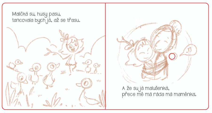
Something I would send to my current publisher:

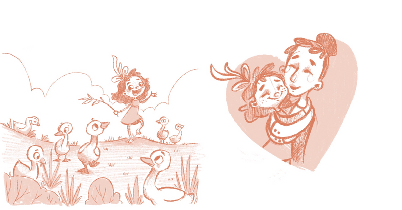
A tighter sketch of the same illustration (it's usually my last stage of drawing before painting the illo:

-
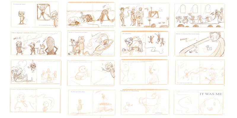
I think either would be fine I’ve never actually submitted a dummy before but I have one that I’ve been working on as well and this is how I plan on sending it in once I finish the rest

-
@mag I haven't submitted a dummy either so take whatever I say with a big grain of salt, but from everything I've heard they are supposed to be quite rough since the whole point is that it's not final and both manuscript and layouts are subject to change. Your sketches are clear and readable, so I think they're fine as it is!
-
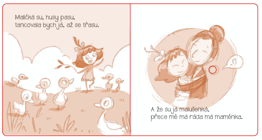
@mag For a submission ready dummy I would suggest a hybrid of the two options you posted.
Take your rough sketches and add a bit of shape based toning (I use the lasso tool in photoshop). In the image below I simply added a few minutes worth of toning to the rough sketch version you posted.
This is one of my favorite things to do when working on a dummy because you get so much value out of relatively little effort! And it encourages me to think about designing the images at a very early stage.

-
@Asyas_illos Thank you for sharing your dummy! The story is so fun, I love it! Are you planning on submitting to publishers or to literary agents?
@NessIllustration You are correct of course. It's a good reminder. And I know this stuff, but as I'm trying to put my foot on a completely new ground (foreign market) I'm a bit stressed out...
I LOVE your YouTube channel, BTW.
@davidhohn Thanks so much! This makes complete sense and it's very efficient, I'll definitely try it! And Thank you for taking time in doing the draw-over. -
@mag yes I know you probably couldn’t read all the text but that’s my general plan it’s my shortest story so I thought it’d be a good start!
-
Wow @davidhohn, its quite amazing how much a little color mockup can add such a big punch to the layout.
@mag Check this out too. Cale Atkinson made a informative blog post on his process and approach to picture book dummy's. Super good read and backs up what @davidhohn and @NessIllustration are advising. Your work is looking great!
-
@mag I really like the characters and the art style!
I agree with @NessIllustration "Your sketches are clear and readable, so I think they're fine as it is!" -
@BradAYoo thanks for sharing the link!