Studies & Sketches *crits welcome*
-
This is my first post in quite awhile. I am trying to make a picture book dummy a goal of mine for this year and I realized pretty quickly that Im quite rusty. I haven't worked in 2D for some time bc my work is all 3D, so I'm trying to take it slow. To start off I thought I'd do studies from artists I admire while get my principles down.
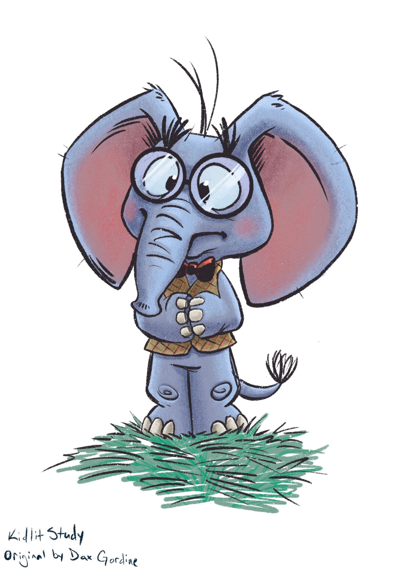
Original work is by Dax Gordine. I decided to take it further by adding inking and color. I feel like I'm having troubles with my color choices though.

-
I really like your color choices the adjustment I would make would be to the grass color maybe make it a bit more on the warmer side? With gold-ish tones to go along with the vest? Looks great though
-
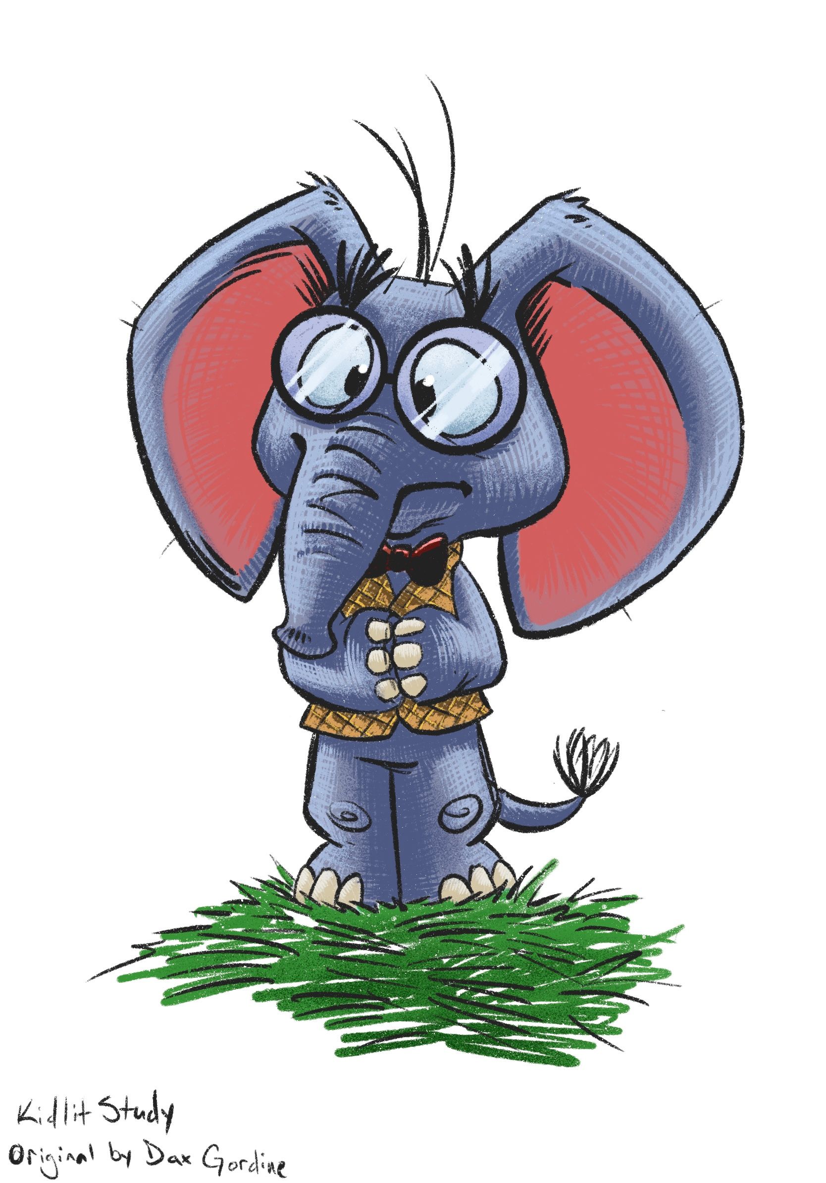
Thank you for your advice @Asyas_illos, they were very helpful when giving this a second try. Both really helped make things pop.
I changed this up a little. I wanted to challenge myself and try a different style. I wanted to go with something that reflects something unique to me while showing my love for comic books. I tried my own spin by cross hatching the buildup of color instead of in the inks itself. Honestly, I'm not even sure if this works. I tried to keep track of the process but I ended up working on each section so differently.
If anyone has time thoughts on the style or a critique would be super helpful. Has anyone seen a similar style? If so I'd like to compare.
-
@BradAYoo I think the hatching of the colour really works and think it’s a brilliant way to show texture. It gives the surfaces so much more depth, and I’m probably going to boost it to try it our for colouring some of my works if you don’t mind ;). The colour on this one stand out compared to the first one. I liked the colours you chose in the first one, but these really pop!
-
@Niels Awesome, I'm glad it reads well. I want to make sure that its not too distracting from the overall. It's a little nerve-wracking trying to figure out a style but this was still super fun to do.
As for boosting it, yeah take it for a run! I'd love to see other interpretations. I feel like we're all learning from each other as well so if it inspires you go for it! Tag me on your post when you finish. -
@BradAYoo this looks great! I really like the style of it - you are asking for critique so I will share my nit-picky feedback
 for me my eye gets pretty stuck on squares in crosshatching - I think you could argue that 90 degree cross hatching does follow form but it also constantly arrests the flow of the eye over the form in my opinion...or I guess in my experience would be a better thing to say - making the hatch lines anywhere closer to parallel let’s our eye flow over the form and the lines become more descriptive of the form instead of a graphic element applied to the form.....could be wrong of course - it really does look good!
 -
Okay, good to know @Kevin-Longueil. This is definitely a style I want to keep refining but I want it to be easy to read too, so I'll keep that in mind. Makes me think if I want to draw more attention, using cross hatching may be a good use in areas but probably too be used sparingly.
( On a side note, I saw your comment on Roblox. Roblox has been a trip to work with. 3D is fun so I love that I can brighten kids lives and make something that's cool. It's ultimately about them getting to tell there own story by way of what they wear. )
-
@BradAYoo re-reading my post and I am not sure I was explaining what I was thinking very well.... it is only when the hatching makes a sort of waffle pattern that it grabs my eye a bit too much - otherwise it is great and Iooks awesome !
-
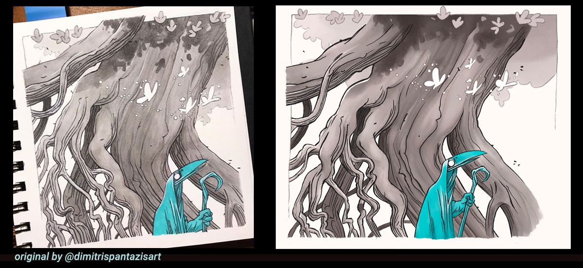
Hey all. Life's been crazy so it took a long time to get finished. I've only had an hour here and there to work on this study but I'm excited. I'm happy how this study came out and more importantly how much I learned about my tools/process in Procreate. I haven't found a digital watercolor set that feels like the real thing to me so I used other brushes and my version came out a lot smoother. That said let me know what you think.
@davidhohn I wanted to ping you in since you have me some good advice on how to study on another post. Thank you again.
-
@BradAYoo This is a good looking master copy! I still feel like I struggle with Procreate. Giving yourself these kinds of assignments are going to pay off big in the future!
-
@davidhohn Thank you David. Getting back into illustrating gas been difficult stop this challenge has made it feel a bit less daunting. I feel like I gained some knowledge for sure as well as getting a better grasp on using Procreate. I've just started using Procreate this year and I do have to say that drawing on the iPad/Procreate has felt more natural that drafting on my Cintiq. The game changer was buying the Paperlike screen protector though.
-

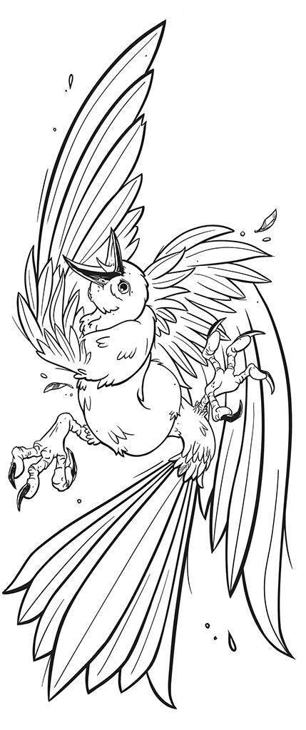
I wanted to do an original so if been working on this guy. It's been a nice change of pace to work something from my head.
