Society of Visual Storytelling

    SVSLearn Forums

    • Register
    • Login
    • Search
    • Recent
    • Tags
    • Popular
    • Users
    • Groups
    • Search

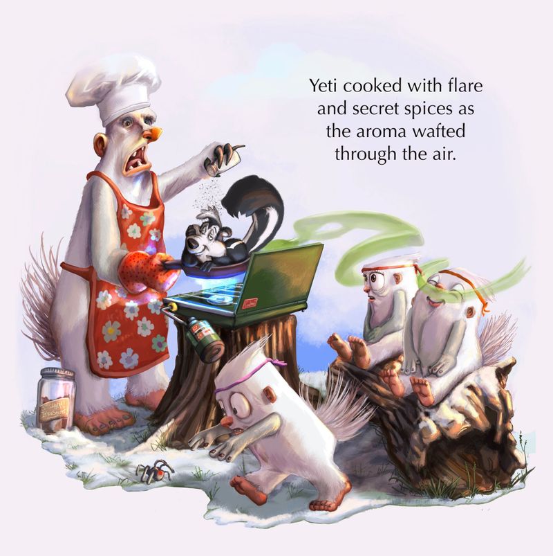
    Yeti WIP cooking spot or not?

    Questions & Comments
    9
    18
    650
    Loading More Posts
    • Oldest to Newest
    • Newest to Oldest
    • Most Votes
    Reply
    • Reply as topic
    Log in to reply
    This topic has been deleted. Only users with topic management privileges can see it.
    • Jeremiahbrown
      Jeremiahbrown last edited by

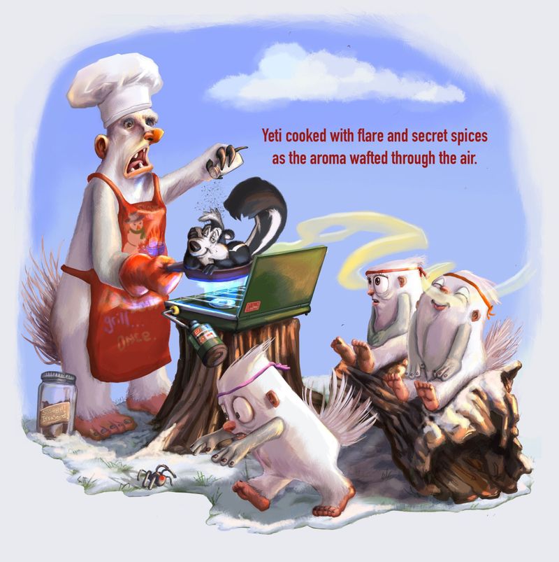
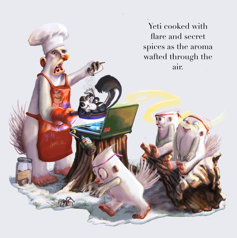
      Happy Tuesday! So my wife and I watched Critique Arena last week and stayed for the spot illustration discussion at the end and when she saw me working on this month's entry she thought the version with the blue sky was more of a full illustration vs. the background-less version which she thought was more of a spot illustration, again, based on the discussion after the Arena. I sort of agreed with her but figured I'd pose this question to you all. Thank you for any of your thoughts! (I'll admit it... I added a bit of "cute" for this entry.)

      Yeticook.jpg
      Yeticookspot.JPG

      Jeremiah Brown
      www.jeremiahbrownillustration.com
      https://www.instagram.com/jeremiah.brownillustration/

      Jeannelle Nyrryl  Cadiz 2 Replies Last reply Reply Quote 6
      • Jeannelle
        Jeannelle @Jeremiahbrown last edited by

        @Jeremiahbrown looks really fun. Love the sniffing little yeti. I think your wife is right. The first one looks more like a vignette. The second one is definitely a spot illustration.

        instagram: https://www.instagram.com/jeannellepita/
        website: http://jeannellepita.com/

        1 Reply Last reply Reply Quote 2
        • Casual-T
          Casual-T last edited by

          This is absolutely superb!! I LOVE the facial expressions... As for spot vs. not spot: Technically I think your wife is correct (although, being a married man myself, you should never let her know that 😉 ), but then again, rules are there to be broken. I'm digging the version with the blue background just a wee bit more (for what it's worth). I say, go for it and blue it up!

          -T

          I hope the publisher likes stick figures!!
          www.casual-t.com
          www.instagram.com/casualcreates.art

          1 Reply Last reply Reply Quote 1
          • Tiffany Thomas
            Tiffany Thomas last edited by

            Hahaha, I love the "bit of cute"! I agree with @Casual-T, there's something really nice about the blue background. Maybe if you fade it out with a gradient or something on the top right, so it's not such a strong division between the background space. I think the key is having the image break open into the surrounding page. Really awesome piece!!!

            1 Reply Last reply Reply Quote 1
            • T
              Tamisha SVS OG last edited by

              The second is definitely a spot. Your illustration is great with or without the blue.

              1 Reply Last reply Reply Quote 2
              • Jeremiahbrown
                Jeremiahbrown last edited by

                Thank you everyone! @Tiffany-Thomas I'm definitely going to try your idea of fading it out, I like it! @Casual-T "blue it up" haha!

                Jeremiah Brown
                www.jeremiahbrownillustration.com
                https://www.instagram.com/jeremiah.brownillustration/

                1 Reply Last reply Reply Quote 1
                • Nyrryl  Cadiz
                  Nyrryl Cadiz SVS OG @Jeremiahbrown last edited by

                  @Jeremiahbrown hehhehehe lolz 😂😂❤️😂

                  Portfolio: nyrrylcadiz.com
                  Instagram: https://www.instagram.com/nyrryl_cadiz/
                  YouTube: https://www.youtube.com/channel/UCbJCF1Im8ZO7hpGWTKOJMuA

                  1 Reply Last reply Reply Quote 1
                  • Jeremiahbrown
                    Jeremiahbrown last edited by

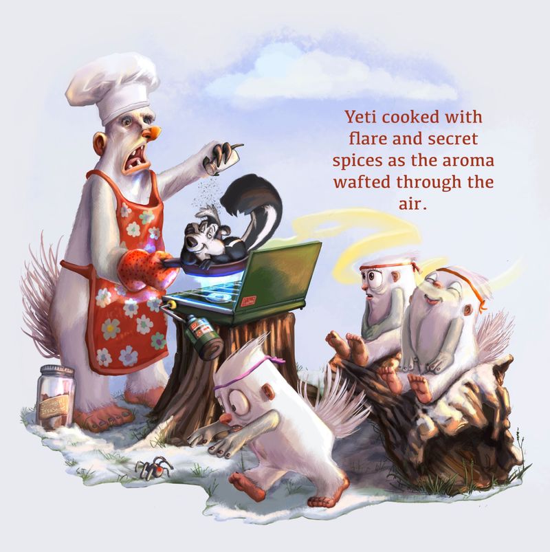
                    Is this a happy medium or should I just stick with one or the other? Thank you for all of the feedback!
                    Yeticook 1.jpg

                    Jeremiah Brown
                    www.jeremiahbrownillustration.com
                    https://www.instagram.com/jeremiah.brownillustration/

                    1 Reply Last reply Reply Quote 2
                    • Tiffany Thomas
                      Tiffany Thomas last edited by

                      So I really think that deeper blue you have in the first image compliments the characters and allows them to pop more. They all look great, but in my opinion, I think if you can find some way to preserve the blue more, especially around the figures, it will help elevate your already awesome design. I did a quick mock up of your first one to try and show what I'm talking about (I hope that's okay?).fadedbackgroundexample.jpg

                      1 Reply Last reply Reply Quote 1
                      • Asyas_illos
                        Asyas_illos last edited by

                        I like your happy medium version I also like without any sky at all I think that it overall looks great

                        Asyasewardillos@gmail.com
                        www.Instagram.com/asyas_illos/
                        https://asyasewardillos.wixsite.com/mysite

                        1 Reply Last reply Reply Quote 2
                        • chrisaakins
                          chrisaakins last edited by

                          Is no one going to mention that he is cooking Pepe Le Pew?

                          Chris Akins
                          www.chrisakinsart.com
                          www.instagram.com/chrisakinsart/

                          Jeremiahbrown Tiffany Thomas 2 Replies Last reply Reply Quote 2
                          • Jeremiahbrown
                            Jeremiahbrown last edited by

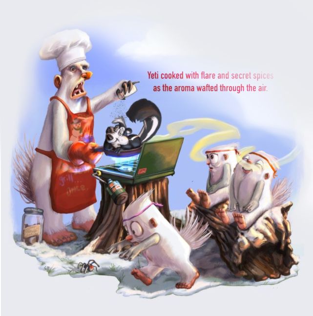
                            One more version and I'll stop, haha. Is this a happier happy medium? I used took some of @Tiffany-Thomas' version. I may be splitting hairs at this point. Thank you all!
                            Yeticook 2.jpg

                            Jeremiah Brown
                            www.jeremiahbrownillustration.com
                            https://www.instagram.com/jeremiah.brownillustration/

                            Tiffany Thomas Casual-T 2 Replies Last reply Reply Quote 3
                            • Jeremiahbrown
                              Jeremiahbrown @chrisaakins last edited by

                              @chrisaakins I was wondering if anyone would notice that😁

                              Jeremiah Brown
                              www.jeremiahbrownillustration.com
                              https://www.instagram.com/jeremiah.brownillustration/

                              1 Reply Last reply Reply Quote 1
                              • donnamakesart
                                donnamakesart last edited by

                                They actually included samples in their instagram post: https://www.instagram.com/p/CLSl7pMjgZa/?igshid=fjraxyuc30zp

                                I think your blue sky matches the 2nd photo in the link above 🙂

                                Instagram: https://www.instagram.com/donnamakesart/
                                Behance: https://www.behance.net/donnamakesart
                                Website: https://donnamakesart.com/

                                Jeremiahbrown 1 Reply Last reply Reply Quote 2
                                • Jeremiahbrown
                                  Jeremiahbrown @donnamakesart last edited by

                                  @donnamakesart Thank you, I didn't notice that!

                                  Jeremiah Brown
                                  www.jeremiahbrownillustration.com
                                  https://www.instagram.com/jeremiah.brownillustration/

                                  1 Reply Last reply Reply Quote 1
                                  • Tiffany Thomas
                                    Tiffany Thomas @chrisaakins last edited by

                                    @chrisaakins hahaha, I would have said something like "poor Pepe" but he seems to be totally okay with it, lol.

                                    1 Reply Last reply Reply Quote 1
                                    • Tiffany Thomas
                                      Tiffany Thomas @Jeremiahbrown last edited by

                                      @Jeremiahbrown Yes! I like this one, it seems like the best compromise! I really love the cloud effect as a transition - also sort of give the feeling that they are up high on a mountain top. Such awesome and relatable characters!!!

                                      1 Reply Last reply Reply Quote 1
                                      • Casual-T
                                        Casual-T @Jeremiahbrown last edited by

                                        @Jeremiahbrown That last version definitely rocks... Awesome work! These characters are just fantastic!

                                        I hope the publisher likes stick figures!!
                                        www.casual-t.com
                                        www.instagram.com/casualcreates.art

                                        1 Reply Last reply Reply Quote 1
                                        • First post
                                          Last post