1 Year Later - Ways to Improve?
-
Hey all,
Last week I came up with a project for myself and I picked one of my favorite pieces I did a year ago and I wanted to redo it using a lot of the things I've been working on and learning this last 6 to 12 months.
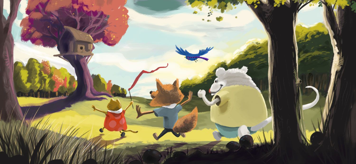
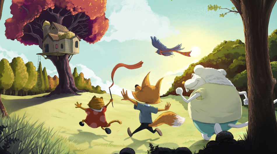
So I chose the one I did with the kids running in the field to the treehouse. Here was the original:
Here's the new one:
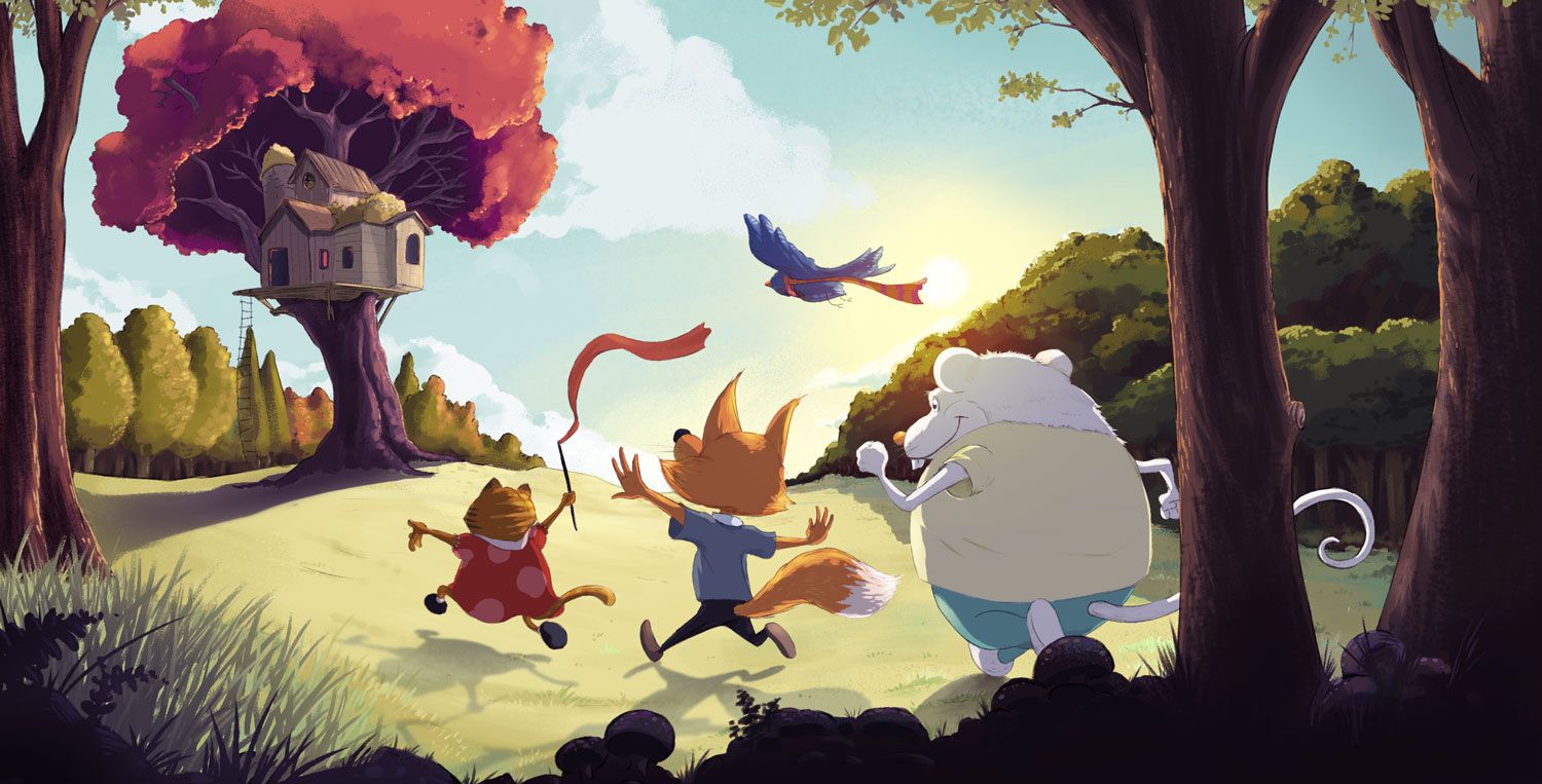
I'm basically looking blindspots I'm missing. And I'd really like to know did the original have elements that I'm missing in the new one? I don't want to lose something good because of newer techniques, so if there's something I need to work on translating back that would be super helpful also.
-
@jdubz WOW! I think that's a great improvement in every way!
-
@jdubz I think the improvement here is huge! I can tell you've learned a ton over the course of a year.Everything looks like an improvement in the new piece to me
")
-
Amazing difference! You have improved the image for sure! What a great self challenge. Nice job.
-
That is AWESOME! Way to improve!!!
As far as feedback, the only thing about the original that might be missing in the redraw is the color of the grass. Love the new rendering of the grass but it does feel a tad washed out. It’s such a nitpicky little thing, though, and there might be a very good reason for the change. Not that you need to up the saturation since it’s lovely as-is, but thought I’d mention since you asked.
It’s such a great exercise to revisit old work, isn’t it? LOVE this new illustration. Definitely a portfolio piece.
-
That's really encouraging, thank you for sharing. Your hard work is extremely evident!
-
@jdubz So much improvement in your lighting and color!! You should feel SO proud! It's beautiful and will make a great portfolio piece!
I'm trying to take a super-critical nitpicky look for you, and I think the only two things I liked better in the first one was the little specks of yellow in the pink tree, and the positioning of the left hand of the first character. The new hand pose just feels a little awkward, like it would be weird to run with your arms like that.
For improvement going forward, (taking a guess here) I get the feeling that you're less comfortable with the characters, the one in the back is a lot more line heavy than painterly, and almost feels like a different style. So if it's true that you feel less confident there, maybe spend some time working on character design.
-
Thanks all really appreciate the kind comments!
@Melissa-Bailey-0 said in 1 Year Later - Ways to Improve?:
As far as feedback, the only thing about the original that might be missing in the redraw is the color of the grass. Love the new rendering of the grass but it does feel a tad washed out. It’s such a nitpicky little thing, though, and there might be a very good reason for the change. Not that you need to up the saturation since it’s lovely as-is, but thought I’d mention since you asked.
I will definitely try that. I did wash it out slightly on purpose because I just wanted the focal points to have more saturated colors to grab your attention, but maybe I took it too far. Thanks for the comment. I'll see if I can figure that out some more.
@carlianne said in 1 Year Later - Ways to Improve?:
I'm trying to take a super-critical nitpicky look for you, and I think the only two things I liked better in the first one was the little specks of yellow in the pink tree, and the positioning of the left hand of the first character. The new hand pose just feels a little awkward, like it would be weird to run with your arms like that.
For improvement going forward, (taking a guess here) I get the feeling that you're less comfortable with the characters, the one in the back is a lot more line heavy than painterly, and almost feels like a different style. So if it's true that you feel less confident there, maybe spend some time working on character design.
Thanks for bring nitpicky
Hmm I played with the hand position some and flipped it around a couple of times. I'll mess with it some more.The only reason the front character has more lines is I'm figuring that as the foremost character in the scene, you probably would only see those details on that character. So it was intentional, but it seems I missed the mark a bit. I definitely want them to all look like similar.
Now, I did color the line art more on the other characters, so maybe that is doing it... I'll try a couple modifications. I think I might want to add more line detail to the other characters rather than remove detail on the front one so I'll try that first.
-
@jdubz Yeah I actually don't mind the lines so much as that it feels like you're relying on the lines there to definre the form, more so than you are anywhere else, which is why I was wondering if you felt less comfortable with characters than with the bgs.
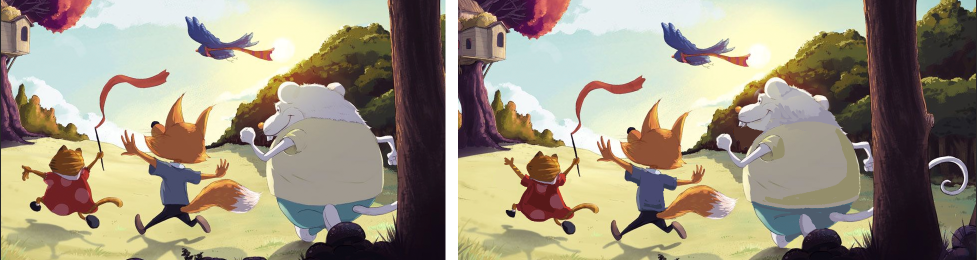
Again, being super nitpicky, and I hope you don't mind, but as an example, the folds of the clothing could have shadow shapes there, or you could more show more texture on the back of the mouse's head. Also, I'm wondering if you could improve their gestures a bit, giving the cat an arch to her back so it's like she's leaping, or lifting the mouse's head up so he's looking at the house. Very. Very minor stuff, but to me that's the area that felt a little weaker than the rest.
Very super rough example of what I mean, yours is on the left my edit on the right.
-
@carlianne yeah I totally see what you're saying there... I was already working on the cat in a similar way when I saw your post and I definitely agree the mouse needed to be looking up.
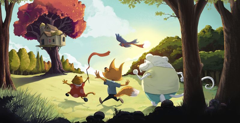
I made a cumulative change with all the feedback. Hopefully this solves the majority of what people were seeing.
-
What a great edit, that feels more cohesive to me. Do you want to adjust the pupil on the mouse to be looking up at the tree as well, or did you want him looking off to the side?
-
@carlianne I moved the iris/pupil up... does it look like he's looking below the tree? It looks to me like hes looking at it, but maybe I need to move it further up??
-
@jdubz I took a closer look, and I think it's just the highlights on his eyes are actually making it look like his eye is lower down? And you might need to hide more of the pupil on the edge.
-
@jdubz it’s even better!

-
@jdubz hi! You made great improvements. Well done. This is just my personal opinion, but I prefer the your more vibrant colors in your earlier piece.
-
Amazing! Gives me hope hahaha.
-
@Nyrryl-Cadiz yeah I gotta say I struggled a bit there. The original one was something I submitted to critique arena, and the comments when it got eliminated were that the colors were too garish. So I kinda backed off a bit. I personally preferred it as well, and I think I might go back that direction. It started that way but there's a vibrancy filter layer sitting on top of it bringing that back quite a bit
 so at least it's an easy fix heh.
@hayleyannececil said in 1 Year Later - Ways to Improve?:
Amazing! Gives me hope hahaha.
Don't sell yourself short
Your stuff is great. This all here is mainly just processes applied in a certain order.@carlianne Ahhh yeah I see what you mean... I do have the eye pinlight pretty large in there.
-
@jdubz yeah, I kinda see what they mean but I think it’s because you used vibrant colors even on the background. Due to atmospheric perspective, your colors should look more desaturated or even bluer as it goes further into the distance. If the vibrant colors were focused more on your characters/focal point, you’ll be fine.
-
@jdubz This looks fantastic - personally I think the colour looks great on this one. Not too saturated, not too light. With the pink tree and low sun, they are basked in a golden glow, so the little bit more on the grass looks great.
It's great to see old works re-visited... It's a really good way to test out what you've learned!