Illustration Critique
-
Hello All!
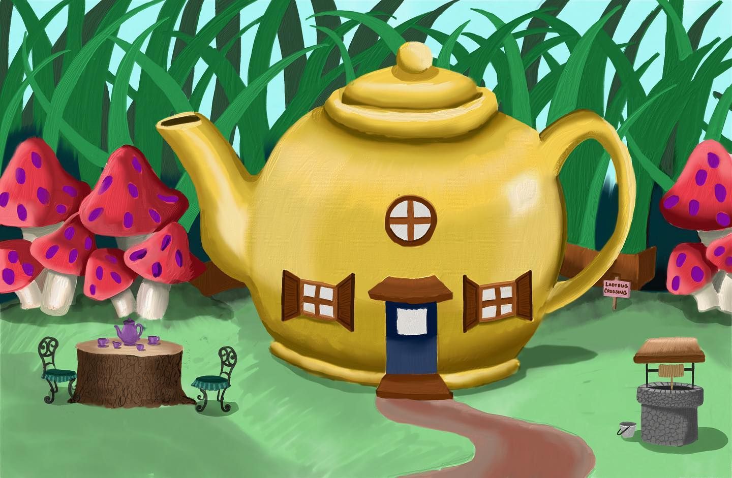
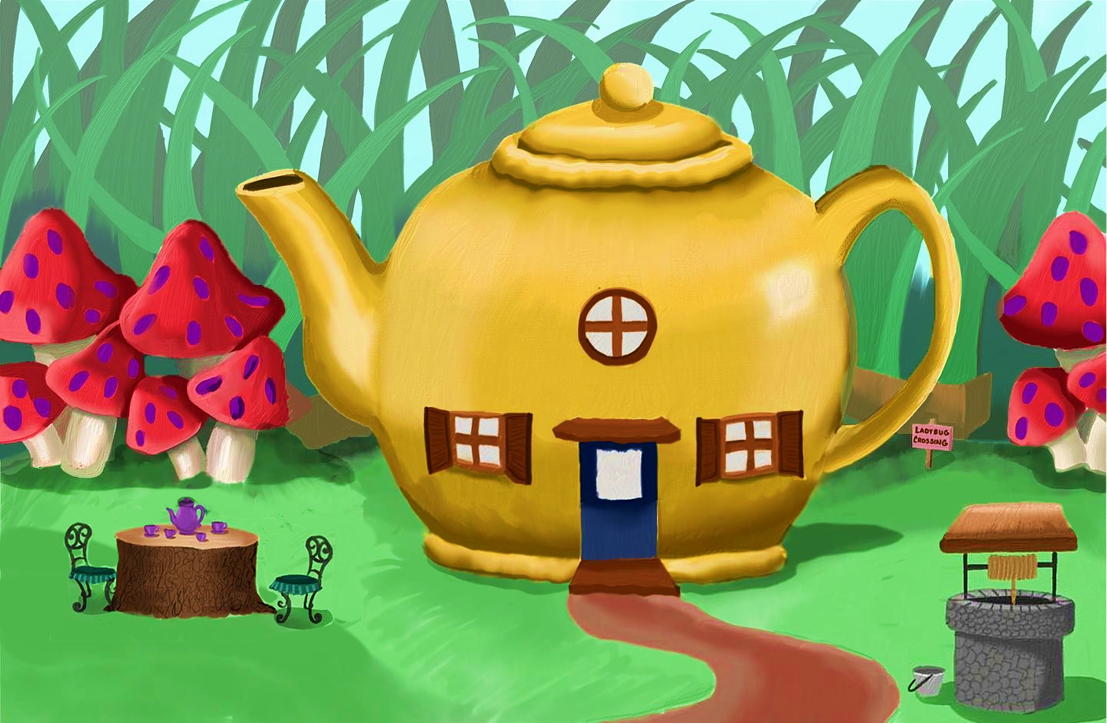
Based on the critiques I was able to receive on an Inktober52 sketch, I created a digital painting that I'm actually quite proud of. It was definitely outside of my comfort zone and I was trying new things. I think I'm on the right track and would love for this to be a portfolio piece someday. My plan is to continue to develop this, and eventually add characters (I was thinking ladybugs) to the scene.
I was wondering if I could get some advice on the lighting of the scene? I've never pushed my values as much as I have in this painting (I've always been too nervous about it), so I really want to focus on that.
Thanks in advance!
-
Two quick things jump out of this charming little scene.
- Where is the light coming from? I see indicators of it coming from multiple sources. I recommend picking one.
- The flat blue in the back of the painting pulls my eyes away from the foreground. It's too bright or something.
I like the new placement of the windows.
Good luck.
-
@ABCre8ive As soon as you asked about the light direction I realized it's coming from several different sources the way I've painted it so far...dang it. I think my plan is to have it coming from the upper right corner, so it's not backlit, but will still allow me to create shadows.
I see what you mean about the sky; I'll try a gradient.
-
Hello @lpetiti I do have some advice on your lighting and values but I also have a couple of comments on the shapes and compositions of this piece. If you don't mind?
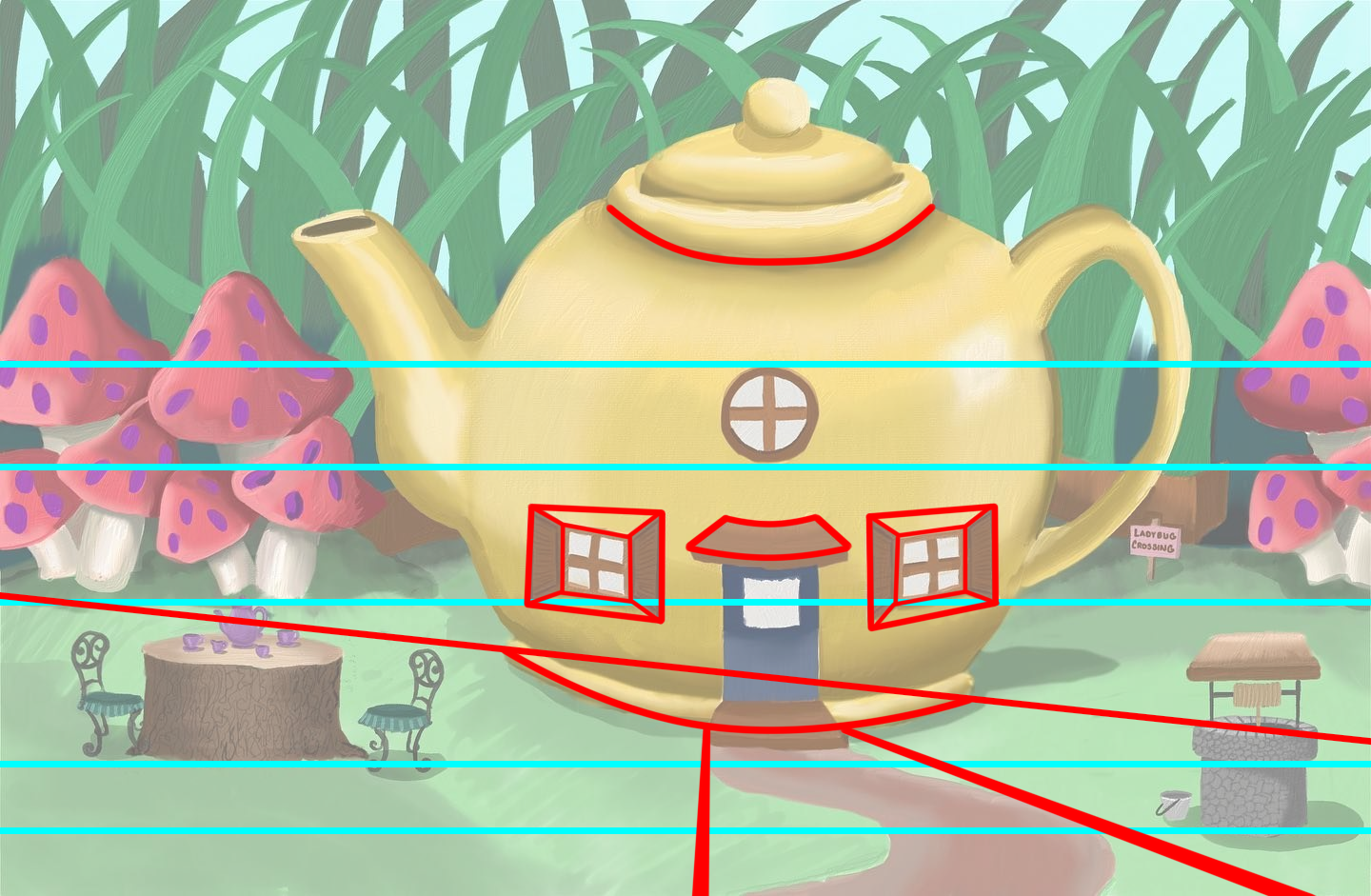
There is some contradictory positions and angles in your piece. For the most part, it looks like we're looking at the piece straight on. The mushrooms, the table set and the well are all sitting on a consistent horizontal plane. However, the teapot house reads as if we're looking downward at it, like we're a little bit above it, which sort of disrupts the overall perspective of this piece. The ends of the teapot house are not parallel to the horizontal plane. If I assume correctly that we are indeed looking straight at the house, the roundness cannot really be conveyed and instead sits parallel to the dominantly horizontal appearance.
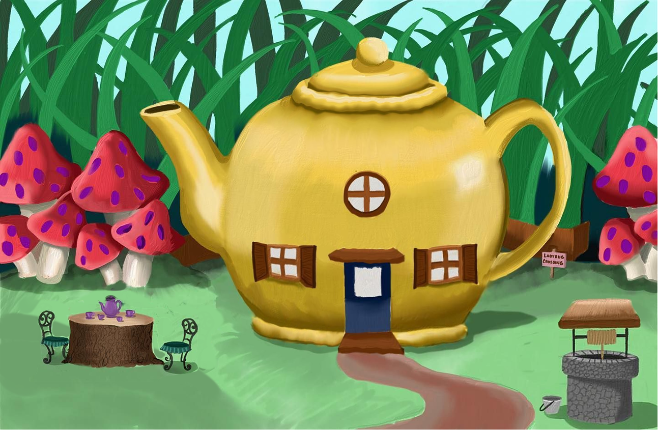
What I did here was shrunk the tableset, it felt a little too big in my opinion in proportions and distance. I also increased the size of the wishing well so it felt like it was closer towards us. I'm sorry if this part is too nitpicky, but I felt like I needed to get this step out of the way to really approach the issue of values.
What I did here was I upped the saturation by a lot and the contrast by just a bit. I felt like the current colors you have are okay, but they are just bit muted. I don't know, maybe I'm being biased I just think this is a teeny bit more tasteful.
For the massive grass in the background I added a mint green layer and put the senting onto "Screen". This will help bring the main piece of the painting, the teapot house out. Naturally in real life, backgrounds that are further away tend to lose color and objects start to blend in with each other because of the atmosphere in the air becoming more visible from our points of view from afar.
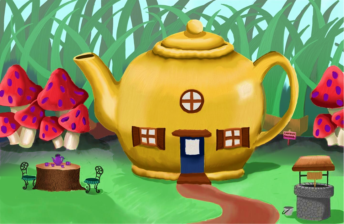
Then I added shadows where the grass and the floor meet to create more contrast.

And to add even further drama I added additional shadows. So just like what @ABCre8ive said, the light source isn't that clear but it's very clear with your table set, well and the shadow cast by the teapot onto the ground. And so that's how I determined the shadows for your piece. And to top it all off I added additional lighting to finish your piece.
I think it looks much better and cleaner. Please let me know if you have any questions. I really hope this helps.
Finis Coronat Opus
Instagram: www.instagram.com/madgcartoons/
Behance: www.behance.net/madgcartoons
Website: https://michaelangelodgo.wixsite.com/madgcartoons -
@Michael-Angelo-Go that’s very thorough, I appreciate the time you took! I agree that the contrast needs to be upped, that’s what I will continue working one. I hadn’t considered the colors to be too muted, but perhaps we just have different tastes (colors weird like that I suppose) I’ll definitely experiment with brightening the colors as well as the contrast. Again, I appreciate this, it gives me a lot to work with.
 ️
️Website: laurenpetiti.myportfolio.com
Instagram: @laurenpetiti"So the man who really loves God could...paint his pictures, even if no man ever saw them. He knows God looks upon them." - Francis Shaffer.
-
@lpetiti I liked your colors! I don't think they're muted
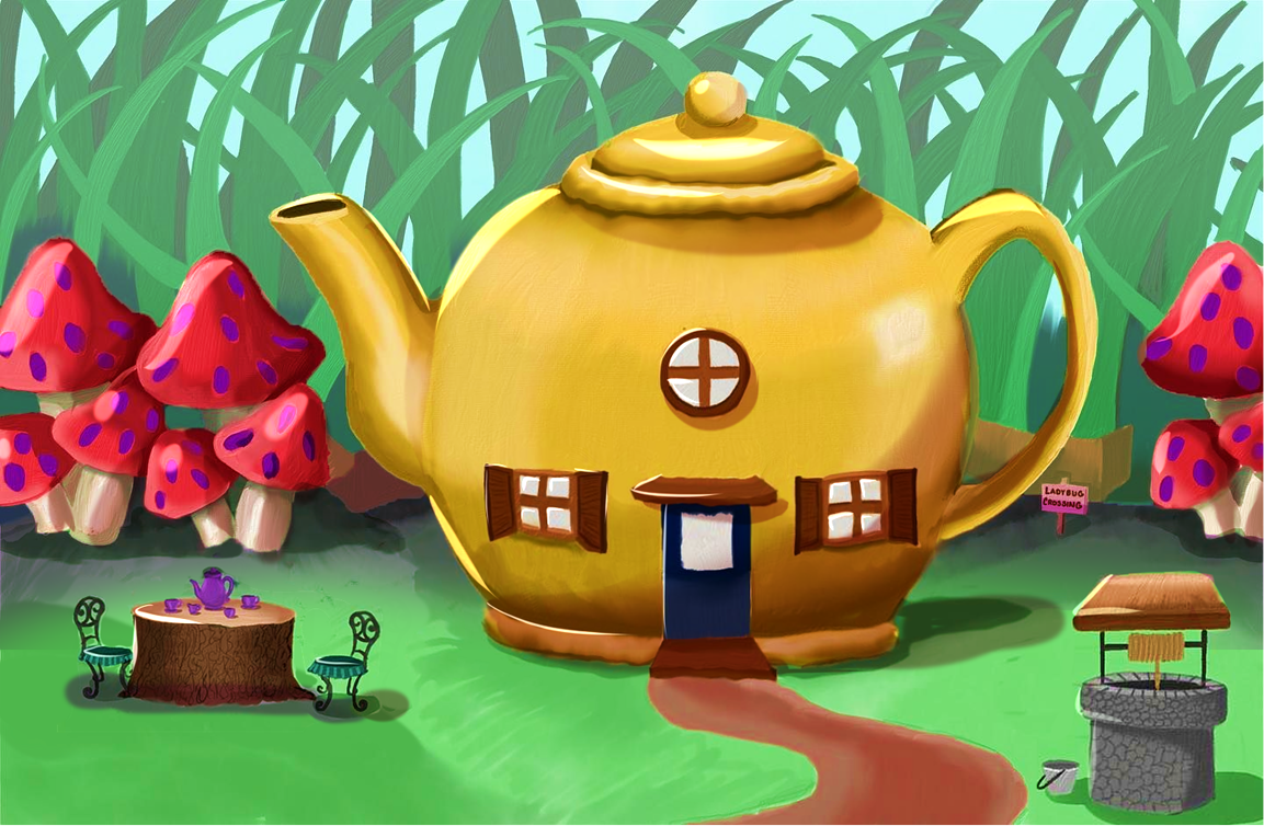
") I'm someone who has a tendency to go overboard with the saturation and it can quickly look very garish, so I like you restraint in picking tones! Michael makes some really good points about all the other stuff, though I would personally do the opposite for fixing the ellipses: instead of straightening the teapot, adjust the other elements to match it. I like the angle of the teapot better because it looks like we're looking at it from above - which is very fitting for the subject matter! This is a very lovely piece, good work
I'm someone who has a tendency to go overboard with the saturation and it can quickly look very garish, so I like you restraint in picking tones! Michael makes some really good points about all the other stuff, though I would personally do the opposite for fixing the ellipses: instead of straightening the teapot, adjust the other elements to match it. I like the angle of the teapot better because it looks like we're looking at it from above - which is very fitting for the subject matter! This is a very lovely piece, good work vanessastoilova.com
instagram.com/vanessa.stoilova/Check out my Youtube channel for tips on how to start your career in illustration! www.youtube.com/c/ArtBusinesswithNess
-
@NessIllustration thank you for the crit! I definitely see what you and Michael are saying about the perspective, I’ll work on that too! I appreciate the encouragement about the color palette, I enjoyed making it!
-
I didn't say they we're full on muted. Perhaps I could rephrase what I mean? I just thought it needed a little bit more saturation.
-
What's the focal point in this picture?
it feels like everything is put on equal importance. And there's no foreground. I would putt hat well REALLY close to the camera or something!
Also, personally I think the colors overall are too saturated. but that could be due to just the lack of contrast in values. I feel like the mushrooms especially should be lighter and fading into the background. And that the grass leaves could use more backgrouund atmospheric perspective too.
My Drawing Show: https://www.youtube.com/ArtParlor
Instagram: https://www.instagram.com/frostdrive/ -
@Frost-Drive is it a hard and fast rule that there always needs to be a foreground? (I'm not questioning your critique, I'm legitimately curious because it's been a while since I've taken composition classes). I see what you mean about the atmospheric perspective.
The focal point was supposed to be the teapot. I figured it was larger and more centered than the others (the original sketch had the mushrooms the same size and the table far too small so I made some adjustments). It's also why the teapot is bright yellow.
Website: laurenpetiti.myportfolio.com
Instagram: @laurenpetiti"So the man who really loves God could...paint his pictures, even if no man ever saw them. He knows God looks upon them." - Francis Shaffer.
-
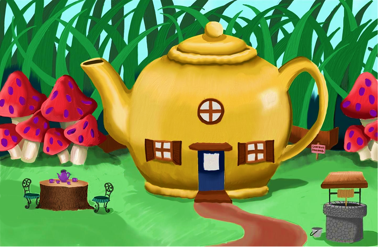
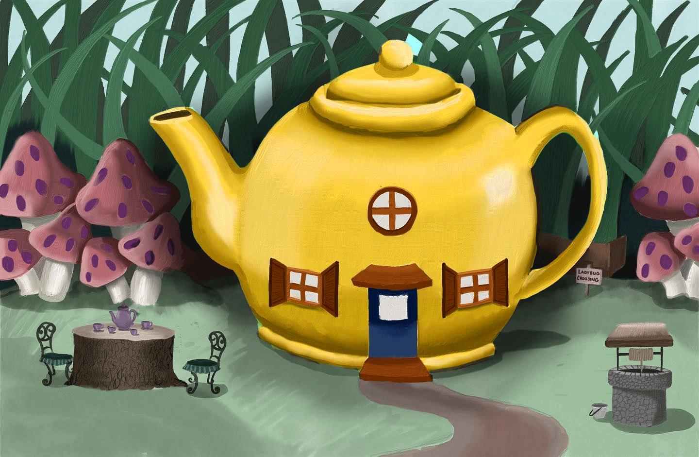
I'm a little late to the party but just wanted to add my 2 cents. I would de-saturate everything apart from the teapot and push up the saturation on the teapot. This will make everything a bit cooler and your focal point warmer.
I would also add a bit of a shadow behind the teapot to push it out from the background.
-
@skillydan That's an interesting approach! I see what you mean about the shadow, though I feel like desaturating everything except the teapot is making it look a bit like there are two separate pieces.
-
@lpetiti It's not a hard and fast rule to include foreground, but it's just one of many compositional tools. Just throwing numbers out there, lets say theres 50 compositional tools. Any piece should probably have a dozen or so of those in them. (Cuz not all pictures can have EVERY tool. and when a picture doesn't have enough, it will look unbalanced and awkward.)
Also I think what skillydan did looks good! Doesn't look like two pieces
My Drawing Show: https://www.youtube.com/ArtParlor
Instagram: https://www.instagram.com/frostdrive/ -
@Frost-Drive That's what I thought about composition, but I wanted to refresh myself so thanks for the clarification.
Website: laurenpetiti.myportfolio.com
Instagram: @laurenpetiti"So the man who really loves God could...paint his pictures, even if no man ever saw them. He knows God looks upon them." - Francis Shaffer.
-
And maybe others can offer insight into this, but worrying about a dozen or so different compositional tools seems a bit...complex? What if a piece is simple and minimalistic (not saying mine is, that wasn't my goal, again, just curious)...it seems like worrying about creating a complex composition would take away from that?
I'm realizing how many different directions I can take this work. This is very interesting.