Feedback on style changes
-
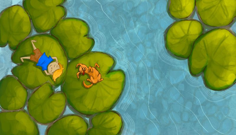
A brief history of my artistic growth, I used to draw mostly when I was a child and up into my teen years and then in my 20s I started painting with acrylics and canvas and now in my 30s I’ve kind of switched back to my drawing because I’m really interested in illustrating for children’s books. I still really enjoy painting and I’m trying to figure out how to bring my painterly style into my digital illustrations. I’m still very new to digital art so it may take me a while, but here is one that I did recently and I’m hoping to get some feedback on it. I can’t seem to get my characters to blend in with my background they look like two separate styles to me. Any ideas?
-
@Asyas_illos Others will have more professional input than I, but I don’t feel your characters look like a different style. Bringing up your highlights and dropping your shadows on your characters and maybe dropping the saturation on your background a tad might make them stand out a bit more. But all in all I think it is a nice illustration, very suitable for children’s books.
-
thank you @erinrew maybe if I add some fish to create another focal point that’s equal in detail could help it be a little more cohesive? I will play with the saturation a bit too thanks!
-
@Asyas_illos I think stylistically, they do match up. The variation I think is that your characters look more intentional. The lines for the most part are really clear and crisp, and the background the edges are a lot less defined/painterly. That might be intentional though... stylistically doing crisp characters and painterly backgrounds is used all the time. If that's the case, I might consider exaggerating that to make it just feel more intentional.
I think it's worth looking at the values as a possible reason it's not looking "right". The characters are literally blending into the vegetation because they are all on the same value range, so your eye has a really hard time figuring out what to look at.
-
Thanks @jdubz yes I was trying to avoid my hard black linework I usually use, but I still ended up with some definition in the characters. I will take your advice and look into my values.
-
@Asyas_illos I think it looks great...your characters are more crisp but I assume they are the focus.
-
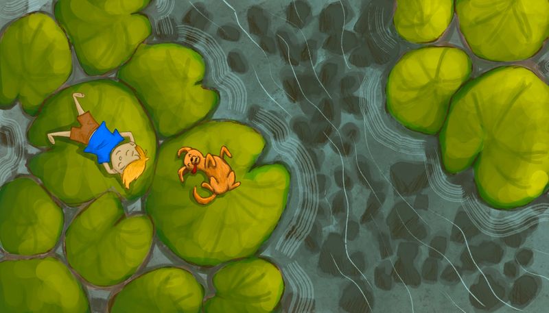
This is actually the original water layer I had done. the first post i had used a different filter for that layer. Does this look better? I think so. It’s funny how sometimes you look at something and think it’s a good idea just to look back at it after a spell and realize it was better the other way.
-
Yea I think I like the more pronounced rocks also. It makes the water feel more shallow also.
-
@Asyas_illos I think it could go either way...without the rocks the water would seem like a great place to put the text if it's for a children's book.