Donna’s Sketchbook
-
I’m staking my little corner in the SVS forum haha.
I wanted to list down my Big dream projects to keep me focused and accountable:
- Grimm’s Fairytale book collection
- Filipino Folklore book collection
- Bible themed activity sheets and flash cards
- Chinese metaphor anthology
- Life in Ongpin (original story based on our grandparents food factory)
These aren’t listed in order and it will probably change over time (I would love to explore Greek Mythology and Holiday themed illustrations!) but I wanted a convenient place to refer back on when I’m feeling lost and don’t know what to draw haha.
What to expect: I’ll post WIPs whenever I feel stuck and need feedback, milestones and wins whenever I hit them

Thanks in advance for the many help and encouragements you freely give
 this forum is truly a blessing haha
 -
Posting the first works feel like drawing on the front page of an actual sketchbook haha.
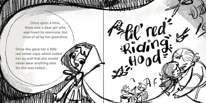
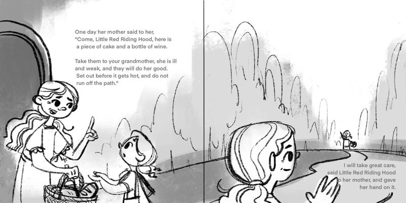
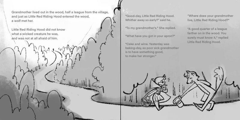
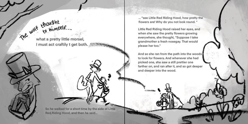
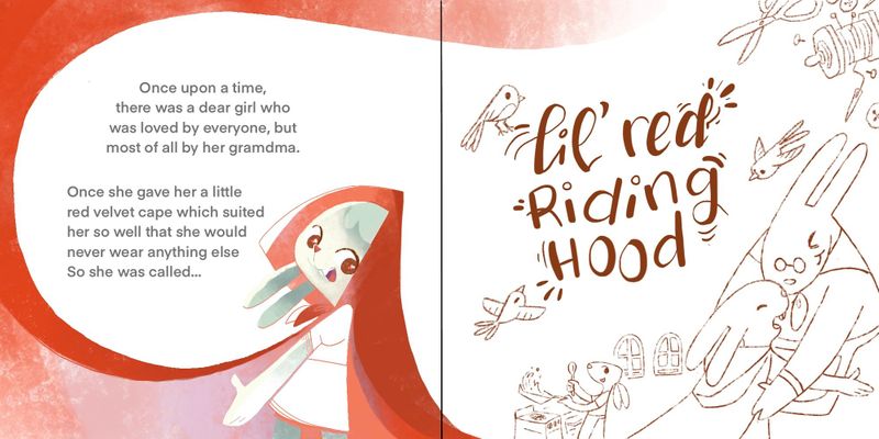
I did this a few years back after Lee Whites Visual Storytelling class. I’ve felt stuck on how to continue Ever since

Is it worth continuing or should I scrap it and start over?
Suggestions on how to improve the spreads are also very welcomed
 Thanks so much
-
Awesome goals @donnamakesart! I like the value pass before going to color. Value and composition are king!
-
@donnamakesart I love your dream project list. It makes me feel like I should be doing something more substantial in 2021

I have two minor suggestions on your spreads. On the right side of spread 2 I would consider moving the text into the negative space in the sky. It kind of feels cramped in that corner plus I think it will be easier to read on a lighter value. The left side of spread 3 feels too sparse compared to all the other pages. Maybe that is by design, but I think you could add a little something to help push the storytelling (maybe show more of the village?). I love spread 4! You had me at wolf in a top hat :), but also really enjoy the composition. If I were you I would keep working on this project. Good luck!
-
@j-sienkowski oh love that village idea for spread 3. Noted on the text for spread 2

Glad you liked the top hat! I might tweak the character designs though since I went into this project without much thought back then
 thanks for the feedback! Much appreciated
-
@Jeremy-Ross yeah. Starting with value comps makes the whole process go much smoother. I’m not sold on the compositions I did so I might revisit them before moving forward haha.
-
Some progress. I’m trying to explore shapes and textures more but I’m not quite vibing with this. Switched the characters to anthropomorphic ones to fill in the gaps in my portfolio. Killing 2 birds with 1 stone
 (PS: I just realized how inhumane that idom sounds @.o)
Bought a new brush set (Vivibrushes) for Procreate so I might give that a go. I played around with it today and had fun. I’ll show you guys the sketches

-
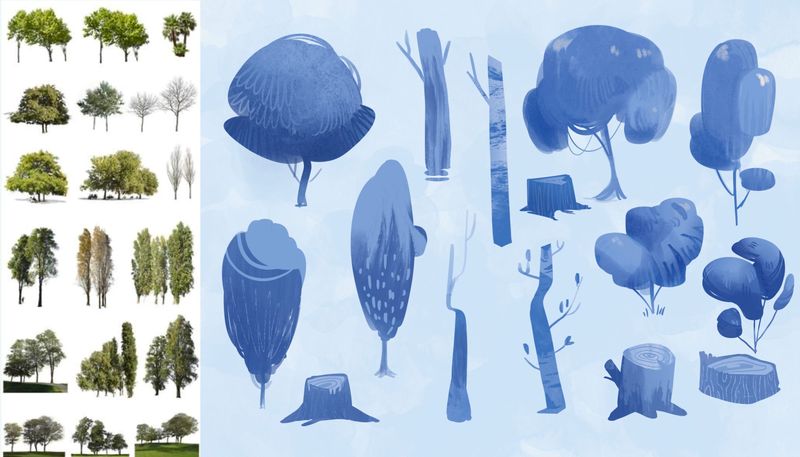
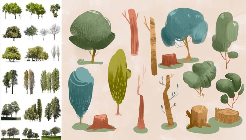
I’ve been figuring out how other artists could make their digital art look so toothy. Maybe good texture brushes was the answer haha.
Nothing can replace the organic feel of traditional art but I was pretty stoked with how these studies turned out

-
@donnamakesart Now your making me want to fill up a page with stylized tree studies! Actually, I could probably really use the practice. Haha, awesome work

-
@donnamakesart great study! my trees tend to be too identical. I also need this type of exercise
-
@donnamakesart This is exactly the kind of study i tried/wanted to do. You've given me some inspiration!

-
Thanks @Braden-Hallett @Nyrryl-Cadiz and @Jacy13
 tag me if ever you do! Also, if you’re willing, let me know what brushes your use for digital works. This has opened a while new world for me haha.
 -
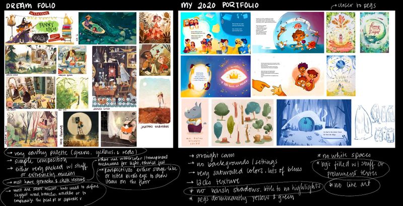
I’m revamping my portfolio but could not figure out what direction I wanted my art to take. I followed the Dream Portfolio assignment and found some interesting insight: mainly my use of line art and color palette did not match my vision for the perfect illustration

My recent works have been heading towards that but with this modboard I can fill in the gaps and point out what I’ missing much quicker

Now for the hard work: master studies haha.
-
@donnamakesart this is really inspiring to see, thank you for sharing!
-
@donnamakesart I was just thinking about this last night! That was one thing I was unhappy with on my contest entry was my tree so I figured i might do a practice sheet of trees or plants that are more stylized
-
@Navya-Raju thanks! Glad you found it inspiring

-
@ambiirae yes. It was a useful and surprisingly fun exercise

-
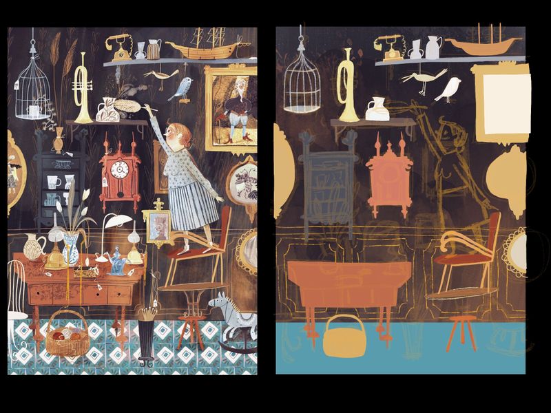
Master study no. 1
The illustration looks deceivingly simple but, oh man, it’s so detailed and not at all my natural style. In fact, I’d go so far as to say it’s the OPPOSITE of how my brain functions

The focus on shape and design composition is taking a lot of focus on my end but I’ve been learning a lot! I’ve always wondered how illustrators could make a piece defy perspective and have wonky lines but still have them look appealing and believable. Basically, the secret is to not lift your pen. And don’t draw constructive sketches. Just draw shapes


I hope that made sense hahaha.
-
@donnamakesart I love your trees, can i borrow them for inspiration?
-
@Dima-Eichhorn yeah sure
 tag me if you ever post! Would love to see your works haha.