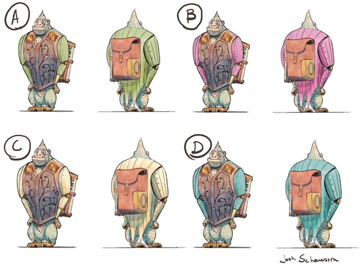
Y.E.T.I. WIP
-
Hey guys, wondering if you could help me out with some colour study/character design for the robot yeti.

I personally like C, but it was noted that the back of the 'tux' blends too much with the colour of the 'fur', and possibly doesn't look as much like a suit as a vest and shirt combo from the front.
Thoughts?
-
@JoshSchouwstra wow I absolutely love them! I think all of the colours look good, I really like the tone. I would tend to agree that with C the tux blends more with the fur than with the other colours. Personally I really like A and D

-
@JoshSchouwstra C looks nice, but I think the green of A helps convey something 'otherworldlyish' and out of the norm, which is great for a Robot Yeti. I know you have the purply/pink with B, but I wonder what a red would look like. Somehow red and grey are robot-y colours for me.
-
@JoshSchouwstra I think D speaks to me the most. I was drawn to B and the pink outfit because I liked the strong contrast in colour but D seems more fitting overall. That’s my pick!
-
@JoshSchouwstra I really enjoy the shapes used in this character. Personally, I like like "B" and "D" because, I also, like the color contrasts. Nice work!
-
@DaveLeekArt seconding!
-
I can't wait to see finished piece for this. Love all of the colors! I think D is my personal favorite though.
-
Thanks everyone for the feedback! I'll probably go with 'D', and change the colouring to the other poses.
@Cayleen I tried the red and it didn't contrast enough with the backpack, so I decided not to have that as an option

-
Nice! "D" was the one I immediately got drawn to. I think they are all great though.