Hohoho - Feedback?
-
Howdy friends! I'm back at it again!
Do you have a quick moment for some feedback?What do you think about the axe? Does it feel awkward or inconsistent to you?
How about the middle ground tones? Does it feel like it has enough depth (especially between Santa and the midground trees?)
The values around Santa's axe arm and the trees are too similar, in my opinion.
The space under the campers is meant for a holiday message")
I'm thinking about adding a word balloon or something like that. I'm thinking "Hohoho" - likewise, I'm thinking about a name for the upside down boat - maybe "Holiday Surprise"? Ideas?
Finally - the redscreen nightlight is skewing the colors a bit I've changed the settings but the computer hasn't responded to it, soooooo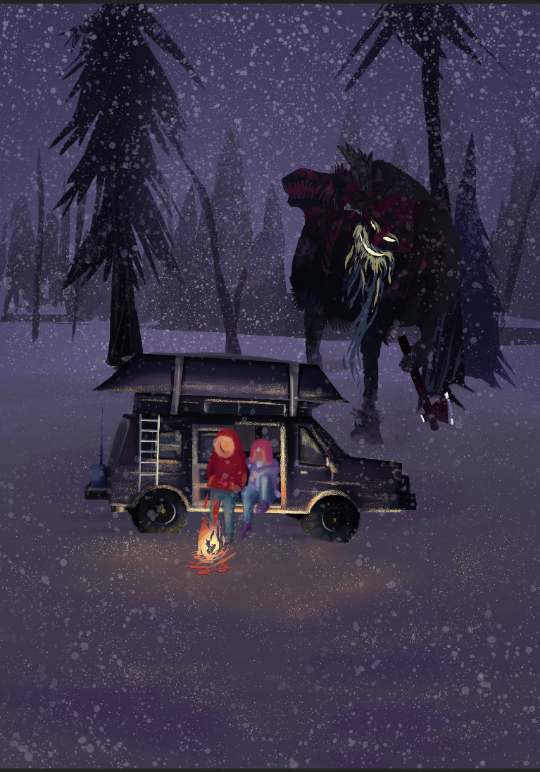
Thank you for your time! I really appreciate it!
Best,
Shani -
Hmm maybe you could add more trees in the background so the evil santa claus/krampus/whatever blends in with the environment more? I think it would give a more sinister vibe if there was a figure that blended in naturally with its surroundings. A darker background would also give us better figure ground composition, where the campfire will be more pronounced. If that's too much, work maybe just darken it more.
Also maybe the campfire lighting should reach more parts of the figure's body like it's shoulders, sack and maybe even it's ax?
Maybe another detail you could add is tracks? For both the van and the monstrous figure?
Overall, I think it's really great. The color harmony works very well.
Finis Coronat Opus
Instagram: www.instagram.com/madgcartoons/
Behance: www.behance.net/madgcartoons
Website: https://michaelangelodgo.wixsite.com/madgcartoons -
@TheArtBard hi! What’s this story about?
Portfolio: nyrrylcadiz.com
Instagram: https://www.instagram.com/nyrryl_cadiz/
YouTube: https://www.youtube.com/channel/UCbJCF1Im8ZO7hpGWTKOJMuA -
Thank you for the feedback @Michael-Angelo-Go! Super helpful! I'll be adjusting the image later today or tomorrow - so I'll definitely get back to you soon
As for the tracks - I experimented with footprints but it didn't translate well - I'll give it another go though, because it's obviously a missing element
Thank you for the color harmony comment - I definitely kept your last bit of feedback in mind when I was deciding on colors (on the Hot Holy Snowman piece) - came in handy!
Thank you again! I'll be posting the updated piece soon! You gave all very good feedback - thanks for your time!Till then,
Best,
Shani, The Art BardPS - I think I saw you on LinkedIn - mayhaps we should connect?
Happy holidays! -
Howdy hey @Nyrryl-Cadiz! Thanks for your question
There's not too much of a back story with this piece - the goal is to lease these out as holiday cards. I suspect that there's a percentage of the holiday card market who's interested in some darker, humorous holiday scenes, hence the evil santa.
The prompt is "unsuspecting campers, winter evening, trouble coming with a holiday theme". It's not really for a story, but I do enjoy putting narrative elements in my illustrations - the space below for a message is a courtesy to card manufacturers - does that make sense?Thanks for your question!
Happy holidays @Nyrryl-Cadiz!
-
@TheArtBard I'm having trouble figuring out the monster's pose - which limbs are his legs and which are his arms for instance. The pose just isn't clear to me. Also feels a bit odd that he's holding the axe with the sharp part pointing outward. That's not a natural pose to hold an axe so it feels awkward. The fire could be radiating a lot more light than this, especially on the ground and characters.
-
I love the way you handled the mountains and trees in the background. I think it adds a lot of depth to the image, without becoming too overwhelming from the foreground.
I agree with you that the values on Santa and the values of the midground trees are too similar. It distorts his silhouette and makes it more challenging to see his pose. Maybe separate the midground trees away from Santa so they don't overlap? As for the axe, I think it would naturally hang with the blade facing down, since the blade is the heaviest part.
I really like the concept, and I like the design you gave Santa, with the bulky body and long lanky legs. It's unexpected in an interesting way.
-
Thank you all for the feedback! I haven't responded to everybody individually because I've been reworking the piece - everything y'all said was super helpful, and spoke to a lot of my insecurities with this piece! Thank you for your time and thoughtful responses! Below is an improved version as of tonight - may change it depending on feedback I might get
-> I've increased the light intensity from the fire
-> I've changed Santas arrangement, including the axe
-> I've given the boat a name
-> I added car tracks
-> I added more mid ground trees to add depth
-> I've added fire highlights onto Santa and the tall trees, as well as the foreground snow, and the people
-> I put snow on the car and boat
-> I added car tracks, but decided against footprints for santa because I'm having a hard time fitting them in
-> I darkened the ambience, but I'm running into the same problem of similar values around santas axe arm and the trees behind it.
-> I'm considering moving Santa around
Of course this is a screenshot of the actual file (file is too big to upload) so I apologize for graininess.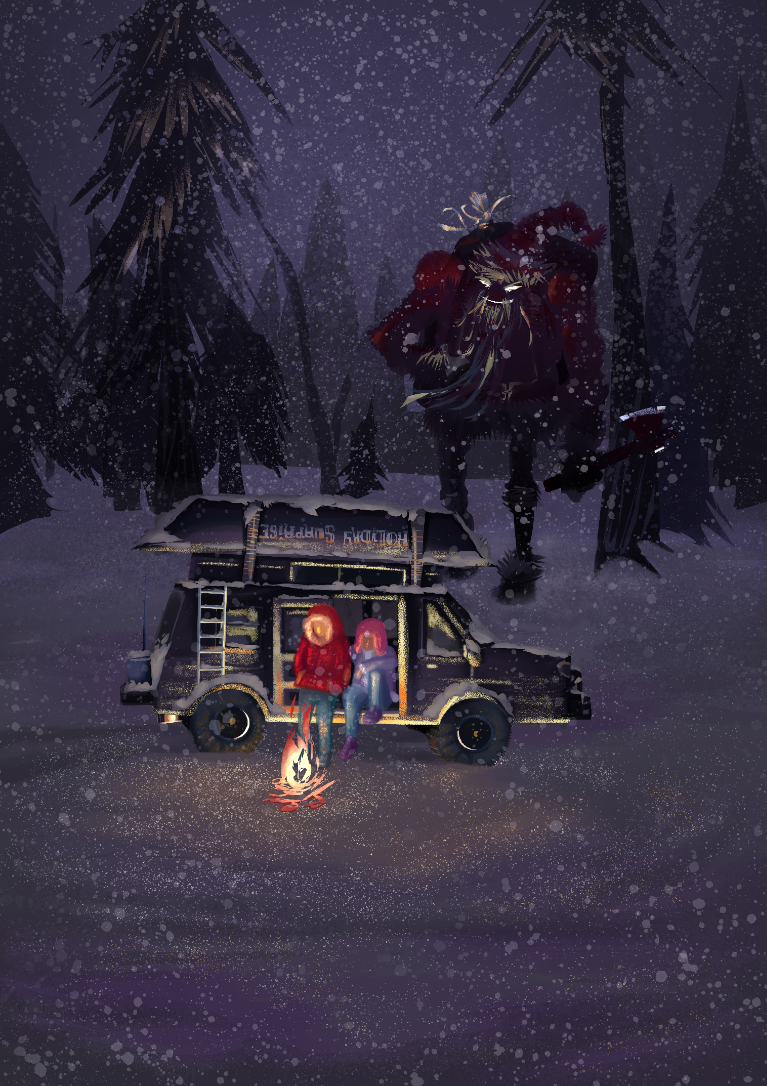
Thaaaat's mostly it! I'd appreciate any feedback you have time for! Thank you for all the feedback y'all have already given! Very helpful!
Happy holidays!
Best,
Shani -
I think this is much better ArtBrad, I personally think the axe is okay because it's not as distracting or sticking out as much as that log from your previous drawing, but if it really bothers you all I can personally recommend is give it the same values as the ones you placed on his beard and face.
Overall it's a great improvement!
Finis Coronat Opus
Instagram: www.instagram.com/madgcartoons/
Behance: www.behance.net/madgcartoons
Website: https://michaelangelodgo.wixsite.com/madgcartoons -
@Michael-Angelo-Go Thank you so much! It's super helpful to get feedback from somebody who hasn't become numb to this image
 especially around the axe area. Thank you for the kind words! I agree, definitely an improvement
Question - do you find the words on the boat hard to read? I was thinking about highlighting them more but I didn't want to distract from the focal points...Thank you!!! Have an excellent night
Best,
Shani -
@TheArtBard Eh I don't think highlighting the words are necessary. You always want to dum down the smaller details in your piece so the bigger picture sticks out more. It creates a better focus.
Finis Coronat Opus
Instagram: www.instagram.com/madgcartoons/
Behance: www.behance.net/madgcartoons
Website: https://michaelangelodgo.wixsite.com/madgcartoons -
@TheArtBard hey, great image. Creepy as hell! Haha. I think the axe should be facing the other day (blade toward Santa’s midline). Since you asked, the mid tone does seem pretty close to that of Santa. Maybe pushing it back a bit would separate those planes a bit better. All in all though it’s a cool image! Nice work.
Instagram: @daveleekart
-
@TheArtBard hi! I’m seeing unsuspecting campers, winter evening, but I’m not seeing the Holiday theme because I can’t tell if this looming giant is Santa Claus or not. Since this will be a card, why not center Santa claus. Have him looming over the campers. Let the light from their truck light the bottom part of Saint Nick just enough that we can see his red coat and him holding his axe. But cover his face in shadow and all we could see is his glowing evil eyes.
Portfolio: nyrrylcadiz.com
Instagram: https://www.instagram.com/nyrryl_cadiz/
YouTube: https://www.youtube.com/channel/UCbJCF1Im8ZO7hpGWTKOJMuA -
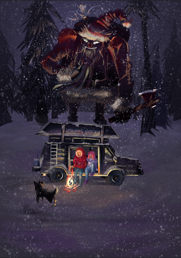
You can ad humor and story by adding a tiny dog noticing Santa and starting its defense - still unnoticed by campers.
-
@Michael-Angelo-Go Heyhey! Thank you so much for the feedback! I'm sorry about the delay and the unexpected hiatus, but your feedback was really valuable for me and I thank you for sharing it!
The updated version is below! Thank you so much for your time and wisdom
I hope you're well and keeping busy!
Best,
Shani -
@DaveLeekArt Heyhey! Thank you so much for the feedback! I'm sorry about the delay and the unexpected hiatus, but your feedback was really valuable for me and I thank you for sharing it!
The updated version is below! I made A LOT of changes using all the advice given and it made for a much better piece! I agree with you on the midtones and have upped the contrast! I think it came out A LOT better! So thank you very much for your feedback and timeI hope you're well and keeping busy!
Best,
Shani -
@Nyrryl-Cadiz Heyhey! Thank you so much for the feedback! I'm sorry about the delay and the unexpected hiatus, but your feedback was really valuable for me and I thank you for sharing it!
The updated version is below! And absolutely, yes to everything you said! I incorporated all your great advice and it turned out awesome! Thank you soooo so much! That was the exact feedback needed to throw this piece over to top! I really appreciate it~I hope you're well and keeping busy!
Best,
Shani -
@Kim-Hunter Heyhey! Thank you so much for the feedback! I'm sorry about the delay and the unexpected hiatus, but your feedback was really valuable for me and I thank you for sharing it!
The updated version is below! And YES - I definitely incorporated your idea of a dog! It would have been waaaay funnier if the dog was smaller, but I went with a husky, just to balance the weight of the piece a bit more. But that was a stroke of genius so thank you so much for sharing it with me! I appreciate the input!I hope you're well and keeping busy!
Best,
Shani -
THANK YOU ALL FOR YOUR EXCELLENT ADVICE!
And I apologize about the delay and unexpected hiatus!
I took your thoughts and incorporated them into the piece! I think it came together really well!
Of course, no pressure for feedback, hahaha, but if you're up to it, I'm interested to know what you think about it!Thanks again everybody! I hope y'all are well, healthy, and keeping busy!
Best!
Shani
(PS, this is a screenshot of the actually file, which is too large to post here)
-
@TheArtBard
In my oppinion I'll stick with the first one. I think is simpler and communicate the message perfectly and have better reading and body language that the other versions. I don't think your changes add nothing to the piece, at the contrary, over-complicate things and make more confuse the message.For example, in the original I quickly go to the figures and say "oh, they are relaxing camping, great, everything is at peace!" Then my eyes go around and BAM! oh man, there's some danger here, I didn't notice before now the whole scene takes another direction. That it is story telling, that it is what's makes illustration great!
But in the last one my eyes go directly to the monster, everything is so obvious, the storytelling is broken, the painting don't let you participate and play, discover for yourself.So the first one is perfect for me.
The things that can improve the first one are:
1- Cropping the scene, there's too much ambient around.
2- Vignetting.
3- More light in the car around the figures, right now it looks like they are cut and paste. And desaturated the figures in the areas less expose to the light.Less is more and not always the changes are an improvement. Every painting can be lead in millions of different directions, I always try to give feedback to improve the original painting, not to change it for another completely different. To recognize what it is right and works is as important as to recognize what can be improve.
Anyway is all subjective so take what you want and left the rest, is your painting.Have a great day!