Slowvember Narnia project
-
I have chosen to illustrate a scene from the Beavers' home in The Lion, the Witch and the Wardrobe (Narnia) for Slowvember. Eventually I want to do a sequence of three illustrations from the book, because it gives me a good opportunity to work on several aspects of illustration that I still need to demonstrate in my portfolio: character consistency, interior environments, and story development.
The meeting at the Beavers' home is intended as a full-page spread between text pages in a chapter book. The keywords for the home itself are: Rustic and cozy, but the overall keyword should be mission. This is the last cozy moment in the book for a long time!
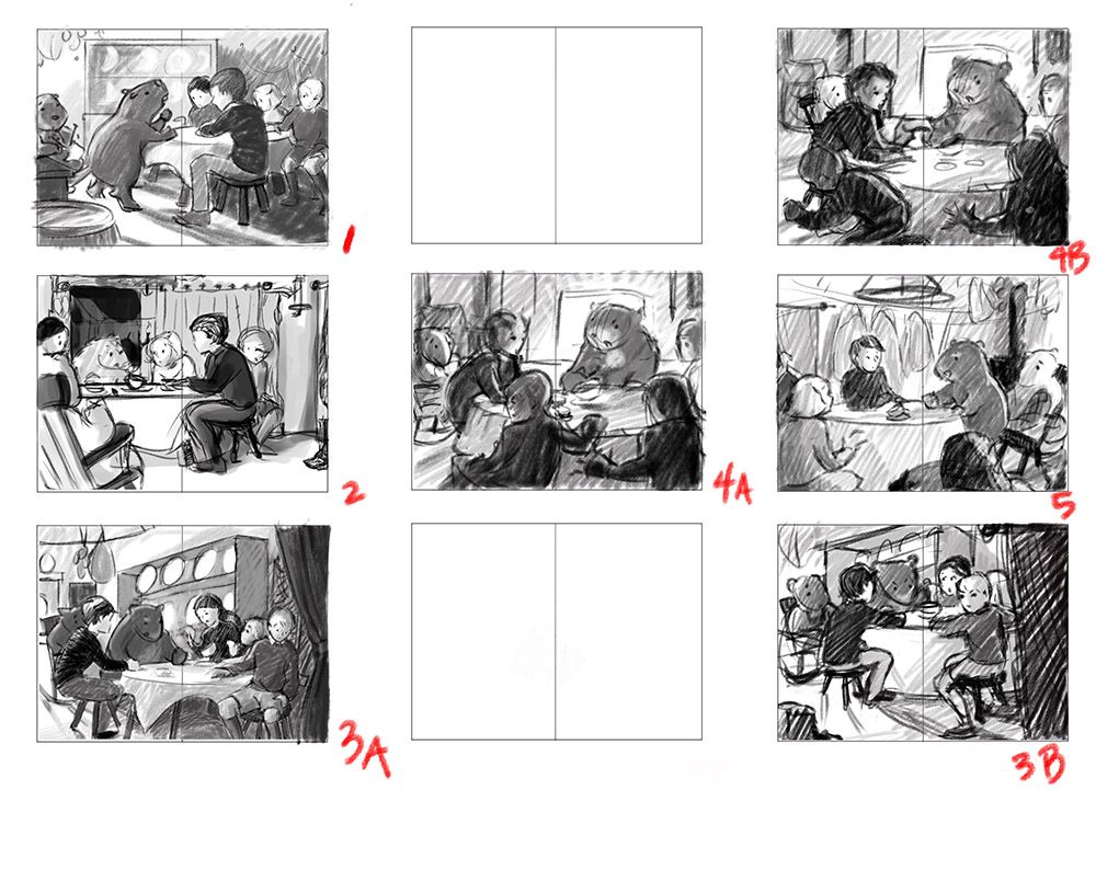
If you know the Narnia stories, I've chosen the moment when Mr. Beaver gets so enthusiastic about Aslan that he bangs his fist on the table. (I need to refine his expression because he looks angry). Edmund (the smaller boy) doesn’t like what he’s hearing, so he’s starting to look towards the door. He will soon leave and betray his siblings to the Witch. (In one thumb, he is actually moving already.) This scene is a key moment in the book because this is when the children understand their mission, around which the rest of the plot unfolds, and also because of Edmund's betrayal.
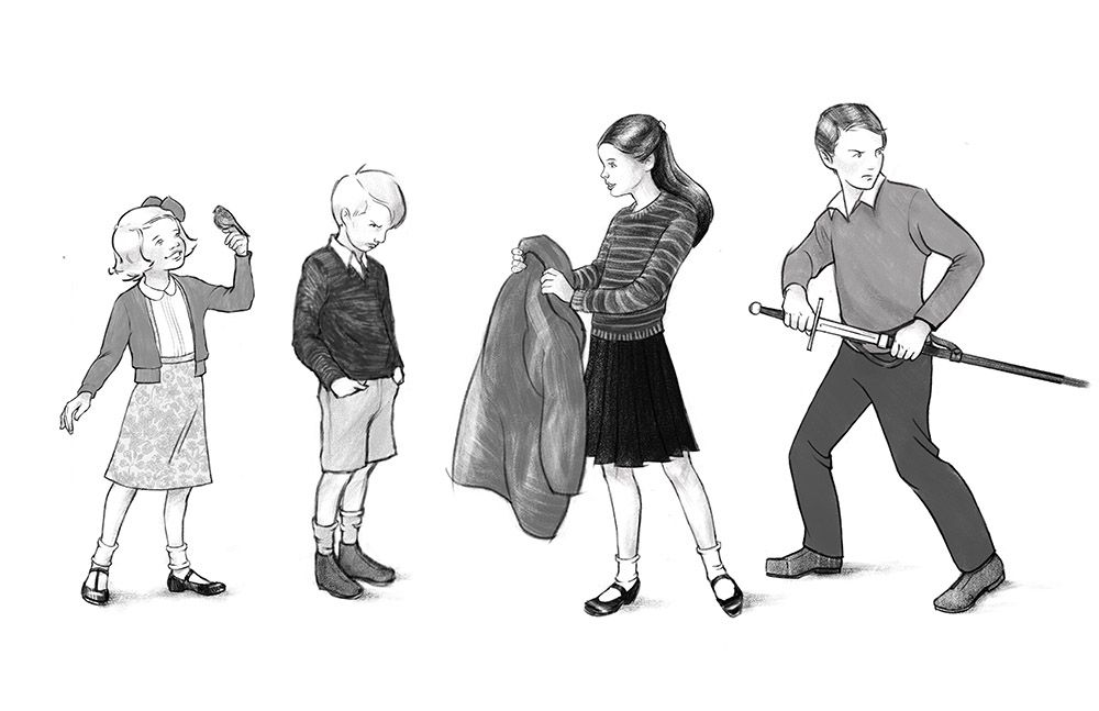
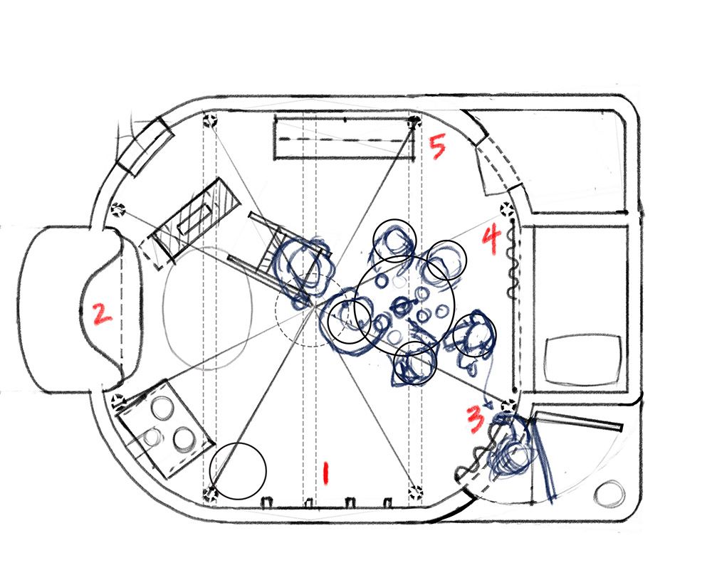
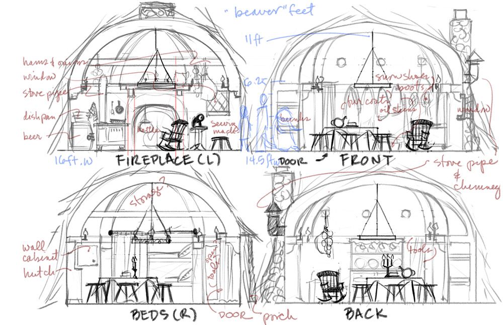
So far I have done character design for the four children (I still need to do the Beavers and later the Witch), I have thoroughly researched every item that the book describes in the Beaver's home and coordinated all the action. But I couldn't get a clear mental image of their home until I did a floor plan and elevations. This may seem excessive, but I think it will help once I choose a camera angle and start drawing it all out in perspective. (I watched your entire perspective class this week, @davidhohn. It was very helpful!)
So, below are my thumbnail finalists (numbered by camera angle), and below those are the character designs, the floor plan with the camera angles marked out, and elevations. Here's what I'd like your help on with the thumbnails before moving into a more refined drawing by Monday, November 16:
-
Is the action clear? The focus should be on Mr. Beaver, or at least enough on him that the kids are plausibly distracted from Edmund. In some of the thumbs, I know I need to make him more prominent and dynamic. The idea of making him so excited was a process of evolution, so he's only standing up in the later ones.
-
The kids know Edmund is grumpy, but they don't know he is betraying them yet. Does the way I have portrayed him reveal too much? (I can play it down.) Is it distracting? In 5 he is already leaving and you only see his hand on the curtain.
-
Which camera angle suits the action best? That is the main thing I need to choose for now. Local values, expressions, and most everything else can change. Given the same angle, would you crop it differently, change something? I know I have gutter problems at times!
Thank you for your help, and I will keep posting updates as we move into week three!
-
-
Wow! Love how you've thought this through! (I'm a sucker for architectural cutaway views)
Great pitch! You've got a clear goal for this piece. With all that in mind I'm a fan of 4A.Personal opinion: I would have a go at pulling the camera out to showcase a bit more of the unique architecture of this space.
-
@davidhohn Thanks so much for your reply! Actually, I would love to showcase the architecture! I think that I tend towards closeups during thumbnails because otherwise I can't tell what's going on. But for this drawing I may do the final exercise from your class and then put a FOV box over it to see exactly which slice of the possible scene works best. I realized that a lot of my problem with getting an interior scene on paper had to do with not understanding how FOV works for the human eye (lots of peripheral vision) compared to an illustration, so your class got me researching even more!
In a long-ago past life I was an interior designer, so back then this would have been a very imprecise set of plans and elevations, but those skills sure helped me work through the scale issues in this piece and think about what an anthropomorphic beaver's house might look like. It may take the whole month, but I hope to finally do an interior that I can be proud of!
-
@LauraA love thumbnails and all the planning! its impressive
 My favourites are 1 and 5. I choose them before i read your description. I felt like it would be cool if beaver was in focus.
 -
@LauraA It's been a long time, but I remember the urgency of that scene. The light moving across the room reminds me of how they were trying to get ahead of the witch. So although I like #1, if you let the viewer float above the room, maybe the shadows will be emphasized and can be added to the table, especially connecting to Mr. Beaver's paws. And maybe since Edmund is turned, his face can be in shadow. And Mrs. Beaver is a bit too relaxed if she is knitting like I think she is, iirc she hurredly prepped them all for the trip. I could be wrong about that, though. I think zooming out might help because with #1 the gutter divides the group between the Beavers and the kids. Not that that's bad. but for some reason it feels too tight.
-
@carolinebautista Thanks for your thoughts! I agree about trying to zoom a little more and seeing what that does (also for the gutter), but I do want to show their expressions, and if I float above, I'm not sure I can do that. And for whatever reason I really do want to show a bit of the ceiling!
The moment I'm depicting her is a bit before the one in which they start hurriedly packing to escape (that's quite a scene in itself!). This is instead the moment when they first hear about Aslan, the children are feeling awe, and Edmund (unbeknownst to them) is feeling disgust and is therefore deciding to leave. Mrs. Beaver's hurry to pack is a few minutes later, when they discover Edmund is gone, search for him outside, and realize he has gone to the Witch. It's important because it's such a turning point in the story.
There are two reasons I show Mrs. Beaver as I do: 1) There wouldn't have always been six stools at the table in a house for two. One stool could have been pulled up from the sewing machine, but there needs to be another, so I have put her in her rocker, which is pulled up from its place near the fire so that she can listen. Being a busy Beaver, she probably would have occupied her hands with something, but I do want her expression to be attentive (still need to refine it). 2) Compositional balance. I didn't want them all crowded around one side of the spread. And yet, with her off to the side, I don't want the viewer to think, "Why doesn't she notice Edmund leaving?" Having her well occupied with knitting and the conversation might accomplish that.
That's a lot of words for something that the viewer may never notice, but that's what I'm thinking. Or over thinking, which is one reason I post these things
 . The proof of these choices is in the fresh perceptions of others, not me!
 -
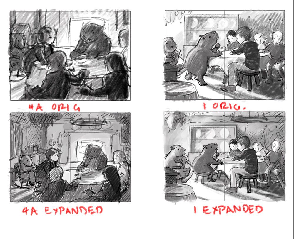
I'd love your thoughts on these zoomed out views of two of the studies, 4A and 1. Right now I think 4A is the most successful, perhaps because we are looking Mr. Beaver in the face, but you still get the idea of the cozy room.
For 4A, I am wondering about the shadows in the bottom left corner, but I am inclined to leave them because they are accurate and they point towards the door. But if they are too distracting I can work on them.
For 1, I decided that Mr. Beaver was just too big in the first draft. I can still have him standing, but a Eurasian beaver should be about Lucy's size max, which is already pretty big for a beaver! And I've made the beavers considerably stouter than Lucy. Also, it bugs me a little bit that both beavers are on one side of the page and the children are on the other. The separation is accentuated because I already had to move Mr. Beaver over a good bit to keep him out of the gutter, and he probably needs to be moved even more. But I still like the dramatic shadow pattern.
Questions: Do you prefer the expanded views or originals? Do you have thoughts on the values (which can certainly be tweaked), placement of figures, emphasis and storytelling, etc? Which would you choose to move on with?
I hope to start the final drawing tomorrow once I get your feedback. In the meantime I'll be doing a beaver study and thinking about color.
Thank you!
-
@LauraA Thanks for the response. IMO this is not overthinking it, this is the kind of thinking I really enjoy as part of chapter book illustrations that you don't get in picture books - the choice of what to show combined with when to show it. This kind of thinking within an illustration makes me a better reader! I am always looking for what the illustrations add to the text, and inaccuracies stand out. This didn't stand out as an inaccuracy but you've added a setting and details to the characters that make people think. So although I hesitated before I posted (since i haven't read it recently) I can tell you that expanded #1 really fits for me, so it must not be to do with the knitting after all - she looks fully engaged in the conversation in a way that I would expect when she has very unusual guests! So that might not still help you but I do think it fits better with your keywords, especially mission. So maybe still rustic and cozy before the urgent part, while still being an exciting event for the Beavers as everyone's mission is about to unfold. I think mission can be paired with calm and cozy, but it isn't a relaxed or detached thing either. Adding the ceiling is really lovely, because we get to see more of what it's like at the Beavers' house.
-
@carolinebautista How about if I changed Mrs. Beaver's expression in the expanded version of 4A? Would that have the same effect? I can change expressions and poses for a couple of days still, but I do need to pick a camera angle by tomorrow and I confess I feel pretty confused at the moment. Maybe it will be clear by then!

-
@LauraA I think it would work, too! Maybe you're confused because both are really good options.
 I really enjoy #1 Expanded, and I think it might be partly because of the way the faces are turned more clearly as a group (excepting Edmund) and the Beavers are the same size. I also enjoy the way Peter is sitting (he is so comfortable but it's also a little small for him), the diagonals of the shadows all the way across the illustration, and the general shape of the cabinet holding all the plates grouping Mr. Beaver and the older two. I like that Mr. Beaver in profile means there isn't as much contrast between him and light coming from the fireplace behind him, like the other one.
But you know what, it's always hard to know what to take a risk on because all the problems I anticipate in my own thumbnails I'm certain will work change as I fill in the details...
-
@LauraA Sorry I just had a thought - do you have a general sense of what you might be doing for the other illustrations you're doing for this book? I can see how deciding between a smaller selection of this scene might work better if you can compare it to the other scenes. There is a nice horizontal quality to #1 expanded that I really like and now that I think about it that might be a great contrast with something that's outside in any possible other scenes you're interested in. It's that Molly Bang compositional thing of how horizontals imply safety that seems particularly apt to emphasize here when the other scenes might be conveying threat or danger or an adventure in full swing.
-
@carolinebautista Wow, you've given me a lot to think about here! The other illustrations will probably be Edmund meeting the White Witch at the beginning of the book (I'm thinking about a horizontal woodland scene that goes across the top of two pages with text underneath), and Lucy applying the cordial, either to Edmund (in which case it might be more of a close up from below looking at her worried face as she pours it in his mouth), or across the battle field in general (which I was thinking of showing from above in a sort of panoramic view).
I think the reason that the expanded version of 4A appeals to me is that I have always wanted to do a super cozy interior with a kitchen, wooden beams and a fire, and I don't have one in my portfolio. The possible problem is that doing one may conflict with the needs of the story, butI am tempted to choose by what I like to draw, especially as common wisdom has it that you get jobs based on what's in your portfolio.