Critique my art style
-
Hey everybody, I am thinking about writing my own children's books for sale. I want to hear what people think about how I draw characters, and what direction (or directions) I should progress towards to having presentable pieces of work.
My main art program is Paint Tool Sai Ver. 2. I make my files compatible with Adobe Photoshop to utilize certain features (puppet warping, liquifying, specific blurs, etc.). I have been currently experimenting with my brushes. When I considered children's book illustration, I took inspiration from graphic designer Gabi Tozati's techniques and I have recently found a liking to Kim Smith's (Quirkbooks) and Stevie Mahardhika's (Prince & Knight) work just last month.
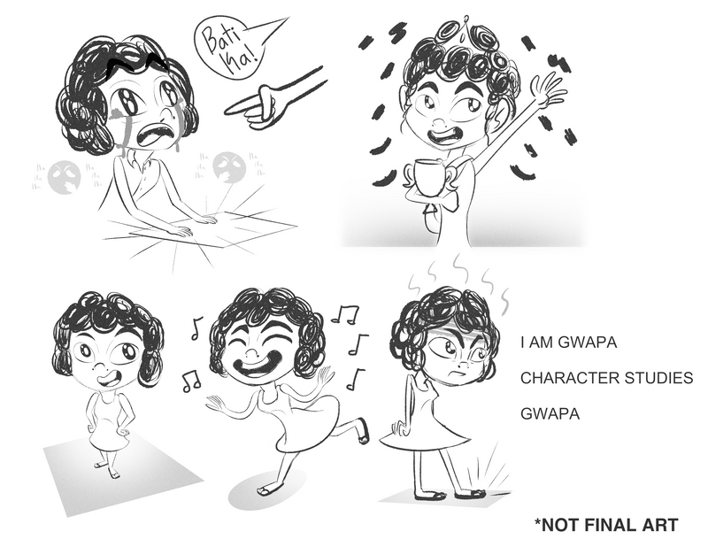
I am writing a book called "I am Gwapa" which tells a story of an African-Amerasian Filipina girl who wants to join her school's beauty pageant, but is being constantly told she won't win because she doesn't fit Filipino beauty standards. For this concept art, I tried drawing the character slightly different compared to my previous work, and as a practice to draw my characters consistently. She's very different from my usual style. Her head is a lot bigger and her face is more oblong then my usually artwork. I've been experimenting with perspective, making the bodies small and stick-like, noodle-arms.
-
@Michael-Angelo-Go hi, Micheal. I love the concept. I could totally relate to your story given how I had similar experiences in my childhood. I also speak Cebuano. that “Bati ka” line is really familiar to me


 . So far, I think your character design is looking good. I’d just like to point out that her hands need more work but given this is still a sketch, you’ll probably work on that later. I’d love to see where you’ll take this project.
 -
@Nyrryl-Cadiz Hello Nyrryl, I'm sorry it's been more than a week and I have made no progress on this book idea (I was sick with the flu and was worried it might've been COVID). What do you believe could be improved about her hands. I know that in one of the panels I presented where she wins her waving hand is rather sloppy.
I spoke to some of my Filipino friends, and I realized that for my story that I had to change her name. Amerasians in the Philippines born from the Mt. Pinatubo incident were in the northern region of the country where the main language is Tagalog. Unfortunately, I had to change her name Gwapa to Maganda, and the 'Bati ka' would be inaccurate to that region's native tongue. Sorry Cebuanos and Visayans!


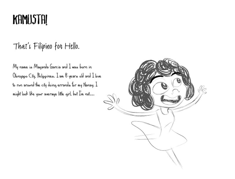
Is that better?
-
@Michael-Angelo-Go hi! Her hands are good. Tho I’m a bit sad that you’re switching the language from Bisaya to Tagalog. Does it really have to be set near Mt. Pinatubo?

-
@Michael-Angelo-Go Also, “kamusta” means “how are you?”
-
@Nyrryl-Cadiz Maybe I'll compromise. Maybe the teacher and some characters can speak Cebuano in a most Tagalog speaking location. Also how do we say 'hello' in the Philippines. I know that 'Kamusta' does come from Spanish '¿Cómo estás?' which does mean 'How are you?' in English, but my parents told me that's how we say hello, unless there really isn't a single word in the country that can be translated into hello.

-
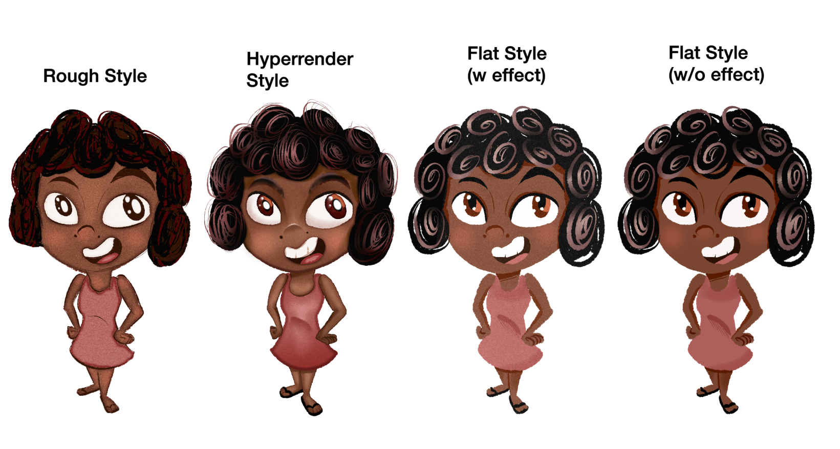
I've been working on coloring. What do you think of the styles? What do you think might work for my book and what might not? Do you see all styles being a possibility in the book or perhaps other book ideas under another tone?
I haven't work on color scheme ideas, but if you think her current colors work let me know!
-
@Michael-Angelo-Go you know, come to think of it, I don't think there is a direct Filipino Translation to 'hello'.
 WE usually say "Kamusta?' (how are you) or 'Magandang Umaga' (good morning).
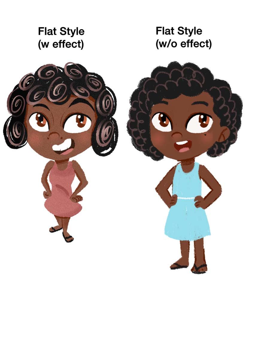
I also did a quick over your character design. I love your flat styles. I'm aware my critiques are more base on my style and taste but hopefully, you can take a few notes on my revisions that you'd like to implement in your own work.
Notes:
-
Maganda has boobs. Since Maganda is still 8, she shouldn't have boobs or a curvy body. I gave her a more age-appropriate body.
-
Her gradient colored curls are distracting and inconsistent. everything is colored flatly but her hair feels out of place. I think you can simplify it as seen below.
-
I softened her eyebrows, removed her nose ridge lines, and remove her 2 moles(?) beside her nose. I think she looks younger in this version.
-
I think her current dress color looks to similar to her skin that it kinda looks like they're blending together. My suggestion for this is to choose a color that compliments her skin. My choice is baby blue but there's a lot more options for you to choose from.
-
Maybe it's because of the angle you draw her but if not, then she seems to have a very small body for an 8 year old.
-
-
@Nyrryl-Cadiz Hello Nyrryl, I love your suggestions. But can I add a few things? Just so I can own my design, you know hehe.
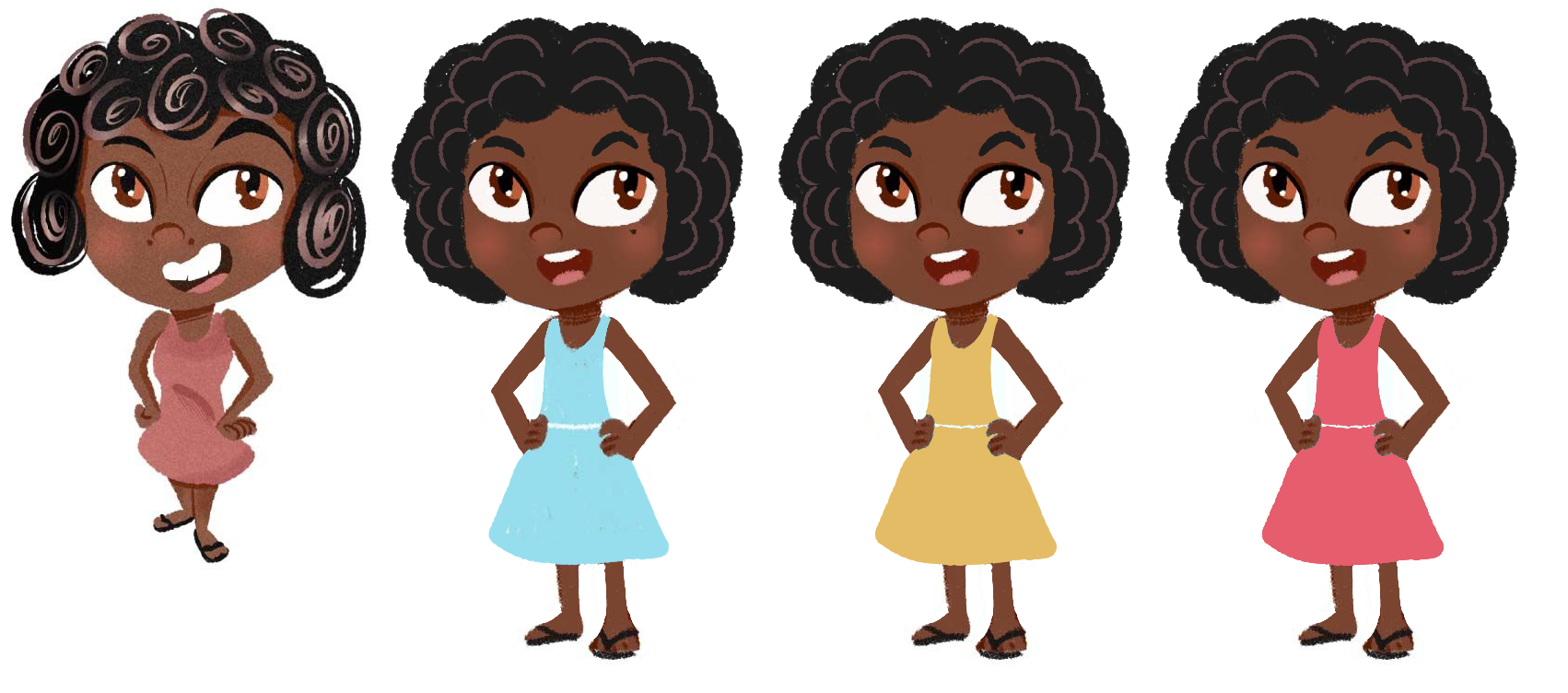
To address a few things yes, I drew her from a bird's eye view just to give a sense of depth to the illustration. In her original design I made her rather skinny, since a lot of people back in the country tend to be more on the 'smaller' side due to issues like poverty, hunger, etc.
I agree with the decision about the gradients in her hair being less detailed to be less distracting. I don't think the hair should be asymmetrical though, I think I want Maganda to have a much simpler silhouette. That's actually not a mole, but those are her nostrils

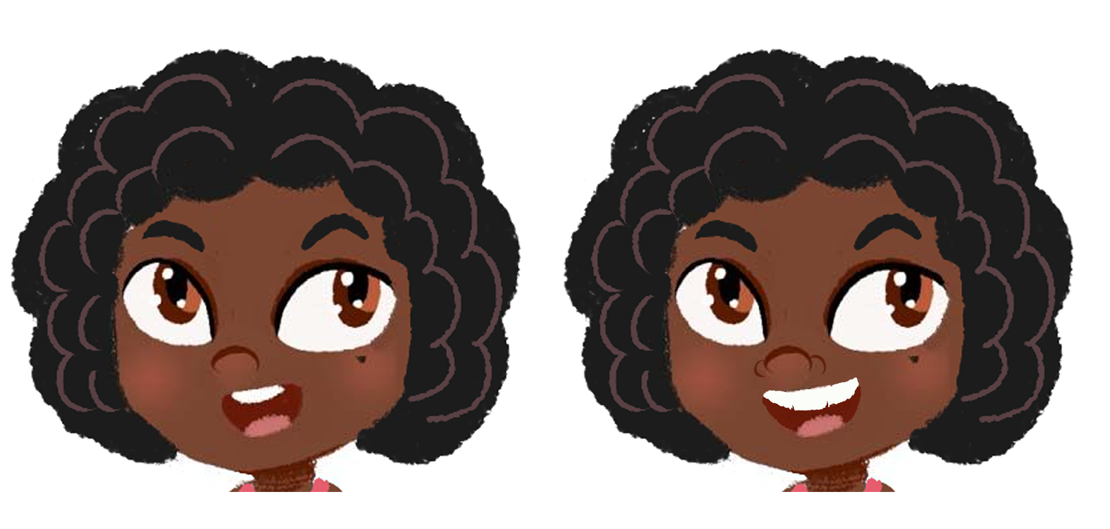
How do you feel I instead draw the wings of her nose? And maybe give her a slightly bigger smile with pronounced teeth? I wanted to give a slightly dorky look that has it's own charm that isn't necessarily = cute. I know this might make her look a little older, but I have a tendency of pronouncing certain details of the face that helps indicate a character's ethnicity.
-
@Michael-Angelo-Go Since you don't have a very high amount of detailing overall, I don't think it's necessary to add the nostrils. In fact it looks creepy, like she has a mushroom on her face or something...