Serious critique requested - mountain scene
-
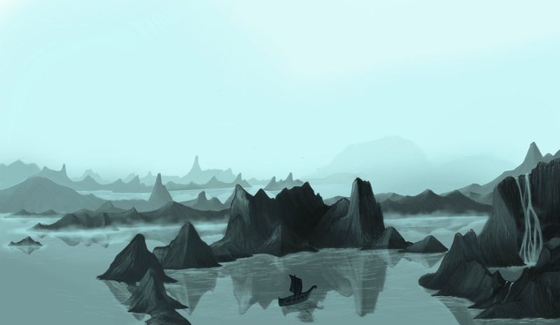
Hey guys I have finished the values for the mountains (I think) and I am trying to place in this boat but I am really struggling with this boats value and placement. Any suggestions you could give would be greatly appreciated with the boat or any other part of the piece before I try to take it to color
 ️
️
-
@ambiirae I am not sure about value but placement perhaps closer to the inlet where the waterfall is and the reflection of that tower like cliff to the right (so it's closer to the rule of thirds). Maybe if there was a light near the front of the boat that is a value lighter than the water in the waterfall. The waterfall is drawing my eye more because of the high contrast against the darker cliff.
Anyways, those are my thoughts. Looking good though, I am impressed.
Instagram: www.instagram.com/heatherboyd.illustration/
Website: https://heatherboydillustration.ca
Shop: https://www.inprnt.com/search/products?q=HeatherBoydIllustration
Ko-Fi: https://ko-fi.com/heatherboydillustrationBe blessed,
-
@Heather-Boyd thank you! Once I finish in color I am hoping to make it my first portfolio piece.
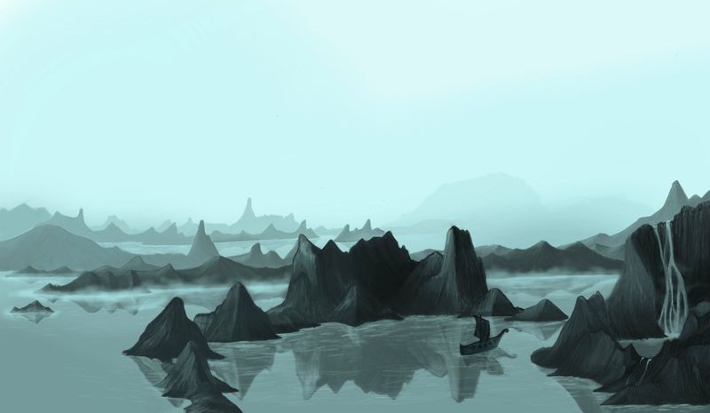
Does this look better? Also I was planning to add a light to it once in color as well
️
-
I do like the new placement better personally. Love the mood also!
-
@ambiirae Digging the Atmosphere, and I think you're doing a great job of the distance.
Is the boat the focal point? If so, I think you need to move the entire middle mountain over so that you can give the focal point the biggest value contrast. Right now the highest contrast is the tip of the mountain right in the middle, which doesn't lead you to anything. And the boat is getting really close to the value of the reflection, so you don't even see it initially.
One global issue I'm seeing is that everything for the most part is roughly the same size. It falls into that "big small little" rule where you want to have elements of varying sizes.
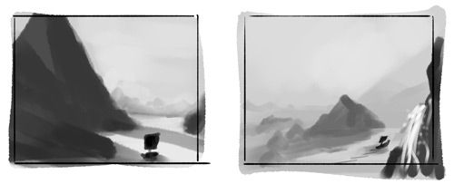
I messed around with a couple of thumbnails to try and maybe see what might pull the boat out more as the focal point. The left one I did a total dramatic switch just to illustrate maybe a bit more on the varying sizes to try and give the mountains some more scale and then I slapped the boat right into the the light. The 2nd one was maybe pulling the light on that mid mountain down so we could clearly see the boat trailing through the pass, and you could pull the water fountain forward to keep the eye from sliding out of the image.
Take it all with a grain of salt and hopefully it's helpful

-
@K-Flagg thank you!
@jdubz thank you for the feed back! To be honest the boat was an after thought or I guess a mid thought lol what I was planning to do when it came to coloring was to add the glow of a village far off in the distance to make it seem as though the boat is navigating through the mountains to this village also to give a small light to the boat to make it stand out a bit more. I agree with the size of the mountains and variation I was very much focused on getting the atmospheric perspective down I forgot all about that. I love your thumbnails! The story of how I got to where I am is too long to post but we can just say it did not include thumbnails.
-
@ambiirae Yes, the overlap helps create depth and the sail is just nicely a bit darker than the rock behind it. Placement helps tell the story you want to tell. Before it was a boat on the water, but now you are leading us with the boat to the waterfalls -leading us through a story to a destination- unless your planning to have sequential work, a stand alone needs to tell your story quickly esp. if it's the most prominent and first thing you want people to read.
")
-
HI @ambiirae One thing I noticed is that the reflections are lighter in value than the mountains. In reality this is almost never the case. It would be reversed. Less light is reflected back into the atmosphere.