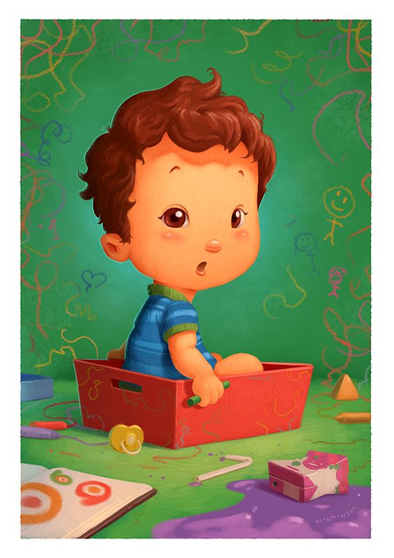
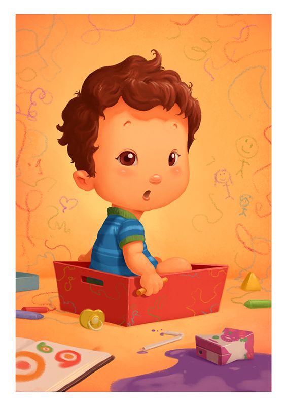
Society of Visual Storytelling

    SVSLearn Forums

    • Register
    • Login
    • Search
    • Recent
    • Tags
    • Popular
    • Users
    • Groups
    • Search

    Yellow or Green?

    Artwork
    16
    16
    148
    Loading More Posts
    • Oldest to Newest
    • Newest to Oldest
    • Most Votes
    Reply
    • Reply as topic
    Log in to reply
    This topic has been deleted. Only users with topic management privileges can see it.
    • Gary Wilkinson
      Gary Wilkinson last edited by

      Trying to build up a collection of kids to seek out commissions on the side and decided to start with my own son in a style that would be more appealing (I usually prefer dots for eyes, but I think eye color would be important for some). As with any 1 year old he is always making a mess so it seemed only right to illustrated him that way.

      However, i'm a bit stuck on whether green or yellow works best for the background. Yellow gives everything a happier and warmer feel, whereas green helps to pop him out more and pose him for a "I caught you" moment. I like green, but my wife likes yellow. Any preference?

      1.jpg

      2.jpg

      www.garywilkinsonart.com
      www.instagram.com/gwillustration/
      www.twitter.com/GWillustration

      Lovsey Nyrryl  Cadiz Heather Boyd Jeremy Ross ajillustrates 6 Replies Last reply Reply Quote 3
      • Lovsey
        Lovsey @Gary Wilkinson last edited by

        @Gary-Wilkinson Very cute! 😊 I definitely prefer the contrast of the subject on the green background. The tone of the yellow background is too close to the peachy skin tones making the eyes and hair stand out inordinately.

        1 Reply Last reply Reply Quote 2
        • xin li
          xin li last edited by

          I think both versions work really well. They give different vibes to the image but both are good if they are meant to be hanging in a kid room.

          As for showcasing the work online, I might use a green background. As people spent little time looking at your website, it might be an advantage using an image with more contrast.

          Web: www.lixin.no
          IG: www.instagram.com/lixin.illustration/

          1 Reply Last reply Reply Quote 0
          • YasminIllo
            YasminIllo last edited by YasminIllo

            The green background does make him pop out, but I have to say I prefer the feeling the yellow background gives, I'd try to change the color of the boy's skin to a slightly lighter color so that you can differentiate the two.

            https://www.instagram.com/yasminastaillustration/

            1 Reply Last reply Reply Quote 0
            • ruth
              ruth last edited by

              Aw so cute! Definitely the green for me. It really makes your illustration pop! The little boy's face and his toys stand out more and it feels fresher and more vibrant. Maybe if you made his skin tone really dark it would work better on the yellow? Love it! 🙂

              1 Reply Last reply Reply Quote 0
              • aska
                aska last edited by

                Green! 🙂 If orange, then maybe you could try a less saturated orange...? Anyway, fantastic as always!

                Aska
                www.mugaska.com
                https://www.instagram.com/mugaska/
                https://www.etsy.com/uk/shop/mugaska

                1 Reply Last reply Reply Quote 2
                • Gabby Correia
                  Gabby Correia last edited by

                  Super adorable Gary! Definitely green for advertising, it makes all the other details pop. But if clients are planning to print it and hang in their homes, a neutral color will look more pleasing printed and hung in a nursery for example.

                  https://linktr.ee/gabby_correia

                  1 Reply Last reply Reply Quote 2
                  • Nyrryl  Cadiz
                    Nyrryl Cadiz SVS OG @Gary Wilkinson last edited by

                    @Gary-Wilkinson Both look really good but The Green one compliments nicely with the boy’s skin and red box.

                    Portfolio: nyrrylcadiz.com
                    Instagram: https://www.instagram.com/nyrryl_cadiz/

                    1 Reply Last reply Reply Quote 1
                    • Heather Boyd
                      Heather Boyd @Gary Wilkinson last edited by

                      @Gary-Wilkinson I can see why your wife likes yellow. I think the drawings on the wall pop out more with the green wall while the purple spilled juice pops out more with the yellow (for obvious complementary reasons). I somehow prefer the green but I understand why the yellow is so appealing, it's warm but I like how the drawings stand out more on the green one.

                      Instagram: www.instagram.com/heatherboyd.illustration/
                      Website: https://heatherboydillustration.ca

                      1 Reply Last reply Reply Quote 0
                      • Jeremy Ross
                        Jeremy Ross @Gary Wilkinson last edited by

                        Hi @Gary-Wilkinson, perhaps an off white wall with yellow floor?

                        https://www.jeremyrayross.com/
                        https://www.threadless.com/shop/@LIONRABBIT
                        https://www.spoonflower.com/profiles/jeremy_ray_ross

                        M 1 Reply Last reply Reply Quote 0
                        • Jacy13
                          Jacy13 last edited by

                          I like the overall feel of the yellow background more. However, I definitely agree with the idea that for advertising your services; the green one might better serve the purpose because it pops more.

                          Deviantart: https://www.deviantart.com/jacy13
                          Instagram: https://www.instagram.com/jacy13draws/?hl=en
                          Portfolio: https://jacy13.artstation.com/

                          1 Reply Last reply Reply Quote -1
                          • M
                            Mara Price @Jeremy Ross last edited by

                            @Jeremy-Ross I like this idea. white with yellow floor!

                            1 Reply Last reply Reply Quote 0
                            • MichaelMattocks
                              MichaelMattocks last edited by

                              I like the green one because it seems to pop more. I wonder if instead of greens you used blues instead.

                              Michael Mattocks
                              Https://instagram.com/mattocksdesign/

                              1 Reply Last reply Reply Quote 0
                              • J
                                jdubz last edited by

                                @Gary-Wilkinson Maybe try the yellow one where the background is just a bit darker to help the character pop. I think the yellow one, at least for me, is more appealing as a color scheme, but the green one has a better contrast between the background and foreground.

                                Josh White
                                https://www.instagram.com/joshwhiteillustration/

                                1 Reply Last reply Reply Quote 1
                                • ajillustrates
                                  ajillustrates @Gary Wilkinson last edited by

                                  @Gary-Wilkinson Man... this choice is just a matter of taste. Do I like complimentary or analogous schemes more... I'm going to go with the yellow, because my brain keeps trying to tell me that the green background with the red tray is "Christmas."

                                  https://ajillustrates.com
                                  https://www.instagram.com/aj.illustrates/

                                  1 Reply Last reply Reply Quote 0
                                  • miranda-hoover
                                    miranda-hoover @Gary Wilkinson last edited by

                                    @Gary-Wilkinson Hmmm... interesting dilemma. I do like the feel of the yellow one more (personal pref because I love yellow and limited color schemes), BUT the green background does help the kid pop more (I also like the lighting). I think my problem with the green one is the red box; because of the contrast with the green, I feel like it's trying to compete for the viewer's attention.

                                    Unless the box has to be red for any reason, I personally would go with the green background but make the box a cool or more desaturated color, so the warm colors are primarily on the kid's face/skin.

                                    Regardless of choice, adorable picture!

                                    https://www.instagram.com/mirananemone

                                    1 Reply Last reply Reply Quote 0
                                    • First post
                                      Last post