Serious critique requested for Oct. contest
-
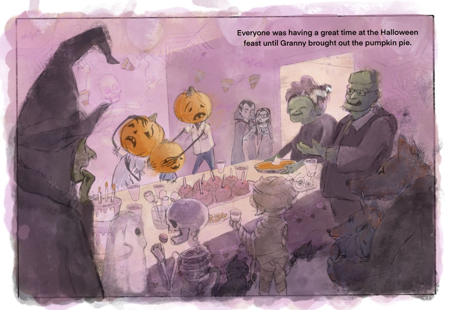
Here’s what I’ve got so far. I would love some feedback in whatever area you see needs help but specifically I’d like to know if
-the idea is clear
-the composition is working
-color is working
-character design needs helpThanks!
-
@kimmypie I think it looks really nice. The concept is very funny!
-
Great composition! I think the concept reads well. I can't wait to see it finished.
-
Funny!!

-
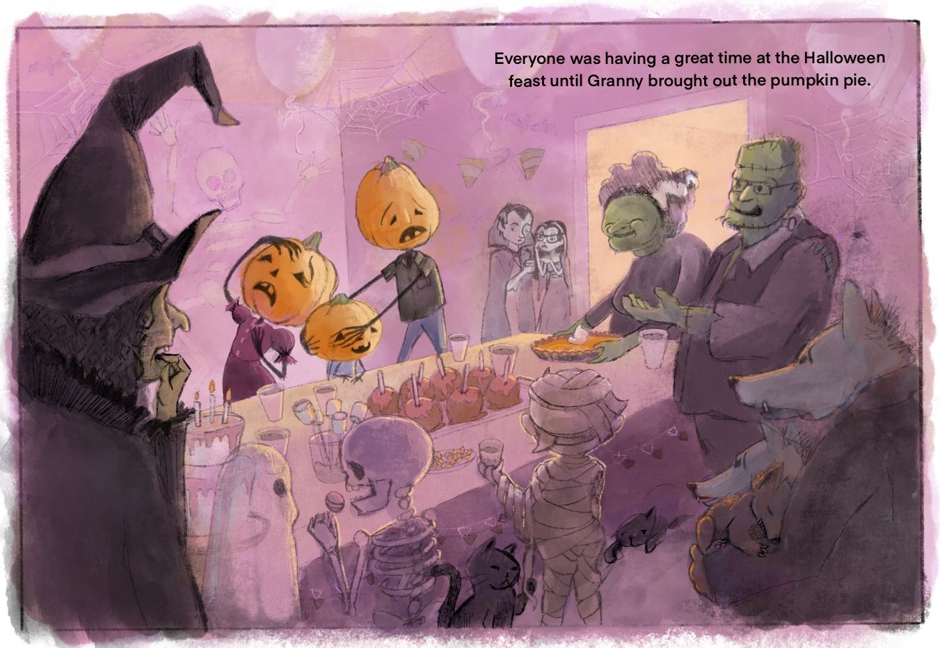
Here’s a little more progress. Any thoughts or obvious issues?
-
I think your update on the pumpkin family was a good choice; they stick out better as a whole since you changed the colors of their clothes, and the dad character is more unique because of the updated head shape. Well done!
I like the human/normal feeling the design of the monsters have! The Frankenstein grandparent characters, the pumpkin family, even the background characters have a friendly warmth to them, as in, no one wants to be mischievous, the Frankensteins just accidently baked pumpkin pie!
Everything else looks good, though I will say that my eyes are consistently being drawn to the mummy, and I think it's because of the bright rim lighting he has contrasting the rather dark colored shadow of the tablecloth. To make the pumpkin pie and pumpkin family stand out more, I'd either darken the areas behind the orange (for added contrast (specifically around the pumpkin pie)) or lessen the brightness on the mummy (for lower contrast).
Also, I'm not too sure if the font style is a placeholder or not, but It looks a bit too clean for my taste when compared to your image (obviously the text isn't supposed to blend in completely with the picture, but it looks a bit out of place right now). I'd either try a different font style, and/or change the font color to white (that might be too jarring to read, though, so I'd leave it up to you).
Nice work so far, though!
-
@kimmypie So clever! I love the cats playing with the mummy's wrap. Really great concept!
-
@Carrie thanks so much.
-
@Jonathan-Malski Thanks so much for taking the time to analyze this for me. I will definitely implement those suggestions.
As far as the text goes, I honestly didn’t give it a second thought. I just figured they would know it was a place holder. I feel like the text needs to be there because sometimes during the critique they say, “I wonder what text goes with this?” even when the illustrator puts a quote in the forum. They don’t seem to see the comments that go along with the illustration. In any case I’m hoping the illustration speaks for itself.
I really appreciate you bringing up the font. I’m gonna try to fix it.