Star Wars Fanart , Requesting Feedback
-
Hello again!
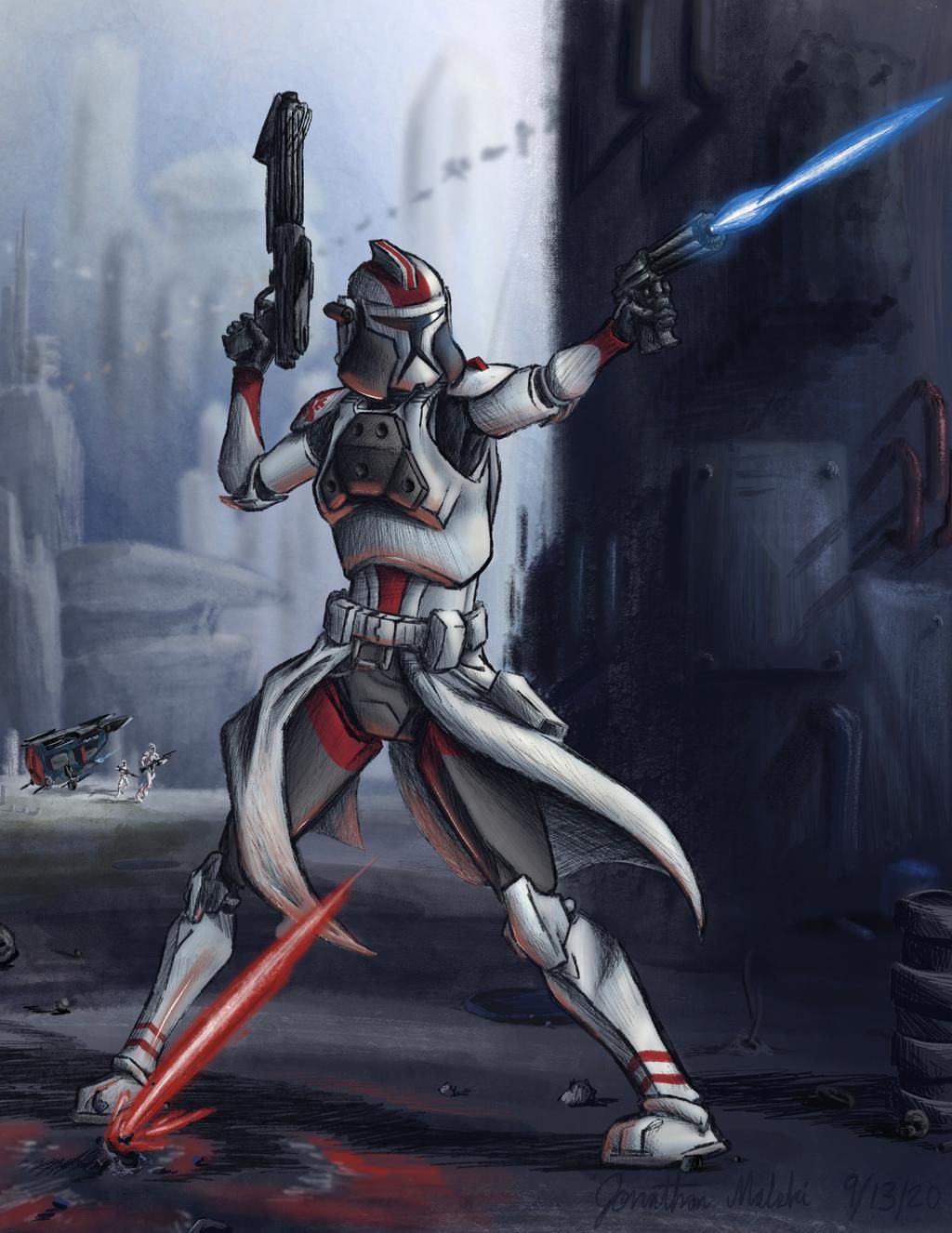
Defending Coruscant
8.5 x 11 inches
300 dpiI finished this image about a week ago.
It features a Star Wars 65th Coruscant Guard phase I clone trooper of my own creation. I love the design of the Republic army in that franchise, so I'll often play around with armor patterns to create my own characters for the Grand Army of the Republic. I'm calling this character Captain Glint!Some extra details about the character's design:
- He's part of the 65th Coruscant Guard (a canonical Star Wars clone legion), whose troopers bear red markings of various patterns.
- His helmet cheek armor design comes from Commander Bacara, who can be seen in the Star Wars: Revenge of the Sith movie
- His chest armor is the same of official phase I clone gunners
Things I take issue with on this piece:
-
The character's right foot position (the foot on the left side of the image). I like the pose, but the way I drew that particular foot makes it feel as if it's not in the same perspective. I feel that if it was moved back in the image, the issue could have been avoided.
-
The angle of the red laser bolt. I wanted to make it seem as if the character's holding his ground while getting shot at; I think I achieved that, but I also think it could have been portrayed even better if the angle of the red laser matched the angle of the blue one. The red laser's current position seems off to me.
-
The lack of of overall warmth in the color scheme. I added a blue "wash," I guess you could call it, over the foreground as I wanted it to appear in shadow. I also added an amount of light-yellow highlights to help brighten up the areas of the character that are cathing the light. But I think I should've added more still, because, as it is right now, I think the piece lacks some "pop," some "umph" in the colors, specifically the highlights.
Thank you for giving this a read, look at, and/or comment; I appreciate all the constructive criticism I can get!
-
Hi! Overall I think it looks pretty good! The problem areas that I see are these:
The characters right knee is bending at an odd angle, the knee perhaps should be protruding more towards us. (I don’t see an issue with the foot)
The characters left arm seems to be foreshortened to too much of an extreme degree for the angle - the arm should be longer at this angle.
I’m confused as to where the rest blast is coming from - it looks like it’s coming out of the ground. If it’s meant to be coming from another character who’s out of the image, I would raise the blast to be character-height.
The color is nice, I don’t notice anything out of place there personally.
-
@VeronicaMui thank you for the comments!
I can definitely see how the right knee appears to face inwards; I think I originally thought it was a cool idea when I was drawing it, but now I have to agree, it looks more painful than cool!
One of my family members took a look at this work when I first finished it and pointed out the same issue with the forearm. I wanted it to be foreshortened, but It doesn't really give off that vibe with the way the body is positioned and all. It most certainly seems shrunk when I look at it now! (Maybe some extra line weight/bolding around the forearm would have helped to give off that effect?)
I intended the red laser blast to come from a person off screen at a higher level than the in-frame character (hence why this clone trooper character is pointing his blaster upwards); I wanted the laser to look like it was making an impact with the ground, but I can see how it actually looks as if the ground is shooting the laser! I do agree that the red laser should be raised at least some amount upwards from its current position.
Thanks again for your feedback and insight on my work! I appreciate it!