Serious Critique Requested!
-
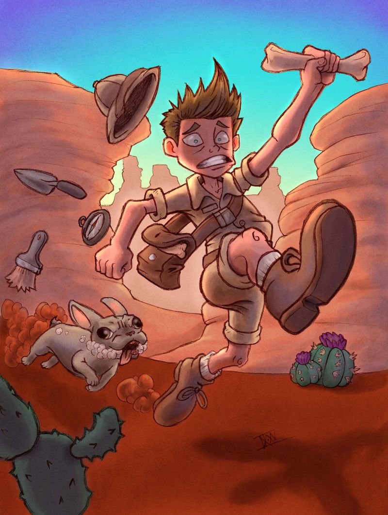
Well guys, I would call this a pinnacle piece. I'm really really happy with how it's turned out. I've never really tried to color before, at least not like this. It turned out very similar to how I saw it in my head. That being said, tear it apart. I want to be even better, so anything is better than nothing.
CK•XXII
-
Hey Casey!
I just want to say I love this piece. It has a lot of energetic personality and is enjoyable just to look at. The only problems I notice straight away are: I’m not sure the setting really matches the mood. The desert is great, but the time of day seems around sunset-ish. This seems to throw off the mood a bit. Maybe midday or noon would match the energy of the piece. The other problem is I’m sort of confused as to what the creature chasing the character is . Anyways, that’s all I got for now.
 -
Okay, so, I spend SO much time tearing my own stuff apart (only to make more mistakes later.) So, I’m happy to help out here.
But please remember three things:- I’m not a professional.
- Almost everything I’m saying only comes from looking really hard for mistakes.
- Its, really, truly, and honestly a really nice piece and you should feel proud.
First things first: I love this piece. It’s really good. There’s so much going for it. I love your line work, I love the style. The color looks really good. I really like the energy of the piece. The warm colors on the desert and guy really go well with the cool sky. Strong use of silhouette and character.
So, for the bad: I did a quick draw over and here are some things I noticed: His left arm (our right) is wonky. Where it attaches seems off (partly there a couple of tangents there that are throwing it off.) And the line where the forearm overlaps the bicep maybe goes the wrong way, implying a weird perspective.
Maybe its a personal preference, but I’d also adjust some of the facial features to the right and go a bit more for a three quarter view. Maybe lose the right (his left) ear some?
The dog seems a little too sideways. If it’s chasing him it should be foreshortened some more. And the dog’s left (our right) eye seems a bit too big.
You did a really good job at eliminating tangents in your piece. The only other one that I found is the dogs ear and the body.
Finally, I would do something to make sure it reads that the dog is behind the man. Either move him up and to the right some more, or create some overlap (the dust maybe?) When you stare at it for a while, it starts to read like the dog is next to the man.
Once again, these are all pretty minor things that I noticed only after staring for too long and drawing over the piece. Anyone looking at this piece in a children’s book would probably never notice most of it. Good job and I hope this helps!
-
@CaseyKinseyArt This is a great piece, there's so much to like about it! It's funny and charming, the pose is really energetic and the coloring really did turn out great. As for negatives, I think the composition could use more work. Almost every inch of the illustration seems to be covered with something important to look at, and you're not creating a clear path for the eye to follow. The objects seem to be hanging in mid-air at regular intervals, rather than flying out of the bag. The whole thing is a little cramped. The contrast of the cold sky and warm rock faces works beautifully, but both characters are also warm so do not stand out against the rocks themselves. I think you want to make this illustration landscape instead perhaps, spread out all the stuff, and make it so the characters stand in front of the blue sky. Create a clear path for the eye in the image that informs the story and works to reinforce it: dog, then objects, then scared guy. That's my 2 cents
")
-
Hi Casey, your picture is really fun and has a lot of energy! Nice drawing and really great concept!
Even if working with lines, you could try to bring more value structure into your colors. It would help you to get even more readable composition.
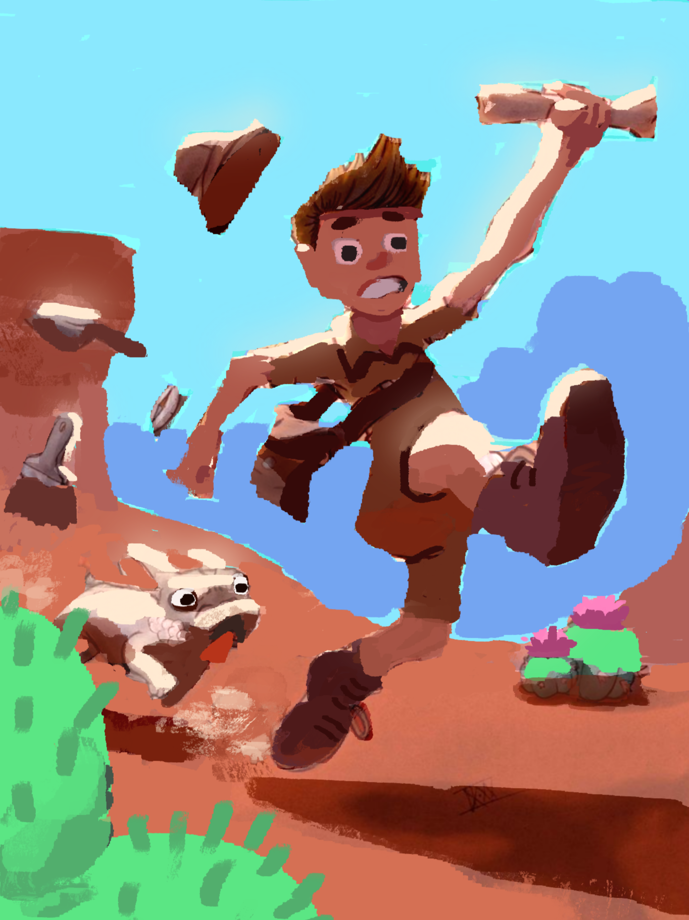
I beliave you are going for hot midday sunlight. That strong direct light would quite separate values in light and shadow. It is important to think in planes, to know, what is lit and where is cast shadow. The lit planes would bounce quite some secondary light. The sky would have less color gradient. You could use the sky and some atmosheric perspective with mountains to change the composition and get better silhouletes.(Did a little scribble over your nice drawing to see what i meant
)
-
@Cole-Rts Hey, I really appreciate the feedback! I think you have a great point about the lighting. I guess in my mind, the encroaching night time seemed more perilous to me, but I for sure see your point about noon and how the hard light would look. Also, the creature was meant to look like a French Bulldog, but they're pretty weird looking
 Thank you so much!
 -
@Ross-Cuellar-0 Thank you for the honest feedback! I'm so mad I missed those tangents, but you're totally right. I definitely see the issues with the dog, including it being off to the side, rather than right behind him. Thanks a ton for the help!
-
@gavpartridge Thank you so much! In my mind I wanted the light to be above and behind, but I'm still having a hard time finding out where the light and shadows would hit. I'm still struggling finding a way to make my drawings flow naturally, and I admit that I added the cacti and tools as an afterthought. I will definitely keep these things in mind. Thanks again for this great critique!
-
@marek-halko Oh wow this is awesome! Admittedly, I wanted the light to be above and behind (not quite sunset, but getting there) but honestly I love this harsh, direct light you used a lot more. I really love the darker blue you used for the background to make the silhouette stand more freely, and wish I had thought of this. I feel like this really helped me identify a lot of my problems, and for that I can't thank you enough! I really appreciate the hard work that went into this critique!