UPDATED with Value Study! My #draw50things Project. Feedback requested.
-
Hi Everyone!
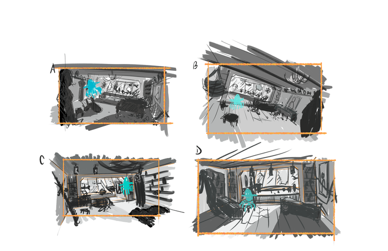
I've been looking forward to the #draw50things class since I heard @Will-Terry talk about it in the podcast, I think. I'm finally getting around to it and have finished up some thumbnails (see below).
My concept takes place in a captain's cabin of a sunken ship (maybe a pirate ship?). A small jellyfish character has discovered the captain's hat, and is proudly masquerading as the new captain.
I would love some feedback on which thumbnail you think works best, or any ideas that might help the angle/composition. I'm really trying to methodically go through each step of this class, so I haven't gotten to the enlarge/add detail phase yet. This is just for the thumbnail right now.
Thanks as always and let me know if you have any questions about it!

-
@JoshuaDages love this concept! Can’t wait to see the finished product. I prefer option B- I think that the jaunty angle really punches up that floaty feeling of being underwater. I also like the composition of that one better- I like the balance of the jellyfish and the chandelier. They’re sort of mirroring shapes and it balances the image really gently. The other three thumbnails feel slightly off in composition to me for some reason. Like there’s a bit of a lack of balance. I like the foreground-middle ground-background you’ve got in all three- really draws me in. Such a cool concept!
-
@Ruth-Tripp thanks Ruth! That's a good point about the balance with the jellyfish and chandelier. And I agree that the other three need a little work in their composition if I'm going to follow through with any of them. I appreciate the help!
-
Hi @JoshuaDages, looks like a fun project! Like @Ruth-Tripp, I find Layout B most interesting.
Keep us updated on your progress.
-
@JoshuaDages Hi!
I like thumbnails A and C. Perhaps for C have a low camera looking up, maybe if there was like a secret compartment in the floor boards (that would help reason the angle in the story- as if something unexpectedly might take place, someone/something is going to catch him in the act) -if you went with an angle like that and worked a story around it.
B does give me a better sense that the ship has hit ground being tilted but I find it a bit uncomfortable but it is dynamic.
-
@Jeremy-Ross Thanks Jeremy! I will definitely post more of my progress along the way!
-
@Heather-Boyd Thanks Heather. I like your idea about a secret compartment so I have more space for the 50 items. It also made me think about maybe having a hole in the wall of the cabin so I can draw more things in the water outside the ship as well! Thanks for the ideas!
-
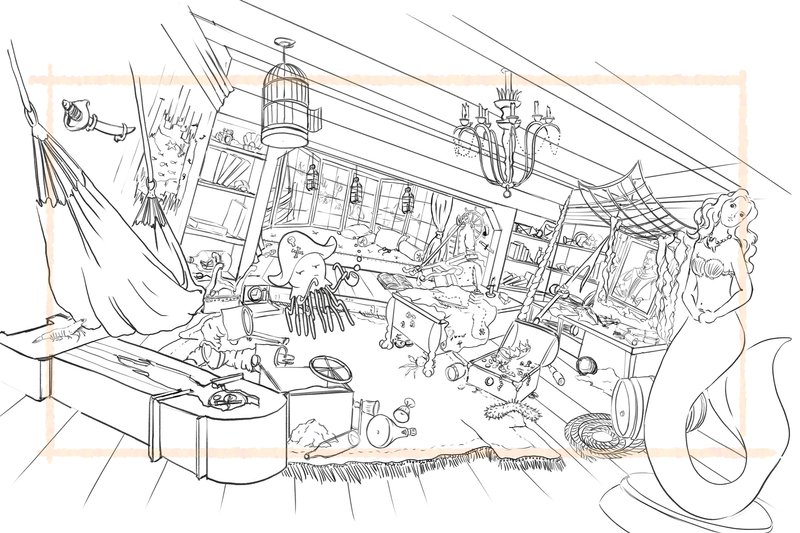
Hey all! Thanks for you input above! Below is my updated version. This is the "add final objects" step (step 11) in @Will-Terry's course. I've got around 85 objects (not counting things bolted down).
This is NOT a final version by any means. This is just the draft that has all of the objects in it. I will add value, consistent line work, and extra detail on the next pass.
Some help I'm looking for now:
-
how is the flow of the image? (realizing that it's hard to tell without value)
-
do you see any major issues or is it confusing at all?
-
are the objects too detailed or just right?
-
do you like the cropping I chose (orange border), or should it be different?
Any and all suggestions are welcome. I will be adding more sand, bubbles, shells, etc., in the next version as well.
Thanks!

-
-
@JoshuaDages Hi so this is my feedback, note I haven't taken this class:
-
I find it a bit claustrophobic because you have so many objects, 85+ but have left some breathing space. I'm not sure how to feel coming in on the right and moving towards the character who is on the left. That doesn't mean it's bad lols.
-
Also if the ship has been down underwater sunk for some time there would probably be water and worn damage (just noting the line work being really clean and straight). It looks or feels more like the ship is tilted and abandoned but not under the water (though I know see you have fish outside the window and critters crawling around in the ship). There also could have been broken damage. Just things to consider for your story.
-
The mermaid is a statue yes, but you cut that part out in your boarder (the base). So she reads as another character that has a uncertain purpose. How do you want your audience to interpret her? She helps frame your image yes, but because she reads as a "character" for me at least, because she has human characteristics, physical weight and less detail line work she is more in focus along with the hammock, clock and your main character the octopus. I also expect I guess naturally to see more scale detail because she is so close to us esp considering I see the details in the map.
-
I like that you have a nice tilt with the lights and the objects, helps with the sway. You have a lot going on and have done a lot of work for sure.
-
It may be interesting to add a floating or swimming fish inside as a small detail. Maybe even a floating feather from the once bird in the cage. Though I don't know if a feather would sink or float, mmhm.
-
I like the fray carpet edge but not sure if that's nec to be in the image.
-
Last thing I just noticed, your boots look really large in comparison to the Captain's desk. I understand it's further away but they still look big. Maybe just my eyes.
-
I see the little ship in the bottle in the back, it may be humorous if that ship too is sunk or upside down. I really like intentional story details like that -now I just need to include it in my own work.
I hope that feedback is alright and not too strong. And smoking bubbles is really a whole lot healthier and funnier than the stuff most people smoke, lols!
-
-
@Heather-Boyd Thank you so much for this feedback! Not too strong at all!
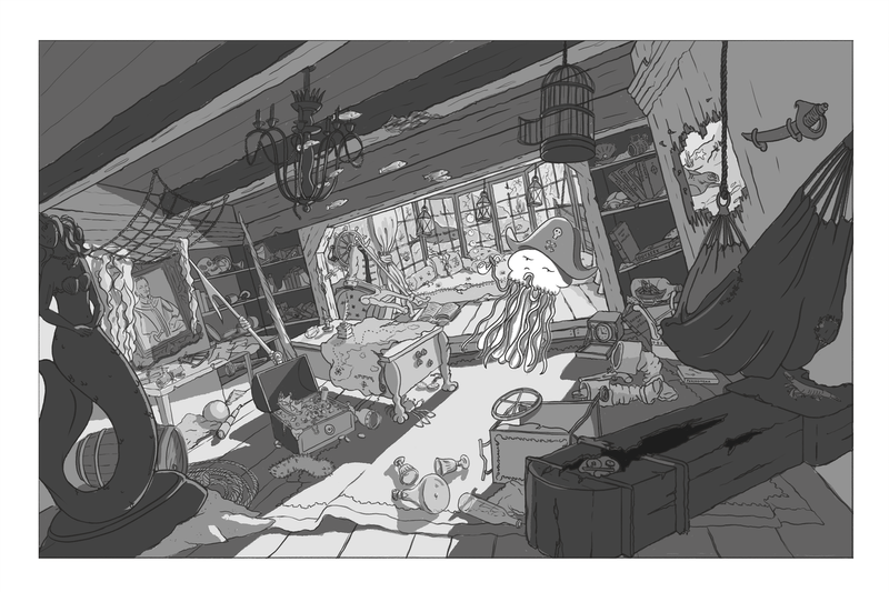
I agree that it feels claustrophobic, so I'm going to really work on using values to "hide" things in the shadows and make the focus more on the main character, so that viewer has to seek out the other objects.
And also agreed that I need to wear out/rot out/break more of the wood and objects so that they look like they've been under water longer.
The mermaid has been my main cause of concern. I am probably going to put her in almost full shadow, but definitely don't want her to look like another character... (I don't think?)
 so I'll need to work on this.
I will work on the size comparison of things as well. I see what you mean with the boots. And I think having more creatures floating/swimming will help for sure.
Thank you again! This was really helpful.
Josh
-
Hi everyone! Here's my first attempt at a value study(?). I've never really done this as values and shading are one of my weakest points, but I'm hoping to get a little help with it!
I know that some artists do a full value painting and then add color over top, but I don't know if that's common or not (or easy... or hard...). Does anyone else do it this way? What are your techniques?
I guess, what I'm trying to say is "help!" haha. I don't know where to go now. I'll be taking a color course (Painting Color and Light 2.0 by @Will-Terry) to hopefully point me in the right direction, but any pointers, thoughts, etc. are welcomed.
Thanks!

-
@JoshuaDages THis looks really good. I think when you finally render it that you ought to make it more murky rather than crisp clean values. There would be reflected light scattered by the water on the ceiling too. YOu have a done a great job at setting up a good interior space. I am envious of your patience. I am too chicken to try this.
-
@chrisaakins Thank you so much Chris! I really appreciate the encouraging words.
Yes, I agree that I'll need to add scattered light, bubbles, murkiness, etc. It's very daunting because I've never done an underwater illustration before, and will have to find some tutorials or something, haha.
-
@JoshuaDages Hi Josh, i think you did really great job with this illustration so far! Really cool scene!
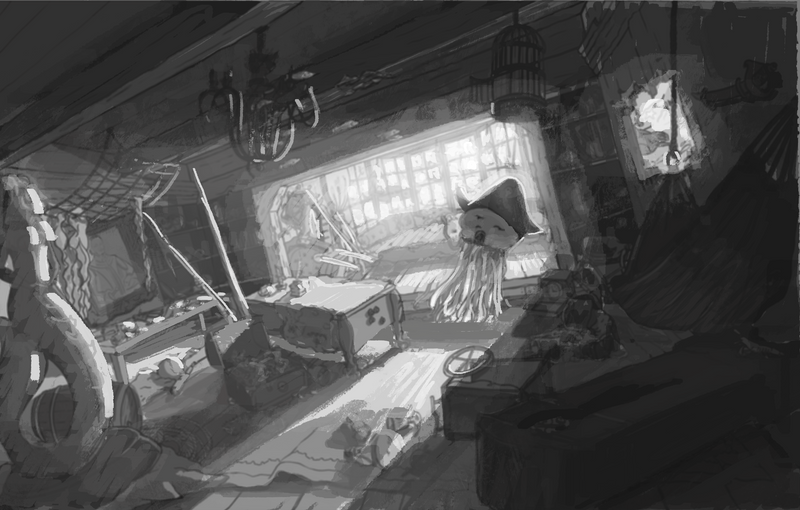
I am no expert, but when doing value studies, it helps to keep it simple and start with two-/three- or four-value study. Then add more values if needed, but it is important that new values dont jump out of the built value structure.
The values depend on the local color/value (dark vs. light) of the object, its material quality (reflective vs. matt) and on the quality of light. If these are similar you can very much group them into one value (group).
Stronger direct light like in your picture makes hard shadows and can very much separate values into light and dark. There is also lot of bounce light hitting in shadows (but never as strong as the primary light), some atmospheric light of water particles.
You can also decide where you want the audience to look at and either expose for light (means more value/chroma variations in the lit objects) or expose for the shadow (means simplifying the lit areas and having more variation in the shadow).
When coloring, it probably depends what aproach is most comfortable. You can definitely color over the value. But depending on the layer blending mode, it can either change your values or the color you want, and you need to paint over it anyway.
Sorry, somehow very long comment. Here some (not so good) scribble over your cool drawing to see what i meant with the values.
-
@marek-halko Wow! That is really helpful, thank you! I love how your paint over makes the image so much more dramatic, and it really helps me see what you mean about using the different types of light. I'm still learning about this, and need to practice it.
I think I will expose for the shadow as I want the viewer to be able to see all of the objects on the shelves, so they can count up the 50 objects for the assignment. I will study your image and others to try to get this right.
Thank you again, and I look forward to working on it more now that I have this input!