Revisiting OZ book cover
-
Hi guys,
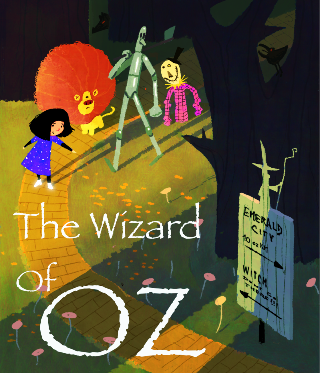
I had some time to work more on my unfinished OZ book cover for the last month contest to include it in my nonexisting portfolio .
.
I am still not sure what is not working on the picture. It may be the composition, maybe the overall concept is not rewarding enough? Colors not matching the story? Also incorporation of the text was a struggle.
Any points or ideas are much appreciated. Thanks!
-
Hi Marek, I rely love your style, for the cover, the thing that I would experiment more would be the Title of the Book. When you look at it from the distance it fades in to the illustration. You could try a different font or rearrange it.
C.S.Zoltan
Portfolio: www.behance.net/cszoltan
Instagram: www.instagram.com/c.s.zoltan -
I really like the style and colors! The title certainly could use some tlc. Hmm. Perhaps remove the sign so the tree trunk on the right can have the title fitted in. Or have the title painted into the yellow brick road.
As for the main piece I notice that the characters aren’t shadowed like the environment is. I think that will help unify this piece. Also is scarecrow missing hands and legs?
Instagram: www.instagram.com/jadepagecraft/
Portfolio: www.jadesv.myportfolio.com -
@Jade-Vaughan I like a lot about this. The composition and values and character design and style. I am confused about the bottom of the scarecrow? And I think his pink shirt and Dorothy's dress are competing maybe? I actually think it might benefit from a tweak in Dorothy's colors. She catches my eye, but seems to flatten out or I guess come off the page a bit. Also the scarecrows hat disappears in a way that I'm not sure you intended though I think in general he could fade a bit (as he is back toward the scary shadows more than the others. I love the treatment of the lion and the underlying warmth of the light areas as the road curves toward the really cool sign in the lower right. Love those subtle pinks of the poppies and rich colors in the foreground shadows. Great color handling there. Just my opinions. Hope that is helpful to you.
-
@cszoltan hi, thanks a lot! It looks like the title needs some more thoughts. Will try to experiment with different fonts a positioning.
-
@Jade-Vaughan hi, thank you for your thoughts! The title definitely needs more work. The characters, i thought, are coming from woods, facing a direct light to silhoulette against background. But maybe just even local color in indirect light (still in shadow) could work better. The scarecrow missing legs and hands was a design choise.. but probably not a good one
. -
@Joanne-Roberts hi, thank you very much for your comments! Great thoughts! The style is overall very flat and 2D. Scarecrow is indeed "shining" too much. Yeah, he is missing legs... thought he might not have them necessarelly.. obviously not a good choise
. Will try subtle down the colors on Dorothy, maybe less hard edges too. Thank you! -
Hi Marek!
Your work is so lovely that I'm shocked that you're not already a professional! Your characters are super sweet and I love the colors and lighting you chose. And I'm in love with the way you designed the sign!
 Below is an idea you can perhaps play around with. I thought your characters deserved a bigger spotlight because they are just so adorable. I tried to move all the interesting parts closer together so that there would be room for text, and I ended up moving the text to the top. I'm not a graphic designer so I just handwrote the text there for placement only. I hope this helps you think of some ideas! Love your work!!
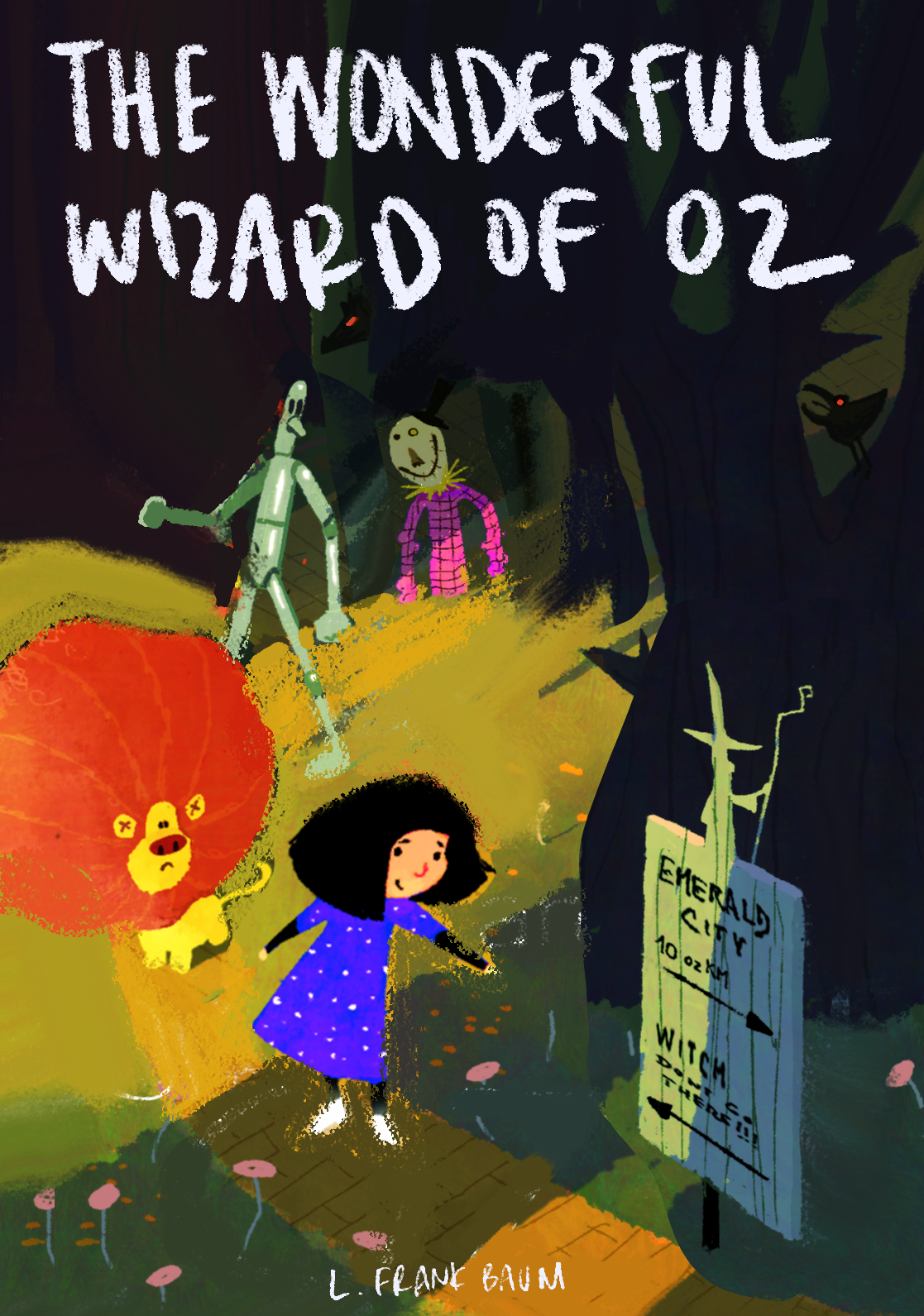
-
@aprilshin Hi April! Thank you so much for your post and kind words! Your paint over is great! I think that might have been my problem with the picture (tried to have a feelling of a small group entering a new undiscovered space... which didnt really suite the picture). Your composition with text integration looks better. If having time, i will definitely try to do these changes. Thanks a lot!
PS liked your concept for Wizard of OZ very much! -
I agree with @Joanne-Roberts about the dress and the shirt colors not quite matching with the image. Your lion is adorable and has a real sense of volume and perspective, and so the other characters look a little flatter in comparison. I've done some quick edits, lowering the saturation on the dress and shirt a little and adding a touch of lighting to match the beautiful rendering you did on the lion's mane. I've also done a few rough/quick redlines to help a little bit with the perspective issue. You have a strong top-down angle but the flat edges of the dress and the scarecrow's joints make them look out of perspective, especially compared with the road, lion, and sign.
Hope this helps!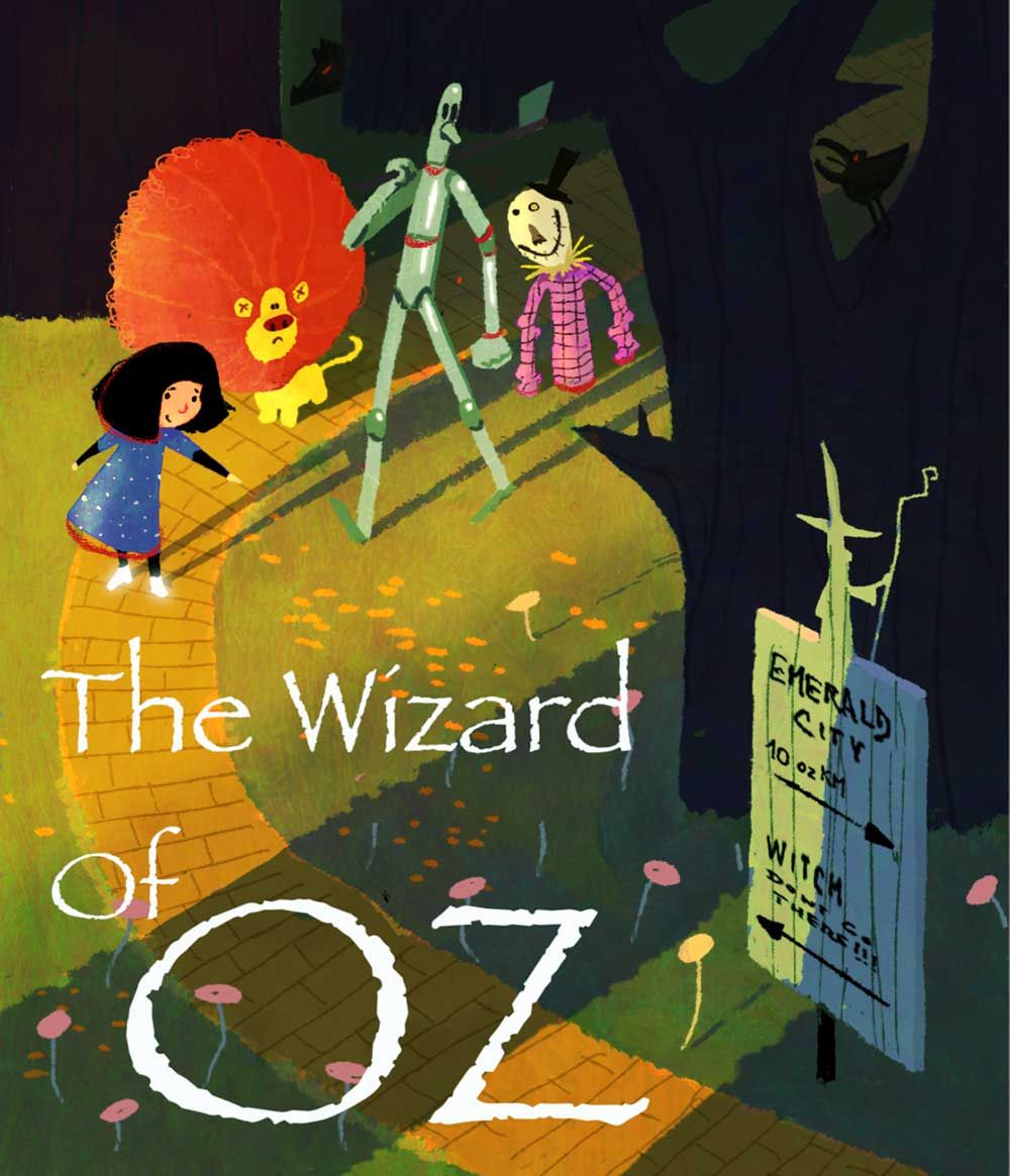
-
@Carmanda Hi Carmanda, thanks a lot for your suggestions! I tried to achieve quite a flat style with very stylized light. The lion is indeed not matching (couldnt resist on the mane
). The blue dress is very much pushed to get strong color contrast (value was not enough) to be a first read... but has to be pulled back a little, looks like. The perspective is not really matching anywhere properly, kind of thought it might get lost in the stylization. Thanks for your comments!