Discovering our style - Who's in?
-
@Meta, I agree with the other comments. Something else I noticed is the compositions move the eye all around the page--very quickly for me. Some have a lot of details, while others achieve this effect with the strong lines and contrast in lighting. Also, most of the characters are very engaged and alert. I'm seeing a lot of depth in most of the images.
-
@Inge-Permentier no worries!
-
@jakecrowe A lot of this does have an analogous feel, but I see some that lean toward complementary as well. The Hellboy for example is orange on blue. The first thought that came to my head when I saw this grouping of paintings was pyschedelic comic art. I think it is the pinks, purples, teal greens, and the heavy emphasis on linework as well as the subject matter that makes it feel like it fits that genre.
It seems like you are drawn to a certain kind of moment and mood. I would call it quiet action. Sometimes the content is quiet but the rendering gives it a little boost, like in the hero never sleeps image. Quiet scene, loud colors.
Other times the content is action packed, but the rendering tones it down. The Hellboy one for example, a monster is busting the ground open with a boooooom but that blue calms it down (for me). I don't know if any of that makes sense but I'm just trying to throw some ideas at you to explore.
Last thing, you seem to be very attracted to excellent draftsmanship. These all have realistic perspective and the human characters are all drawn with realistic proportions.
-
@Meta A lot of green and blue. It looks like you are really influenced by animation concept art. Your dream portfolio feels painterly, yet happy at home looking digital.
I don't have much to add other than what other you said. I would say these images come from people who can draw and paint really well and who love and are inspired by the natural world.
-
@Inge-Permentier It is perfectly fine to start your own thread for yours. I plan to do the same this week once I get everything together.
I love seeing everyone's dream portfolio. I noticed on the ones here and others I have seen most of the time when you look at them small you can see a color pattern. But the style and technique vary. Has anyone else noticed that? So then the cross roads are with what style you want to work towards?
I have also found that the dream portfolio and what i feel are my 20 best are SO different. I have lots of work to do.
-
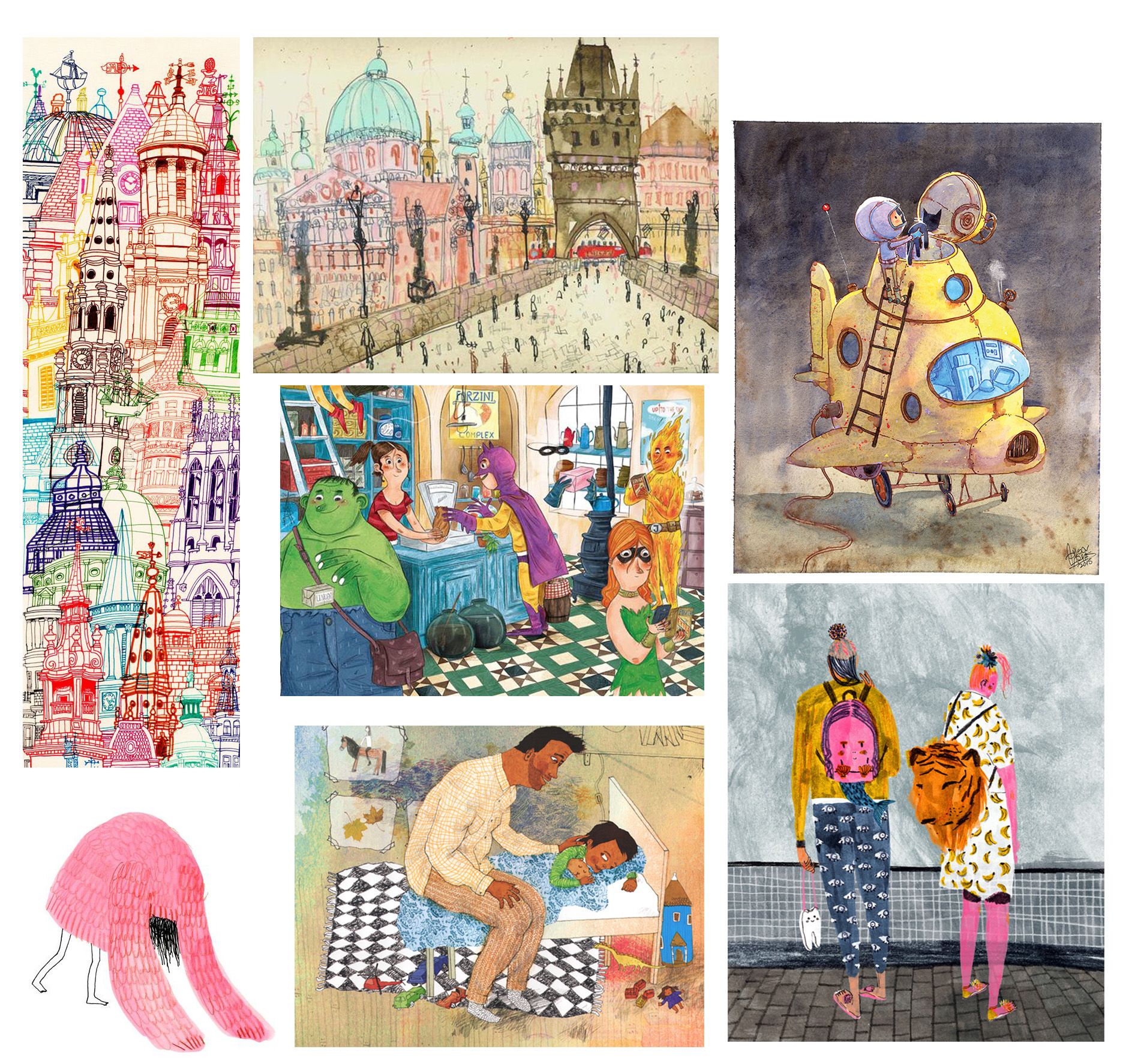
Here's my dream portfolio! Nature and everyday life scenes are a red thread for me. Also a little bit of magic here and there.
Other key features for me are: soft shapes, 'unexpected' proportions (of body shapes or landscape elements), asymmetric and dynamic compositions varied (and quite-but-not-too-much accurate) use of perspective, bright (but not overly saturated) colors, contrast, presence of primary colors (although I love black and white too), analog (or analog-looking) media), with a particular interest for gouache, watercolor and pencils, presence of patterns and textures (I LOVE patterns and textures), generally no outline (except for black and white).
I am loving this exercise, it was a good confirmation of things that I consciously like in other people's illustrations, but also a great source of inspiration. I will try to set aside some time to study these visual techniques and create small swatches or samples of the different traits.

-
@Heather-Boyd @jakecrowe @Miriam @Zachary-Drenski, Thank you all a lot for your feedback! It is just great to have different pairs of eyes to look over things. I think I have a good base now to continue to the next step
 What I found interesting and surprised me most, was Miriam mentioning how the composition makes the eye move around. I think I do already try to create that within some of my own drawings. One could use it it even more on purpose for telling storys. Sort of little sequences within one image. I'll definitely keep that in mind.
My second dream portfolio will look totally different! I've gathered everything and sort it out now. -
How is everyone here FINDING their dream portfolio images. Do you have artists already in mind? Are you simply surfing google?
My pinterest and google rabbit holes rarely lead me to anything I really LIKE. Or it's 'I like that, but I don't wanna DO that'.
-
I've been sort of doing this for a little while now but always gave up as my collection seemed all over the place. I saw a comment (I can't seem to find it again now to quote it) about focussing on a picture book portfolio and then doing a separate one for other topics (comics in the case of the comment I saw. Fine art painting type stuff for me). This helped so much! I am revisiting my dream portfolio and asking for each image "yes, you like it but would you see it in a picture book?" Et voilà, I am starting to see some overall themes emerging! Can I join in and post it here to get your thoughts? I feel there's a lot that I'm not seeing - particularly around colour. I will also try and comment on all your gorgeous portfolios but it's a lot harder than I thought it would be to put my thoughts into words!
-
@neschof yes join in
-
@Braden-Hallett mine are from the artists that I love.
-
@neschof Absolutely welcome!
@Braden-Hallett For me the task was only picking from what I already collected. Since I knew I'd go back to drawing (half a year ago maybe?) I was liking and following stuff/people on instagram, saving some other non-instagram-related images on my computer. If you start from scratch, this is definitely time consuming. It still was for me, but I had that base ... Have you got nothing and no one from arts that does what you want to do? If there would be one at least you could go to instagram or pinterest and look up the things that are related to that art. Though it can be very tireing to click around ...
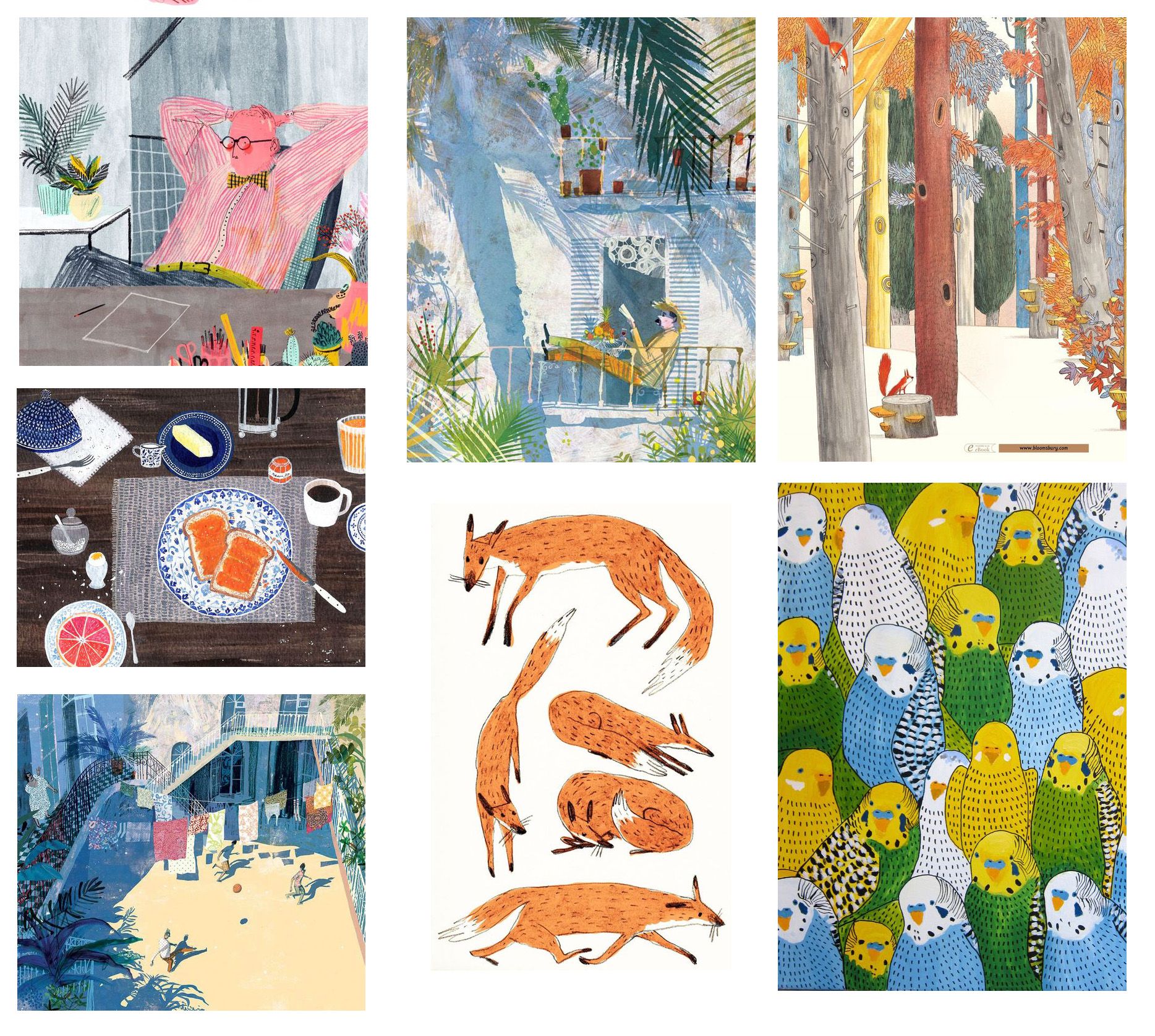
@Elena-Marengoni I also see a lot of desaturated and brownish colors. Your backgroundas are very basic and there is few rendering. At least a part of the images use geometrical shapes. They use abstaraction in many cases - mostly for plant matters! Almost everything has an air of fairytale. There's a high variety of different compositions. Is there any that attracts you in particular?
An interesting thing that I notice is, that within your dream portfolios, I am attracted most to those images that fulfill the criteria we've analyzed about mine. Do you guys notice the same?
-
@Meta yep I see all these things as well, except maybe for simple backgrounds... I mean yes, they aren't super complex either, but I like that they have details to look at and that the images are quite busy overall. As for compositions, I do like variety!
 I like when an artist is capable of changing the point of view to support the narrative in the best possible way and get the message across. I would love to achieve that in my own portfolio!
 -
@Braden-Hallett I went to a big bookstore in Milan this week, one that has a huge section dedicated to children's books. I've spent a couple hours looking at picture books and book covers, taking photos and noting down names of illustrators that I found visually interesting. I am building a simple Excel database of those names and looking at their websites. Plus I looked at the work of illustrators whose work I was already familiar with. I find Pinterest full of inspirations, but also tiring and not really the best if you want to discover the name of the artist and be able to look at their overall portfolio.
-
@Elena-Marengoni & all: Book shops (good ones) are always good to find new thrilling artists. I almost forgot that (we're living in rural Portugal with ne next "big" city 3/4 of an hour away. Until I found a great children's book shop in that city. But somehow, after revisiting these bookshelves in mind, I get the feeling that the style I am aiming for isn't on the market ... And I won't go into concept design which is highly competitive. Has anyone an idea where I might snuggly fit? Any branch or field of illustration?
-
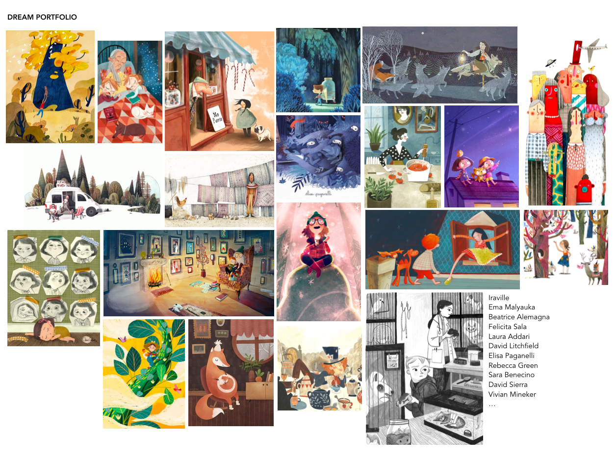
Ok, after some brutal culling here is my dream portfolio!
I'm feeling really happy and excited about this now as it feels like a coherent set. I'm still struggling to identify the specifics though. Here's what I've got so far:
- generally quite flat, even when it's a scene with depth - like it could have been created with cut out paper shapes
- lots of pattern - clothes, rugs, tiles, wood. patterns next to patterns
- lots of line but not always as outline - it seems to weave in & out of outline and texture
- texture! provided by watercolour + linework mainly I think.
- generally missing light sources and shadows (this was a big shock to realise - I thought I loved shadows!)
- they're all quite high key (?) (I'm starting to struggle now)
- colour....? I'd love some help with this as I can see they all have something in common I just don't know what!
I'd also love to know anything else you notice or see - this is all so fascinating!


Now my attempts to look at other's portfolios. Sorry if it's all very obvious stuff you already know:
@Elena-Marengoni I see blocks of bold bright colour, often paired with brown. All shapes are rounded. I think you said "soft shapes" and this is very clear across all the images - there are no sharp edges and even square objects somehow manage to look like they would be squashy to sit on.
@Meta The gradations through similar colours comes across very strongly in lots of the images (particularly shades of blue and green). They also seem to be generally quite high contrast with dark backgrounds. The focal point of the images is often provided by a strong light source contrasting with this darkness. I'm getting an animation vibe from many of the images.
@jakecrowe lots of detail through fine linework. Limited palettes within single images - usually only two main colours and these are applied in flat shapes and flat backgrounds. Because I realised that my images are devoid of shadows I saw that yours generally describe and define the 3D forms via shadows.
-
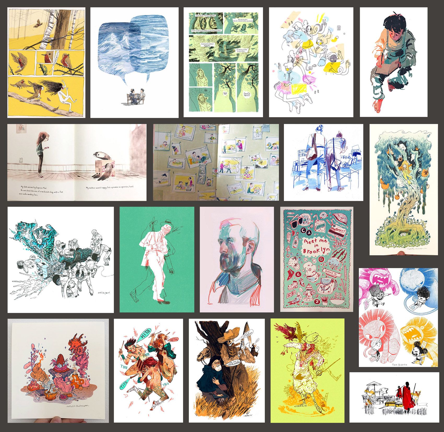
My second Portfolio. Maybe surprising? It's quite different to the first one. :face_with_stuck-out_tongue:
 I made it up based on the need to start with something easily achievable, which is fun at the same time. I'm thinking more of editorial, non-fiction illustration. Still not sure where to fit it best ...
Ignore the subject matters in any case. My choices weren't neccessarily what blows me completely off, but the question: What would I like to I try with my "style"/What would be a fun and fast way to draw on a daily base?Sorry for not putting all the artists names. This was a faster process and you don't always get the artist's name, say, from pinterest. It's very confusing.
Briony May Smith
Catherine Pape
Cyril Pedrosa
???
Mabel Ye
???
Katja Gehrmann
Voctoria Antolini
Natalie Andrewson
Kim Jung Gi US
Mikkel Sommer
???
Natalie Andrewson
Tom Boothe
Natalie Andrewson
3x Núria Tamarit
Tim Möller-Kaya
This is what I found: fast lines, vivid colors, colors not always in place, and made up for the design ignoring natural colors, leaving parts of the image blank. Flat blocked-in colors. Few colors per image, sometimes handled like in multilayered printing techniques (few colors printed above each others - don't know how to describe this in english
 ). Partly brightly colored lines. I cannot name a certain color contrast here ... any ideas? Besides some monochromatic or analogue colors. Forgot so much about colors in all these years!
Few detailed or non existant background, higher level of abstraction then in Portfolio #1, expressionistic, much movement ...Does this make any sense to you? I can imagine to grab some of the elements and go experimenting within the visual language I am capable of.
@neschof Awesome! I see a lot of things there, but am too tired for writing them down right now
 I'll post it later.
 -
@Meta It is also late here and I'm off to bed
 but a first thought on your new portfolio. I'd class these as "drawings", in contrast with your previous portfolio which was definitely full of "paintings". Except the image of the boy in the top right of the new set. This seems more painting than drawing to me and doesn't sit comfortably in this new set, even though it is a sketchy sort of painting I could definitely be wrong, viewing with tired eyes, I'll have a closer look tomorrow.
I also realised I didn't give any of the artists names in my portfolio. I'll add them tomorrow too.
-
@Braden-Hallett - Libraries, caldecott winner lists online, other lists online, and looking at everyone's dream portfolio here. I don't yet know what will make the cut for my top 20 pieces, but I've been taking about 20 minutes each day to research new artists.
@Chip-Valecek I think if the pieces look different stylistically it's okay because our job is to steal little pieces from the artists we like and allow those combinations to form into our own unique style. That's my take at least. I am trying to stick to published childrens book illustrators at the moment though, but that's the only self imposed constraint.
-
@neschof Can you please include a lists of the artists? I see some stuff in there calling me :smiling_face_with_open_mouth_smiling_eyes: I will look it over later and do my best to add to what you're seeing.