Unfinished or loose - lighting & mood critique
-
I love it also, it calms me, the color palette is really simply and fitting, nice harmony there. I find it soemtimes very difficult to draw without lines. But I like this without lines a lot, it has some style, would like to see more in this style. There is no instagram or webseite in Your signature, would be nice to see how You usually draw.
-
I really love this...I wouldn't have thought that this was outside of your normal workflow. It doesn't look unfinished to me, either.
That said, I'm really curious about where he's sitting: it looks like an on-end boat? Or is that not a boat at all?
-
I love it! It says a lot with a little. Nice and simple, nice clean style. Love the muted palette.
-
Did I sell the water as a texture? I've studied calm water surfaces and reflections but I've been staring at it for so long I can't tell if it looks right or not.
Yes, definitely, it works the most in the reflection. Less so further out towards the horizon.Do you feel what I wanted to convey with this? Does the piece appear calm?
I feel calm looking at it.Did I overdo the looseness thing? I was REALLY boling it down only to the most important details and I am afraid it may not read well.
In my opinion, no. But had you not pointed it out, I would have been content that this was your objective, practice and a study.Do you notice anything wrong about the lighting? It was quite terryfing to NOT use lines to describe forms.
The answer to this is subjective. Because you've chosen to do it quite stylised, even with a limited palette, I cannot judge on "right" or "wrong" lighting. You could rephrase that to does the form fit the function? Is the lighting appropriate for this scene? And in that, I say yes. But you can always push and play with it more.I do understand how you feel, I too have been trying to explore breaking away from using lines a bit, or at least breaking them up. Having a hard time understanding how to really translate planes and define form though... also rendering takes me longer and I lack patience!
I am personally becoming a huge fan of strong colours more than subtle, as well as use of texture in these situations.
Does it look, despite the looseness, like an finished artpiece? Do you look at it and think "Oh, this guy meant to kept it quick and loose" or are you more like "That's an unfinished painting, someone must be halfway through the process here"
Again, this answer is very subjective. What you intend and what I see are not necessarily the same thing. There is definitely room for improvement and cleaning up your forms. But like with any painting, we can always push things further. It's learning to listen to the painting telling is when it is done and accepting that.That being said, if you tidied a few things up and cleaned up the border, presenting it in a somewhat neater fashion, this could definitely pass for something more finished.
Good work, keep at it.
-
I think you have done a beautiful job of conveying calm. The palette is great, it is loose and I love hwo the boat is tipped vertically. I think yu met all fo the limits you placed on yourself and did a good job of it!
-
@IgorWoznicki I really love this, your colours and shapes are fantastic. It looks like you were very successful at everything you were trying to accomplish. As for finish, it really reminds me of colour keys I have seen for animation in which the main focus is to nail down the colours and lighting and the details are often left out. For me it reads like a work in progress. To keep the charm of the simplicity and loose style and still read as complete, I think it needs just a little more finish - some gentle smoothing of strokes that look a little jittery, removal of stray strokes, and some additional details to distinguish between the boat and the fisherman. I can’t quite tell where he ends and the boat begins or what is happening in the bottom half.
-
Oh wow, there is quite a large amount of feedback here!

Thank you all for taking the time to answer, this means a lot! Lemme adress some things now.@Heather-Boyd will it be more clear if I had shown you?

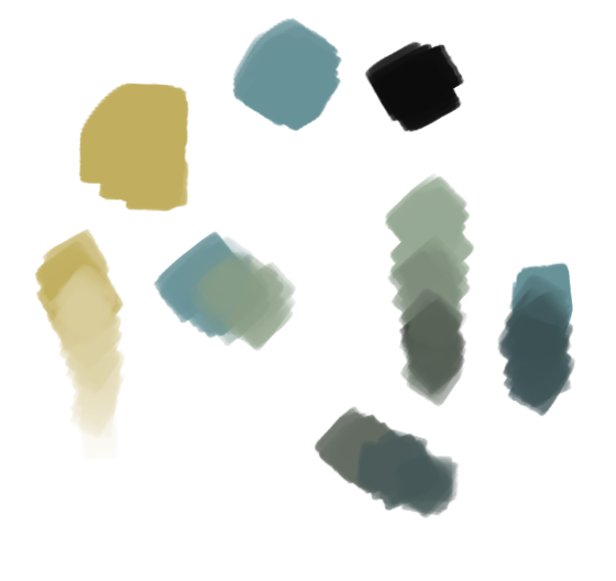
I took this hue of yellow and this hue of blue and created myself swatches using them as well as black and white. I would cheat sometimes and turn up the saturation to the level which was unachieveable for my initial colors, but for the most part, the pallete was created only with these four colors. Kinda felt like mixing a real paint. Tons of fun to aproach it that way
@MichaelaH if you are interested, here is my instagram profile I've been in quite a rut lately and needed to rethink what I want to learn and where I want to take ma art. Decided to try out this painterly aproach since that is something I've been admiring from a distance for quite a long while. I wonder what effects I am gonna get by mixing all that I've learned so far with this whole new subject matter which is painting
 Prolly gonna do some more, maybe even buy myself some gouache.
@Aaron_T thank you for your kind words. That's a boat turned 90 degrees. Don't ask why, it just happend to be an appealin idea for me

@Amanda-Jean thank you so much for such a detailed answer! Took some notes on that. I kinda like what you said about listening to the painting telling me when it's done. I am gonna tidy some things up, add a few more subtle shadows and lights here and there and see where that takes me. And about the border, I actually like it that way, thought this fitted the convention quite nicely and that it added some more edge to it. I'll rethink it though, probably create a separate version with a clean border to see how it works for me or I'll just push the effect back a bit. Thanks again for taking this much time to help

@Erin-Cortese Do you mean things like The Dam Keeper? If so, then I couldn't be more proud of myself
 I had this masterpiece in mind when I was coming up with the initial idea. About the issue you've adressed, I consulted that with one of my close art friends and she helped me to figure out some ways I can make the fisherman pop out of the boat a bit more. Not being able to understand what is happening at the bottom of the boat is quite a big technical issue.
Thanks for pointing that out
That being said, thank you all again. I thought it through, consulted it here and there and I am gonna make some changes tommorow. Nothing huge, but (hopefully) this will help the piece, even in a subtle way! I will post an update here if the time allows

-
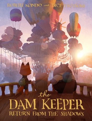
@IgorWoznicki Is this the “Dam Keeper” image you were thinking of? This is such a phenomenal piece, I stared at it for so long the first time I saw it!! LOVE the style. In spite of the simple and loose feeling it conveys, it has very clean and crisp edges and includes subtle textures and and smooth transitions. It just depends on what you are going for.

-
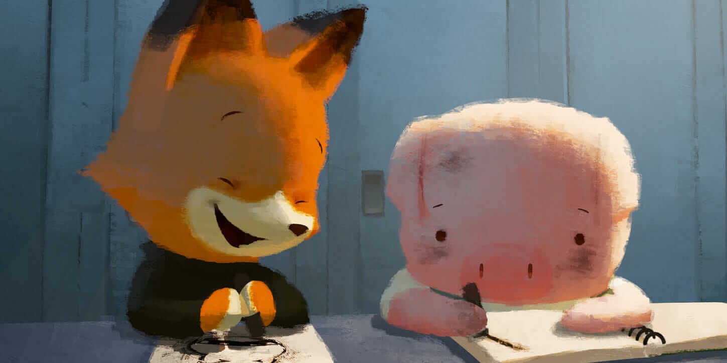
@Erin-Cortese I thought more of the stills from the short itself, such as this one

You know, light only in the necessary places, very loose. The comicbook ones tend to be a bit more detailed, depite still being simple. I have been, however, looking up with admiration to artwork like that and that essentialy lead me to creating this fisherman

Have you read the Dam Keeper graphic novels? I am thinking about buying them but there is soo many artbooks and comicbooks that I'd like to buy that I am unsure how soon should I get it
Back to the artwork though, I made some changes

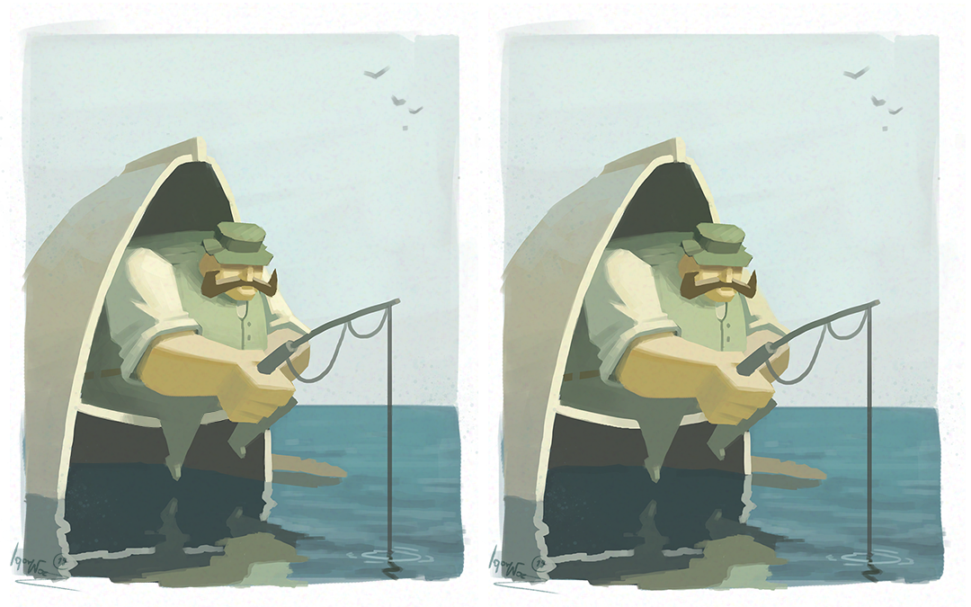
Most of them happend on the character itself, I added some more subtle shadows to show some more form and to make certain things ( like his head, which is my focal point, afterall ) pop out.
I played around with adding gradients to the reflection to push distinction between it and the boat but decided to step back. It started getting more cluttered in there and ended up killing my initial idea of being extremely simple. I tried to go for some subtle light bouncing off the water but again, it started getting too cluttered.DAMN HE LOOKS SO POOR POSTED NEXT TO THE DAM KEEPER'S STILL


Anyways, there are not many changes and not everything you guys told me was used here. I just want to say that I do not take your advice for granted, some of them just didn't fit the direction I meant to take it. I am still extremely grateful for all that you've written. All the kind words also made me feel a bit more secure with what I did here

-
@IgorWoznicki Ahhhh now I see what you are going for. With this in mind I think you did a great job accomplishing what you set out to do! I know the feeling of seeing your own piece next to one you idolize, it’s tough. Your piece has such a nice feel though, I would be proud of it if it were mine.
No worries about not taking the advice, it’s not personal at all, I just didn’t see your vision initially. Now that I see it, I can see why my advice did not apply.
As for The Dam Keeper, I didn’t even know it was a graphic novel! I thought it was animation only. I’m going to look for it now, thank you!