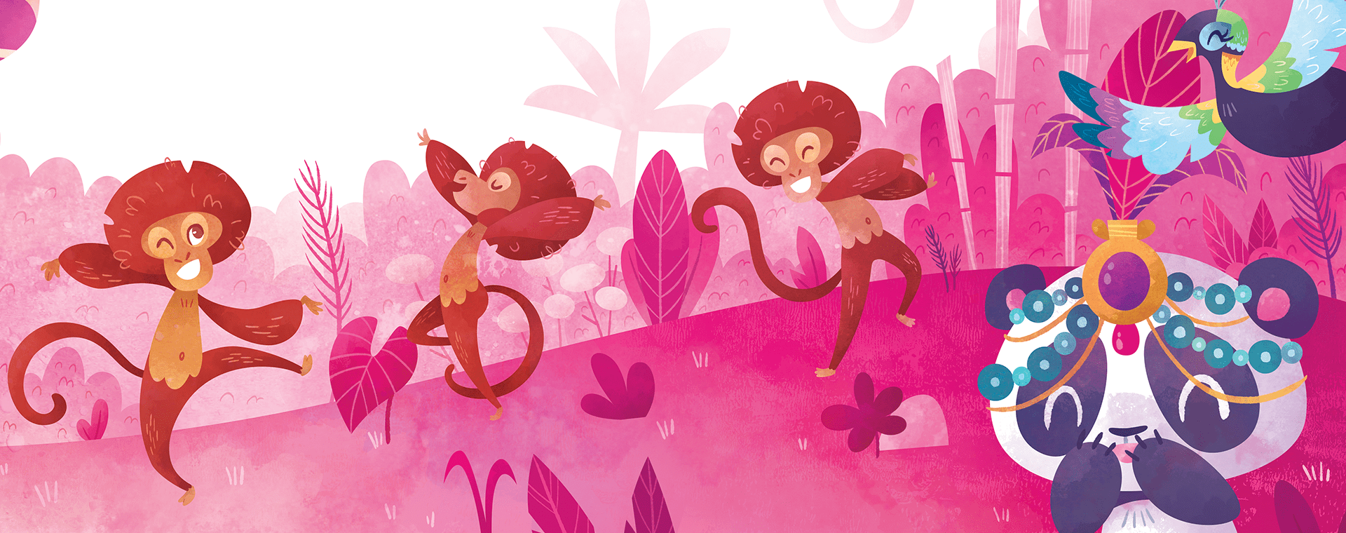
Much needed website update
-
Happy 4th of July everyone!
I've spent the last couple days updating my website, which desperately needed some attention! I hadn't touched it since last fall, I think! I'd very much like to see what you guys think about it and if you have any feedback for me

Changes I made:
- Entirely took out the blog section (which was not really relevant and I never had time to update)
- Changed my website menu. Previously I had a "My work" section which was a drop down menu that included children illustration, watercolors, mobile game art, nursery art, etc. I took out everything and replaced it with 2 links: Books and Projects, and Children Illustration.
- Updated my about section with current information
- Updated my portfolio to add my most recent work and take out lesser pieces
Please let me know what you think and if there are any problems I overlooked!
 Thank you!
 -
@NessIllustration very clean and professional look. Looks very nice!
-
@NessIllustration I think it looks great. I’m viewing it on mobile, it’s very easy to navigate. Your messaging is clear and your images look crisp.
Have you considered changing the title of your ‘Children Illustration’ section to, ‘Illustration’? Your messaging in your ‘About Me’ section is clear that you are looking to focus on children’s illustration, but I think the title could box you in for various potential employers. Many of your images could be used in a variety of fields and sometimes verbiage can make an employer only see one thing. Just a thought!
-
Hi, your work looks amazing. If you let me an advice try to resize your web images because in a slow internet connection it can be discourage to visit your website. for example, the image call it header3.png is about almost 2 MB and took me a lot for load. you can use free online services like www.iloveimg.com or tinypng.com to compress your images without loosing quality.
I compress your header3 image for testing and this is the result:
 only 570 kb
best regards

-
Wonderful website! It looks good even on its own, without the vivid pictures.
However, to me the logo seems a bit unbalanced, with too much weight on the left.
Also in the menu in the My work section (https://nessillustration.com/work/) could be centered for my taste.
Cheers -
@adiba you know I didn’t even find the ‘My Work’ section until you put the direct link. Maybe it’s being on mobile but I didn’t find that in the menu. That could be problematic if all of your work can’t be seen. Perhaps that also means my initial comment could be disregarded.
-
@jakecrowe That's a great idea, I'll do that!
-
@Tokkaido Thank you so much, that's a great suggestion!! I'll optimize my images

-
@NessIllustration viewing it to my phone. It looks great! Very clean and simple. Great artwork and ABOUT section too!
-
@adiba @jakecrowe I have taken out the "My work" section in this update! I didn't delete the page itself just in case for a specific job I need to link to one of those galleries, but the link is no longer in my menu because it's not meant for regular visitors. I think I'll try to hide those pages a bit better!
-
@Marsha-Kay-Ottum-Owen Thank you Marsha!

-
@NessIllustration
Your website looks very polished and clear! I think you've done a great job with it, and if there's one small thing I could suggest, it would be moving the About section tab all the way to the right, so the leftmost tab is Home and then Illustration, then Books and Projects, and finally About, followed by Contact. This order makes me more likely to click on your illustration work first, which I think is what you want potential clients to do too!You did a wonderful job and I particularly like how clear the hierarchy is clear throughout your sections, as well as the way you used your limited color palette!
-
@Alicja-W That's a great idea, and is such a simple fix! Thanks for the suggestion, Alicja!
-
Looking great! Love the design. Also recently removed the blog section from my site.
-
@reddprime Yeah I initially thought it looked really "cool and professional", like "real website". Turns out it's unnecessary noise and the lone 3 blog posts looked sad and lonely hahaha!
-
@NessIllustration Looks clean and easy to see your beautiful illustrations.

-
@Judy-Elizabeth-Wilson Thank you Judy!
And thank you so much everyone for the suggestions! I changed my "Children illustration" section for just "Illustration", moved it before my About section, and optimized my header images. I do feel that it's much better now, so thank you everyone so so so much! People here always have the best advice


-
I’m late to the comments here...but I echo what has been said. It’s easy to navigate and the website is very clean and focused. Great updates!
-
I love your work, @NessIllustration and I love the rotating headers. I happened to click when you had a kind of adult 'homecoming' time image of maybe two travelers reunited? It was so different from your usual kid-lit style that I thought I was on a different site. I'm not sure about that piece in the the header because it is so distinctly different in tone and subject matter. Otherwise, I love the simplicity of the site, and might point you toward using sans serif fonts throughout (rather than serif up top and sans at the bottom). Best of luck!