Group run through creative environment design week 1 art and feedback
-
Remember ladies and gents that the intention of this course is not necessarily to design things that are real (though that's fine
 ) it's to design things that look good.
 -
Also (watching Jake's exaples in the 'reference' video at about 50 minutes) a great way to make sure that you keep the awesome silhouette for your building/tree is to take the black silhouette, resize it (and lower the opacity) then draw overtop of it on a new layer. I've found that if I don't do that I tend to de-exaggerate my silhouette.
-
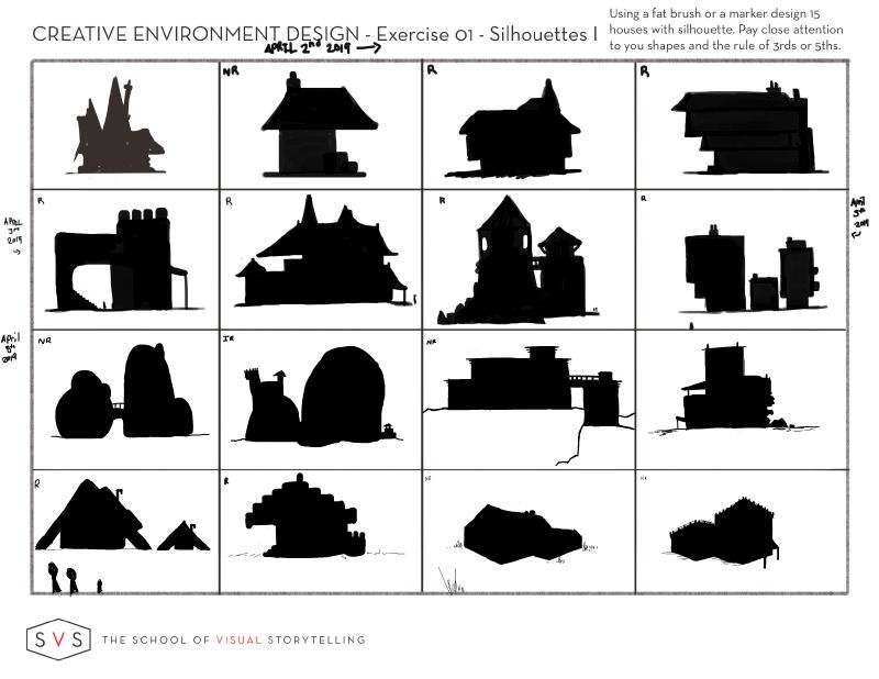
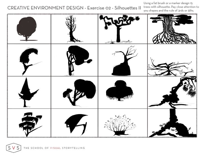
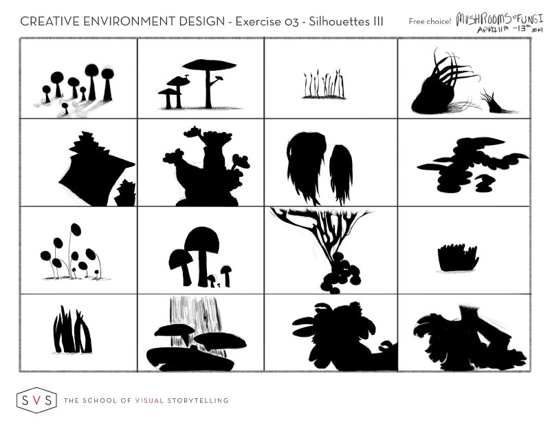
1-3 Exercises completed this week.
 Just squeezed in. I loved doing these. But houses were the hardest -master perspective class after this.
-
@Heather-Boyd Perspective is haaaaaard! But i do find it easier in thumbnail form
 It's a lot easier to extend those imaginary lines waaaaaaay off the page when what you're drawing is tiny
 -
@Braden-Hallett
You make it look easy.
-
@Heather-Boyd These are great! Very creative.
-
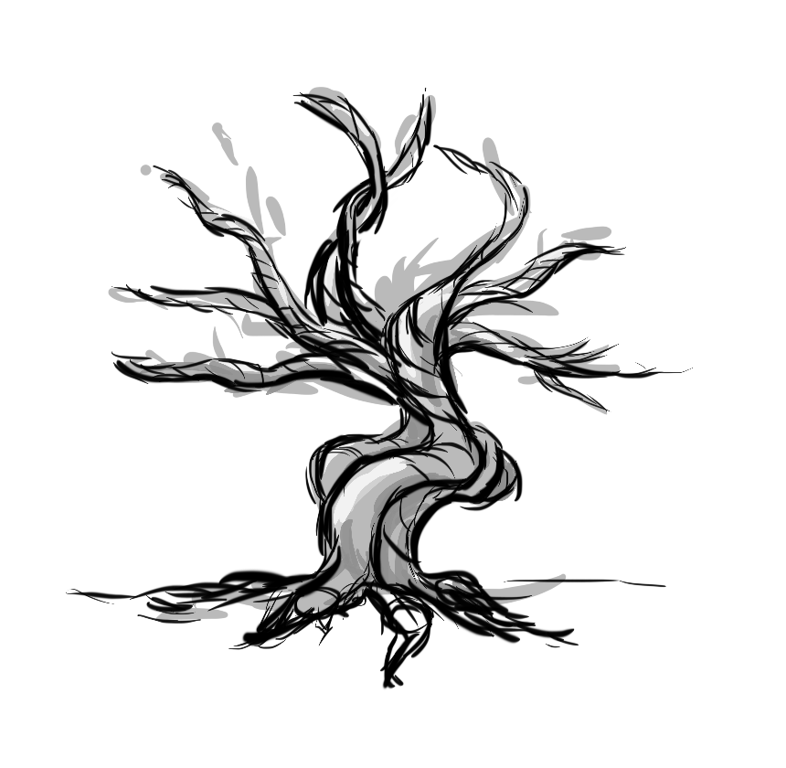
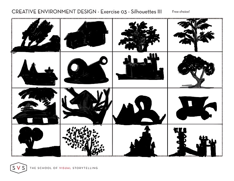
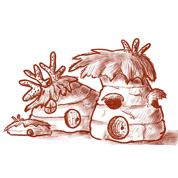
Here is my third silhouette page which I don’t love but it’s done and my objective view of one of my silhouettes. At least, I think it’s the objective view if I’m understanding what that means.
-
@demotlj Neat design!
Which silhouette were you using for it?
-
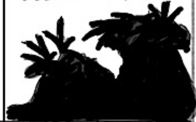
@Braden-Hallett it was my first set of building silhouettes second row farthest right.
-
@demotlj Oh nice! I missed that page
 You stayed nice and true to the silhouette!
 -
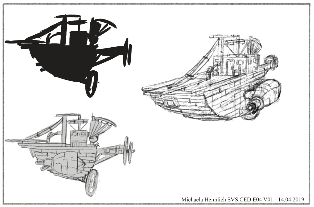
So I think I am finished, not perfect. It was very difficult, because I never do such perspective. It is only one raw sketch, would like to do one clean sketch with better perspective (after it is finished I see many parts lacking..but as Jake said, it is good to go some more times over the design after time passes), but after 2 hours doing this exercise, I need some break. But I am proud of me, that I did some environment and one I never usually do...
-
@MichaelaH Very intricate! The different perspective is very nice and well done. That's something I have real problems doing -- turning my creation (or anything) around in space and imagining how it would like from another angle. Yours is great.
-
@demotlj Thank You. I know what You mean, I also never turn my objects, because I don't know how and am afraid of it. Now I know it takes also a lot of time and work. I think my ship looks longer than it is in frontal sketch, but it is ok for the first try.
-
@MichaelaH I've started making clay models of my characters so that I can turn them around but it would be a lot faster and easier if I could just get my brain to do it without aids

-
@demotlj That is a great idea, to take objects like models or like you do with the clay.
-
@ErinCortese These look so good. Nice job!
-
@MichaelaH This looks so good

-
@murielle Thank You Murielle

-
@murielle Thanks!
-
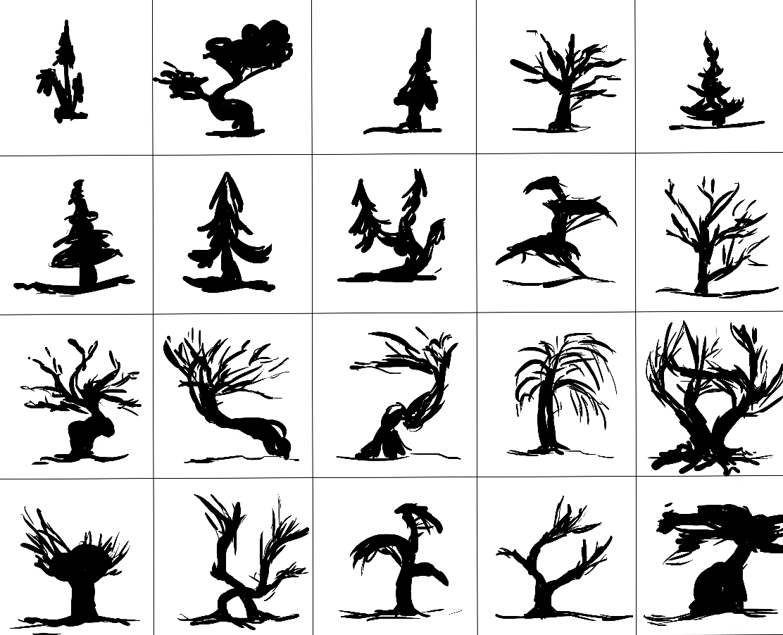
The last stretch for this week.
I wasn't planning on doing the trees but by lack of other inspiration, I thought I'd give it another try. This is the second time that I do this exercise, taking at heart everything I've learned here by reading the comments.I was looking to design pine trees and creepy trees.
Pine trees seem to be really boring, does anyone have an idea on how to make them more interesting?