Is my work professional?
-
Hi there!
I'm preparing to send out postcards for the first time, and would love some feedback on this image that I'm considering.
Is this an image of professional quality? Does it show flair? And more importantly, do you think it tells a story?
Thank you so much!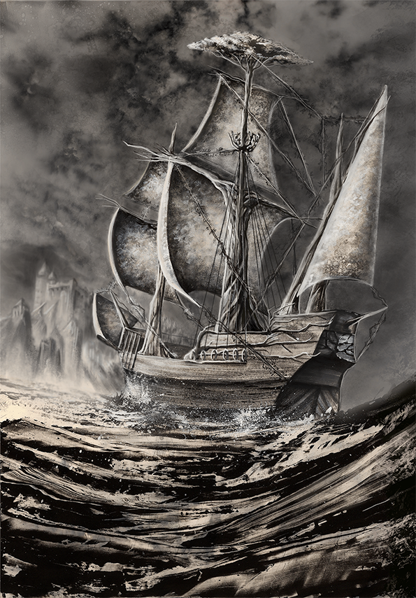
-
@jennymwine I think this image is wonderful. Hard to say if it's professional. Depends on on taste. I've seen published work that I think is horrible...but they are professional artists. Also you might want to post a few more pieces of work to get some good crits. After all an agent or an art director is going to look at your entire portfolio not just one piece. That being said I think this image is very eye catching and there are a few different stories going through my head when I look at it.
-
@jennymwine I think I would answer yes to all three of your questions. It makes me wonder what this boat is, and why it has a tree for a mast, and if it's possibly alive somehow? It's really a neat idea, and also a very atmospheric piece.
I agree with @evilrobot . I've seen a fair bit of professional work that I don't like at all, so I guess everything is subjective.
-
@jennymwine It is certainly a very beautiful image that shows a high level of skill. As for professional, as @evilrobot said that is highly subjective.
First of all, professional what? Depending where you're sending this postcard it might be the completely right or wrong style. It does look a bit older than say for children's book illustration. I could see this image in an illustrated novel, something a bit older but with pictures. They often have these black and white illustrations in them. And again as @evilrobot said much of it is going to depend on your entire portfolio as a whole. You want to make sure your postcard image shows a style that you want to draw in the most, and that is representative of what they'll find in your portfolio. You want your portfolio to show a variety of subjects, but in one strong signature style that is consistent throughout the whole portfolio. This image intrigues me but I'd need to see more because if I'm an art director I'll ask myself "Ok but can they do color? Can they do characters?" etc. Also while you're obviously very skilled at landscapes, be careful that your portfolio does show a lot of characters. I made this mistake the first time I sent my portfolio: I'm very well-versed in perpective and decided to show that off with grand illustrations showing detailed and impressive backgrounds. Result: I was told by multiple people that I didn't have enough emphasis on characters in my portfolio, and that while backgrounds are important, in a children's book connecting with the characters is everything so art directors NEED to see your characters in your portfolio more than they need to see your backgrounds. Again it depends what and where you're even applying for, you didn't specify what genre and target audience you're aiming at...vanessastoilova.com
instagram.com/vanessa.stoilova/Check out my Youtube channel for tips on how to start your career in illustration! www.youtube.com/c/ArtBusinesswithNess
-
@evilrobot Thank you so much for your feedback! Posting more of my portfolio for a more informed critique is a great idea.
-
@NessIllustration Thank you so much for taking the time to give me such great feedback!
My previous work is mostly full color character illustrations geared toward the table top gaming genre. (Example below.)
Currently, I'm focusing more for a fantasy young adult genre. I'm really influenced by Jim Kay's earlier black and white work and Patrick Arrasmith's work on The Last Apprentice series.
Do you think postcards featuring character work might get a better response from editors?
Thanks again. I appreciate your insights!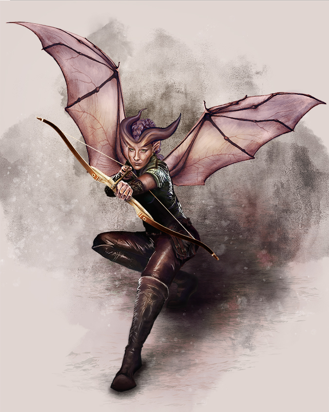
-
@jennymwine I think it depends which companies you are applying to even in tabletop. Last time I bought books the lower tier publishers often did black and white for most of the books and the first piece is really good, so I might go with that one. I've heard wizards it's characters for dnd and scenes with a full environment for MTG. It seems like you may be aiming the first tier though? Maybe independent publishers and such? I think B&W could suit there. The first piece could be part of a pirate adventure or lore book.
-
Oh wow your work is incredible! Definitely looks professional to me, but like everyone has said it depends where you are sending your postcards and what you're aiming for. I don't think this style is suitable for young children, but maybe for young adults or graphic novels! To me, your work looks perfect for game design/fantasy art etc, are you on Art Station? Your work would fit in well on there
")
-
@jennymwine your work is definitely of high quality.
-
I think your art is to a very high standard - it depends on what you want to pursue with it. I definitely agree with game art or concept art, your art has a very strong filmic quality to it. I think the second image for a postcard would be stronger - just to ask, do you have a piece that has a character in a location or as part of a story? It would be cool to see the winged character on a ship or in a battle.
-
It's beautiful. Very classy. Keep up the work.