Rapunzel - color and composition?
-
Looks very good! - i think the extreme twist in the horses neck is making it difficult to reconcile with the anatomy - i think filling out the area where it seems to taper in the front will really help - if you twist a straw too much it will collapse on itself - that is the effect the taper is having for me -
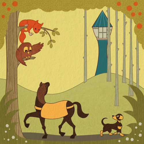
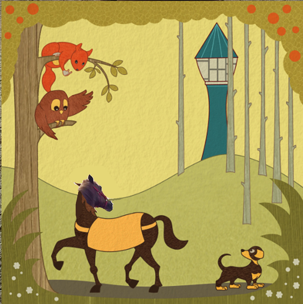 - i did a quick cut and paste on the horse to show where i am talking about filling out the form - i see that you reduced the sharpness of the owls' left wing and i think it does looks better - i reduced the sharpness in the owls' right wing and added a slight bump where the alula feathers reside on his left wing just to go a tiny bit further with it - looking back at your original color comp i see the horse looks very good - the gesture has a lot of life to it - i think the neck of the original comp looks great and the head looks good also - one other thing that works in the original is the legs of the horse look very elegant - but on the newest version there are large nodules at the knees on two of the legs - i think the lighter anatomy of the original looks really nice - if you google "carousel horses" you will find some excellently carved examples of dynamic anatomy for horses - same with the dog ..the gesture has so much life to it in the color comp....the dog and horse both look as though they could dart across the page and be gone if we look away in the comp version....it could be that the feet are too grounding - that the hooves and the paws are too large or too flat to the ground -
 -
@Kevin-longueil
Thanks, Kevin, good that I can always count on your fruitful critics.") I can follow all your points.
I can follow all your points.
You did a very good job on the owls wings. You have no idea how long I played with the wing pointing to the tower. I felt that the connection to the body is somehow off, but I could not find the solutions. Yours looks really nice.
You are right, the horses neck looks much more elegant in the sketch and the dog is not that static. I will work on that.
Many many thanks! -
Your color comp horse and dog reminded me of this beautiful carving... simple elegance of form and gesture
 - i'm glad you are not feeling harangued by my feedback - i really do enjoy your piece! you have a lucky lab mate!
 -
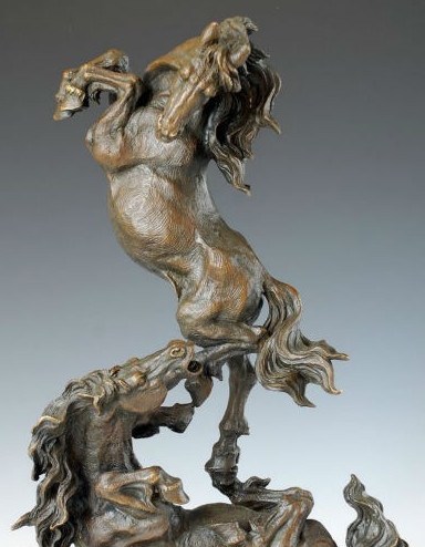
That is indeed a nice flow in this work! It reminded me a bit to some sort of art nouveau. You might also like this art nouveau sculpture:
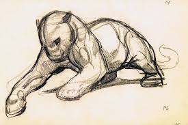
Do you know the art of Paul Jouve? He shows also some nice elegant poses in drawings and sculptures:
-
Had not heard of Paul Jouve - i just checked out his work - amazing draftsman and sculptor! - thank you for sharing.
-
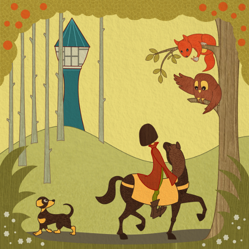
Here my newest version with a more elegant swing in the horse neck (hopefully) and more motion in the dog. Any comments?
-
@Jana Hi Jana! One thing I noticed that has changed from your original to the more refined versions you have been working on is that the birch like trees (near the tower) are now completely straight up and down. But in your original sketch they had subtle bends and curves to them which I thought looked quite nice especially against the very stoic tower. I wonder if you might consider putting some of those little bends and curves back into them to create the subtle variation and interest?
-
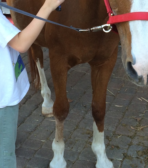
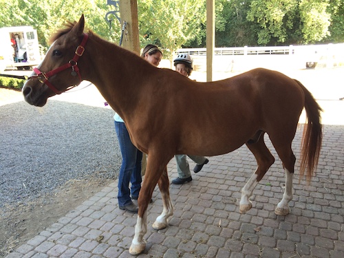
The neck and wings look good! and the dogs feet look much nicer to me also - the one thing i keep getting stuck on is the horses anatomy - if you look at a horses from leg from the front it will have that very round look that you have given the front leg that is planted on the ground - but when you look at it from the side it is not so round in its silhouette - there is a lot of roundness in the bones from the side for sure - but the circles at the knees seem oversimplified compared to the level of abstraction of the rest of the drawing - ... the back leg also keeps pulling me back to it and seems off - here is what i think it is - these are photos of the horse my son is learning to ride - if you look at the back leg that is raised off the ground of the horse (in the photo) the upper part of the leg points backward before it makes a bend and comes forward - in the drawing you are not showing this - i think that it gives the horses a strange comical gesture as though he is lazily sweeping his hoof forward pretending to be human with his knee bent the wrong way - if i cover that leg with my finger this is corrected - if you are happy with it the way they are though let me know and i won't mention them again - it is looking good!
-
@Kevin-longueil I don't know how you do it, Kevin, but everytime you point to some issue, I can directly see the problem. Why I don't see it before?
So please, keep on pointing to things you see. I can just learn from it. For sure, I will work on the horses legs. Thanks!
@Rich-green Thanks for your feedback, Rich. You are right, the trees have a different style. I will try a version with shapes, which are more similar to the sketch. It is worth, comparing these two options. -
It is difficult for me to see my own work clearly too after a while - I think that is where flipping the canvas horizontally really helps - or holding a painting up to a mirror (I'm sure you know this) - very helpful to have an extra set of eyes - one thing I just noticed is the possible tangent between the squirrel tail and the owl head - in the color comp there is a nice negative space between them - I would possibly try curling the tail a bit away from the owl's head (possibly point it subtly toward the tower too) and giving some space between them again and see what you think -
-
After many (sad) days without drawing, I finally found some time to work on Rapunzel again. Following Kevins (@Kevin-longueil) advice, I made some changes at the horses legs. I guess it is better now. After switching the whole image, I liked the switched version even more than the original. So I keep on going with the new version.
In a tutorial I learned that if the character moves from left to right, the viewer is moving together with the character, because we read an image from left to right. There is a positive connection so to say. But if the character moves from right to left, there is a confrontation with the viewer. Which can cause more negative feelings. What do you say? Can you follow this argumentation? For this piece I have to say, I feel much better when I, as a viewer, move together with the horse. It is more like making the same experience as prince and horse. Or is this total rubbish?
")
-
Looking great Jana! - I believe what I like about the first composition is that we discover the tower the same way the rider does - we move our eye from the squirrel to the owl to the horses head to the riders head and then to the tower - with it flipped we see the tower first then go to the riders head (seem to skip the horses head entirely)then to the owl then the squirrel - and back to the tower - I both the dog is discovered slightly later which is fine ....anyways I don't disagree with anything you wrote but I though I would share how I am reading it
- beyond that the horses legs look good! - sorry to keep going back to your original study but I think the gesture of the rider and the scale of the rider really looked nice in that color study - in this new version the upper body of the boy is too long - I understand that he may be "posting" in the stirrups but I think he reads as too big somehow - the head stands out to me as being too large also...I know it is his haircut but I though I would just say what I was seeing - once again i'll point back to your color study - it looks correct there and also the negative space between the boy and the horse looks very nice in the study also - anyways it may just be me so feel free to ignore! ...really looking nice!