Carrying out a second fall idea and looking for critique
-
@lauraa I really love how you have reworked the image. There is a lot of great movement and life to it. The gesture on the dog is really cute!
-
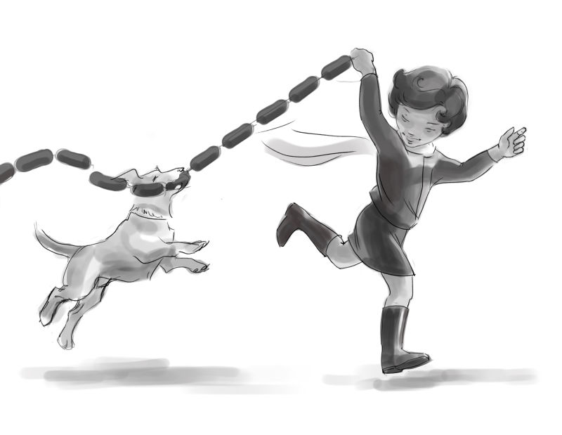
And a quick fix, because my daughter pointed out that if the dog is biting the sausages, they're going to be taut. Still have to work out the details, though...
...who knew that illustration would require working out the physics of sausages?!
-
@burvantill If I go back to that version, I'll work it out. The original idea was that the arm was bent in, and thus foreshortened, but if that isn't evident, it means I didn't draw something right!
-
@lauraa I like this version a lot and kudos to your daughter for catching the physics of pulling on sausages!
-
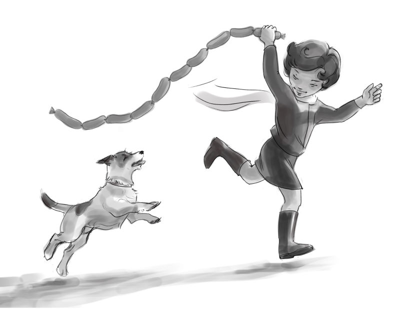
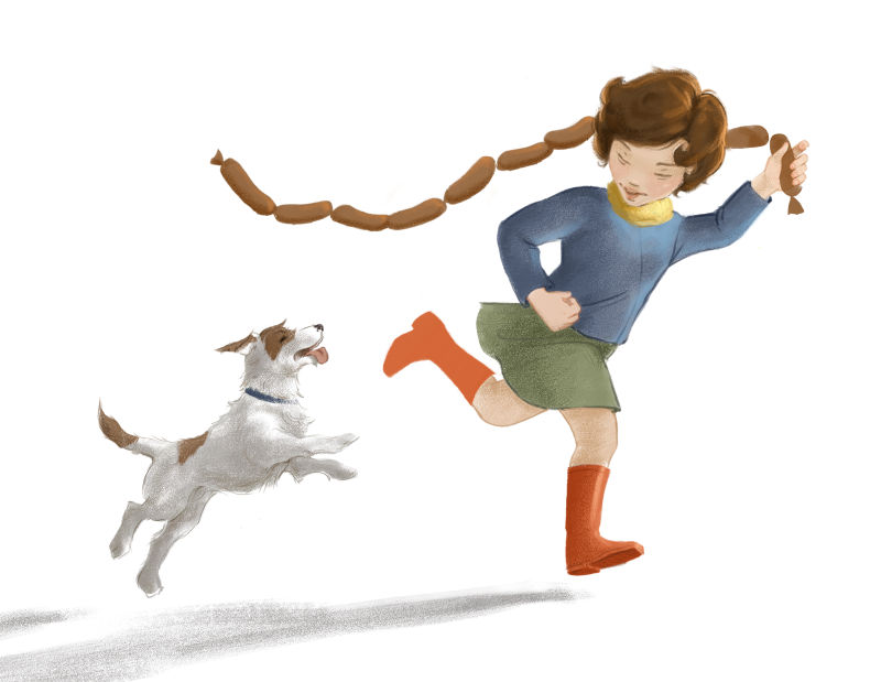
Thank you for your patience and help guys--I'm uploading yet another version! Something about those taut sausages was attracting too much attention for me, so I worked out a version with the dog jumping at, but not reaching, the sausages.
The sausages are tighter and jumbly-er, but in my research on the physics of flying link sausage (a limited field indeed) the string of sausages always curves a bit and acts as a whole.
I also decided that the POV is low enough to the ground that perhaps we really can see under her boot.
Any other critiques you'd like to make before I move on?
Boy, is it ever going to be satisfying to move on to color and texture on this thing! But I think that in the process, I am learning to draw much better from my imagination. And that's kind of the point, isn't it?

Thanks so much for your help!
-
@lauraa You can see the dog's face better in this version too. I can't wait to see it colored!
-
@lauraa really like the updated version! The movement is more dynamic, can’t wait to see color
-
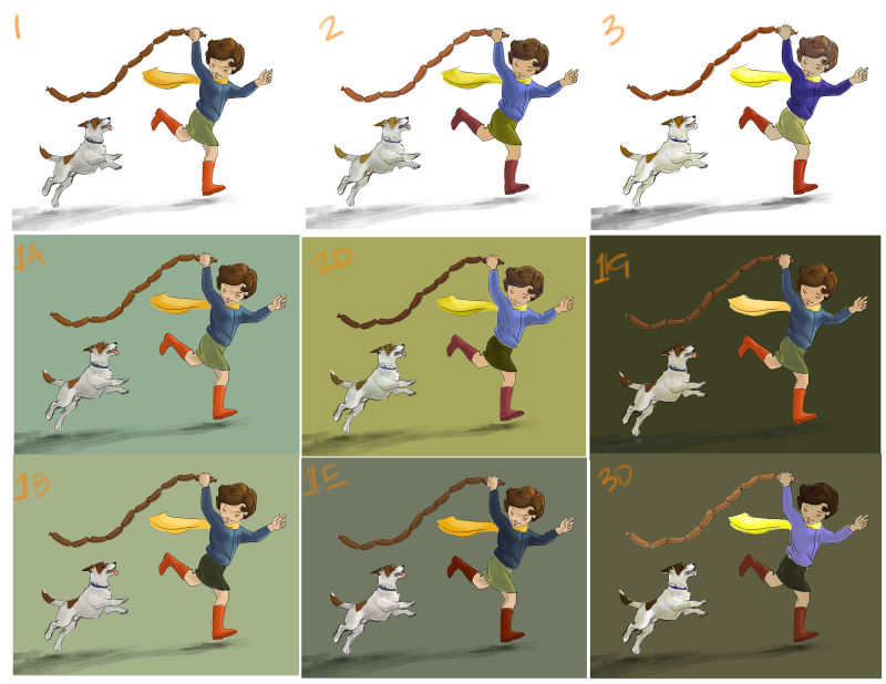
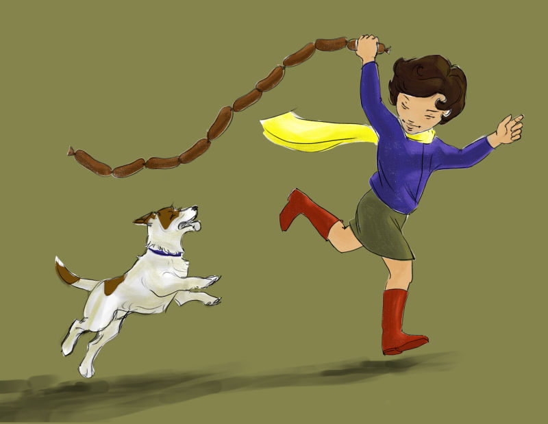
Color studies! Below I have posted three basic schemes at the top with white backgrounds, and then variations on each labelled 1, 2 or 3 plus a letter. Because I had one left over and have little time, I'm posting a final choice below as a separate .jpeg. Its number is 3f. Pardon the sloppiness of the layout but knowing my working time was coming to an end for the day, I wanted to get this in today for some feedback. Your feedback is valuable to me!
BTW, I checked all of these in B & W, but I admit I have a weakness for similar values of red and green vibrating off one another, so I left some pretty close. Is that a deal breaker? What do you guys think?
Looking forward to getting your opinions! Knowing I have way too many choices, I tried to make it as easy as possible to compare. Thank you so much!
-
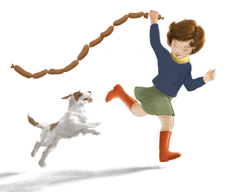
Since posting, I have gone back and redrawn the figure, redesigned things, etc. As you can see, I haven't redone the shading on everything yet, but I am really struggling with taking this thing to finish, so I thought I'd post again since I have to take a break now anyway. Am I missing something fundamental here? Especially something about the whole composition and pose? This is the part I struggle the most with in my process, and I wonder if it's because I'm missing something crucial at an earlier stage. Thoughts?
Added: I guess an additional question is, given that I've gotten so far away from my thumbnail and original sketch, maybe there' s something going wrong with my thumbnail or sketching stage?!
-
Hi Laura, I am very impressed by how you well you've improved the image from the first sketch to the final colored version. The relation between the dog and the girl is much more dynamic, it works also better without the scarf. However I wonder why you changed the hand holding the sausages and the space between the dog and the girl?
-
@Julia I changed the hand because there was something really awkward in that arm, and I finally decided it might be that the running pose necessitated that the arm be in more of a typical running position. But there's still something about it that doesn't convince me. That's one reason I posted!
The space was because the figures looked a little lost in the white space to me, so I made the girl bigger. But then that necessitated bringing the dog closer. Also, it might make it look more like he's about to get a sausage!
-
@lauraa To me, the other arm worked better because I imagined she was suddenly holding the sausages higher, which in turn made the dog jump. With the other arm, there is more distance to cover and the sausages are probably too heavy to fly over the shoulder with this type of curve (unless she runs very very fast in a strong wind!). I would be interested to know what the others think as I am by no mean an expert in composition and in motion
") Good work though, the dog and the girl really work well together.
Good work though, the dog and the girl really work well together. -
@lauraa if you read/buy the book Understanding the Invisble Art of Comics by Scott McCloud, there is a whole chapter on time frames - It's a comic about sequential art. In there is a section on action lines from those used in Europe through to the US and then onto Japanese influences. This is a great help for creating motion and the understanding the illusion of motion in a static image. Worth a read. On the front cover there's a quote by Neil Gaiman "You must read this book." So I bought it.
-
@julia I tried the arm up version again with the other changes I'd made and it just felt all out of balance to me. So here's a version with the other arm down. What do you think?
-
@sigross I looked up this book, and it seems it's something of a phenomenon. I may have to order it! Thanks!
-
@lauraa it looks better to me! but if it doesn't look right to you, then don't listen to me
") Let's see what others think!
Let's see what others think! -
@lauraa It definitely is. I'd have learnt a lot more in school, if all textbooks were written in comic book form. The illustration is coming together well. Can I make a suggestion for the dog - if he is moving to keep up with the girl in full stride with his tongue out then I think his mouth would be wider open. With the tongue flapping further up the side of his face. Like a scarf in the wind. Or a flapping string of sausages! Maybe even showing him licking his top lip a bit as he smells those sausages.
-
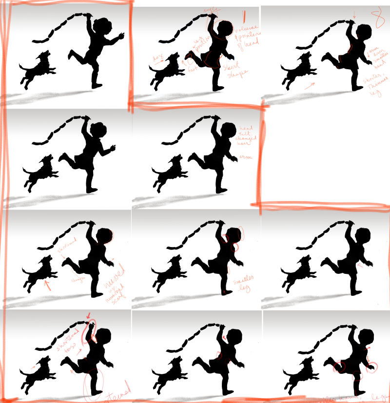
I thought this might help someone. I did silhouette studies all week. It was a busy week with a lot of tech support, so I kept having to walk away from the silhouette, and when I'd come back to it, it was fresh and so I'd make changes. I think it's a lot better now--it was way too top heavy before!
You can see the progression inside the boxes outlined in red, and then the first and last versions with the arm down at the upper right. I also made notes on what changed each time. It was time consuming, but I really want to learn from my mistakes.
Now, the trick is, how do I learn to spot these things earlier and save myself some time and a lot of agonizing?! I keep posting updates on this piece because I'm really trying to work through my process and how I can improve it. I hope it might help someone else as well. As usual, suggestions welcome!
@sigross Though you can't see the change here because I kept pasting the same dog, I did move the dog's head up, and when I start redrawing I will also look at the position of his mouth and tongue.
-
Thanks for sharing the process of this... really it's so helpful to see. The idea just came to mind, if you've been searching for good reference photos for this, I wonder if searching for, "running with umbrella" or "running with kite" could help find poses that could assist in ironing out the final draft of your design. I am inspired by your persistence to get this to a place you're happy with! Duffy Sheridan is one of my personal inspirations, and his philosophy is to fix something as soon as he senses a problem, even if it's slight. Looking at his art, it's pretty clear that the results are a product of that idea! Duffysheridan.com