Composition Question
-
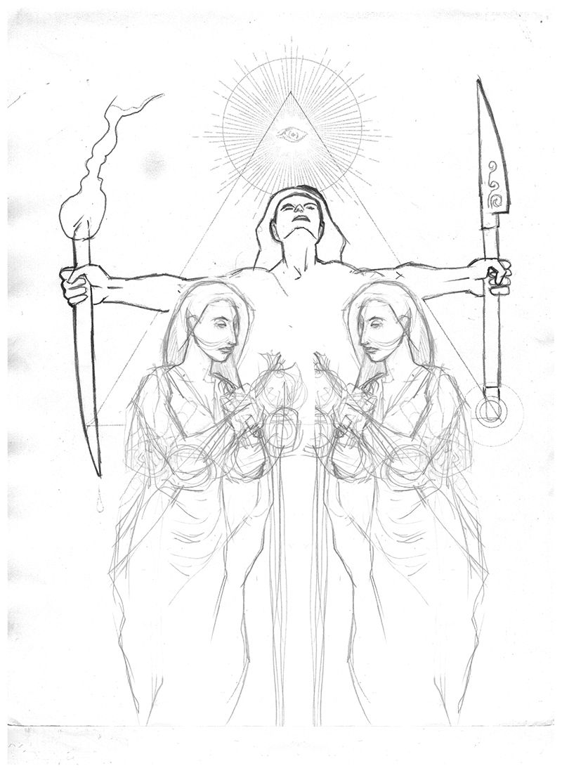
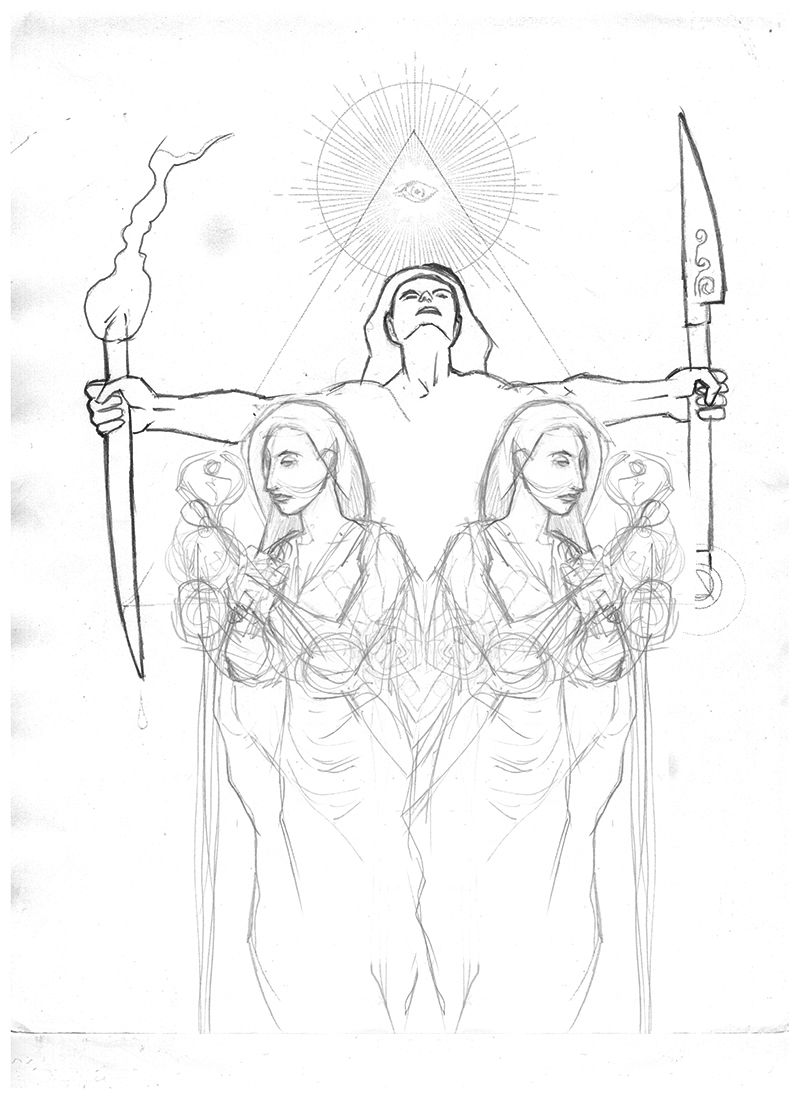
Hi, I am working on a piece where I am exploring a more cryptic design. I am happy with the middle and top of the design but not sure how I should pose the two characters(guardians?) on the bottom. I am not sure if posing them inward or outward convey any significant and or different feeling/meaning to people. What are your opinions? Also does the different compositions direct the eye in any particular way? i.e. open or closed, flowing or static, etc... It would be nice if there is a discussion on this. Thanks.
-
I think the sightlines created by the women draw the eye away from the image. I would go with the top.
-
I agree, I think the top keeps the focus in on the image.
I would suggest making the women slightly asymmetrical in their posing- just subtle variances in their arm poses/hands to add a bit of interest.
This piece is right up my alley, and I hope you post progress of it.")
-
I think that it depends upon the narrative you want to offer:
You have a good start and are featuring some tricky things to draw - a foreshortened face and hands (kudos for not hiding hands!). I think it is successful for sure.
If you want the audience to think of this ritual as personal, exclusive, intimate and a little creepy- then make the two forms face one another. Their close proximity also speaks to intimacy. The character in the middle is looking away and makes me think he/she is leading the ritual and that the two facing each other may be helping or even the subjects of the ritual.
If you want the audience to think of the ritual as more of a service or performance in some way, then facing the figures away from each other might do the trick.
One unsolicited note: I feel like, since this piece is looking overwhelmingly symmetrical, it would be nice to see differences in the two figures. Different poses (related, but different), different hair and even skin complexion... just something to break up the symmetry. I think my shrink would concur, I am a big fan of imbalance.
-
Hello! To me, it would be stronger if the character in the center was slightly bigger (more imposing). However I know nothing to composition, it is just a feeling. Good work, I am looking forward to seeing the finished piece.
-
@julia I wanted to take a moment to discuss your compositional comment (and hopefully boost your confidence as it applies composition). I might be taking this more seriously than you intended, but I really think it's important.
In my opinion, composition serves one function: To make the viewer FEEL something as they look at an image.
Ideally, the way the viewer feels is a result of all the various choices the illustrator makes as they are creating the image. Ergo, the illustrator needs to have a feeling in mind (I refer to these as "keywords") as they make those choices. Every choice, the image size, subject matter, composition, color palette, shape design, even the medium used, should be working toward that feeling (the keywords) the illustrator wants the viewer to feel.I think it is always better when the illustrator asking for a crit indicates the keywords they are going for. But quite often that doesn't happen. In those cases it falls on the critiquer.
In your comment you indicate that you looked at the image, it made you feel something and you generated a keyword from it. "Imposing". You then suggested a compositional change that in your opinion would better communicate that keyword.
Congratulations! You have a firm handle on composition!
It is now up to @alexsen to decide if "imposing" is the keyword he wants to communicate. If so, he's likely to use your suggestion. If not and he really wants to communicate "friendly and delicate" he's likely to go in the opposite direction; to make the central figure smaller and possibly even change the pose. Either way his piece is one step closer to communicating the intended feeling.
-
@davidhohn Thank you! Your explanation does make me more confident to take part in discussions (I love reading the critics from the experienced drawers when someone asks advice on WIP). It also teaches me to be a bit more thoughtful about my own work!
-
Thanks everybody for your comments!
I actually started with a asymmetrical design but I felt it was not cryptic enough.
I was struggling with having them be less happenstance and more ritualistic and more intentional/purposeful in nature. I have included my original sketch so you can see.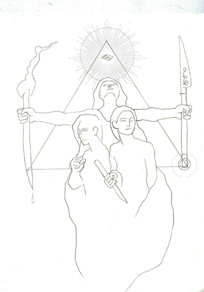
The asymmetry made it feel too unstructured to me, I think it might be because the variation made the design less symbolic and unintentional. I realized that I needed more order in the picture.
If your wondering where I came up with the idea I am basing my ideas upon gestalt theory and qualities such as unity, order, closure - consistency and repetition of elements creates more order and structure, but in doing so, I think it loses spontaneity and dynamism.
But I understand what you are saying, I think that is why I am happy with the top of the image, it has one knife/torch up and one down it is slightly asymmetric but still balanced
Recently while doing some research I found this symbol which is the mathematical symbol for congruence - meaning something that is the same but different - which is what I was thinking of when I did the initial rough. I think this is what I want to express achieve.
I am putting some symbols in to the design but not sure if it loses something when I add it.
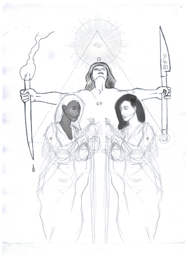
Is the omega symbol, yinyang, or congruence symbols making the piece too tacky?
Does anyone have any ideas about this? -
I like that you're adding the symbols, but the omega and the yinyang just seem kind of placed there. Is the congruance symbol on the blade the man is holding? I like that one because it seems like it was built into the ritual - it's on a tool.
The ladies look like an appropriate symbol of yinyang without being overtly obvious. Maybe find a way to make the omega a more integral part of the ritual - an arc of stone around them, or a necklace around his neck, or wrapped cord around all three of them with the symbol on it - just spitballing ideas here.