Advice on Foreground Character Placement
-
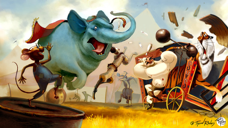
This is an idea I'm working on for this months "Biggest Fear"
I need advice on my mouse in the foreground placement. I am hung up and not sure as to which looks better. Any advice? Thank you in advance.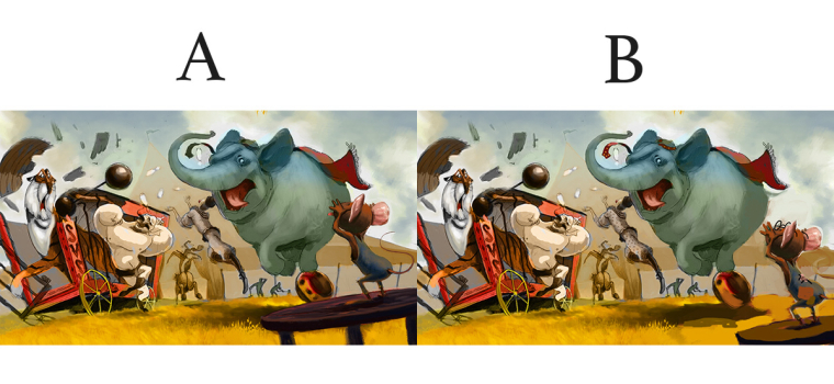
-
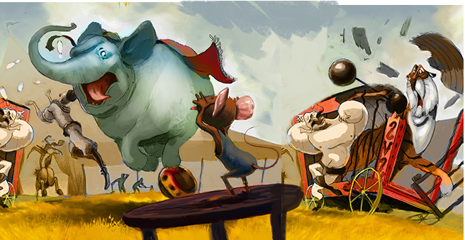
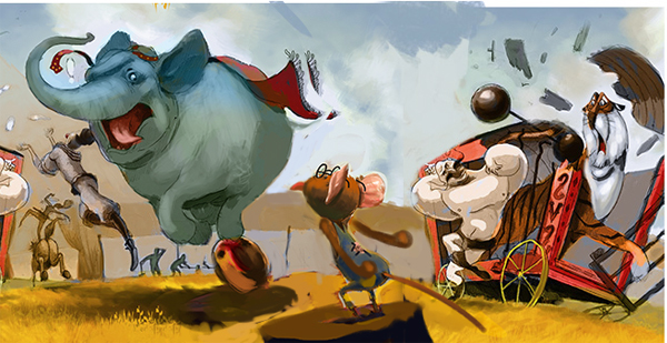
Hard to say. I think you get a stronger silhouette with option B, but more depth with option A. Really nice illustration!
-
hi Tyson, This is a really good concept. Try and push the mouse and the elephant , cause they are the vocal point. The Tiger cage and all stuff around it take a lot of interest, witch you don't want. Perhaps turn the comp a bit? Again, love the concept and your rendering is great!
Leontine
"A picture is worth a thousand words."https://leontineillustrator.com
https://www.instagram.com/leontine.illustrator/
http://www.facebook.com/leontineillustration -
What a fun scene! I think the mouse looks better in A, because in B it almost looks like he's waiting to catch something that the elephant is going to um, drop, from his backside
")
I got a little distracted by the placement of the figure by the elephant's mouth, though. At first I thought the elephant was dropping something from his mouth. Maybe consider moving him slightly to the left so there's a little space between him and the elephant?
Anyway, lots of fun things going on here!
-
Hmmm, I'm leaning toward A, but wonder if you can make the silhouette stronger by lightening up the area behind it? Like there's dust or something being kicked up by the elephant and it's catching the light. That way you keep the depth and the silhouette.
-
I like "A" because "B" is too close to the corner if you use "A" I would go much darker with the mouse or lighter with the elephant (have some fun and make him a pink elephant). As an alternative I would consider flipping the mouse and putting him below the cage wagon and having him very dark with a clear silhouette and move the elephant to the right slightly lining the characters up on the thirds
-
@tyson-ranes First of all, what a wonderful illustration. I really love how unique the characters look and the idea as well. I can't wait to see how you polish this off. So I totally agree with @Leontine, the composition looks much stronger with the lions cage on the right. I get a grander sense of the surroundings and better sense of this area being populated . Plus it creates a great central focus on the mouse.
However I would use B as the separation creates a clearer silhouette of your leading character. One more thing I would edit is the hand placement of the mouse. I didn't really get that he was doing a "neener neener" at first because the tongue looked like a pinky at first. You can get the same idea while playing with his hand/arm placement. Heres a quick paint-over but I'd say the shape of your silhouette isn't as strong as it could be. Lasso the little guy, change to black and see if you still know what animal he is.
Awesome awesome awesome start!
-
P.s. I'm really digging how you've warped that tiger. Works super well with his pose and expression.
-
@bradayoo Great advice!, I think now the composition has been improve a lot.
")
-
@leontine , @bnewman , @kat , @TessW , @rcartwright , @BradAYoo , @Jose-Ramos
Thanks all y'all for the responses and help. I am super tied up with other work and have had pretty much zero time to devote to this project and replying, but just reading everyones perspectives Im actually more confused as to what the right placement is now. Most of the time at a point I will have a strong conviction as to the proper look of the composition whether wrong or right, but like I said I seem to be more unresolved with this particular project. I hope to get the time to work on and finish this in time. If anyone has anymore direction they feel strongly about it would be greatly appreciated. I am still stumped how to make it work. When I reposition certain images it seems to create a new range of issues to the overall comp. -
This is a very beautiful piece, full of action and energy, I really like it. Some random suggestions for potential improvements:
- Definitely better with the silhouettes clearly detached (option
")
- Consider clearing up the hand and arm action of the strong man. It does not read well at moment. I actually had to look three times to understand what the white shape was. Maybe the tiger could be also clarified a bit.
- Is the elephant in rage because of the mouse teasing him? That definitely does not come across. The mouse looks like a spectator to the rage of the elephant and is not a first read either (the elephant is seen first, followed by the strong man.
- Movement direction normally works better from left to right in the Western world, because we are primed by text reading direction.You could try simply mirroring and see if that works better. Also the position of the moving entity (at the "beginning" of the page with lots of space in front of it or at the end of the page and moving out of it) tells different stories. If the mouse has caused the elephant rage, then you may definitely consider to put the elephant running "out of the frame" rather than into it.
- Definitely better with the silhouettes clearly detached (option
-
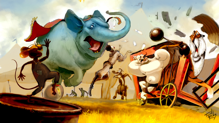
@smceccarelli thank you for the advice and encouragement. I am half asleep right now but here is an update taking into account all that was said post replies. I flipped it so its now moving left to right and strengthened the silhouette of my mouse. I still got a ways to go but I think the placement will stay as is for now. Thank everyone again. Its not easy being cheesy. I realize I cant hit all the notes so at this point mainly because the ay the comp started. Hopefully I will end on a good one with this piece.
-
These are fantastic wow such great energy!
-
I believe this might be the final. I'll be looking at it and critiquing the daylights out of it although this lil guy needs to be put to bed already.
-
@lmrush thank you! Very encourageing, this illustration has been somewhat of a wrestling match.
-
Great to see that all the adjustments worked so well. I really like the final image. I particularly like the tiger.