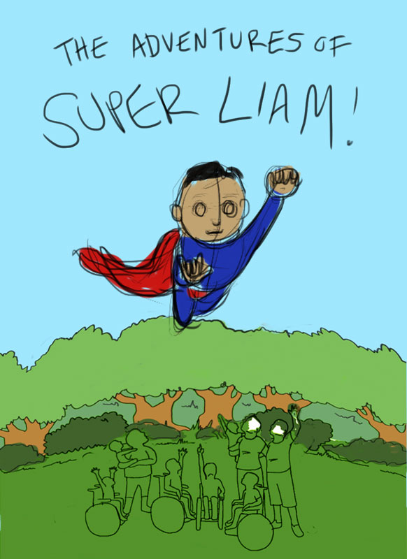
The Adventures of Super Liam Feedback Please
-
@marsha-kay-ottum-owen Yes, the eyes aren't going to stay like that LOL. Just trying to get a sense of color and layout for now. I see what you mean about his hand, I will fix that. Thank you so much for checking it out!
Jess
-
My heart goes out to Liam's family. Very sad.
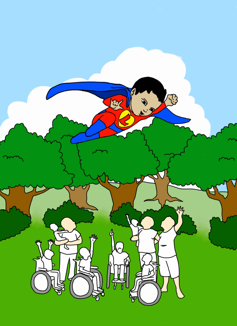
Ok, here's my two cents. I think Liam in the story looks much older than Liam in the photo. Is this intentional? Overall composition looks fine but you could make some improvements to be slightly more dynamic. The kids in the wheelchairs on the ends are good as they are in front of others, I would maybe just push the middle kid -- the one pointing straight up -- back slightly so he is farthest away. You could take this approach with the trees as well, just to break things up and make it a bit more realistic. One final nit.. you've got a lot of sky. If you're doing this digitally I might consider playing with the position of Liam, maybe move him up a bit so he's higher than the trees but still breaking that line a bit. As it stands, his legs are too close to the where the trunks meet the leaves. -
@bnewman, I hadn't noticed the age difference. I will work on that, he should look young. I like your idea for breaking up the group of kids and the trees. Yes, the drawing is digital and is in layers, so it is easy to move Liam, but the reason there is so much sky at the top is to leave room for the title. Could I change his position with the trees in some other way? Thank you for your input, exactly what I am looking for.
Jess -
@meilidesigns Ah, the title! Good stuff. Perhaps he interacts/overlaps with the letters in some way. I think once you shorten his limbs to make him younger you will have more room. Glad this is helpful.
-
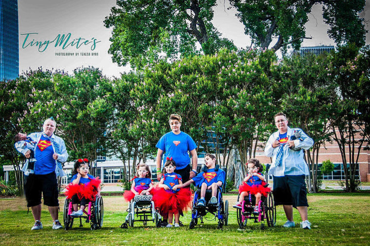
This is Liam's family. They adopt children who are medically fragile, and give them a family knowing that they will not have a long life.
My sister, Kaitlyn and I were adopted from China when we babies, and our family just adopted our 11 year old sister, Joy, from China last year. Joy has spina bifida and uses a wheelchair, so we wanted to help tell Liam's story.
Below is a blog post about Liam's family, written by Tammi Keen, the author of The Adventures of Super Liam.
Behind the Pages - The Adventures of Super Liam
July 6, 2017
His little face filled our newsfeeds every day, collecting hundreds of likes and hearts and smiles from runners and buddies all over the world. Super Liam was our little hero, and we were all cheering for him to overcome the odds and stay here with us just a little while longer.Misty Merideth and her wife, Laura, understand the power of love in a way that few others can. They're not just foster parents, or adoptive parents - they're the family that terminally ill and medically fragile orphans can call their own. They share their unconditional love with the ones who need it most, for as long as their forever lasts. Because they know love makes a difference.
Liam was born with multiple chromosomal duplications that caused countless physical deficits. The outlook for him was grim, and he would need medical care literally around the clock. From medications and surgeries to a trach and a vent to a g-tube and hearing aids, Liam had many needs. But Misty and Laura knew that more than anything, he needed a family to love him and make each one of his days an adventure fit for a superhero.
I met the Meredith family at Liam's Celebration of Life. There was to be no funeral for this little boy, no silent, somber ceremony. That's not who the Merideths are or how they wanted Liam to be remembered. Instead, friends and family came from all around, dressed in superhero shirts and costumes, to feel the love that Liam had shared. Those who couldn't be there in person were there in spirit, posting their photos on the I Run 4 page where Liam and his family had found even more love and support.
I'd been one of those distant fans, watching Liam's story unfold, until the day when I felt the need to reach out to Misty and share whatever I could (which in my case is almost always words). I sent a message and asked if I could send Liam a book. We had recently published "Natasha and the Christmas Wish," and I knew its message about the strength of a mother's love would be one she would connect with. Her response came almost immediately, and when I learned that she wanted to write a book about Liam, I knew why I'd felt so strongly about contacting her. I knew this story was one that needed to be published. And I knew we could make that happen.
When I arrived at the church, though I'd never met any of the people there before, I was greeted with hugs and introduced all around as the writer who was going to tell Liam's story. In the midst of their sadness, this family made me feel like a superhero myself. That's who the Merideths are - people who celebrate the goodness that really does still exist in the world.
While I nibbled on superhero-themed snacks and talked with other runners and buddies and new friends, I overheard Misty explaining their desire to finalize Liam's adoption before he passed away, so that they could have a say in his care and in the final decisions that would be made for him. The conviction in her voice, the importance of being able to provide for this little boy in his final days when no one else would have, taught me more about the meaning of family than I'd figured out in the past 40-something years on my own. It's about belonging, and accepting, and believing so strongly in the value of a life and a soul that you'll move mountains if that's what it takes just to call that little person one of your own.
And that's exactly what Misty and Laura did. Not just for Liam, but for Noah, and Jazmin, and Piper, and Aurora, and Penelope, and Koda, and for Annie, who was already waiting to welcome her little brother to Heaven. And they weren't done. They would continue to give that same unstoppable love to any child who needed them, regardless of their diagnoses or the amount of care they may require, no matter how long or short their time together might be here on Earth. Because that's just who they are. Misty always knew she wanted to be a mom and take care of children in need, and for Liam and all the little ones like him, I for one am so thankful that she followed her heart and did just that.
Liam's story, like Natasha's, didn't necessarily have the typical happy ending that you'd expect in a children's book. But life is rarely as we expect it to be, and that's another lesson to be learned from Super Liam. Every now and then, when it seems all hope is lost, a good thing comes along to show you the power of love. It may not conquer all, but it certainly gave Liam a happily ever after, where he can fly high and free up above, sending sign language "I love yous" down to the family that will forever cherish and celebrate the memory of their little superhero.
-
What a cool project to be a part of. This story is very touching.
I have a few suggestions, some of which are echoing what others have said.
-
I would sketch out several poses before deciding on the final, to see which one works best.
-
Possibly tone down the saturation of some of your green elements.
-
Add in more of the bushes.
-
Possible curve the tree line as you've done with the ground plane.
-
Make Liam's body smaller to reflect his age.
-
Watch for tangents as the family's heads touch the foliage line.
I am not a lawyer, but I would assume using Superman colors are fine, especially since you have changed the logo and have given him gloves. I could be wrong, but I suspect it's fine.
Here is a quick paint over that hopefully illustrates my suggestions, though his body is probably not small enough.
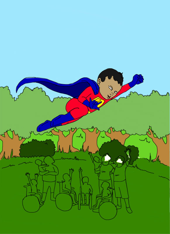
Good luck on this project! You have a nice start.
Website: www.tessawrathall.com
Instagram: www.instagram.com/tessawrathall_art/
-
-
@tessw Thank you for the great ideas!
-
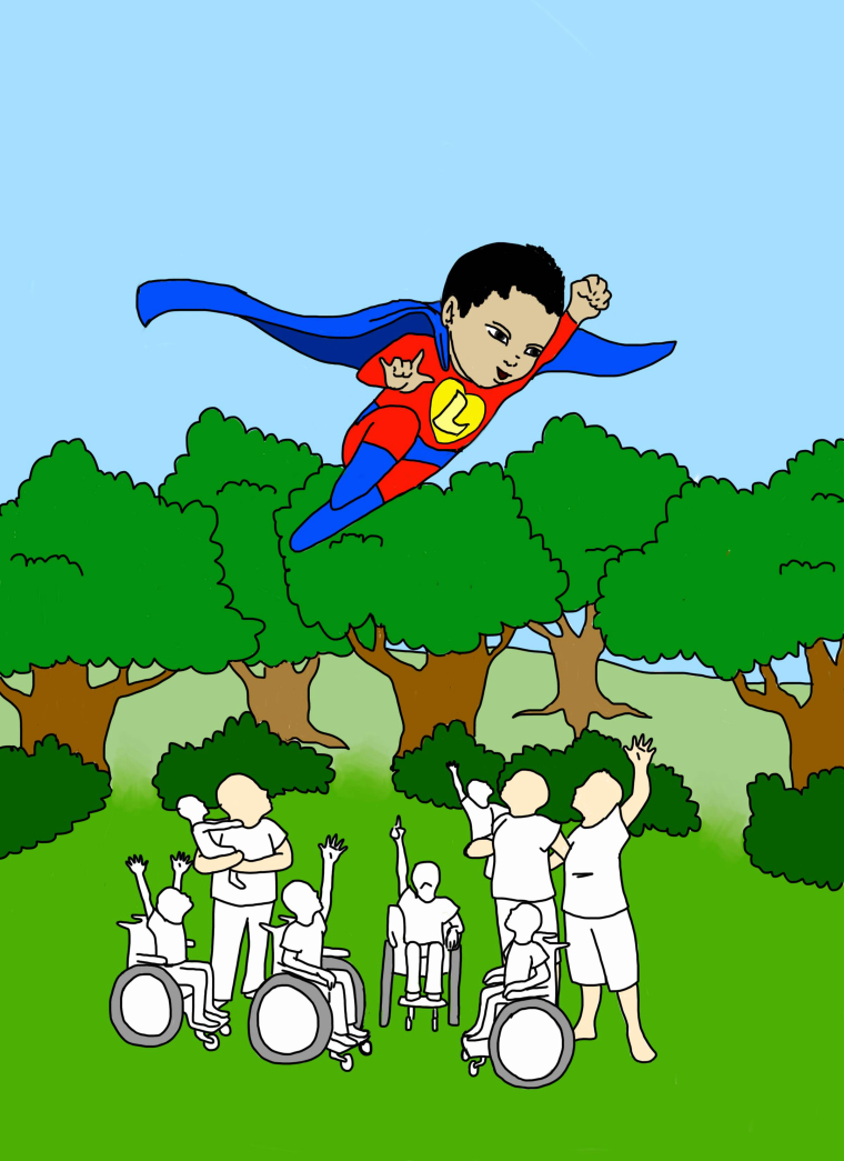
Ok, so I made most of the changes suggested here. I tried to make Liam look younger by making his body smaller, and I broke up the line of trees and pushed the middle kid back as @bnewman suggested. I toned down the greens a bit, and changed Liam's direction. I didn't change him as much as yours @tessw because his family requested that the cover show him looking down at them and signing I love You as he flies to Heaven, and with that position, he was looking more at the reader.
I am still not sure of where in the picture Liam should be positioned - up, down, left, right. I need to make sure there is enough room for the title, and I need to have the authors and illustrators names at the bottom (4 names) so I cant really cut any of the grass out. Is he ok the way he is, or should he be positioned differently against the trees?
BTW, this is only a sketch for trying out positions of the characters, etc. Kait will add shading and details later, so we are not asking for input on details at this time.
So in terms of layout, what should we look at next?
Jess and Kait -
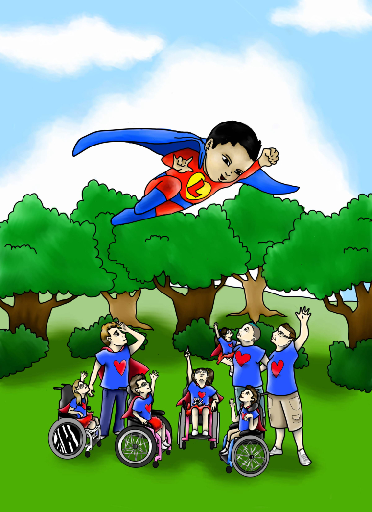
@meilidesigns This is looking good, my only suggestion would be to tilt his head down a bit more so he's looking at his family below.
-
How's this?
-
This post is deleted! -
Ok, so this is the cover now. Is there anything that I should change before I add the title?
Thank you!
Jess
-
Hello, this is a super project! If you want an advice, then probably i would try to get different colour of the skin. This one looks very pale and greish.