July contest: Independence WIP
-
ver 4 is much more dramatic than the others. the perspective and the how big the bird is really tells the story well.
just keep practicing with Photoshop. Grab you some brushes online and play with those
-
@snapdragoon thanks! I wasn't happy with the perspective in the others. Glad you like this one better.
-
@tombarrettillo Thanks! I got a bit carried away with brushes in v3. I think I need a separate project to practice brushes with. Time is running out on this one!
-
@ambiirae Very kind of you to say. Thanks!
-
I like #1 The character design and the colors
-
#4 is the best for me it's a great angle and I think it gets the story told effectively.
-
#4 is the winner for me as well.
-
@bnewman Sounds like we're all on board with version 4. Love the style, love the less background detail - really makes the bird pop. Great job, looking forward to seeing it finished.
-
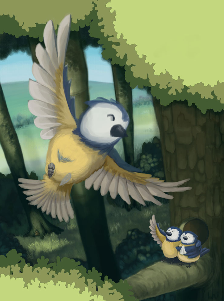
Thanks folks. I've been staying up way too late working on this. Something happened last night, not sure what but I got into a groove and I'm quite happy with the way the parents turned out. Everything is coming together now. Here is where I'm at.
-
Looks great so far. You can add some sun light rays poking through the trees that would really add to it.
-
Looking great!
-
It's coming together very nicely!
")
-
This is such a good piece. My suggestion would be that the white on the parents is a bit bright and the white on the bird leaving is a bit gray. I think if you switch that the baby bird will pop out even more and mom and dad will recede a bit, to emphasize the leaving. Love this one, captures a really good independent moment we can all relate to.