July contest: Independence WIP
-
@jose-ramos I agree
-
@lmrush Thank you!
-
@tessw Thanks! Yes, I shall number them in the future.
-
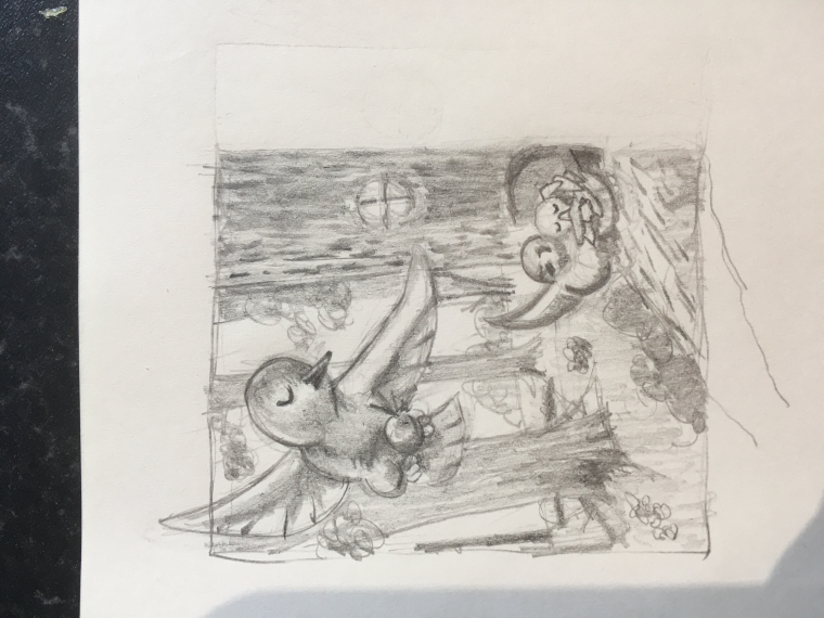
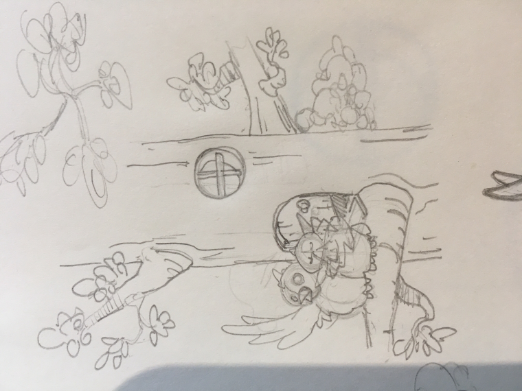
@bnewman I'm assuming this represents the baby bird who left the nest first. I like the ones where the wing break the image plane. Favorite would be 3rd over, 3rd down.
-
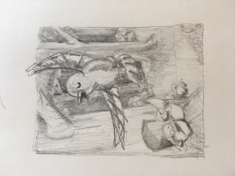
@tombarrettillo You got it. I like this one as well. Basically the same composition as the one above it, but mirror image.
-

This is where I struggle. I'm attempting to lay in value here with the brightest light past the tree line. Reasonably happy with the composition. -

Here's my second with a darker forest background and mirror image composition. -

I quite liked how this detail turned out. -
@bnewman said in July contest: Independence WIP:
asonably happy with the composition.
I really like this one.

-
@bnewman Love seeing the progression of your idea! Can't wait to see the final!
www.facebook.com/LMuggliArt
www.instagram.com/lmuggliart/
www.lmuggliart.etsy.com -
@jose-ramos Thanks!
-
@laurie Thanks! Me too. I'm terrible at finishing but I will do my best.
-
Ok, so I've been learning how to paint with Photoshop. Bought me a Wacom and stylus (had one years ago). Never digital painted before although I know Photoshop quite well. Painting is a whole new animal and I gotta say, I did NOT expect it to be this hard. Even with all the great SVS videos. In my mind I know what to do, but the proof is in the painting. I must have switched styles a dozen times and I reworked the composition. I've spent way too many hours on this so far when I should be doing my homework for the Turbocharging Creativity class. Anyway, I am doing my best to get this independence ill finished. I'm finally at a place where I like the background and I will (must) not paint over it again. Just throwing this out there... comments welcome of course. Constructive criticism is always welcome! I am super impressed with the level of conversation happening in this forum. I wish I had time to participate more. I enjoy seeing and reading about everyone's work!

-
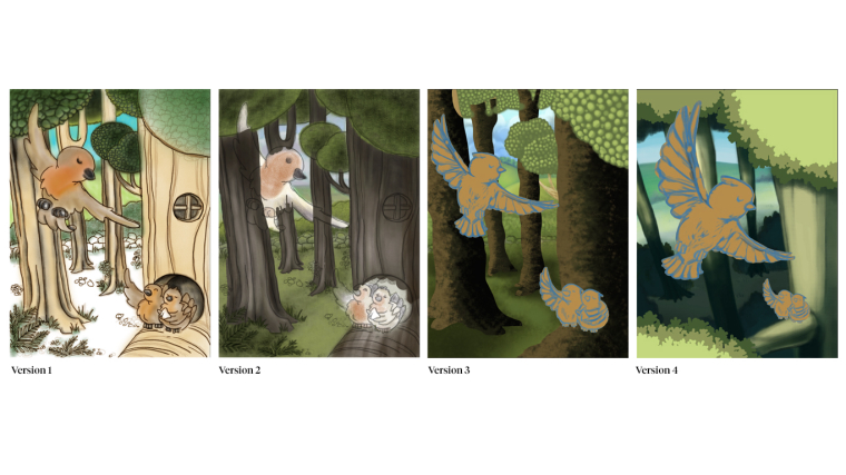
@bnewman I'm really digging the intense perspective and the colors in Version 4! I really get that impression of flying from it, and the warm browns on the bird pop out more against those blueish shadows.

-
@bnewman I really like version 4 as well the colors really pop and the trees are really nicely done
-
ver 4 is much more dramatic than the others. the perspective and the how big the bird is really tells the story well.
just keep practicing with Photoshop. Grab you some brushes online and play with those
-
@snapdragoon thanks! I wasn't happy with the perspective in the others. Glad you like this one better.
-
@tombarrettillo Thanks! I got a bit carried away with brushes in v3. I think I need a separate project to practice brushes with. Time is running out on this one!
-
@ambiirae Very kind of you to say. Thanks!
-
I like #1 The character design and the colors