Draw 50 Things Challenge
-
Hi
I started working on the draw50things challenge. So far it has been really good practice and I surprised myself by how much doing the prep work sped up the actual drawing part.I am at the sketch stage and show my previous stages at the top. Think I am going to do some more neatening up but this is the general layout.
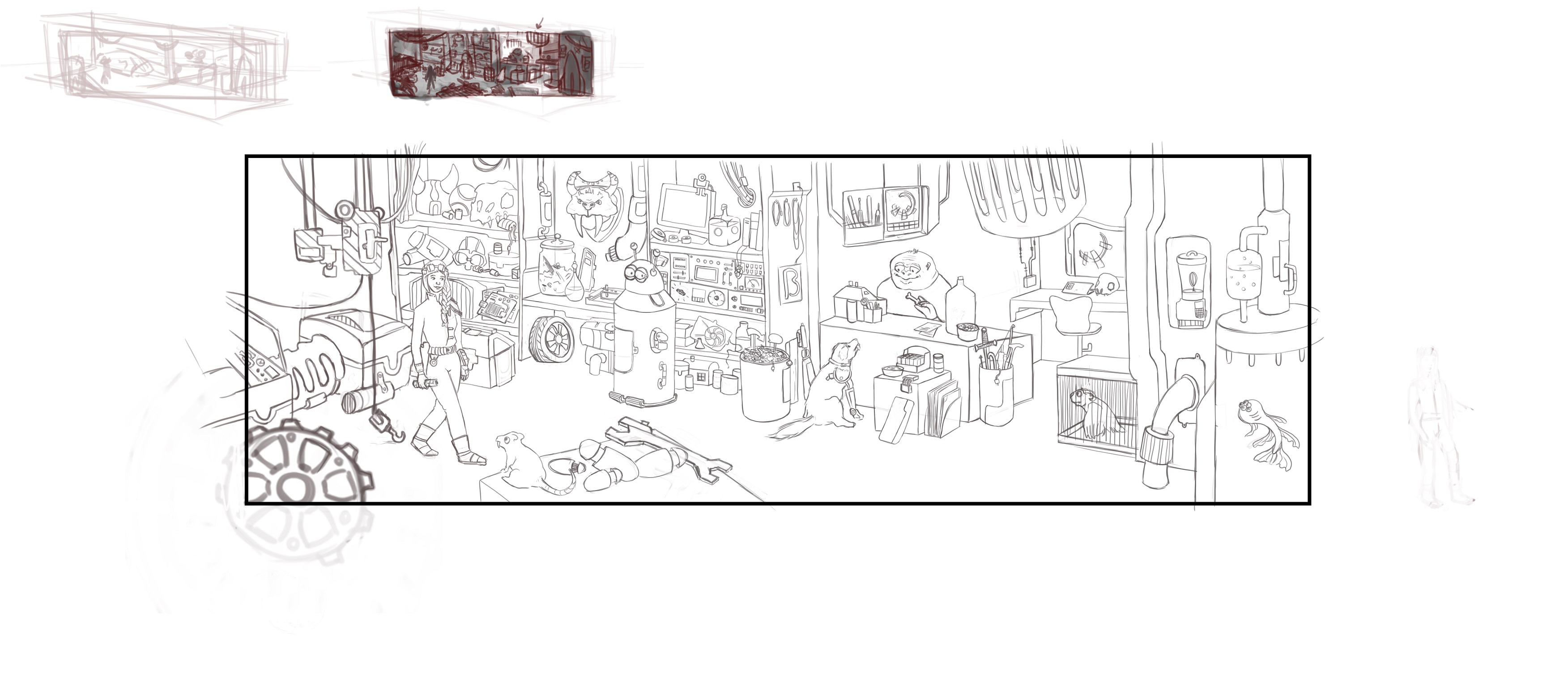
I spent a lot of time thinking about room shapes and planning out angles because it took me a while try something different from what @Will-Terry had done in the demo. I hope having the diagonal across the wall makes it interesting.My main focus will be the figure at the till and the dog.
-
I have been working on adding in tone today.
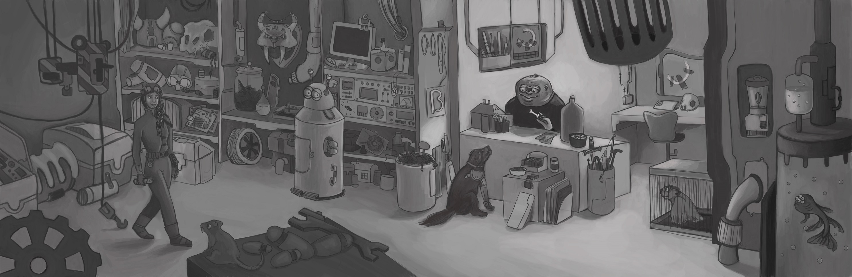
What do you guys think? Can you see anything that needs fixing or adjusting? Is the main focal point clear enough? Do you think any areas are too dark?
I feel like i have been staring at this for too long!
-
It is a really interesting image and I love the concept. Drawing looks nice too. In your value study, you are using only about 30% of the possible value range - this tends to kill your focal point and to make everything look a dull gray.
I have made a very rough adjustement (I am not on PS now, so I do not have all the nice tools that photoshop has!), just to see how the image look with a wider value range.
It would need a bit finer touch, but I think it explains what I mean...It is still not going all the way to black or to white (often not a good idea), but is using about 70-80% of the value range now.
-
Hey
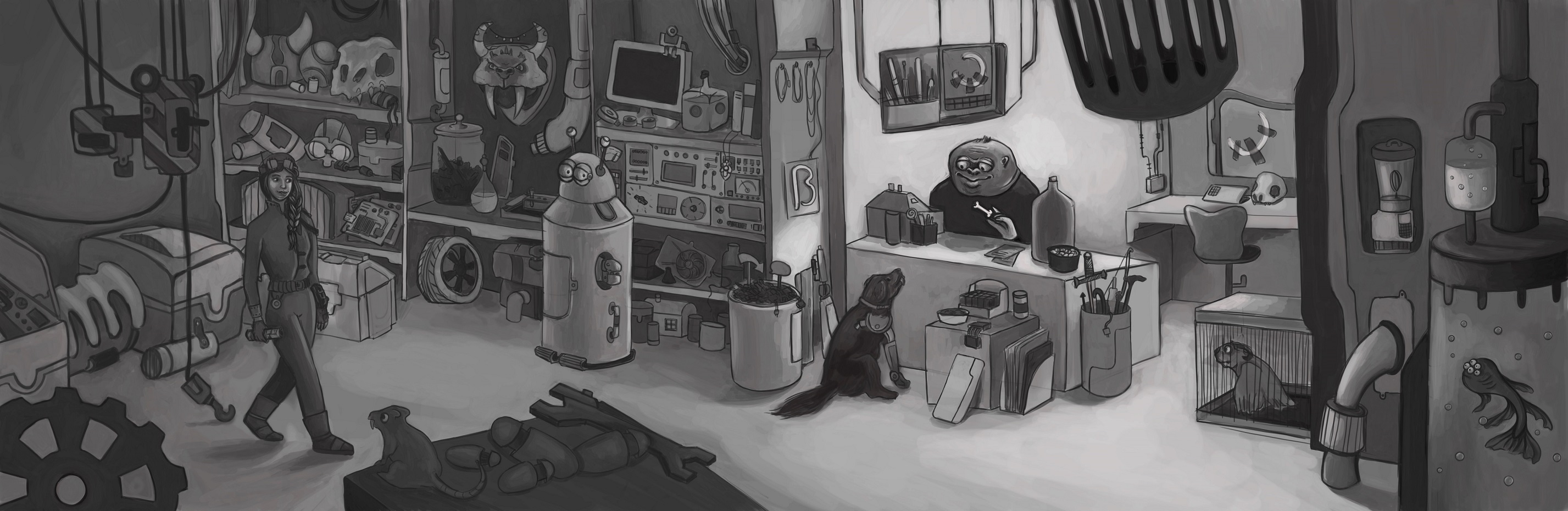
This is something I struggle with which is why I always do a black and white version.
I did use the level tool but it is hard to know how far to go. Obviously further than I think!
Does this look better or does it need to go further? I usually add colour with a colour overlay so don't want to have to much pure white or black.
-
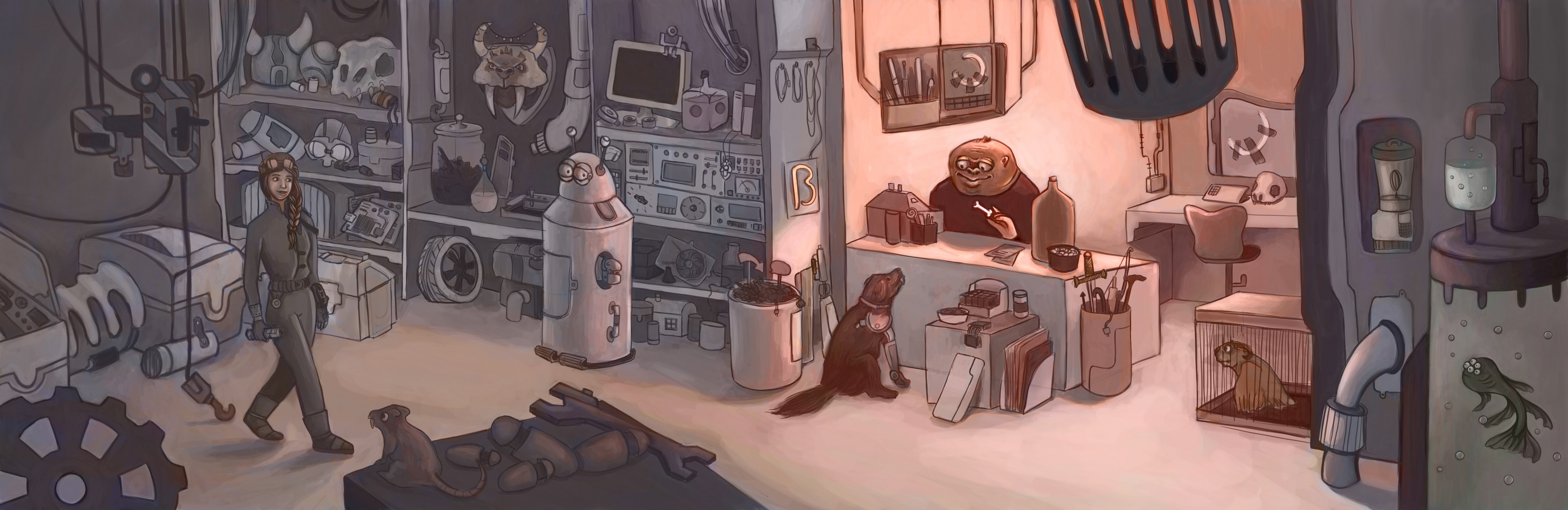
Hi,
I have added some colour in. Not sure I like it yet but what do you think? Not sure if the colours are quite right. Also struggling with how much colour to put into the dark shelves as don't want them to distract from the main focal point.

Website: http://www.seelliottcreations.com/
Facebook: https://www.facebook.com/SEElliottCreations/ -
@sarahelliott489 dude this is incredible!
-
@sarahelliott489 really like the color
-
@sarahelliott489 Loving the colors!
-
Hi Thank you so much for the feedback.
I did some final edits yesterday. Think I am going to leave it as it is now because I need to move on.