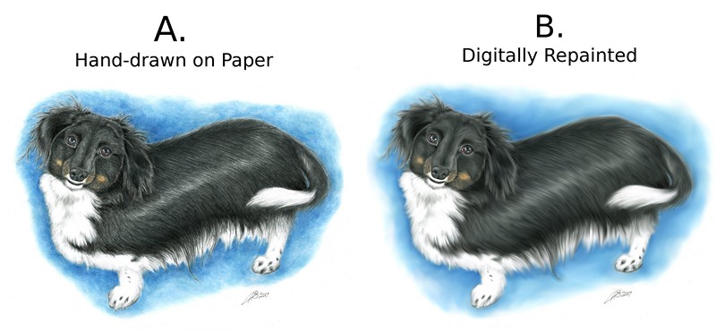
Which Doggie Do You Like Best?
-
This is a pet portrait for a client. I'm trying to decide whether the "B" version is good or not as good as the "A" style, for future work decisions. Personal dilemma. A or B?
-
A) Is better in my opinion. The right still looks good, but it does come off as digital. I would suggest using digital for this image only to correct, or add slight highlights, but it looks good as it is imo.
-
@Amanda-Bancroft I like "A" a little better than "B" - I did not read the captions before I decided which i liked better so i did not know the digital/traditional angle of the question - i do think if you used a more textured brush you could get a similar feel digitally as you did with traditional - they are both very good though
")
-
I think they are both good - it depends on preferences. I personally like the B version best, because I find the texture in A a bit too overpowering. Maybe a middle ground between the two?
BTW - this is a pet peeve of mine, but I think we (artists) should stop using the sentence "it looks digital". You can achieve any type of look with digital tools (just look at Lee White's and Marco Bucci's work) and you can achieve a sleek, smooth look with traditional media....so "it looks digital" (normally used as a negative critique) does not make much sense too me. -
I do this all the time and do not know when to stop when i digitally repaint an image .I think they are both lovely I prefer A a little more the fur looks more real.
-
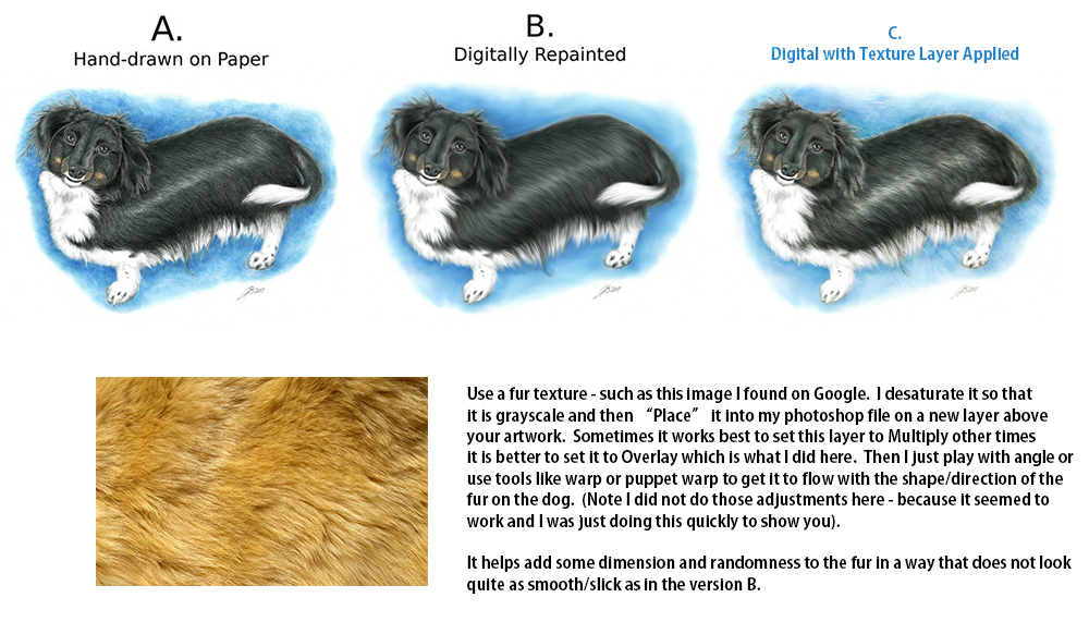
@Amanda-Bancroft Hi Amanda, you may want to give this a try, which will sort of create a hybrid between your current hand drawn and digitally painted versions of the dog.
-
Wow I've been blown away by the response! I also took a vote on Facebook. Almost 100% of people like A better than B, which is the opposite of what I expected so it's good to ask I guess!
Thank you everyone!
And now to reveal my opinion -
To me, B looks more realistic, soft enough to reach out and touch its little ears. I think A is ok except my experiment with Prismacolor pencils + sunflower oil (solvent) didn't create the smooth background I wanted. I agree with smceccarelli that the texture is too overpowering, but was surprised that most people actually want that. Good for me though! I don't like the feeling of working digitally, and it already takes me 20-30 hours on paper so cutting out the digital will save time. More incentive for me to stick to traditional. And my favorite result would be Rich Green's excellent C option with the background from B. Thanks for the tips!!!Actually I work in GIMP, and only know how to use these tools: crop, eraser, smudge, color picker, stamp and one kind of brush/pencil. B was done entirely with the smudge tool.
-
my favorite one is the hand sketched one.
-
@smceccarelli said in Which Doggie Do You Like Best?:
I think they are both good - it depends on preferences. I personally like the B version best, because I find the texture in A a bit too overpowering. Maybe a middle ground between the two?
BTW - this is a pet peeve of mine, but I think we (artists) should stop using the sentence "it looks digital". You can achieve any type of look with digital tools (just look at Lee White's and Marco Bucci's work) and you can achieve a sleek, smooth look with traditional media....so "it looks digital" (normally used as a negative critique) does not make much sense too me.I see what you are saying but I think that typically "it looks digital" is shorthand to refer to the work that is typically created by a "beginner" in the digital medium. I tend to think of it as either "airbrushy," "overly filtered (e.g., lighting effects like glows and whatnot)" or "overly texturized" or a combo of all three.
At least that's what I tend to mean.
@Amanda-Bancroft : I have a hard time deciding. I quite like the fur effect of B but A has a certain charm (maybe in the face area?) than B somewhat lacks. I'll "cheat" and say a mix of both.
-
I don't know if anyone cares to know but in case someone is thinking of pet portraits as a side job -
My client absolutely loved version "A" and is getting it framed for their home. So they're happy and that's great! I charged $150 for this original portrait and did make a quote form and contract I'd be willing to share if anyone needs examples. Thanks again for the awesome feedback!
-
@Rich-Green I really love your edit. It has the best of both mediums and really pulls the image together.