Fall critique WIP
-
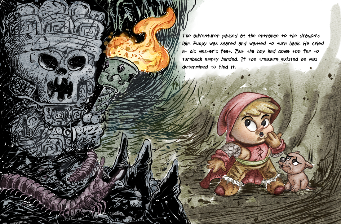
@evilrobot - Can not wait to see this one finished. I love the look of the tiki/skeleton guard on the left side. And how you have the insects worked into that area below it. Very cool.
-
Looks great, the only thing is the text looks quite small. I don't know the size of the image so might be fine, just a thought. I'm a fan of your style of work it's always interesting and cool to look at.
-
I want to see this colored now! Looks great!
-
Thank you guys very much. Yeah, color is going to be interesting. I'm not quite sure how I'm going to handle it yet because I've done so much with the line work. I need to fix a few things with the line drawing and then start experimenting with the color. I've really been digging line work lately looking at a lot of http://skottieyoung.com/ art really dig his style. I'm still looking for that right mixture to combine my line work with rendering....and it not take me a million hours per piece.
-
@evilrobot funny you mention Skottie Young, i was just drooling over all his work. So many different styles and he makes it look so eazy.
-
@evilrobot This looks fantastic. I like that you're continuing with your character from last months project. Your style is really flourishing and am enjoying all the texture throughout. The only thing that is standing out is your character and his companion, a little too much. You have all this outstanding detail but your characters look out of place because of the lack of detail. The only way that I can see this working without adding more linework to them would be texture in the color stage.
-
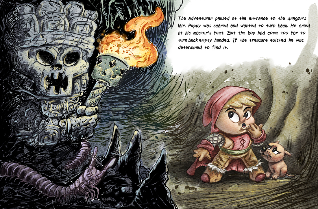
Here's another work in progress on this

-
And finished this up. Looking forward to the "Fall Critique" and not....you never know, you think something is good until somebody points out all the flaws.

-
@evilrobot This looks great William! - are you looking for critique at all on this? Something hist me today about this piece and i just wanted to do a quick paint over o see how it would go - i have a feeling that the light area above the boy where the text is is taking the drama out of the picture for me - it is so light and airy above him - i know there is a second light source that is lighting the boy and the dog from the front but i think the direction of the shadows are still confusing because i had to figure out that there was a second light source - possibly have the main light hitting the adventurer from the side with it's yellow orange cast to it from the torch - you could still have the shadow side lit but with an ambiguous fill that did not demand explanation - i hope i'm not annoying you with this - in the paint over i did not tackle the lighting but i did darken the top area by inverting the black/white - it is maybe too black but it has more tension without the light area i think - feel free to ignore - it really is a nice peace !

-
Thanks @Kevin-Longueil my original idea was pretty much what you have painted here. Then I changed it up. I was trying to make it look like they were still outside in the day light (Like the last little bit of sun is hitting them right outside the cave.) Then the rest is getting darker as it goes back in shadow towards the entrance to the cave. I was trying to keep from having to have the reverse text effect. I see what you mean though it's definitely not reading like I intended. And the flame on the torch is so huge and I don't have it effecting the characters at all so I can really see how it's confusing.
-
@evilrobot Hi WIlliam - As you know I really LOVE this one - your drawing and linework on the tiki side of this thing is really stunning.
Like Kevin I felt like the other side of the image with the adventurer and the lighter color was not as strong and losing a sense of drama.
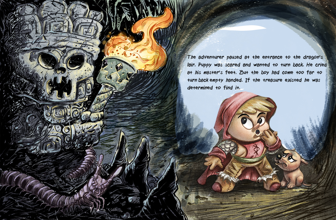
Reading your text and realizing he is pausing at the start of the dragon's cave - I wonder if you can work that opening into the drawing.
It would allow you a lighter space for the placement of the text.
And I think it might also make more sense that he would have just entered and paused (his back facing the entrance). Right now I think you have it so that it looks like he has turned around and is facing the entrance.
To give you a very rough and crude visual - perhaps if you changed it up to look something more like this?
It tells the story and also feels more planned out in terms of layout/design for the text, which you could also adjust to fit the opening shape you create .
Either way that tiki guy and all of his details are AWESOME!

-
@Rich-Green that's a good idea. Then I could put him in shadow and have a nice strong rim light and fill out his form with a bounce light...thanks for the insight.
-
This post is deleted!