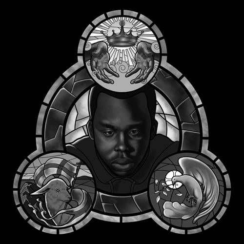
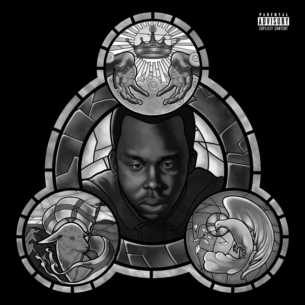
Stained Glass Illustration
-
@Christine-Garner thank you.
-
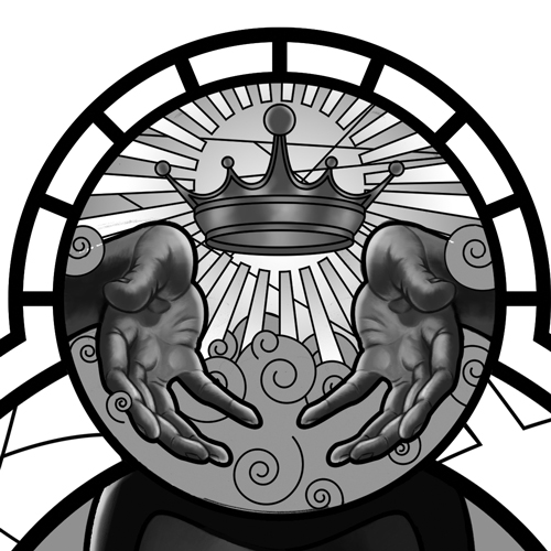
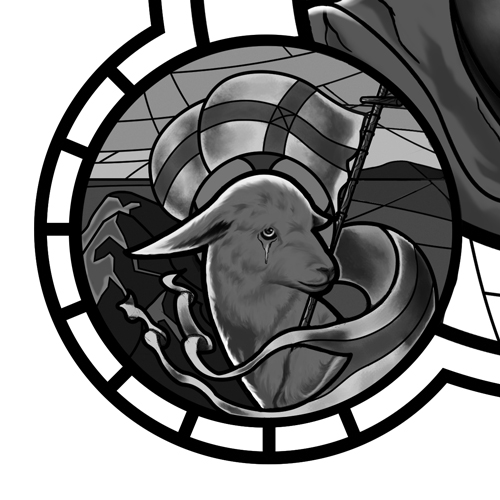
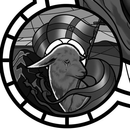
Here is the Lamb of God detail so far. Just focusing on lighting and tone.
-
looking super beautiful if I say so myself! Honestly I would opt out on the gradients you have on the flags, the work you have already is extremely nice and the tones with your hand painting is working really well. Everything looks authentic and then you have very synthetic looking gradients on the banner/flags that just scream photoshop. Maybe this is the look you wanted or its just not finished, just thought I would leave a comment.
Regardless, I love this a lot. Please keep updating!
Consider following me!
https://www.instagram.com/bohmartistry/?hl=en
https://twitter.com/BohmArtistry -
This is turning out really nice, who is the person in the middle?
-
@Jack-B thanks. I will experiment with a different way of shading the flag. I just ran out of time for the day.
-
@Russ-Van-Dine he's a local rapper out of Los Angeles
-
@Durrell-Odom Wow, this is turning out really amazing! You're drawing skills are so good, always impressed with your work.
Nat Iwata
www.iwataillustration.com -
-
Awesome!
Marsha Ottum Owen
-
@Marsha-Kay-Ottum-Owen Thanks! Much appreciated.
-
A little update
-
It's turning out beautifully. Nice job on the hands. I always have a hard time with the hands. Looking forward to the colored version.
IG: @larissadrawsstuff
Twitter: @ocartstudios
Blog: larissamarantz.blogspot.com -
@Larissa-Brown-Marantz thank you. It'll probably be much more difficult to figure out. Lol
-
Late to the party here, and I want to mention first that I think that you have an awesome start so far. It is beautifully designed and the values are looking really nice.
The one comment I have to make is one of those weird technical nitpicks that only some people would even care about--as someone who has actually done some stained glass (not much, just enough to know a bit about how it works), one of the first things I notice first is that some of the glass shapes you've drawn would not actually work as a real piece of glass--they would break very easily. Glass won't stay together if you have anything "hourglass" shaped--a shape that is wide, then very narrow, then wide again. It would split somewhere in the narrow area. Similarly, anything that cuts deeply into a shape before turning back out again would probably cause a split.
This is probably not something important enough to you to change your design at this point, but I thought I would mention it. I think that when you are trying to imitate one medium using another, it is useful and interesting to know how the medium you are imitating works, which is why I mention it. I'm looking forward to seeing the colored version of this!
-
@Sarah-LuAnn Thanks for the insight! I learned a lot during this whole process and it seems I still have a ton to learn too. Wasn't easy, but it was fun enough. I focused on trying to keep this simple as possible because I had no knowledge of stained glass and also trying to replicate it through digital painting which is was not easy. Also thanks for complement. Here's the final b/w detail. Now onto color.
-
@Durrell-Odom Its looking great.
-
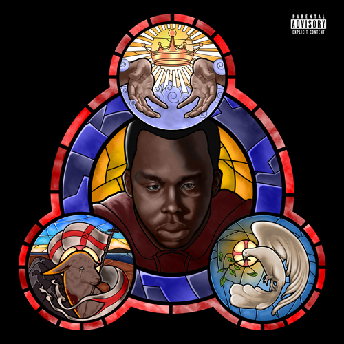
Any thoughts on the color application?
-
@Durrell-Odom Hey Durrell this looks really good - i think i would try desaturating everything quite a bit except for the center area - there is a sponge tool in Photoshop where you can desaturate easily just the areas you want to - it works like a brush... you probably know this already - i tried desaturating in Procreate and i think it really helped to shift the focus onto the artist's face - right now the saturated colors around him really tug at my eye - anyways - really nice work - i think your client is going to be really impressed!
-
@Kevin-Longueil Thanks for the tip. How about now?
-
@Durrell-Odom I think it looks great! - the artist seems to me to be the focal point now - my eye goes to the center first and then wanders around to discover the other panels of the Trefoil - but i end up eventually back in the center