September 2024 Submissions - How To Fix Your Art
-
Please upload your submissions for the September How To Fix Your Art Livestream here by September 1st. Post only finished pieces here (create your own WIP thread if you would like feedback). The file name should include only your first and last name in the file name with a "-" between the two names like this: First-Last.jpg. Anyone can submit work!Before beginning, please read the whole prompt by visiting SVSLearn.com/fixyourart or the How To Fix Your Art course shell.
Only submit if you are OK with our judges potentially critiquing and altering your work during a public livestream on YouTube, which will be recorded and added to our website.
We do not own the rights to your work, you do! But we reserve the right to publish your work on our online platform SVSLearn.com, and its associated email list and social media.
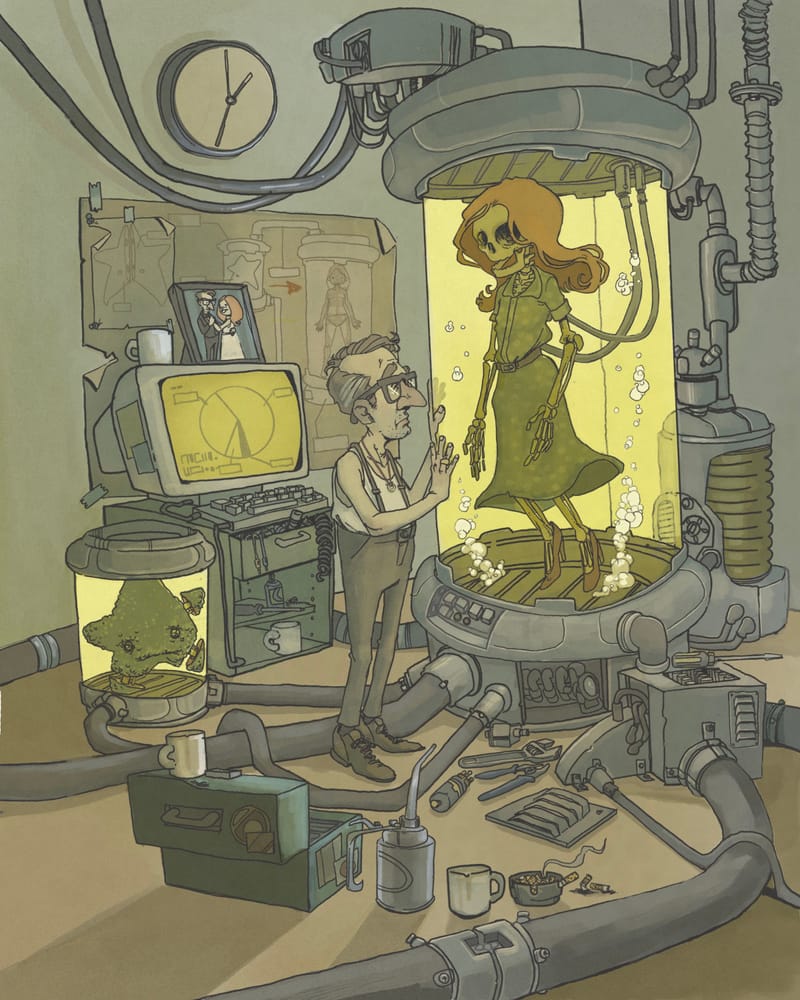
Austin Shurtliff
austin@svslearn.com -
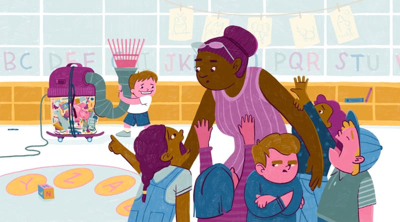
My September submission! Pumped to see everyone's entries!
www.annastenger.com
IG @annastengerillustration -
@annastenger super fun concept! I really like the way you do flat shapes but with a painterly texture. What
s your process look like?Austin Shurtliff
austin@svslearn.com -
@AustinShurtliff Thanks Austin! It's taken me a while to get to a point where I have a pretty strict process to help produce consistent work. It's not fancy or complicated...Let me know if you have questions.
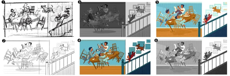
- Rough sketch
- Refine the drawing
- Work out the values
- Determine minimal color palette for the piece/subject: 4-7 colors with a tint and shade for each hue, organized by value. Map out the color usage based on values.
- Render the image with everything already worked out! Contrast and colors may change as this step lays out, as sometimes things need tweaking. I just use the 6B pencil brush in Procreate and keep the brush size consistent throughout. Flat shapes first, details later.
- Throw a white layer over the entire piece with a “Color” transparency mode on top. If it still reads in grayscale, it should work in color.
-
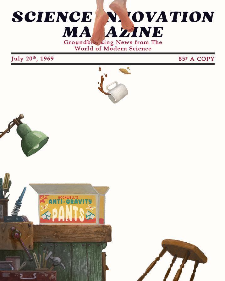
I'm a massive Norman Rockwell fan as you can see, so I challenged myself to try and channel him in my illustration. My aim was to try and get the story/gag across with as few elements as possible, and it was simultaneously so incredibly hard and rewarding. I slapped it onto a "Saturday Evening Post" style magazine cover just for fun. My tribute to my favourite illustrator. I don't know if "Anti-Gravity Pants" count as a "Machine", so I may be off the mark a bit with the prompt, but it made me laugh at least. I also accidently did the entire image at 72dpi, so it was also a lesson for me to pay more attention next time
-
@MarcRobinson Looks like a solid tribute! I especially love the toppling stool for some unexpected energy [:
-
@AustinShurtliff hi Guys, I’m working on the prompt for Oct, but I wanted to ask if it’s ok to submit a single page comic instead of a single illustration.
-
-
@MarcRobinson This is so so good
") Love it, Marc!!!
Love it, Marc!!!Erin Richardson
instagram.com/erinrichardsondesigns21
www.erinrichardsondesigns.com -
@annastenger hey thanks! Yeah I'm glad the stool falling over came across, because I was in two minds about it.
-
@ArtistErin thanks Erin I appreciate it!
-
@Mariana-B great question! Yes, you can submit a single comic page (you probeblly could even get away with a douple page spread as long as it is in a single image file). We've had serveal people submit sequntial art for past promts. Let me know if you have any other question that come up (you can email me, austin@svslearn.com, or send me a private message through the forum).
-
@annastenger this is so cool! Thanks for taking the time to share this! I haven't been doing a lot of finished artwork the last few years (mostly just sketching and doing rought hand drawn animations) and really need to work on rebuilding my rendering systeme. Just curious, when you render in step 5 are you saying use the 6B pencil to fill in all of the large solid colors in your illustration, as well as the line work? Do you select those larger areas or just color it freehand? I love all the texture you create with that process.
Austin Shurtliff
austin@svslearn.com -
@annastenger also, I might ask about doing a blog post or something like that about your process in the future if thats all right. I think it would be really instructional to share this with everyone.
-
@AustinShurtliff I color it ALL in by hand… I’ve tried a few work-arounds (brushes, copy and pasting fills) but nothing looks authentic and the edges look goofy.
And sorry to do a big process post here. I’ll put it some place else next time- I didn’t know about a blog section?
-
@MarcRobinson This is so good. I love the concept and execution is really good. Sorry to hear about the 72 dpi thing. I've been there before.
-
@annastenger Thanks for sharing this! I love seeing others' processes.
-
@MarcRobinson This is so freaken good!
-
@Christijan Thanks mate, I appreciate it. And yeah, I won't be making the dpi mistake again anytime soon...I hope!
-
@Scharon-Campbell Thank you!