Struggling with perspective
-
@MerryMary thank you! This is very helpful

-
Great that you are looking to get a stronger handle on perspective! It's a fantastic tool that will only make your work stronger.
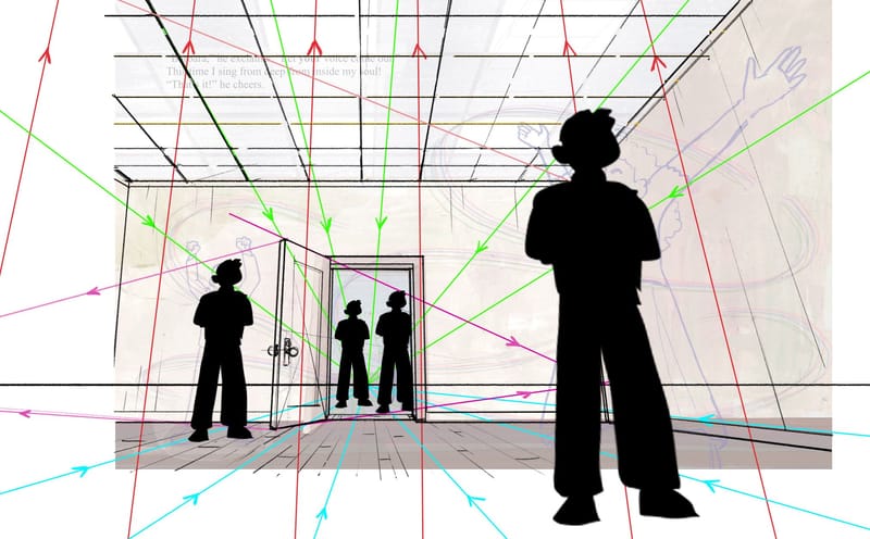
You can see from my draw-over that I'm hitting similar concepts as others. But here's specifically what you would want to keep in mind on low angle POV like this:
-
While this might seem like a one point perspective. It is actually a two point. Only instead of the two points being on the left and right of the horizon line (HL) they are aligned vertically. The first vanishing point (VP) is on the HL where the blue and green lines converge. The second VP is waaaaaaaaaay off the top of the picture plane where the red lines converge.
-
The next thing is that for the image to look right all the figures need to be on the ground plane. That's where the blue lines (orthogonals) come in handy. I used the door figure as the basis. Then drawing blue lines from the HL VP I created a ground plane "grid". As long as the feet of all your figures connect with one of those ground plane orthogonals the viewer will perceive all the figures as realistically standing on the floor. (in the current drawing the foreground lady is either on a different ground plane or she has super stumpy lower legs)
-
Speaking of the figures -- they will need to be adjusted slightly so that they converge on the vertical VP (the red orthogonals converging way off the top of the image)
-
I did make the door feel more realistic by changing the angle at which the door is open, because doors rarely open exactly at 90 deg to the wall. But you can see that doing this introduces two new Left and Right VPs. But those are easy to track to the HL using the purple orthogonals.
-Finally its just a matter of making sure the light grid is a series of consistent square planes.

-
-
@davidhohn thank you for helping us with the things we missed on this

-
@davidhohn I wanted to add a bit of clarification regarding perspective drawing. While it's true that moving the horizon lower can change the perspective mode, it's important to note that this alone doesn't necessarily result in a two-point perspective.
The key factor here is the camera's line of sight.
When the line of sight is perpendicular to the picture plane, it will be a one-point perspective, regardless of how high or low the horizon line is.
For a two-point perspective, the line of sight needs to be rotated upwards (or downwards), not just lowered.
-
@thomas-young You have it kind of right and kind of wrong.
You are right when you say:
"The key factor here is the camera's line of sight.
When the line of sight is perpendicular to the picture plane, it will be a one-point perspective, regardless of how high or low the horizon line is."
You are also right when you say:
"For a two-point perspective, the line of sight needs to be rotated upwards (or downwards), not just lowered."
Yep. Totally agree.
But you are incorrect to apply that concept to this particular illustration.
The OP @ChloeGreenbergArt specifically wrote:
"Drawing from a bottom-up perspective like this is very out-of-my-element, but it’s important for the story."
That suggest that Chloe is looking for a "worms eye view" or a "low angle POV". In that scenario the camera is placed low to the ground and is looking up at the subject. This means that the camera is "rotated upwards" resulting in a two point perspective system.
Thanks for the opportunity to further clarify when and why to apply different forms of linear perspective. That's exactly what these forums are for!
-
@davidhohn true. I missed the looking up aspect which, now that I reflect on it, is what “bottom up” POV means. Thanks for correcting me on that!
I can still create a looking up one-point perspective by placing the camera on the floor and not tilting it. If I get a few minutes I will show a side-by-side comparison. Many art directors I’ve worked with over the years prefer to avoid the keystoning distortion that occurs when tilting the camera upwards.
-
@davidhohn this is exactly what I needed, thanks!
-
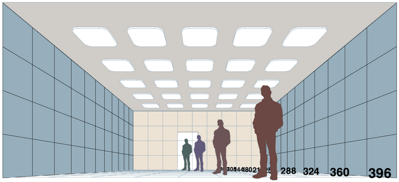
@davidhohn Attached is a one-point perspective where the grid squares are 36 inches with the vanishing point near the floor. Figure silhouettes are 6'3" in height.

-
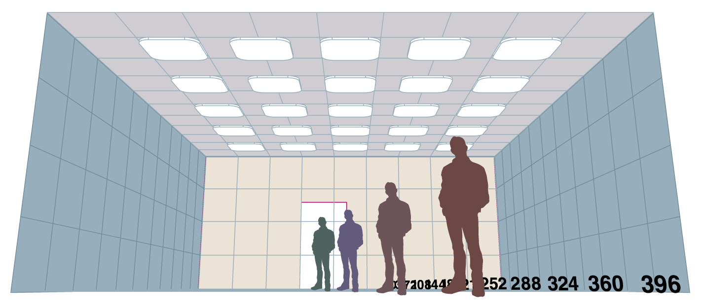
@davidhohn Here is a floor level POV with the camera tilted upwards. A two-point perspective.

-
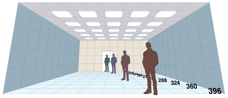
@davidhohn This room view has a higher POV with the camera tilted upwards. It is just a matter of adjusting the camera height and its tilt. Here, the POV is closer to eye level and shows more of the floor, but it does not give a great sense of looking upwards; it is a two-point perspective.

-
@thomas-young Fun! Now comes the question every artist must face -- which one communicates the "bottom-up" or low-angle POV most effectively?
-
@davidhohn I understand why you favor the “bottom-up” view. It has more movement and is more dynamic. I also like how the fore-most figure leans to the left. The one-point, low POV is more static and less suited to Chloe’s needs. Your advice to her was spot on!
It is useful to explore various POVs to find the best foundation to develop the composition upon.
-
@davidhohn Woah, this kind of blows my mind. I haven’t thought of a two point perspective composition like this before!
-
When I was learning perspective, this kind of 2-point perspective confused me a lot! That's because we think of a traditional 2-point perspective where both vanishing points are on the horizon line. But in a traditional 2-point perspective (or 1-point for that matter), all the top-to-bottom lines always stay perfectly vertical (unless the canvas itself is rotated) and parallel to one another. In this case they are not, which is the clue that there is another vanishing point.
To tilt top-to-bottom lines, you'll have either a vanishing point in the sky (the zenith) for a bottom up perspective or a vanishing point deep in the earth (the nadir) for a top down perspective. It actually helps me to think of this illustration as a 1-point perspective + zenith instead of thinking of it as a 2-point perspective. That always just confuses me!