Basic Perspective final
-
I am not understanding the final assignment can someone explain it to me please?
Thank you
Also
As a beg what course would you suggest I take next? -
@Blima-Spetner what part is confusing about it?
-
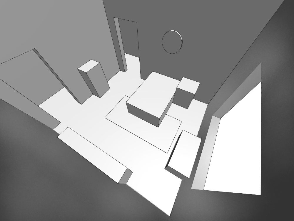
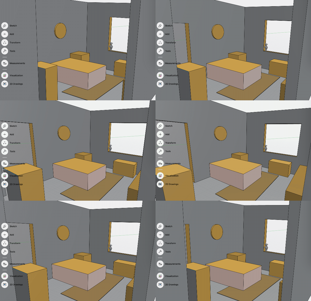
@Blima-Spetner Using the plan drawings of the room and furniture provided on the pdf construct the room using one or two point perspective placing the camera anywhere in the room. After the room is constructed you are supposed to go in and make it look like an illustration by fleshing out the forms provided in the room. There is an isometric view in the pdf that should be helpful in visualizing the room and where you might want your point of view. If visualizing the room is where you are having trouble I have made a quick 3d model of the room that might help. It is isometric also so will not help with perspective but might be helpful in some way…or not. I made a couple of the walls translucent where I thought I would be likely to put my point of view.
I also added a perspective view from the ceiling just for fun.
Link below will take you to an interactable 3d model.
https://collaborate.shapr3d.com/v/aG99-OqFGa6jbfLLaqgSf
-
@Kevin-Longueil wow thank you for your help How long should this take meaning how long should I expect to give myself realistically ( I am a beginner at this!)
-
@Kevin-Longueil to clarify use the plan provided to make a room from any camera angle. If I am using a 2 point p how do I do that with making the room. Just pick a starting point like the bed and make that the focal and make everything towards that?
-
@Kevin-Longueil I just keep getting confused I can't seem to figure out how to do this? Should i use a big paper and grid it? ANd then fill in? Where should i start
I keep thinking i should do a face on view as if you walked into a real room
Thank you for your patience -
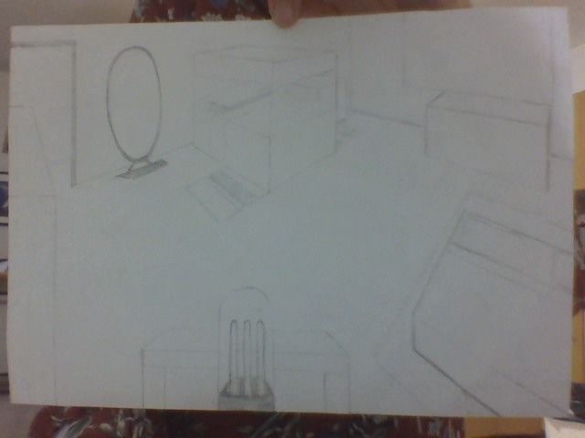
This is what I have right now the bed on the right seems super skewed because it is so close to the "view" but in general what do you think.
PLEASE be honest. I really need feedback. Thank you[link text]()
<img src="blob:chrome-untrusted://media-app/74b68490-ec79-465f-a1b1-8118c511a0e4" alt="IMG_6625.JPG"/>
I am not sure how to upload this right
It says it is too big a file but it is a really small file -
@Blima-Spetner Does the course instructor ever come on the forum to check out how ppl are doing in the course? How does one get feedback from the instructor?
-
-
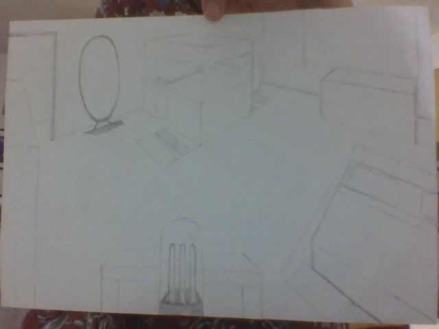
is this right?
-
@Blima-Spetner It is a bit challenging from the photo to be sure but it looks like you are using two point perspective but that two immovable vanishing points on a single horizon line are not being used for the architecture. Furniture that does not follow the line of the architecture would not use the same vanishing points but would use the same horizon line. Maybe draw a rectangle in the middle of your page that is half the size of your page and draw the image within that rectangle. This will allow you to have vanishing points well off of the image itself but still on the page. I’m wondering how you established your vanishing points for this drawing? Did you tape the paper down and add the points to your drawing surface and off of the page? That would work well too as long as you do not move the paper. I tried to see where your vanishing points and horizon line were but the varied from one another. They were close though, but still look a bit off to me. Once again it is hard to know by the image so I could be wrong. I’m not sure about teacher feedback on the forums. I have not been on for a long time though I am an “SVS OG”. You can look at anyone’s profile and see when they were on line last. The drawing is mostly good. You changed the scale of a few things from the prompt which I’m sure is fine as long as you did it on purpose I would think. The only thing that is very off is the table and chair I. The foreground. The horizon line is much lower for this than for the rest of the image. There can only ever be one horizon line. That is our eye level. Lastly the ellipse for the mirror you added has the mirror tilted to the left. Make sure you construct a box for the mirror and build the ellipse within it for this exercise. ….hopefully some of this is helpful.
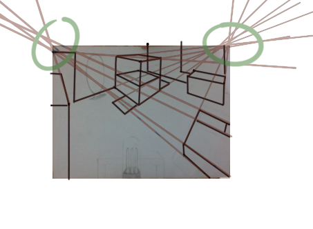
This crude animation shows how changing the vanishing points changes how the room looks..none of them are right or wrong..any could work. The question is how do we want it to look. I think having perspective be forced or extreme may not be the best way to go. Our perspective should not draw attention to itself. It should just seem right to the viewer. I think in reality it does not have to be perfect as long as it looks believable…but for the assignment I think we are going for perfect as a learning exercise. The program I used for the gif below actually distorts the image depending on the lens you choose so lines do not line up perfectly ….but it works to illustrate the point hopefully.
-
@Blima-Spetner it's really hard to see your picture and I am no expert. Though I can relate! The first several times I did this it was pretty hard. I think making a grid is a good place to start though and then establishing the room.
I usually from a perspective viewpoint draw the squares for the furniture on the floor first so that they are in the right place next to each other. Then build them up into the combination of cubes needed to make them the right hight.
I think drawing traditionally might be harder because things are not easily sized up and sized down. If your grid squares are too big on your piece of paper things don't fit as well. And too small can make it hard to work.
Perhaps a good idea to get a hang of what size squares you need for your grid is to just draw a few different grids on several pieces of paper. Put a a few small boxes in them along with the edges where you will put your walls. see how the samples look in the space you have available. Once you feel confident you have the proportional size and viewpoint you need for your picture. Draw in the boxes for the room. It might take a few times to get it right.
Doing a grid and working on a single object in a room could also be helpful before diving into the whole thing. Just to get a hang of drawing from grids and boxes, which can feel incredibly unnatural haha.
I am sure there are lots of ways to go about building this room however, so I think expirimentation will help you find the way that works best for you

-
@Kevin-Longueil I am blown away (sincerely) by your kindness in giving me such a detailed explanation and helping me out.
I used 2 point p and it was the top two corners of the page. Yes I can see that they are too close together and perhaps that is why it seems skewed
I will try again.
Should I use a big huge paper and space the vp further?
Lol to the table and chair. I threw that in with a spurt of creativity knowing that they were 1 vp and totally forgot about using the horizon line at all!!
For the mirror should I build a rectangle as it was meant to be full length and a box would only hold a circle? -
@MerryMary thank you for taking your time to help me!! When you say draw a grid first do you mean to print out a grid or just draw it in by hand.
In my head when you say draw a grid I think it means to make the vanishing point and then draw the lines and create a ton of box's is this what you meant
Thank you -
@Blima-Spetner I'm the instructor for this course. And yep, I do check in time to time.
What has been fantastic to see is how former students of the course have become "Perspective Pros" (my unofficial title for SVS'ers who clearly have mastered these concepts) and the mutual assistance you all give to each other.
Since the idea of these forums is to foster communication between the members I tend not to chime in unless someone is clearly not getting the needed feedback. But in this case @Kevin-Longueil and @MerryMary are doing a great job of explaining their process -- and you are clearly gaining more and more mastery.
Great job everyone!
-
@davidhohn oh wow thank you for chiming in!!!!!!! Thank you for the course. DO you think I am on the right track at all with my drawing? I am going to start over and try again. I can see things are off. I think I will draw on a larger paper. Is it normal it is taking me hours to draw this?
-
@Blima-Spetner yes, you're just going to draw a bunch of criss-cross lines from your two perspective points. Then you will need to draw simple box shapes to make up the items in the room.
The floor plan that is printed out from the assignment is for creating cubes that are the same shape and size to each other, drawn in perspective.
If the bed has 2x3 squares on the floor and 1 square from the side view you need 6 cubes. All next to each other to make up that shape for the bed etc.. you don't have to draw each individual cube, if you don't want, but it should take up the indicated amount of space for each item.
Don't stress if it isn't perfect though, just do your best work! The point is to learn from it so if you gain more understanding of perspective from any attempts in my book that is a win

-
@davidhohn Oh wow thank you for chiming in I am grateful for your course. Do you think I got this at all?
I will try again to draw on a bigger paper. Is it normal it is taking me hours? I went through this slowly and keep trying and trying and it feels somehow I am missing something? -
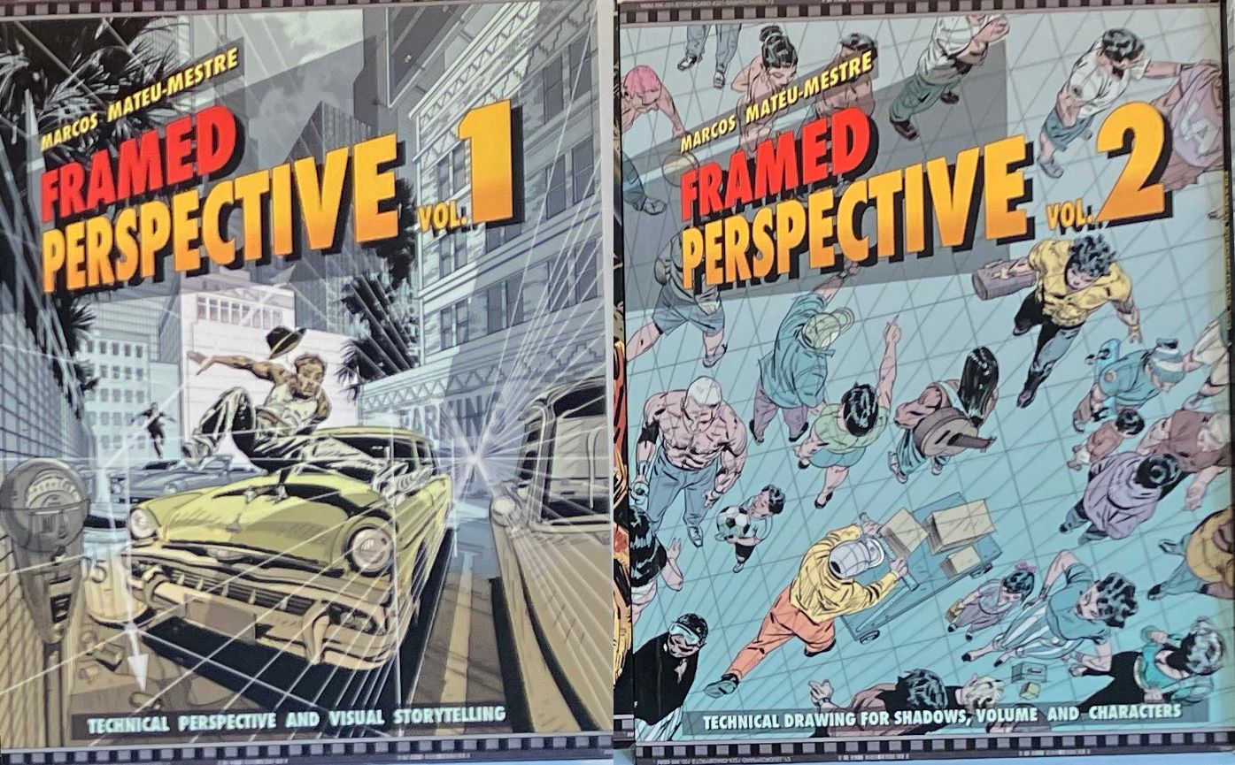
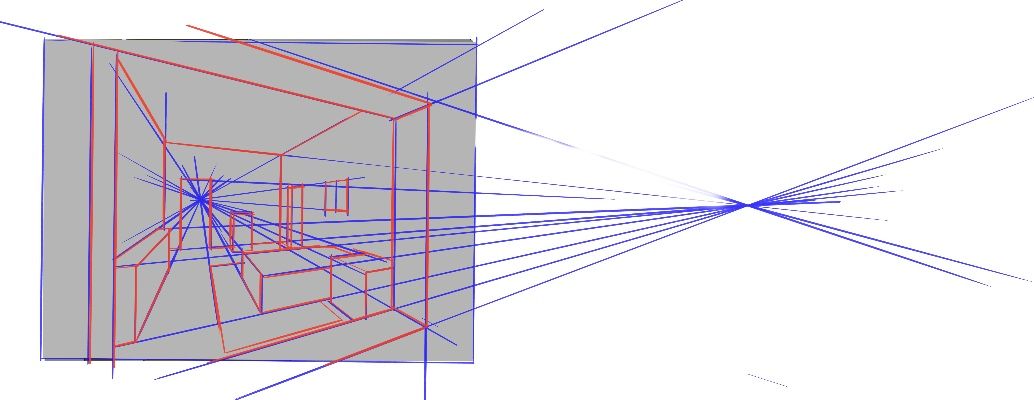
@Blima-Spetner larger paper or drawing within a smaller box on the paper you have will help. Also taping down to your table and putting a point right on the table would work great. I have to admit to not having taken David’s class. I only checked the final to see if I could help. I am a teacher and do isometric drawings all the time so it is fun for me. There are two books that I own that answer any question I have ever had about perspective and I cannot recommend them enough. This guy is a true master and explains things very thoroughly. I’m sure David’s class does the same but it is nice to have a book in hand sometimes. Work slowly through the books or the class again and do not skip to the next exercise until you are sure you have mastered the ideas presented. I added a quick sketch to show the idea of having two point perspective with one of the points being a clear focal point in the frame. I put one vanishing point in the doorway. This is a great way to guide the viewer’s eye to where you want them to look. The second point is well off of the page. This could either be on your table or on a large sheet of paper where you are only using a small section for the drawing itself. For the mirror you added I was only suggesting that you build a box to sort out the top and bottom ellipses for your oval. You could construct a circle at the top and bottom of the rectangle to help guide the drawing of the shape.
-
@MerryMary love your last line thank you. Going to keep practicing on this
