Feedback on Postcards to Art Directors
-
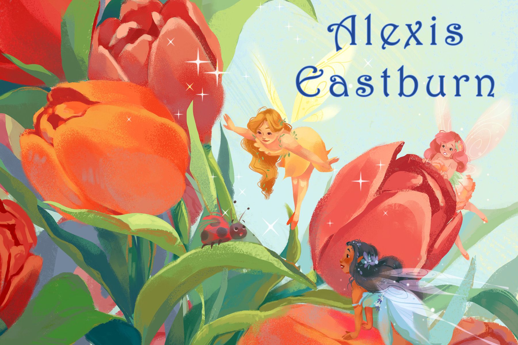
Hello everyone! I'm looking to try and send out postcards to art directors to try and get my portfolio seen more. I'd love any feedback on the designs and which of the two they like more.
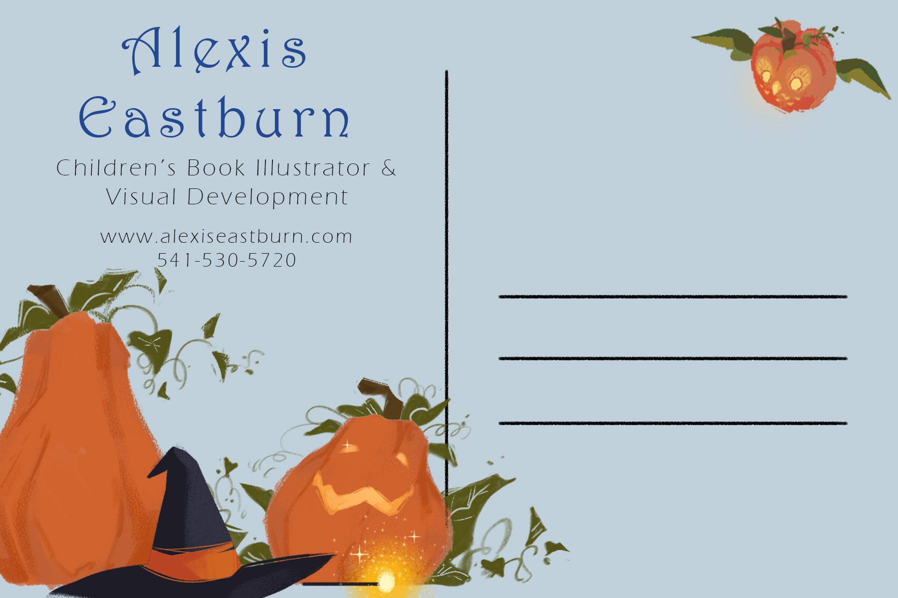
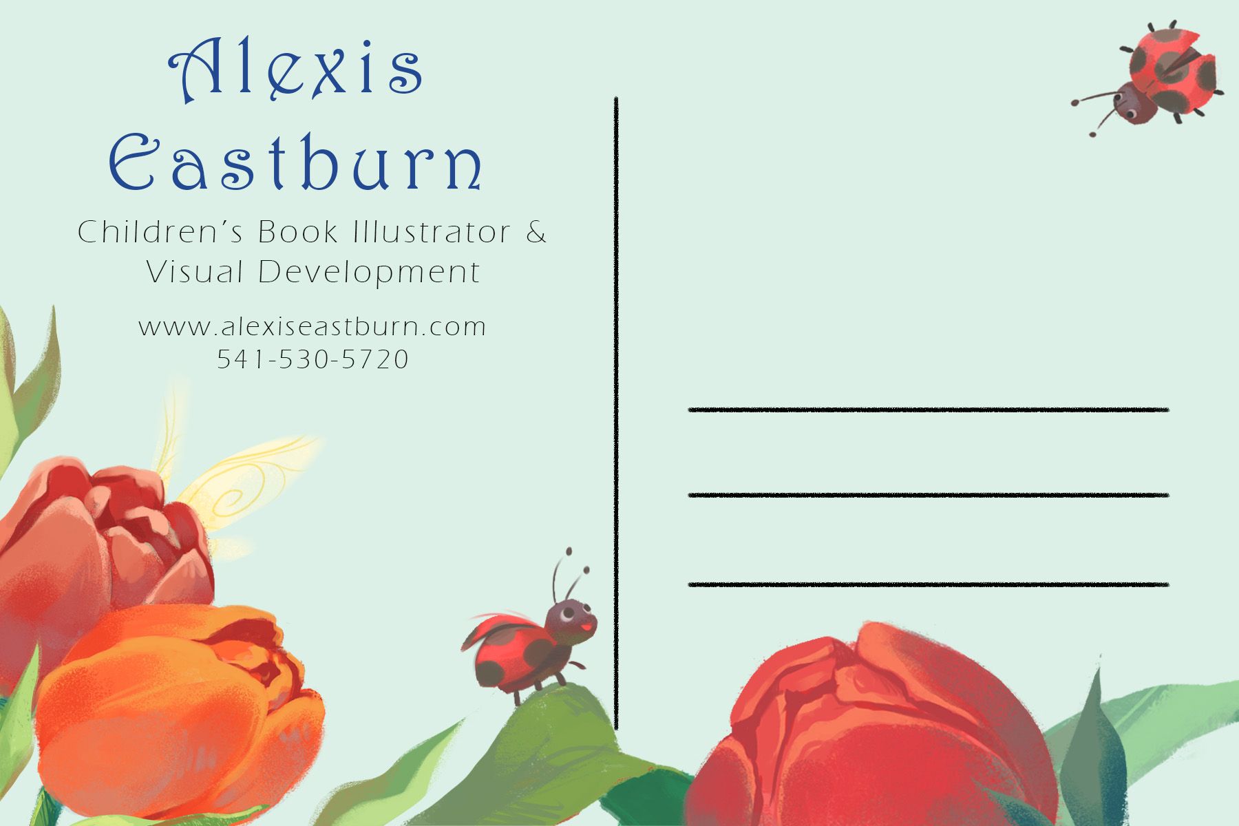
") I have the front view and back view of both.
I have the front view and back view of both.
Thank you so much!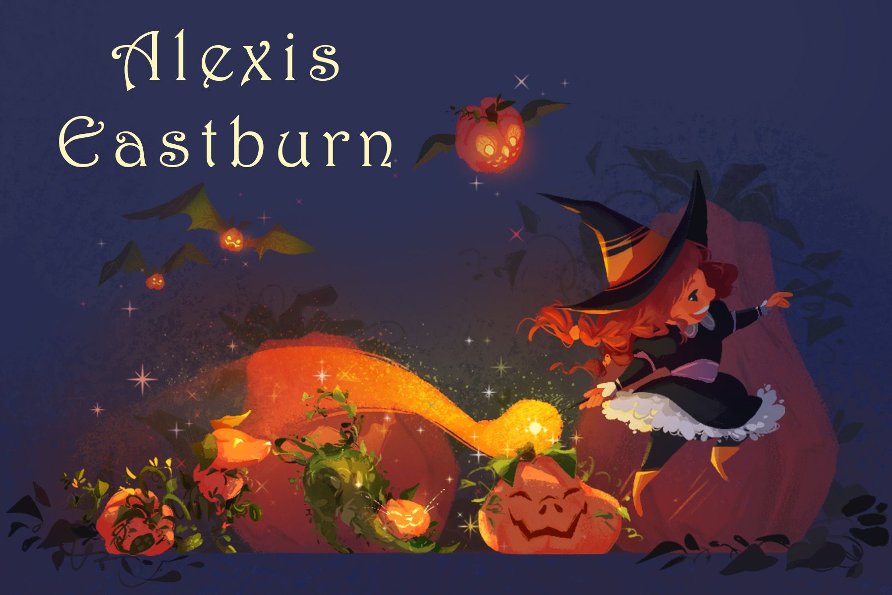
-
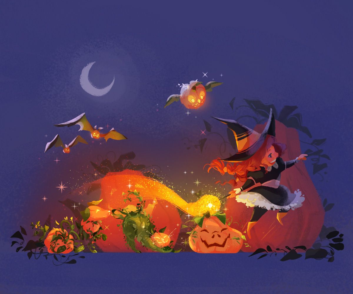
They are both stunning but I think the darker one is more eye catching!
-
Send out both!
-
Wow Alexis your work is so good. I love both. I remember the pumpkin one from Critique Arena, and your work definitely wowed everyone! So my opinion, is do both. I don't know if your budget allows for that at one time but I'm thinking both are so different from each other and they represent you well! I am also checking into postcards, after having a Pro Crit from David Hohn, (Phenomenal BTW!!!) I learned postcards are making a comeback.
Good luck with your journey! It's great to see what you are doing
-
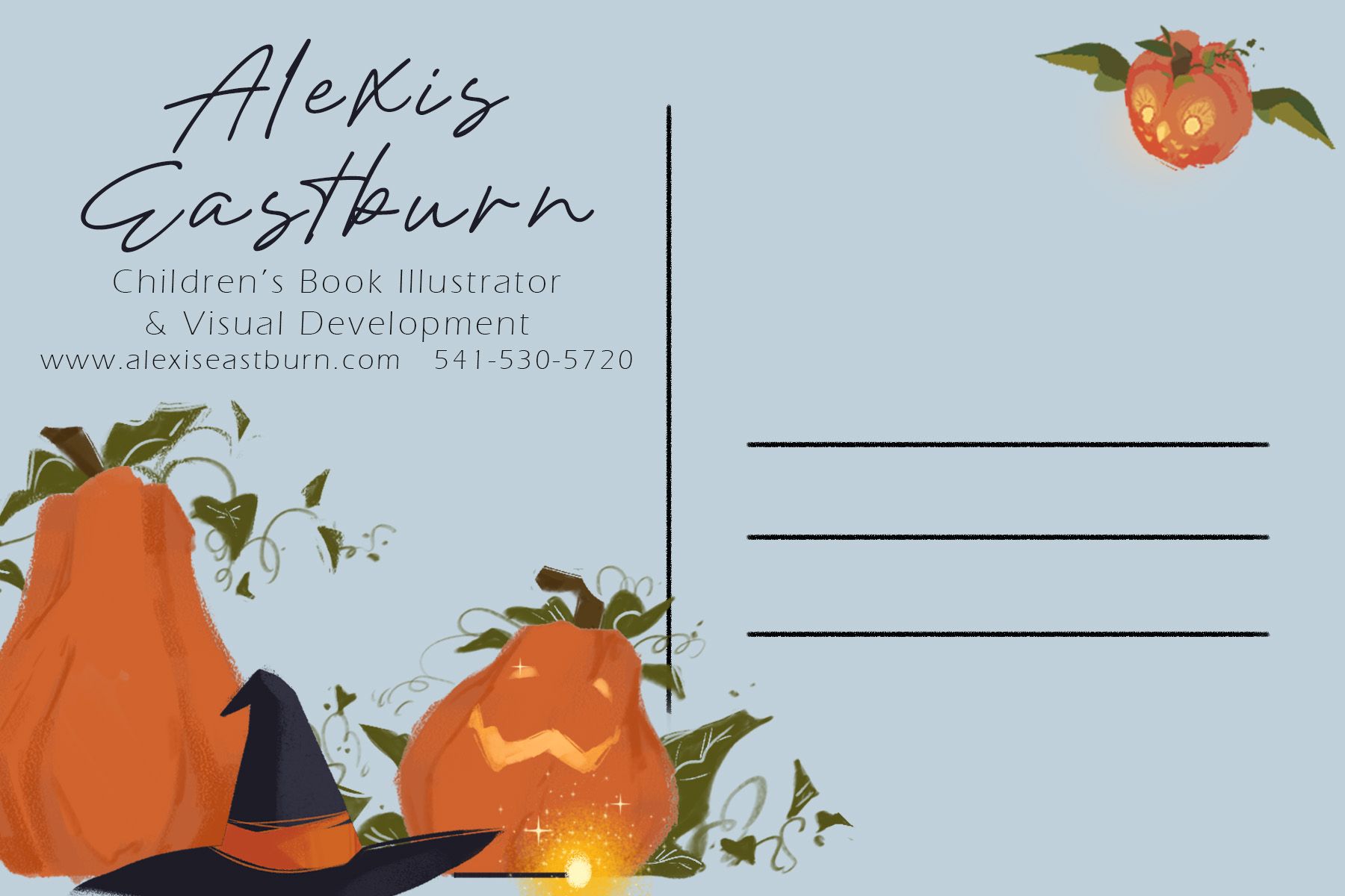
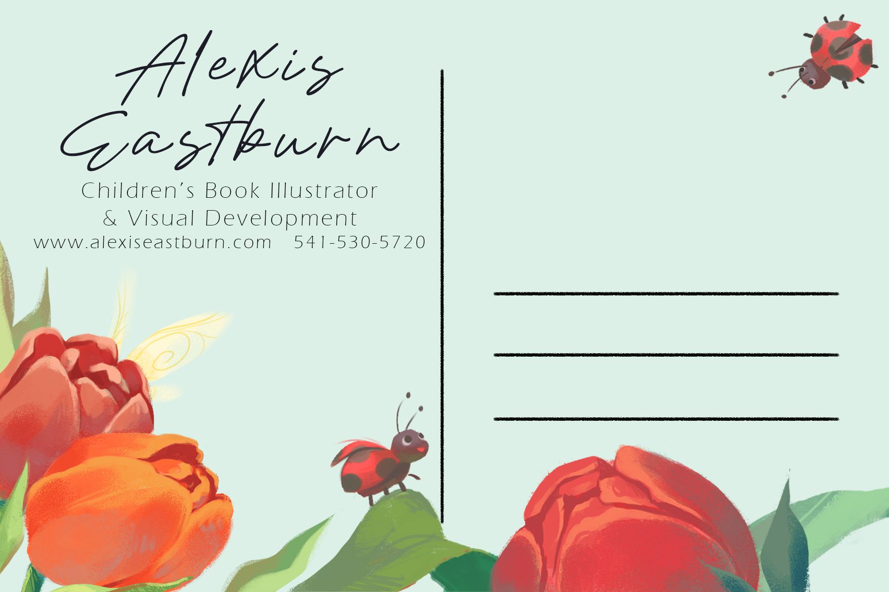
The only thing I can see that I would change, is that in the first postcards back side, the phone number and the lead are really close together. I would just adjust that one leaf to give more breathing room.
Beautiful postcards!
-
@alexisartxox Both look great, but the pumpkin one is so dark and some areas lack contrast and are hard to make out. For picture books, lighter images are a safer choice - while dark images are okay, it's a thin line to walk to still make them easy to make out and children friendly. Very often, these night time images have bright light sources that illuminate a large portion of the illustration, so they are actually quite light and the night time is implied or simulated. Hyper bright moonlight and blue filter anyone?
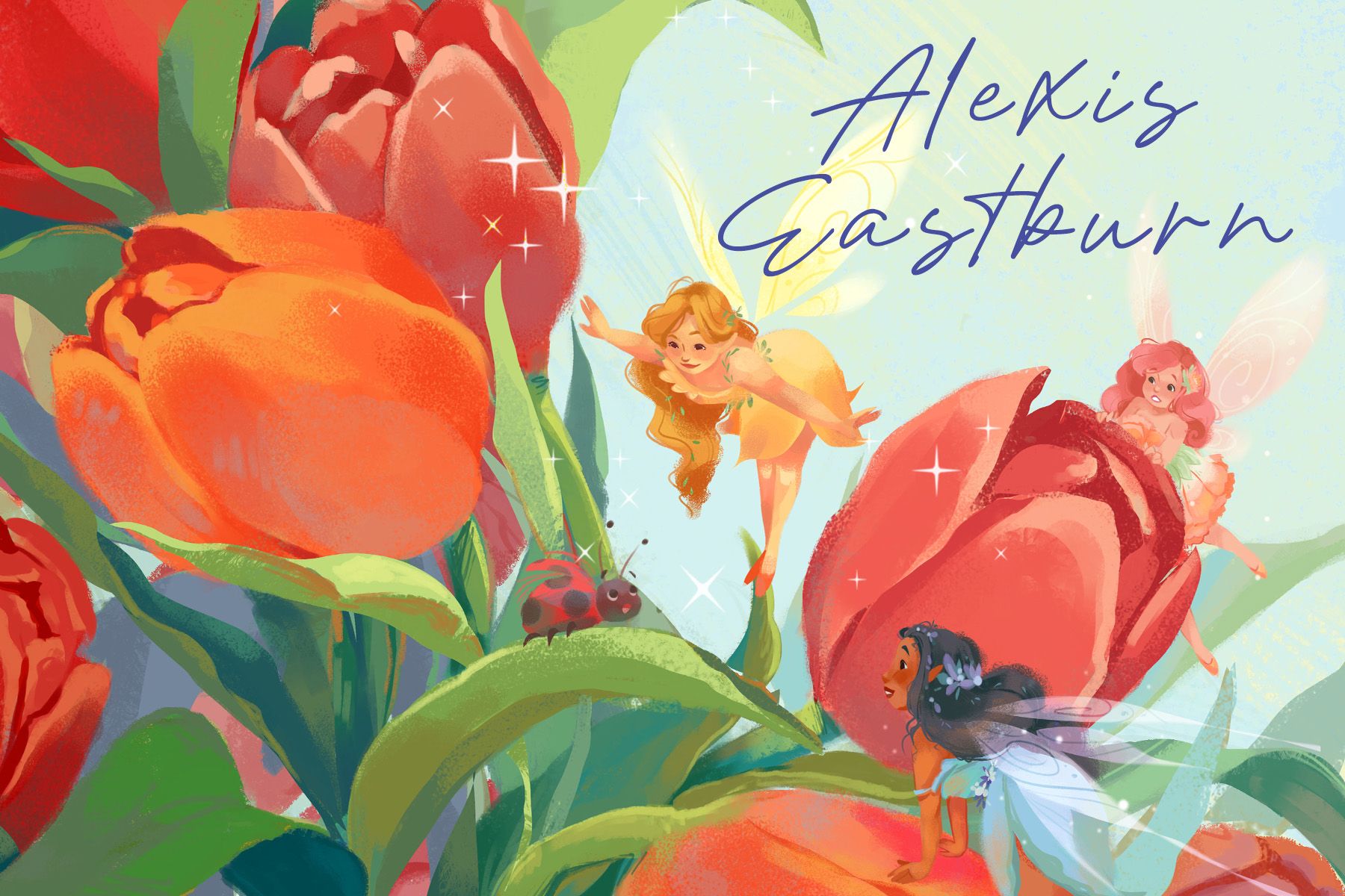
Your fairy illustration is gorgeous and easy to love, which I think is a safer choice!
I'm not sure about the font choices. The font for your name especially feels a bit amateur, and the text layout on the back feels odd. There's more space between Alexis and Eastburn, than between your name and the tagline.
I'd definitely reduce the line spacing in you name and change the font, maybe for something that looks more handwritten. And a bit of space between the title art (your name) and the tagline!
vanessastoilova.com
instagram.com/vanessa.stoilova/Check out my Youtube channel for tips on how to start your career in illustration! www.youtube.com/c/ArtBusinesswithNess
-
@alexisartxox These look so beautiful
-
I would go with the dark one.
But really, it depends on what you want to be hired for and so which one YOU prefer.The second one is very conventional. So as @NessIllustration says, it is a safe bet; but it is also putting you against a lot of competion (they must received colorful fairies all the time). Although it is conventional, you may stand out because of the spatial awareness you demonstrates (your scene feels 3D).
Each picture demonstrates very different skills, so really, I would send the one you had most fun doing.
-
@NessIllustration Thank you for the feedback! Great suggestions on the edits for the pumpkin piece. I've made changes to the illustration. What do you think? I'll work to edit the text in the meantime on the postcard.
-
@NessIllustration Thank you for the tip of "Handwritten font". I really like the look of that better!

Thank you everyone for all your feedback! I'll be working on getting these printed and sent out.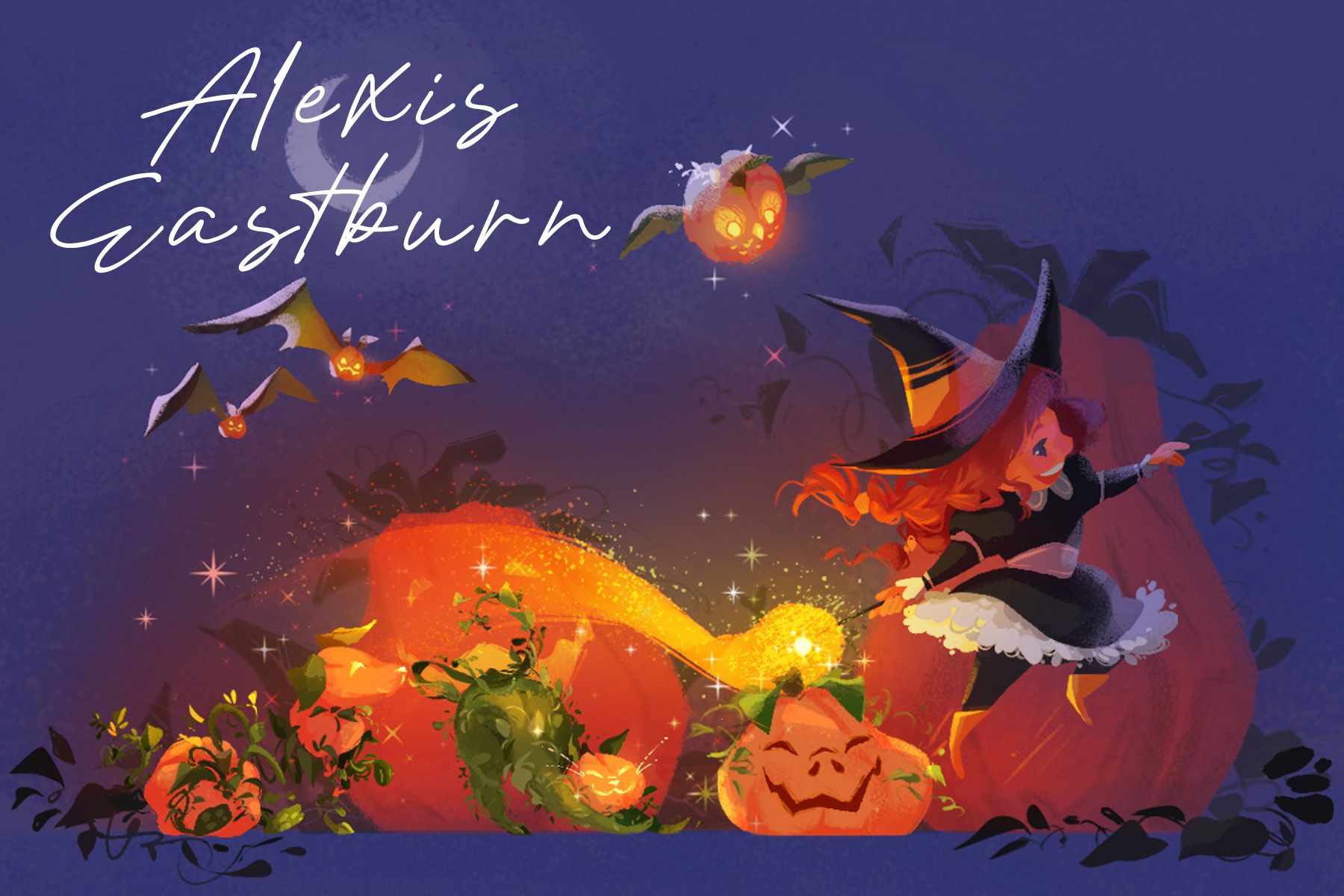
-
@alexisartxox Ohhh I like this! The lightening does help, while it still feels dark and moody, but I'm seeing more details than the first time. I never realized the green thing was a cat until now! The new font also looks great!!
vanessastoilova.com
instagram.com/vanessa.stoilova/Check out my Youtube channel for tips on how to start your career in illustration! www.youtube.com/c/ArtBusinesswithNess
-
@NessIllustration @alexisartxox I’m still getting the feeling that the text is slightly crowded on the back. Do you get that sense, or is it just me?
These are beautiful!!
https://sarahvandam.art/
Instagram: @sarahvandam.art and @artistsandbox.etsy -
Both cards just look awesome! _
I like the vibe of "handwritten" fonts, but I would recommend to look for one that is easier to read than this one. I really have a hard time with it.
I imagine an office of an editor or AD like this: Lots of postcards at the wall and him/her passing by those daily, with eyes just glimpsing at them automatically each time.
The back of the card is never visible as the card is pinned to the wall.SO - wouldn't you want the AD/editor to recognize your name immediately when his/her eyes move over the letters? Shouldn't he/she be able to read it also from far away - when sitting at the desk and thinking of whom to give this illustration job to?
Maybe he/she doesn't want to leave the desk and only looks at the wall with the postcards. If he/she can't read your name properly, your chances of being chosen are smaller compared to illustrators with a similar style and "easy to access" informations.Just my imagination, as I said: Don't have a clue how the desicions are made in the end.
-
@Sarah-VanDam I do too. I think both the title and subtitle could be sized down in order to have more space and space them out better (including more margins on all sides to give it room from the artwork). The text is enormous and doesn't need to be that big to be readable
@alexisartxox -
@MimiHecher @alexisartxox Mimi makes a good point that cards are pinned and not often removed, and for that reason it's good to include at least the website address on the front too. Maybe on the bottom?
-
@alexisartxox They are both beautiful! I love the second one, as it is, and I only have one slight change for the first one--on the back I would move the witches hat up just a bit, the placement makes me feel like it is cut off a bit.
-
I know I'm late to the party but I really like the darker one, the lights from the pumpkins really stand out. So gorgeous! The cat made from vines is a fabulous touch too! Best of luck, I'm sure this image will catch the eye of an Art Director