Help me kill my darling
-
Hi bunnies!
Last week I got a portfolio review from a pro illustrator, and it was soooo good. Getting some hard truths really has me motivated to raise the quality of my work.
For most my images I've been able to implement the feedback without any problem, and I can clearly see that the illos are better off for it. But then there's this one image that I cannot seem to bring myself to fix, because I have fallen in love with its current state.
 So pathetic, I know, but it's the truth. Like, I think this is the best thing I've ever drawn, and even though I know I need to fix it, I can't find a way to do it because I find myself clinging to what it already is.
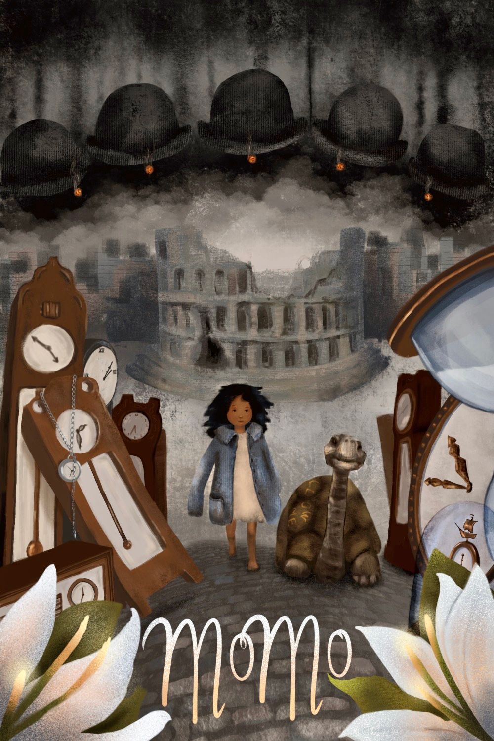
The feedback for this cover is that the value structure is all wrong, which makes the image confusing and hard to read. There are also contrast issues, and no clear hierarchy of the elements to help guide the viewer, and so it's overwhelming and unclear.
I need your help to stop clinging to this current version. How would you fix this image? Draw-overs, alternative comps, and anything else that might help, all ideas are very welcome! Don't hold back, burn it to the ground if needed!

Help me kill my darling, cause I haven't the heart to do it myself.
-
@Mia-Clarke what's the story of this piece?
Portfolio: nyrrylcadiz.com
Instagram: https://www.instagram.com/nyrryl_cadiz/
YouTube: https://www.youtube.com/channel/UCbJCF1Im8ZO7hpGWTKOJMuA -
@Mia-Clarke I was just going to ask the same question as Nyrryl. Can you elaborate on the story?
The focus is definitely a bit all over the place, and the story is unclear. I see what I assume is an hour glass, but it's so obscured by being on the very edge of the illustration that it's a very hard to read shape.
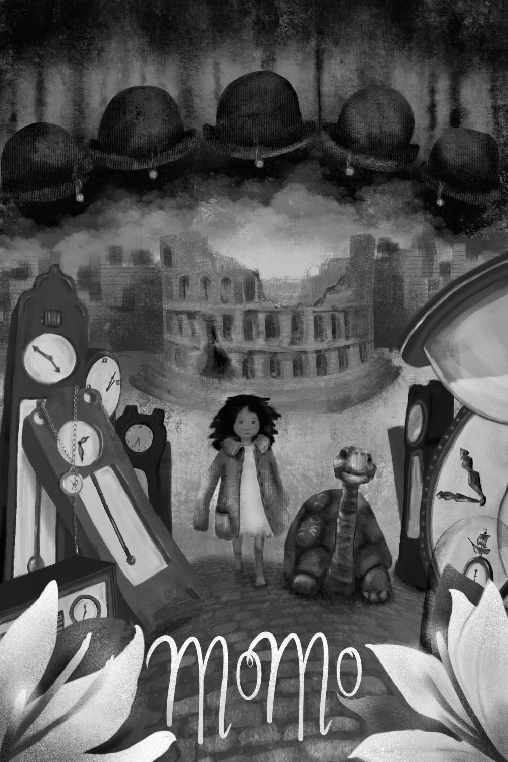
I definitely think your values need adjustment, have you tried putting it into Grey scale to see where things get lost?
-
@Nyrryl-Cadiz Oh, sorry, I should have said.
It's the book Momo, in which a small homeless girl gets taken into a poor community and moves into an amphitheatre. Her special gift is listening and not ever being in haste, and so her precence brings peace and play to the community. The villains in the story are the men in gray, time thieves who sneak into the subconcious of people and get them to "save" their time by giving up anything extra or joyful.
The men in gray move in, and the town is changed from a lovely place full of happy people, to a place of angry, stressed, and harassed people without a minute to spare. Momo gets into the crosshairs of the men in gray when they discover her immunity to their powers. Before they come to take her away, a tortoise shows up by her amphitheatre with the words "Follow me" written on its shell. Momo follows the tortoise, which takes her to the maker of all time, who lives in a house outside of time full of clocks and time pieces.
It's a fantastic story, written by Michael Ende (who also wrote the neverending story).
-
@Mia-Clarke Oh, and the men in grey's bowler hats and cigars are central to the plot. The men in gray are always smoking.
-
@Mia-Clarke Ok, that sounds like a great story.
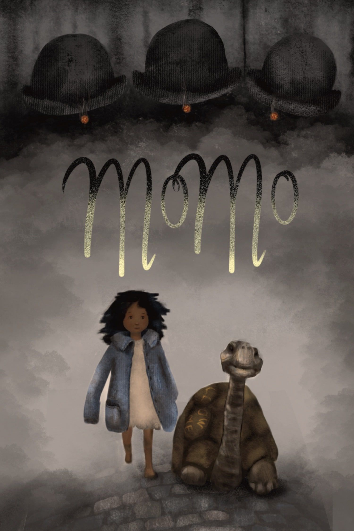
My first advice for this piece is to remove the unneeded details.
For example, are those flowers vital to the story? If not, remove them.
Is it necessary to have that many clocks? If not, remove them. Maybe just leave 1 huge clock or hourglass.
Same goes for the Amphitheatre. Is it really vital? if not, remove it.
Do you need 5 gray men? Maybe 3 will do.
Simplify and only leave the most vital details.
Portfolio: nyrrylcadiz.com
Instagram: https://www.instagram.com/nyrryl_cadiz/
YouTube: https://www.youtube.com/channel/UCbJCF1Im8ZO7hpGWTKOJMuA -
@AngelinaKizz Good ideas! Here's the illo in grayscale.
-
@Nyrryl-Cadiz The lillies are central to the resolution, but they could probably go. These suggestions are exactly what I need, thank you so much!
-
Wow I need to read that! I agree with Nyrryl you need to pick out what’s most important and let the rest go. Also checking your values in greyscale as Angelina said will help too. I will attempt a draw over later but I need to know a bit more about the story first.
-
@Nyrryl-Cadiz Ok, now I've removed everything. It's not at all polished. Is this a better direction?
-
@Mia-Clarke I think now too much has been taken away. I also think you really need a light source, because your values are still muddy.
-
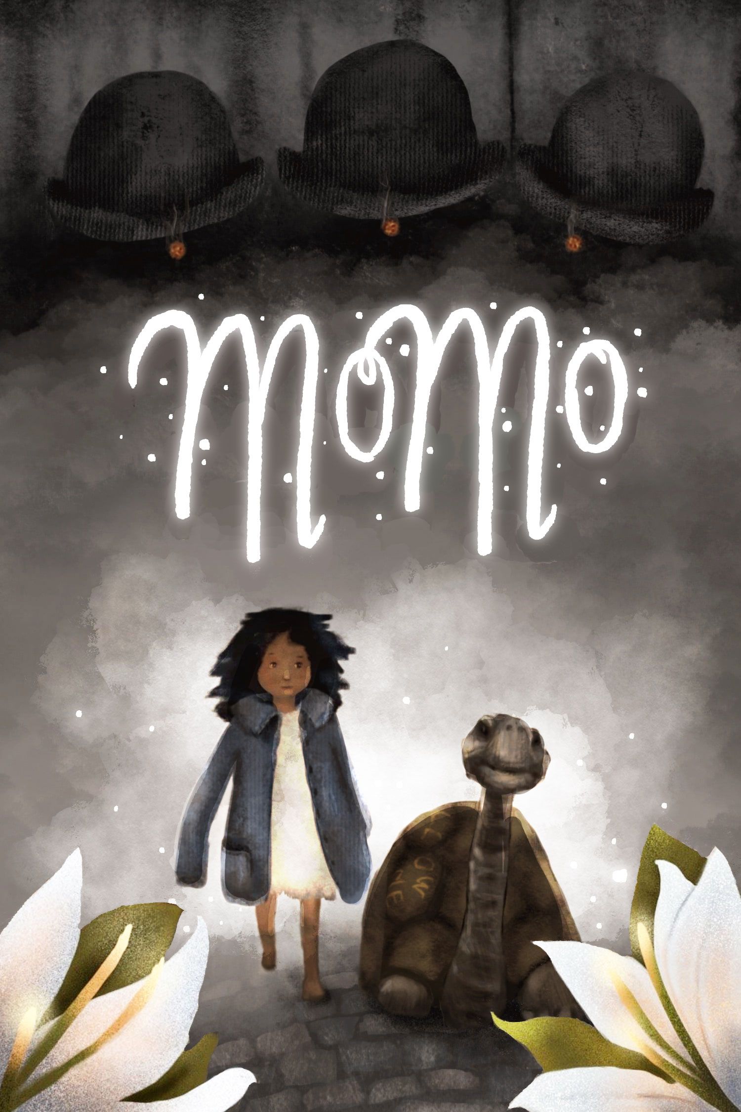
@Mia-Clarke I agree it's now slightly too empty. I've added back the lilies, added a backlight, some white fog and white glowy title with little fairy light to add a bit more magic. Bit more contrast on characters with light reflections on the outlines, and on the girl's face. Title is slightly nudged upward now too. What do you think?
vanessastoilova.com
instagram.com/vanessa.stoilova/Check out my Youtube channel for tips on how to start your career in illustration! www.youtube.com/c/ArtBusinesswithNess
-
@NessIllustration I like this a lot! Thanks! The lillies in the foreground are the opposite to the men in grey, and so it seems apt to have them there. I still would like to incorporate timepieces somewhere... Maybe I could hang a pocketwatch on the title?
-
@AngelinaKizz Yes, I agree. I just figured it might be easier to dial it all the way back and work from there... Thank you so much for your help!
-
@Mia-Clarke That sounds like a really cute idea!
-
Killing your darlings is not an easy thing to do. I find that as long as I’m working on the original image and trying to change it I will never get it to a place it’s needs to be.
To remedy this I recommend starting from scratch with the feedback you got from the portfolio review in mind. I know that sounds like it will be a ton more more than just fixing what you have but I have always found starting from scratch in cases like this ti be way faster than fixing an image that I’m attached to. -
@Griffin-McPherson Yeah, I think you’re on to something… I should probably take the ideas from this thread and start over on a new piece.
-
@Mia-Clarke It's good to remember that you don't need to (and most of the time it's best NOT to) tell the whole story on the cover. You just want to pique their interest, so they'll pick it up & read it.
I like your character design for the girl & the magical effect on the title.
It sounds like the tortoise is part of a deus ex machina (but at least there's the foreshadowing of the girl having similar traits), so that's something I might not want to give away on the cover.
But then again — it might be nice for reptile lovers in a sea of dog books.
Maybe you could hide the tortoise among the lilies? It would be great to have it barely noticeable in the illustration, so it doesn't draw attention until they know the significance after reading that part of the story.
It sounds like you're getting a good start on breaking away. Good luck!
-
@Mia-Clarke hi again! Tho I love the simplicity of it all. I think you may have stripped it down too much. I think it would be great to show a clock in the bg. Also, show variation in size with the gray men. Maybe have a silhouette of the amphitheatre in the bg as well.
I’ll try to make a draw over if I have the time soon.
Portfolio: nyrrylcadiz.com
Instagram: https://www.instagram.com/nyrryl_cadiz/
YouTube: https://www.youtube.com/channel/UCbJCF1Im8ZO7hpGWTKOJMuA -
@Miriam I definitely think you’re hitting the nail on the head here, I’m probably guilty of what Will Terry keeps calling “over-illustrating” on this one. I think I just fell so much in love with the story that I wanted to just paint as much of it as possible.
The tortoise is a main character, so having her on the cover makes sense, I think… Plus, any chance I get to draw a tortoise, I’ll grab. I just love their little faces!