Finding Your Palette (Colours) -Traditional Mediums
-
@Heather-Boyd Yep, I've worked in every medium and tested them exhaustively! The new patreon is here, check it out if you like: https://www.patreon.com/leewhite
-
@AngelinaKizz I sort of agree about the primaries. The problem is finding the color palette that gets you the closest to what you want without extensive mixing. For example, using cyan, hansa yellow, and magenta will get almost any mix, but is too bright and requires a lot of touch to really get the palette that I like which is a bit more muted. So I lean it one way or the other, but the principle is the same. It's just finding the right mix that gets you there quickest and easiest.
-
@Lee-White I absolutely agree with you. It's just not necessary to buy the biggest set available. A set of 24 or 48 can be a great start, especially if cost is an issue. I know that in the US pencils are much more affordable, but in Canada they're wildly high. My local art shop sells luminance for $13.99cad per pencil open stock. Meanwhile Blicks Is $2.36usd per pencil. I've tried ordering from blicks to reduce my cost, and between shipping and customs I ended up higher than my local art shop. I've lucked out where friends were traveling to the US and willing to buy my supplies and bring them back as part of their trip allowance before being hit with customs, but with covid there's just not as much travel happening yet.
For me personally when working with my colored pencils, I very much have a palette that is my go to. I've bought complete sets, and have more than half that have rarely been used, because I go back to my favorites.
-
@AngelinaKizz I think you need to hook up with other artists and swap your pencils at those prices! Start a trade! Yes, I have colours that I love and those that are dull and boring that sit there. Their length really says it all, the pencil stubs a sign of love!
-
I've got some great tips for speeding up with colored pencil. The easiest and fastest way to really up your colored pencil work is to lay down a base color at about the same value and or color you are doing with the colored pencil. I use marker for this step because it is so fast. If the texture is too much for marker, i just lay in a base tone of watercolor (flat). Then I add slight lightening or darkening with the color pencil. It gives the work a much more substantial (pro) look and like I said, will easily double your speed.
-
@Lee-White Yes! I stumbled upon this approach intuitively for last month's prompt as I had found I liked the added texture that a base of watercolour gives to the pencil. Thanks for this tip about marker as I have not seriously tried that as a base apart from in Jake's Prop Design course.
-
@Lee-White This is how I've been working with that base watercolor layer, then layering wax colored pencil but I've been curious about laying marker down first instead like you mentioned - it seems like it would be faster.
I can get caught up in the watercolor layer for arguably too much time.
I just worry about seeing that streaky-ness of the marker, since I don't own copics but rather the less expensive blick brand.
-
@Kristen-Lango another option for your base layer, is pan pastels.
-
@AngelinaKizz wow I'd never seen those, they are beautiful! Thanks Angelina!
-
@Heather-Boyd hi! I think u can buy individual colors from prismacolor pencils.
-
@Kristen-Lango you have to use relatively smooth paper and brand new markers to avoid the streakiness. Another option is laying down the local tone with marker, then putting down a LIGHT layer of pastel (scraped into a powder with an exacto knife or using pan pastels) . Then go on top with the colored pencil. This technique works GREAT with toned paper.
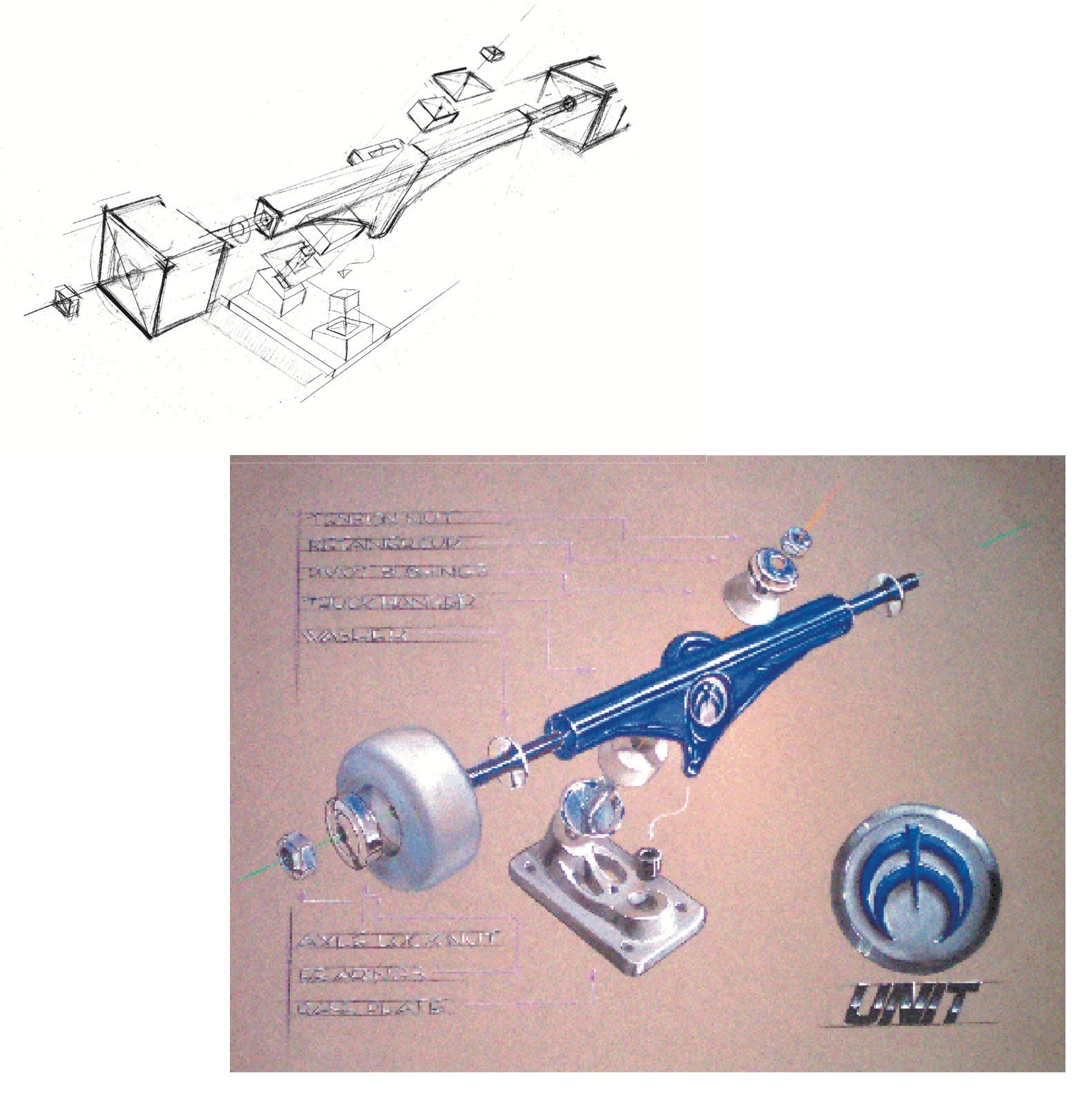
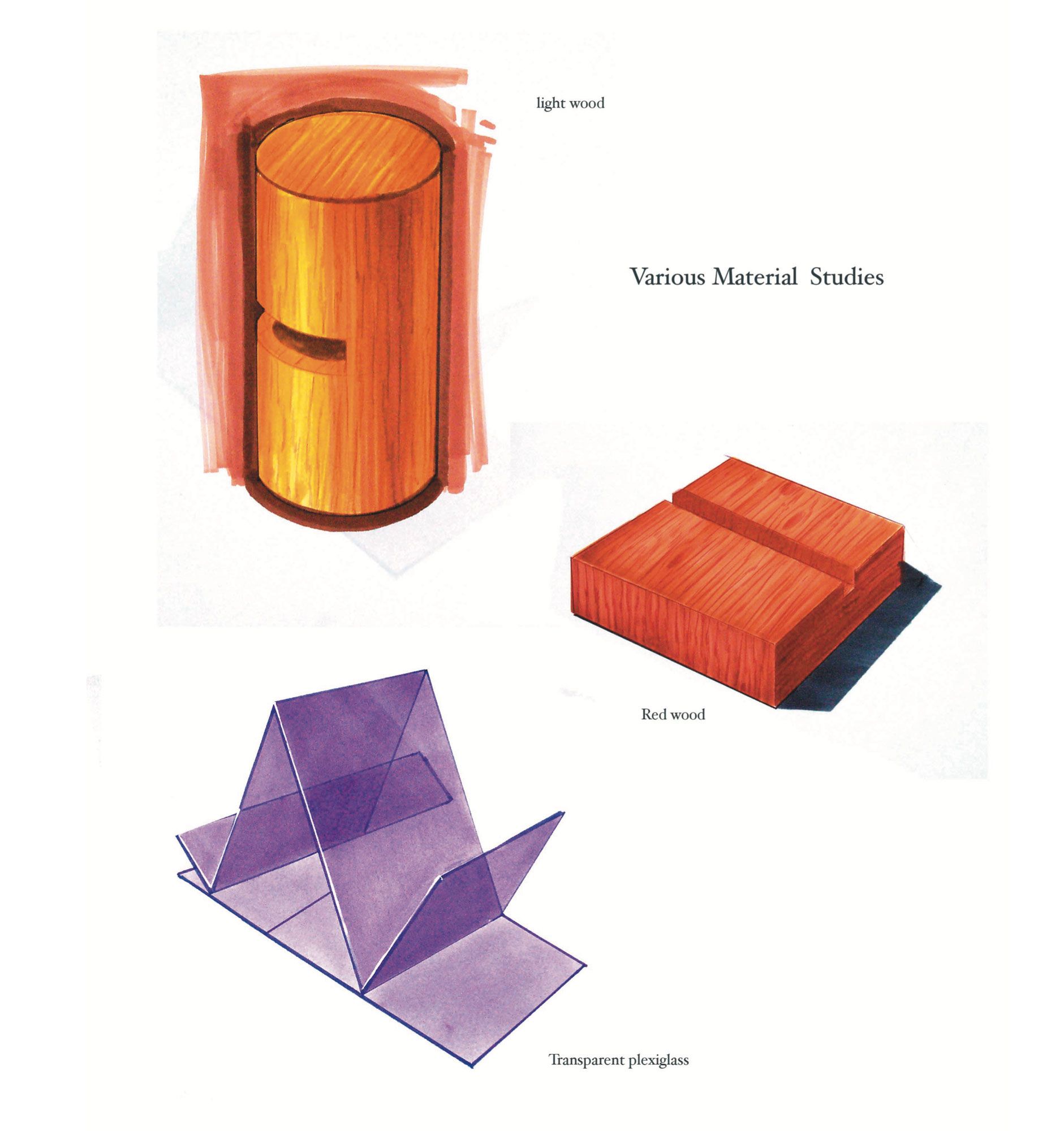
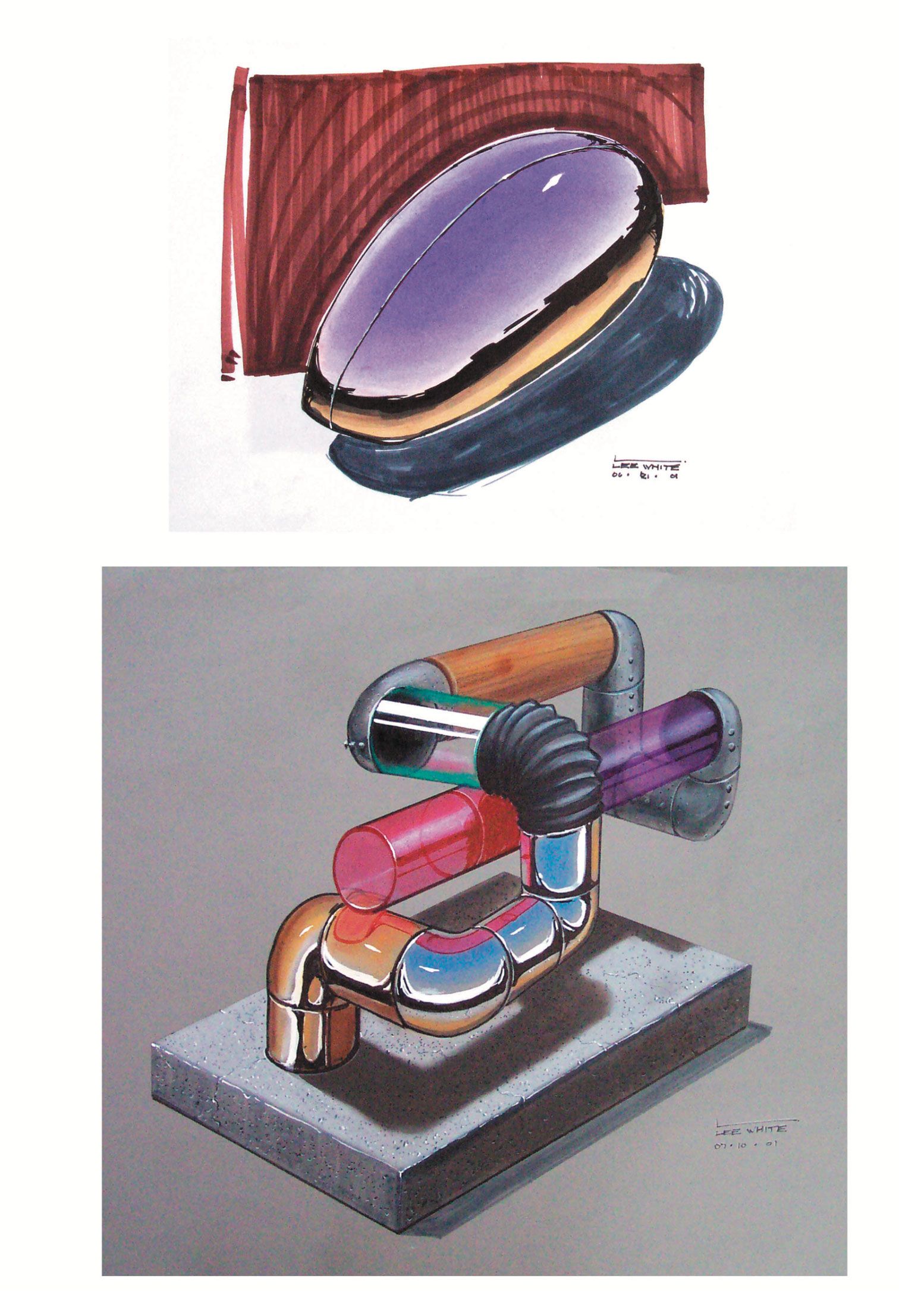
Here's a few VERY OLD samples I did in this technique back when I was an industrial design student

 .
. 
-
@Lee-White what great tips! And love your drawings! So awesome.
-
@AngelinaKizz ha! Thanks! These are so old. I see the date on there is 2001! But I still go back to some of these basic techniques all the time! I used to love these kinds of assignments because I always thought that illustration was so hard mentally that these kinds of exercises are sort of relaxing. : )
-
@Lee-White Excellent and reminds me of my first period of study My first diploma was in Technical Illustration, learning perspective, technical illustration and how to use an actual real airbrush!
-
@Heather-Boyd Hi Heather! I love using colored pencil and traditional media as well. I also love the more earthy tones in those sets. I think most brands offer smaller sets (like with just earth tones or skin tones) you can purchase. I started off with the smaller set of polychromos (set of 24) and caran'dache (set of 20). They're pricy but I bought my sets in 2017 and still have some of the original pencils so it was worth the purchase in my opinion - it was a great place to start and then over time I just went to art stores to buy individual pencils that were not in the set or to replace colors I used up. I think over time you just get a feel for the colors you gravitate towards - plus it's hard to gauge the colors from pictures versus actually using them on paper (so I think finding your perfect preferred palette will just come with time and experimentation). There's an artist on youtube (called Iraville) you might have heard of or enjoy watching. She uses lots of great earthy tones/palettes and she provides links to her materials. This might be a good way for you to see what the different pencil colors look like on paper or which colors work well together before purchasing.
https://www.youtube.com/user/iraville
You can also use adobe.color to play around with making palettes and then you could try to choose pencils that match as closely as possible.
Also some brands just mix better than others. Polychromos have a hard oil-based lead and mix well when adding light layers. Caran'Dache is oil based but the lead is very soft . Prismacolor are wax based with very soft lead. I'm not sure what brand you use now but it might be worth checking out the ingredients to see whether they are oil based or wax based and then researching techniques for mixing the two. You might also find it fun to experiment with odorless mineral spirits to help mix the colors. It breaks down the binding on oil-based pencils and can create some awesome blending effects.
-
@Mary-Toth Caran dache is actually wax based. Derwent lightfast is oil.
-
@AngelinaKizz it depends which pencils you're using by them. That's a good point bc they do offer different types
-
@Lee-White Thanks so much Lee for taking the time to respond! Your advice is much appreciated always
 So maybe a mixed media type of paper works best for that approach? I'm thinking rather than a hot or cold press watercolor paper (which is what I use now with watercolor pencils).
I've never approached the pan pastels, but I think I'll have to now! And thanks for sharing your work, its great to see pieces you did as a student while I learn from you guys.