May stormN wip(s)
-
@Asyas_illos I think a panda would be a winner! The only caveat there would be to make sure that the black patches of fur don't get lost in the dark storm clouds. Looking forward to seeing how this one shapes up.
P.S. Great work with the desert piece! I think you really nailed the sandstorm.
-
@Mike-Marttila thank you and yes since I darkened the sky even more not sure how it’d work out.
-
So sketched out some more characters what do you guys think Im stuck between two…
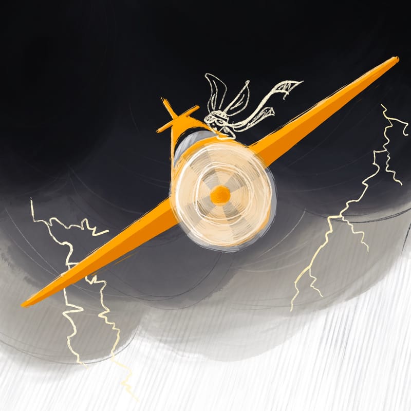
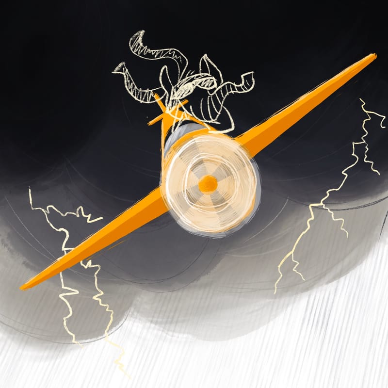
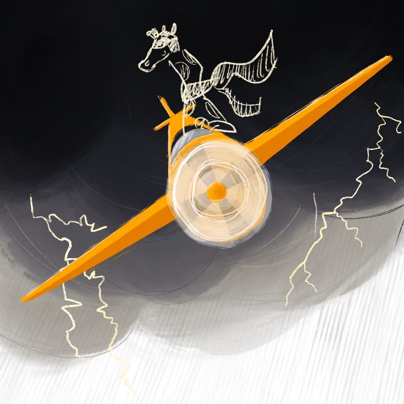
-
@Asyas_illos I think the elephant is a good one, because you can lean his Grey into a blue and complement the orange while having enough contrast to the charcoal clouds. You could also push the size to make it funnier.
-
@AngelinaKizz yes I would definitely increase his size for sure!
-
@Asyas_illos I also vote for the elephant.
A) Thanks to its weight, it’s the funniest in a plane.
B )I think the giraffe would need to be in a more uniquely shaped craft to fit right. -
Well I did one one with a person just to see and I like it too…
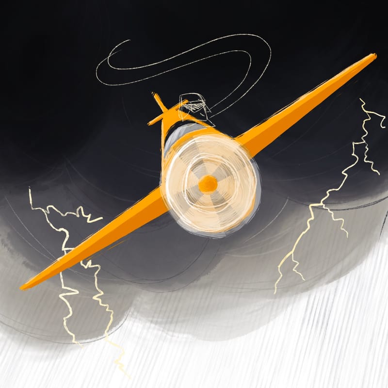
-
Both the elephant and the giraffe made me laugh as soon as I saw them so I vote for those.
-
@Asyas_illos elephant has my vote!
-
@Asyas_illos I second what @demotlj said!
-
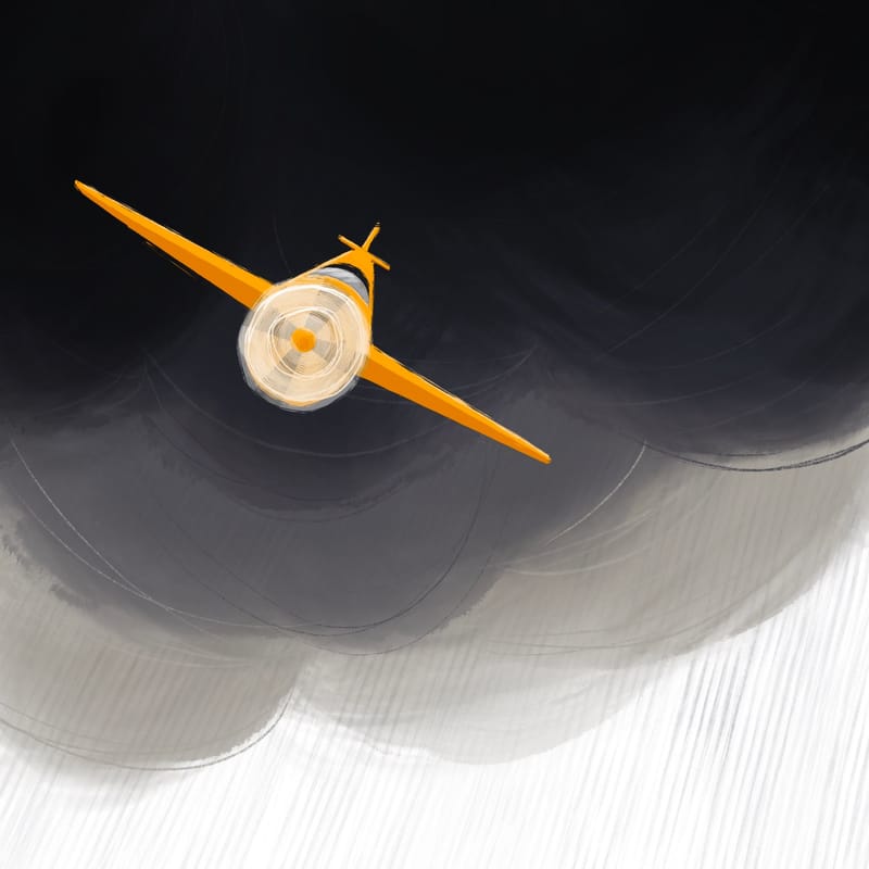
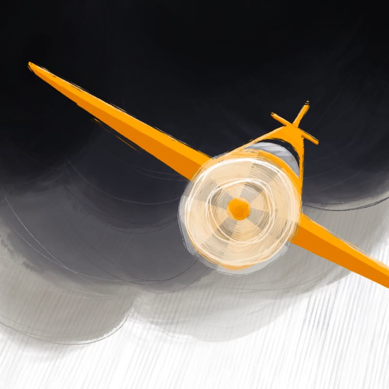
Playing with size and cropping
-
@Asyas_illos I like the composition of the first one. It brings more focus to the storm itself and not whoever is in the plane, though. Which do you want to focus on?
-
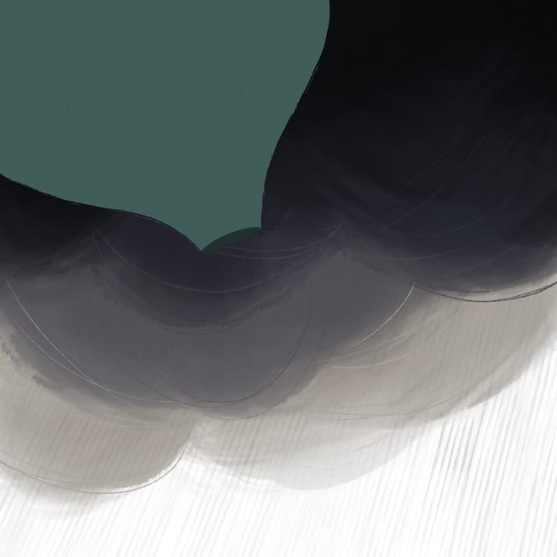
@Patricia-Dishmon thank you and I agree I have since decided to omit the plane and going hot air balloon!
-
-
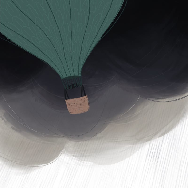
@Asyas_illos I like the balloon idea! But I think your colors were working better with that yellow - it really pops against the clouds. But I suppose it depends what you're going for. Maybe you can put a brightly colored or high value character in that balloon and really draw the attention there.
-
@Asyas_illos Cute! And I agree with @Kristen-Lango The bright color of the plane was great! If you do put a bright colored character in there, don't forget to tie the colors into the balloon.
Also, why is it that I suddenly feel that the white at the bottom is too white? I'd take the whole background and shift it down so that there are only a few spots of white (maybe from lightning?) and fill in the top with that really dark gray.
I can't wait to see the next update! You work so quickly

-
@Kristen-Lango thanks yes I’ve added more detail now
-
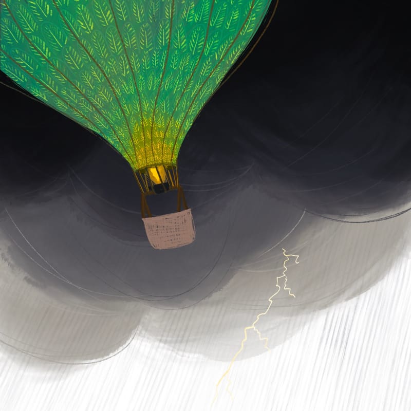
Still a work in progress!
-
@Asyas_illos ooh, i love this green pattern against the dark sky!

-
@Asyas_illos me too! what @Valerie-Light said!